
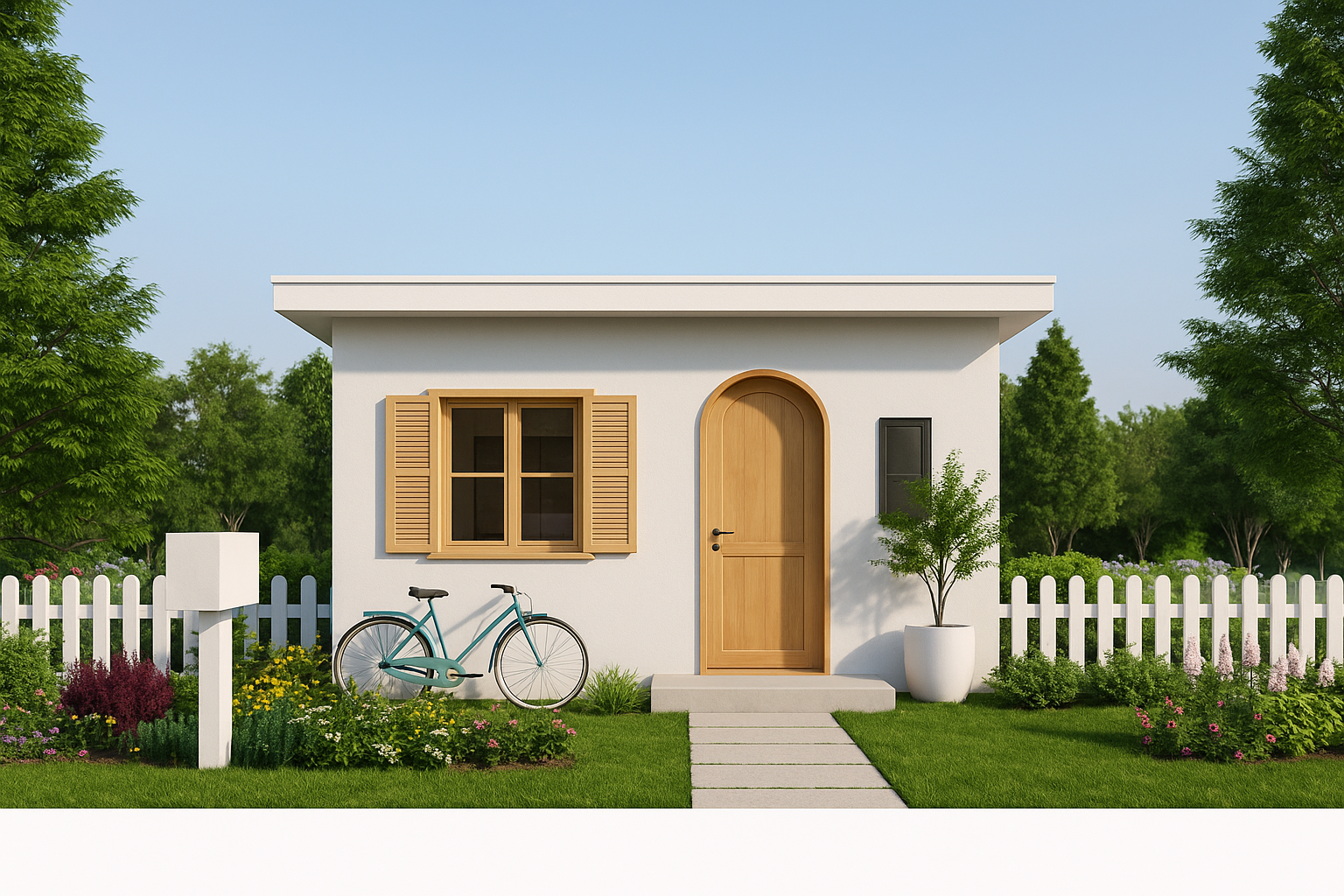
Small House Front Designs Using Brick, Wood, and Concrete
Small fronts reward clear thinking: tighten the grid, give the entry a calm landing, and let light and planting do quiet work. What follows is the short course drawn from sites that had more ambition than frontage.
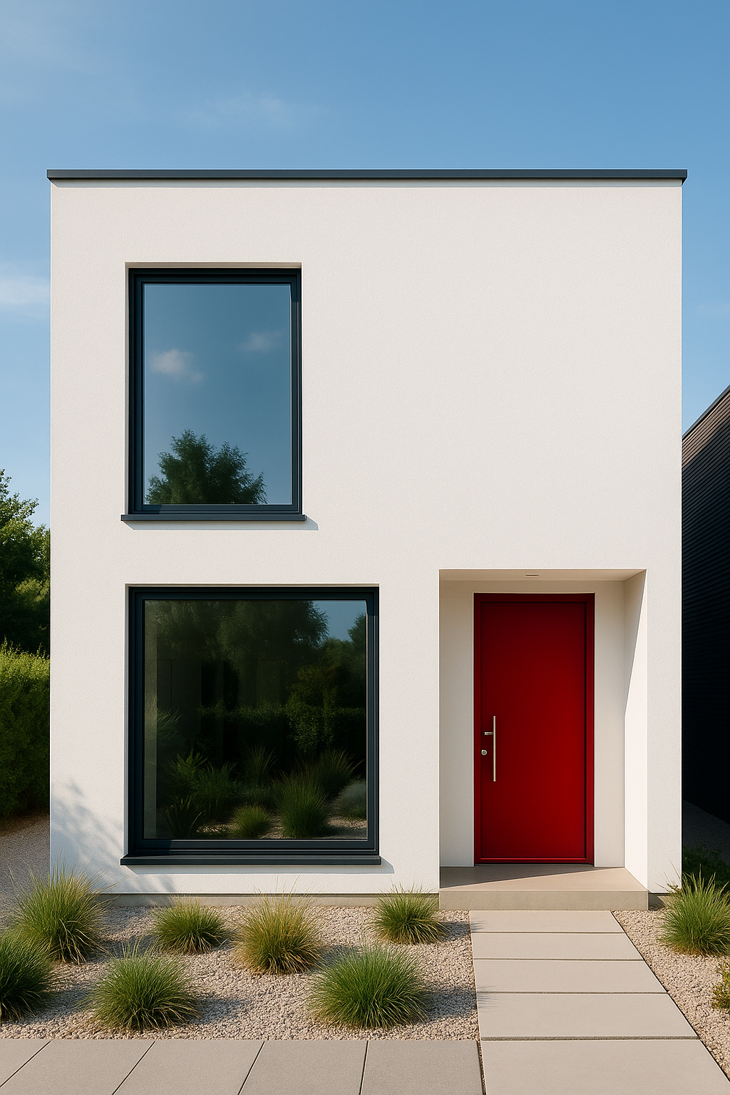
Maximizing Impact with Small House Front Designs
Get the bones right
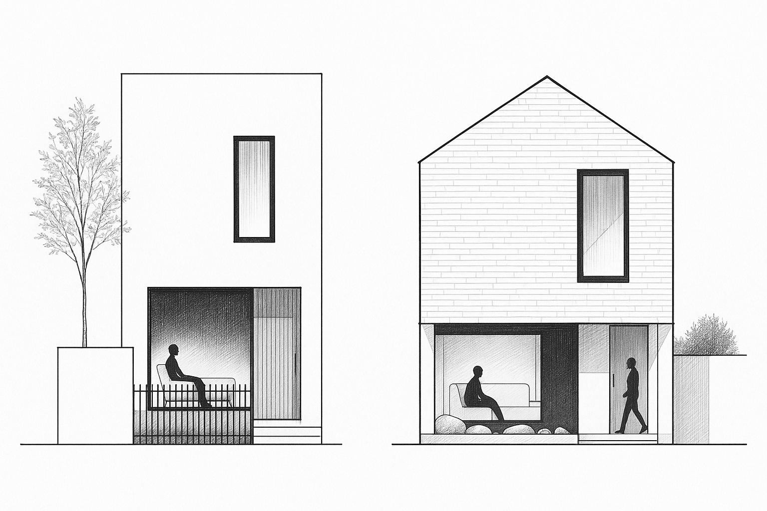
Start with a single datum and make everything answer to it. Pick the door-head height as your line, then align window heads, canopy, and any sign band to that same level. With one head line and one base course, even a 20-foot facade stops reading busy and starts reading intentional.
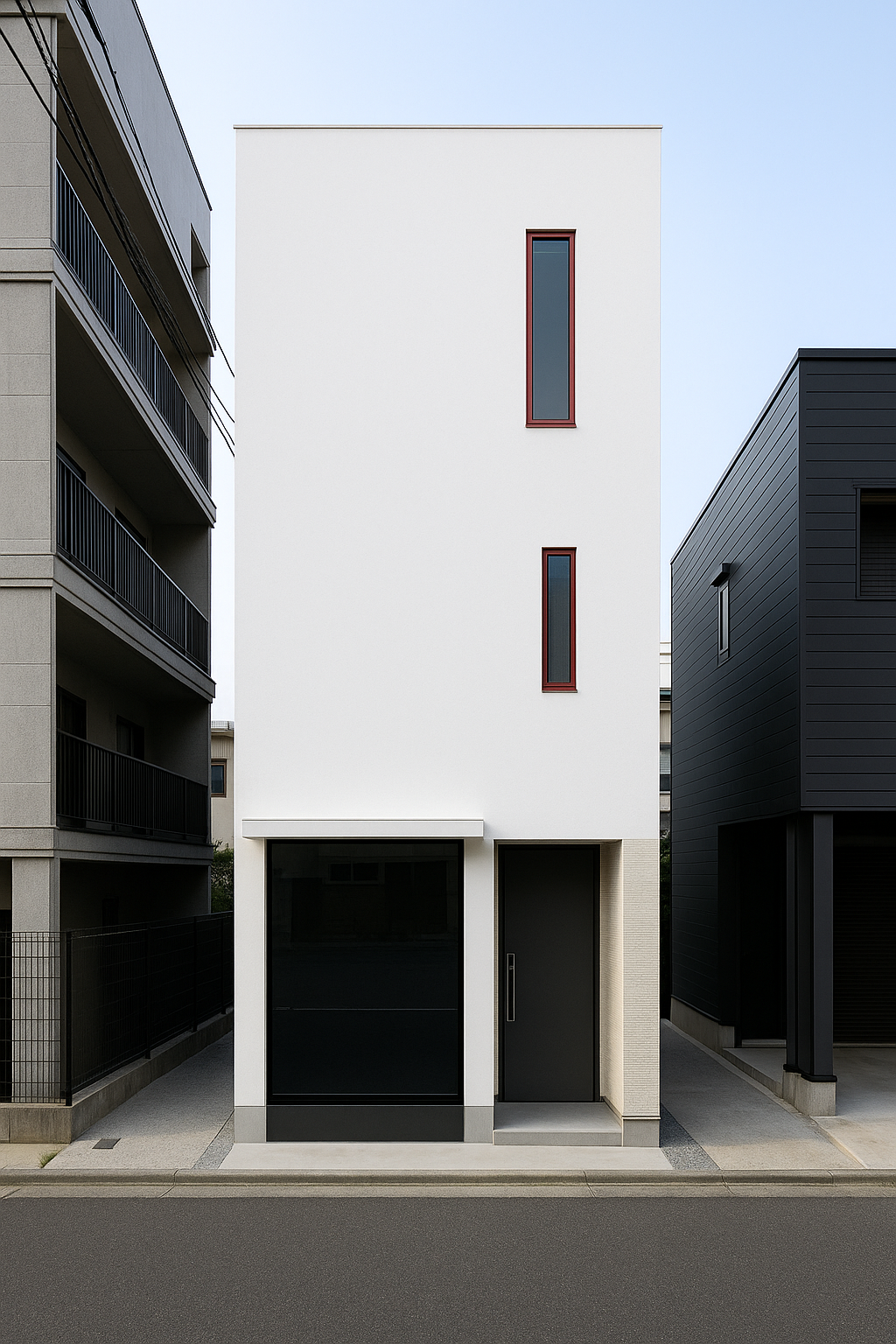
If your elevation mixes window sizes, hold to tall, narrow ratios so the mass looks taller than it is; add a slim transom before you add a wider sash. Keep the palette to one field color plus two accents (trim, door).
Field note (15×45 front): the door was visually swallowing the wall. We fixed it with tall–narrow window ratios, a slim transom over a 36 in door, and tight head alignment. The verticals pulled the eye up so the facade read taller without upsizing the door.
Symmetry vs. asymmetry in practice: classic symmetry stays quiet; asymmetry adds energy. A layout that works on small fronts: a larger window massed on one side, a bold door + shallow canopy on the other—both landing on the same head datum so it stays calm, not chaotic. (Proportion checks live in House Front Design: Architect’s Checklist.)
If you need a deeper checklist for the front itself, use the House Front Design: Architect’s Checklist, and for side conditions and returns, the broader House Elevation Design guide ties front, flank, and services together.
When to Choose Traditional vs. Contemporary Facades
A classical facade buys you calm. Columns, balanced windows, a centered entry: these reassure neighbors and appraisers. Go this way if the street already reads traditional, or if you want your house to “age in place” without looking trendy.
Field note: a 14-foot brick front in Boston was losing offers until we straightened the symmetry and added a portico. Suddenly the house matched the block and sold in three weeks.
A contemporary facade pushes the opposite signal. Narrow windows, flat planes, and minimal trim mark the house as sharp and urban. They work best in dense cities or mixed new-build streets where you don’t need to “blend in.” Just know it dates faster.
The real test: picture the house ten years on. If you want it to disappear into a block quietly, lean traditional. If you want it to stand apart and look current, lean contemporary.
Make space you can actually use
Depth makes porches honest. Six feet works for two chairs and a pass-by; eight feet turns that sliver into a real outdoor room. Those numbers are what keep knees from knocking and trays from clipping corners.
The approach wants the same pragmatism. A primary walk that holds two people and a stroller without shoulder rub lives in the 36–48 inch range; anything tighter belongs to side yards, not the front door. If accessibility matters (it usually does), design to at least 36 in clear route and treat 48 in as the comfort target.
At the threshold, a standard 36 in door gives you the 32 in clear opening that codes expect for the egress door; keep a flat landing beside the latch so groceries and wheelchairs don’t fight the swing.
If you’re sorting details, the diagrams in Visual Handbook of Building and Remodeling condense the dimensions that actually save mistakes on site (hinge clearances, riser runs, landing sizes) — it’s the one book that pays for itself in fewer change orders. → Buy on Amazon
Related internals if you’re scoping materials and presence: Home Front Design: Materials, Entry, and Presence.
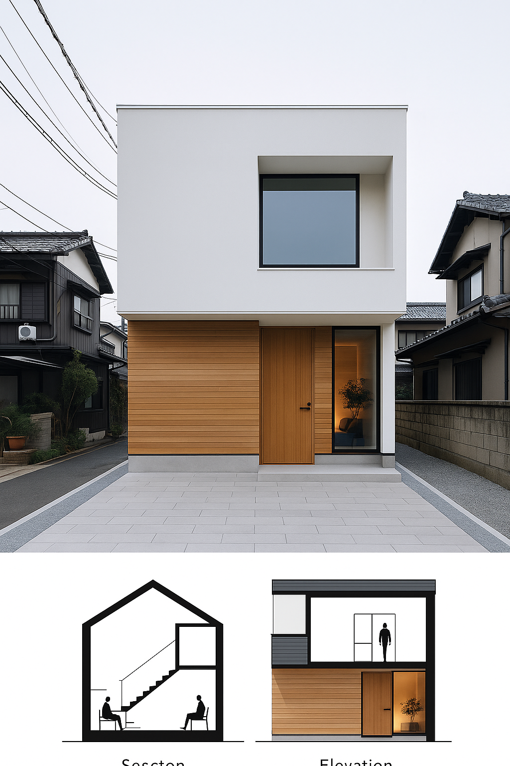
Plan With Family in Mind
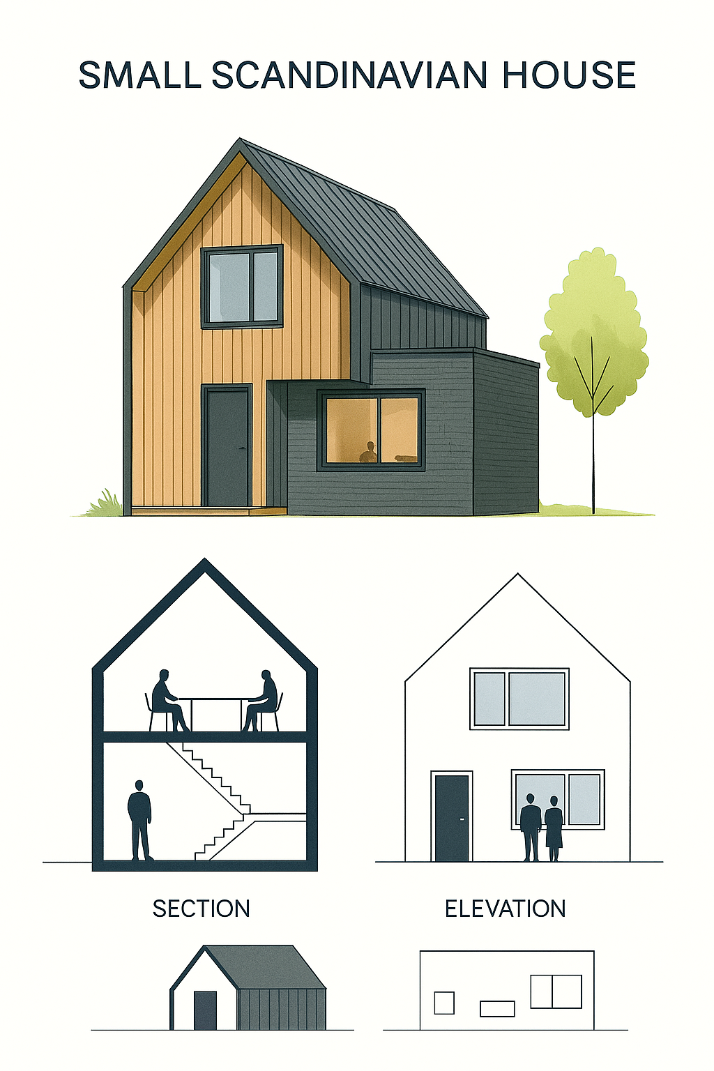
Small Scandinavian House Design: natural wood and dark exterior finishes, architectural section and elevation diagrams.
Small houses can’t afford guesswork. Build for the people you know will live there, not some fantasy version of your life.
Think current and future
If you know kids or grandkids will be part of the picture, leave real space for them. A small yard that can handle a tricycle loop, or a bench wide enough for three, will get used every day. That’s worth more than fancy trim that nobody touches.
If not, keep it honest
Don’t pour money into an oversized porch or “family entry” you’ll never use. It’s better to tighten the design and put the budget into materials that will last. Empty space that goes unused just becomes upkeep.
Plan precisely
Count heads and picture the daily moves. Who walks in first, who drops bags, who needs stroller clearance, who wants a seat. Draw it as a real sequence, not a mood board. That’s how mistakes get caught before the walls go up.
Life is short
Don’t waste on assumptions. Build what fits the life you have now and what you can clearly see for the next decade. Anything beyond that is luck, not planning.
Light what people need, and nothing else
Night work is simple: warm color, tight beams, and no glare. Keep exterior fixtures at 3000 K or below and use fully shielded housings so the source isn’t visible from the street. It’s easier on eyes, kinder to neighbors, and better for wildlife.
Layer the light by job. A down-light at the lock does the task. A quiet wash on the house numbers handles finding you fast. Two low bollards or step lights guide the last ten feet without creating a runway. Shielded “dark-sky” wall lanterns hit that mix off-the-shelf.
Field note (cheap solar lights): on one narrow front we used four $25 solar bollards on a dusk timer. One at the latch side, two along the path, one by the numbers. The house felt safer, read more expensive at night, and never touched the wiring.
Security follows the same common sense. Keep views from the street to the door open above knee height; shape planting to frame sightlines, not block them. That’s basic CPTED: natural surveillance and clear access cues reduce hassle without fences or cameras everywhere.
If you’re selecting the actual entry hardware and light as a composition, skim the fit-and-finish notes in Front Door Design 2025—it pairs fixtures, numbers, and canopy proportions so the entry reads as one move, not a catalog mash-up.
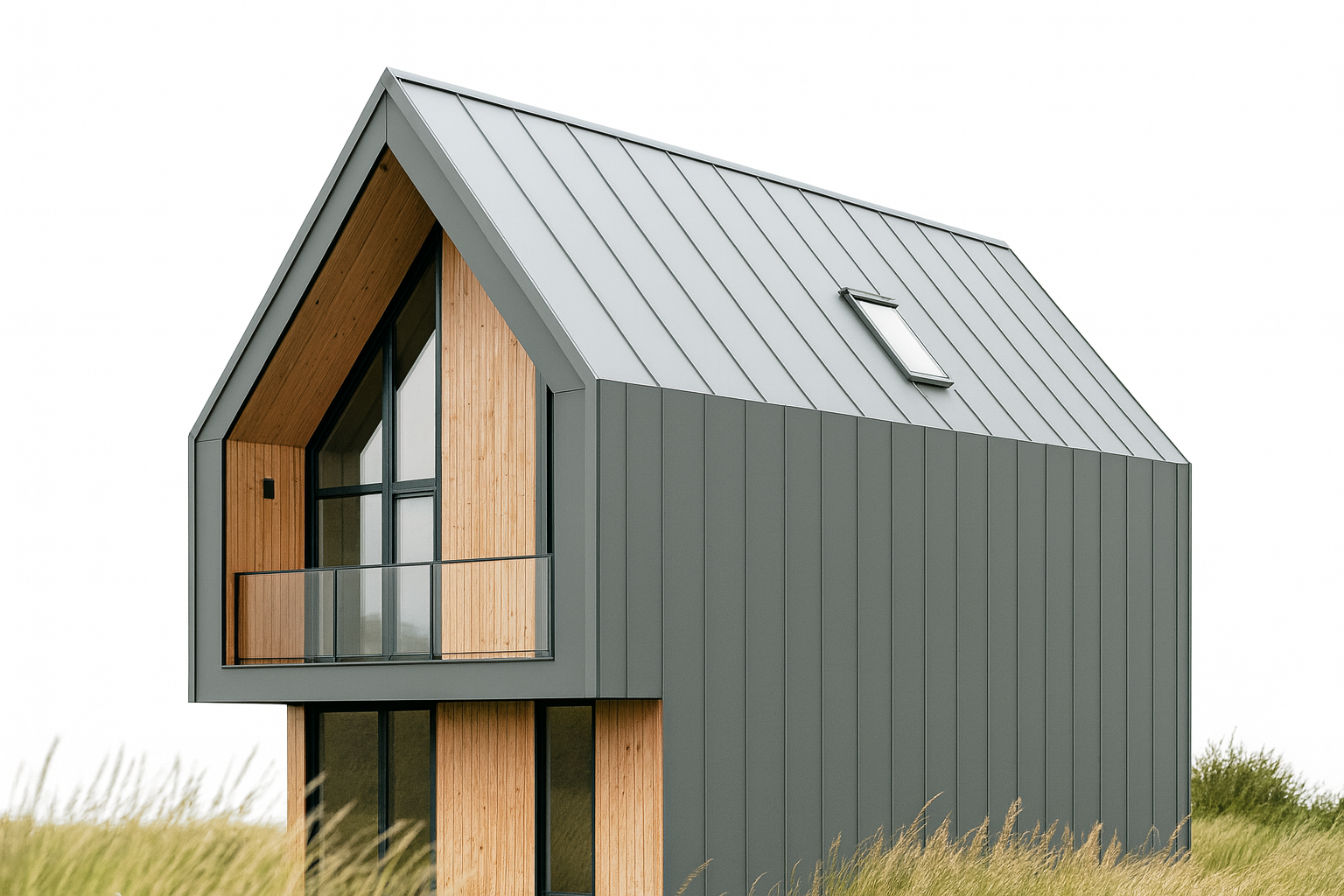
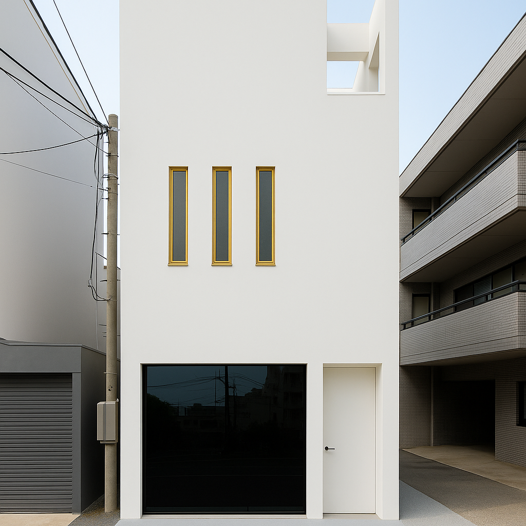
Narrow Windows in Dense Streets
On tight urban streets, glass is exposure. A wide sash makes the living room feel like it’s on display. The fix is vertical, narrow windows cut in sequence. You still get daylight shafts, but views from the street stay clipped.
Field note: one 16-foot front in Queens had nothing but foot traffic three feet away. We ran three 18-inch wide slots floor-to-ceiling instead of one big pane. The client kept daylight, but you couldn’t see more than silhouettes from the sidewalk.
Privacy comes first, but daylight doesn’t die if you stack clerestories higher up. Slot windows low for ventilation, high for light, leave the eye-level band solid. In Tokyo row houses, the same move gets paired with frosted glass or deep jambs to bounce light inside without giving the street a view.
If you want the detailing right, narrow frames and deep reveals make the proportion look intentional, not like you ran out of budget.
Japanese Fronts on Small Houses
Japanese facades read as restraint. Low eaves, clean timber frames, and one strong move—like a deep entry shadow or a single vertical slat screen—carry the whole elevation.
Field note: in a 16-foot frontage we worked in Kyoto, the trick was a single cedar screen that covered both window and door. Light came through, privacy held, and the facade read finished with one gesture.
For small houses, the rules translate:
-
Screens over clutter. A slatted wood panel hides meters, bins, or even windows but still lets light through.
-
Deep shade line. A roof overhang or timber canopy creates proportion and keeps the wall reading flat.
-
Muted material. Natural wood, plaster, or dark ceramic tile. Keep to one palette so the house feels calm.
If you want a facade that hides noise and fuss but still looks lived-in, the Japanese playbook works better than trying to copy glass-and-steel towers.
Materials that carry their weight
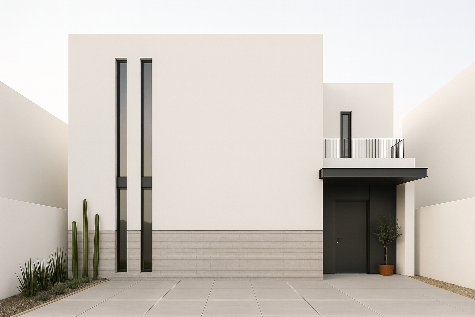
Small fronts don’t hide mistakes. Pick one field material and one accent and let the joints be the detail. Fiber-cement or brick for the field keeps maintenance low; wood or stone at the entry gives touch and shadow. If you mix more than two claddings on a narrow elevation, it reads busy fast. Keep trim lean, align all head/sill lines to your main datum, and seal cut ends before installation so the crisp look survives the first winter.
Roofs show on small houses. If you’re using metal, stop at clean edges and match gutter color to the fascia so the line disappears. On shingle roofs, a darker ridge hides vents better than trying to paint around them. For envelope choices and how they affect presence at the street, see Home Front Design: Materials, Entry, and Presence. If you’re sorting overhangs and pitches on compact forms, the basics in Simple Roof Design for Small House keep proportions in check.
Shop-bench reference when you’re picking details: Renovation (5th Edition) – Michael W. Litchfield — clear sections on siding, flashing, and trim that actually match field conditions.
Planting that works like space
Treat the yard like a room: one hard edge (walk or low wall), one soft edge (hedge or grasses), and a single “sentinel” plant to frame the door. Go for layers — groundcover, knee-high texture, then a slim vertical — so you get depth without bulk. Keep anything tall off the hinge side of the door for sightlines, and stop mulch 2–3 inches short of cladding to avoid splash and rot. If water is tight, native groundcovers beat small patchy lawns every time; they read finished sooner and need less care.
No footprint? Go vertical. A simple steel trellis with vines or a modular green panel gives you shade and color at 6–10 inches depth. Set irrigation on a timer and keep plantings clear of vents and downspouts. When you want compact ideas that don’t feel “shrunken,” start with Vertical Garden Ideas and widen to façade moves in Small House Front Design: Creative Ideas for a Big Impact.
Field note (12×40 plan): zero yard depth, hot west wall. We fixed it with a green wall on a 6 in standoff frame and drip irrigation. It cooled the entry, added shade at eye level, and turned a blank slab into the focal point.
Storage and service without the eyesore
Fronts work better when the mess has a home. Build a porch bench-box for parcels and shoes; repeat your fence slat pattern so it looks intentional. Hide bins behind a 42–48 in screen that matches the facade’s module; add a simple lock bar to a planter wall if bikes live outside. Keep meters and conduits in one vertical bay, then paint to the field color so they recede. Wall-mount hose reels next to a gravel drip pad and you’ll stop muddy corners before they start.
When you’re laying out where these pieces land on the elevation, the section diagrams in House Elevation Design help you keep the front, side, and service faces reading as one building. For a fast punch-list that keeps you from over-complicating the facade, lean on the Architect’s Checklist.
Planning help if you’re phasing on a tight budget: Remodel Without Going Bonkers or Broke – Jim Molinelli — straight talk on sequencing small exterior upgrades so money shows up where people see it.
Sustainability that actually shows up on your bills
Glass and shade that match your sun
Tune windows to orientation instead of buying one spec for the whole house. On hot fronts, keep solar gain down and add a small overhang; on cool fronts, let winter sun in and close gaps at frames so drafts don’t undo your effort. If you’re aiming for a crisp modern look while you do it, skim the patterns in Modern House Designs: What People Are Building in 2025 and adapt the shading details you can actually build.
Water is a design move
Move roof water with a clean chain into a gravel sump or rain barrel and use drip lines in planters. It keeps the entry dry and pays back in plant health. If you’re refining roof edges and overhangs on compact forms, the roof basics in Simple Roof Design for Small House keep proportions honest while you add function. See also: Sustainability in Architecture Design: What’s Changing in 2025?
Hands-on reference if you want small, doable upgrades room by room: Sustainable Home: Practical Projects for a Greener Life
Budget and phasing that don’t bite back

Spend where the street sees it
Door, numbers, lighting, walkway. Those four change how the house reads from 30 feet away. Paint and hardware first, then widen the path if it pinches. If you’re setting the whole elevation, pull tactics from Front Elevation Designs for Small Houses and cut anything that doesn’t earn attention.
One material swap at a time
On narrow fronts, a single new accent (stone plinth, timber surround) does more than three small changes scattered around. Keep the field cladding until you can replace whole faces—patchwork shows. For scope planning inside and out, lean on House Ideas: Designing Smart and Stylish Spaces to keep decisions grounded in use, not impulse.
Size-specific playbooks you can build
12×30 single-floor
Centered door under a shallow canopy, one tall window to the hinge side, one to the latch side. Keep head heights aligned. A 4 ft walk makes move-ins sane. If you’re tuning plans for one-level living, cross-check proportions in Single Floor House Design.
15×40 or 15×45 two-floor
Asymmetry that still lands on the same datum: door and canopy left, stacked windows right. One field cladding, one entry accent only. For bigger-picture layout and massing, the trade-offs in Small House Design: Benefits, Challenges, Best Designs help you avoid pretty-but-impractical fronts.
15×50 light-hungry plan
Full-height door with a narrow sidelight, one tall window ganged above eye line. Use a simple trellis panel where yard depth is zero; it softens the entry without stealing space.
If you’re phasing these moves and need a tool to keep tasks, costs, and lead times straight: The Home Renovation Planner
Personality in the front, not just inside
Color that actually sticks in memory
One strong color is enough. On compact houses, a bold door or shutter can anchor the whole façade. A small duplex house elevation feels less repetitive when each unit has its own entry color but keeps the rest in neutral. To see how color logic plays across house types, check Kitchen Colour Ideas That Don’t Age Badly—the rules work outside too.
Details that work harder than décor
Numbers, knockers, mailbox—small, cheap, and always visible. These outlast seasonal décor and tell visitors where to focus. If you’re setting up gates or small front walls, use the proportional checks in House Front Design: Architect’s Checklist for Elevations That Work to avoid cluttering already tight faces.
For a clear, no-theory reference on proportions that hold up anywhere: The Timeless Way of Building – Christopher Alexander
First impressions as design psychology
Snap judgment is real
Street view decides value before floor plan. Clean lines, visible entry, and one focal point change how people read a home within seconds. In one case, swapping a bland small house main gate for a wrought iron pattern shifted neighbors’ perception immediately. You can cross-check how entries frame space in Front Door Design 2025: What Works, What Fails, What Pays Off.
Styles that telegraph character
Minimalist, traditional, nature-driven, or tech-heavy—your front tells the story. A small house front glass design reads as progressive and modern. An arch reads as rooted and traditional. The effect is the same as body language: subtle, but people always notice. For wider context on how these signals play across eras, look at 40 Architectural Home Styles You Should Know by Sight.
Maintenance that keeps the front alive
Routine beats overhaul
Wash windows, repaint trim before it flakes, reseal walkways. A simple front tiles design for small houses looks new only if joints are clean. Dirt and weeds break the effect faster than bad color choice. If you’re tuning upkeep schedules, the advice in House Elevation Design: Complete Guide to Front and Side Views is a solid practical frame.
Knowing when to update
Hardware that looks worn, lighting that doesn’t throw enough beam, or tiles that date a whole façade—these are signals. Swap one layer at a time. On a front balcony design for a small house, railings and flooring will need refresh first. For interiors that match exterior upkeep, see Color Psychology Basics: What Every Designer Should Know.
Field manual for upgrades without losing control of scope: Visual Handbook of Building and Remodeling – Charlie Wing
Proven Tips and Tricks from the Field
Avoiding Common Mistakes
I’ve lost count of how many small fronts I’ve seen overloaded with “extras.” A balcony crammed with plants, three different trims, and a tiled wall all fighting for attention. The fix is always the same: pick one move and let it breathe. A front elevation design for small houses works best when the eye isn’t dragged in ten directions.
Maximizing Impact with Small Moves
Sometimes the cheapest changes hit hardest. A new gate line, a fresh door color, or better lighting can reset the whole street view. On one 12x30 build, all we did was replace the main gate with a clean steel-and-wood frame. The house jumped ten years forward without touching the walls. For more context, see home front design: materials, entry, and presence.
Trends That Stick
Natural finishes, smart locks, and restrained planting are what I see surviving beyond fads. Clients who tried neon paint or fake stone always circled back to simpler palettes. Durable beats loud every time.
MUST READ:
Designing Design by Kenya Hara — a reminder that clarity and meaning carry more weight than decoration. Worth keeping on your shelf when you’re tempted to add too much.
How Contrast and Balance Shape Small House Façade Design
Façades live or die by balance. You can push contrast — in color, depth, or mass — but if the composition loses equilibrium, the eye stops trusting it. Balance doesn’t mean symmetry; it means visual weight distributed so the building feels steady.
Light and Shadow Balance
In strong sun regions, balance is managed through shade. Deep reveals on one side can be offset by lighter planes on another. A recessed entry reads as counterweight to a projecting bay. Light becomes a structural element — it defines rhythm without adding ornament.
Material Contrast with Order
Good façades mix materials, but always with hierarchy. Heavy textures belong at the base. Smooth panels or glazing float above. When you reverse this, the eye reads imbalance. Architects like Álvaro Siza and Peter Zumthor use contrast this way — stone anchors, white planes lift.
Color and Tone Alignment
Contrast in tone gives legibility. A charcoal window frame against pale render clarifies edges. A lighter parapet keeps weight from pooling. But every tone shift must serve the structure beneath — avoid random accents. A façade is not a painting; its contrast must trace logic.
Proportion as Control
When proportions are right, contrast can go bold. A tall, narrow void can balance a broad wall if sill and lintel lines align with the rest of the elevation. Architects use grids or module lines to tune balance, especially when mixing materials or depths. It’s geometry that holds contrast in check.
Rhythm in Openings
Contrast often rides on repetition. Regular window bays, punctuated by one large opening, give a readable pulse. If spacing drifts or sizes jump without order, balance collapses. Keep rhythm consistent, then break it once — with purpose.
Field Example
In a coastal housing project near Halifax, the main façade used charred wood panels against white fiber cement. The trick wasn’t the color — it was the spacing. The darker panels framed lighter voids at equal intervals. That balance made the contrast feel calm, not graphic.
For deeper structure on composition logic, see Form in Architecture, Balance in Architecture, and Balancing Contrast in Façade Design.
RECOMMENDED TOOL
Color Muse Colorimeter
Portable sensor for reading real material tones and contrast values on site. Useful when matching façade materials or verifying tone difference before install.
Trends to Watch in Small House Front Design
Three shifts keep showing up in real projects. First, the use of natural materials—unfinished wood, stone, and muted cladding—because they hold up and age better than plastic wraps. Second, smart technology—keyless locks, video doorbells, and solar-powered lights—now get specified even in the smallest fronts. Third, sustainable moves—from rainwater barrels tucked beside the porch to recycled brick edging—are no longer “extras.” They’re becoming standard asks. For a wider look at where these directions are heading, see innovative housing concepts and designs.
FIELD PICK:
Cradle to Cradle: Remaking the Way We Make Things — still the most practical book for understanding why material choices at the front door matter as much as structure behind it.
FAQ
What are the best materials for a low-maintenance small house front?
Brick, vinyl siding, and composite decking are the safest bets. They survive weather swings and don’t demand constant repainting. See house elevation design for how these materials are used in practice.
How can I make my small house front look bigger?
Play with verticals. Taller windows, narrow slats, and even a two-tone paint split can add perceived height. Light colors push walls back visually.
What are some budget-friendly ways to boost curb appeal?
Repaint the door, swap the numbers, and add clean lighting. Small moves carry further on compact elevations. For tested low-cost strategies, see tiny home cost breakdown.
Can I add a porch or portico to a small house?
Yes, but scale is everything. A shallow portico with two columns can frame the door without eating into the yard. See house front design: architect’s checklist for proportion rules that keep it balanced.
How do I pick a color scheme?
Start with the neighborhood. Then choose one neutral base and one accent. A bold door color works better than painting the whole wall loud.
MUST READ:
Sustainable Home: Practical Projects for a Greener Life — not theory, just field-tested projects that translate directly to small fronts.
Glossary of Terms
Balance and Proportion
How different parts of the front relate in size. A 4-foot door on a 12-foot wall works. A 6-foot door on the same wall looks like a warehouse.
Portico
A shallow covered entrance with columns or posts. Often just deep enough to step under before opening the door.
Hardscaping
Non-plant work in a yard—paths, low walls, planters. Done right, it frames the front and keeps planting from looking messy.
Sustainable Materials
Wood, brick, or composites chosen for long life and low impact. They cut down maintenance and reduce landfill waste.
Curb Appeal
How a house looks from the street. In small houses, this is often the only view people get, so it counts more than interiors.
Further Reading
Books Worth Having Nearby
- 📘 MUST READ: Visual Handbook of Building and Remodeling — Charlie Wing. Good for translating design ideas into actual construction detail.
- 📘 FIELD PICK: The Homeowner's Guide to Crawl Space Encapsulation — practical if your small house sits over damp soil. Keeps fronts from sagging later.
- 📘 MUST READ: The Nesting Place — Myquillyn Smith. Less theory, more lived-in tricks that make small homes feel finished.