Most color advice online is vibes. In real rooms (and real projects), color psychology comes down to three practical levers:
Color psychology: the only 3 things that matter
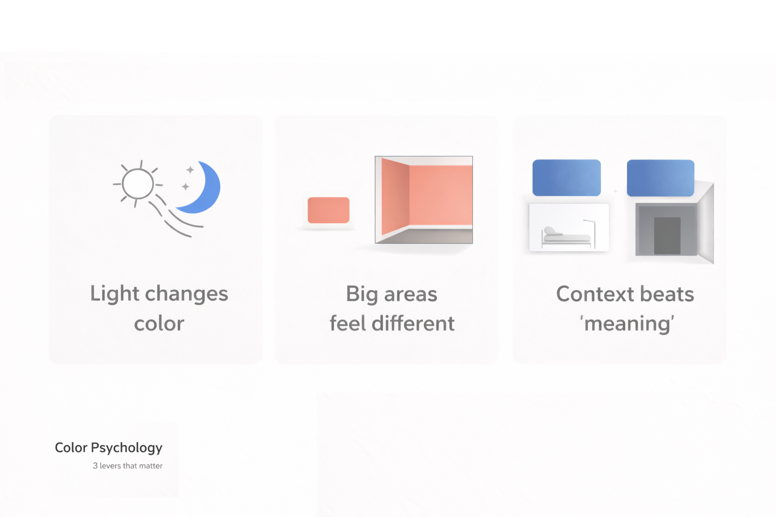
- Light changes everything (undertones + time of day).
- Area changes the impact (a swatch is polite; a full wall is loud).
- Context beats “meaning” (a calm blue in a clinic is not the same blue in a dark hallway).
1) Light first, always
If you take one rule: don’t “pick a color.” Pick a color in your lighting. Morning sun, afternoon shade, and warm LEDs will shift the same paint into different moods.
What to watch: undertone drift (white goes green, gray goes purple), and “night mode” (warm bulbs make cool paints look dirty; cool bulbs make warm paints look flat).
If you want the deeper explainer, use color psychology basics and come back here for the field checks.
2) The “bigger surface = bigger emotion” rule
Your brain reads big color fields as atmosphere. Same hue, totally different effect depending on how much of it you see.
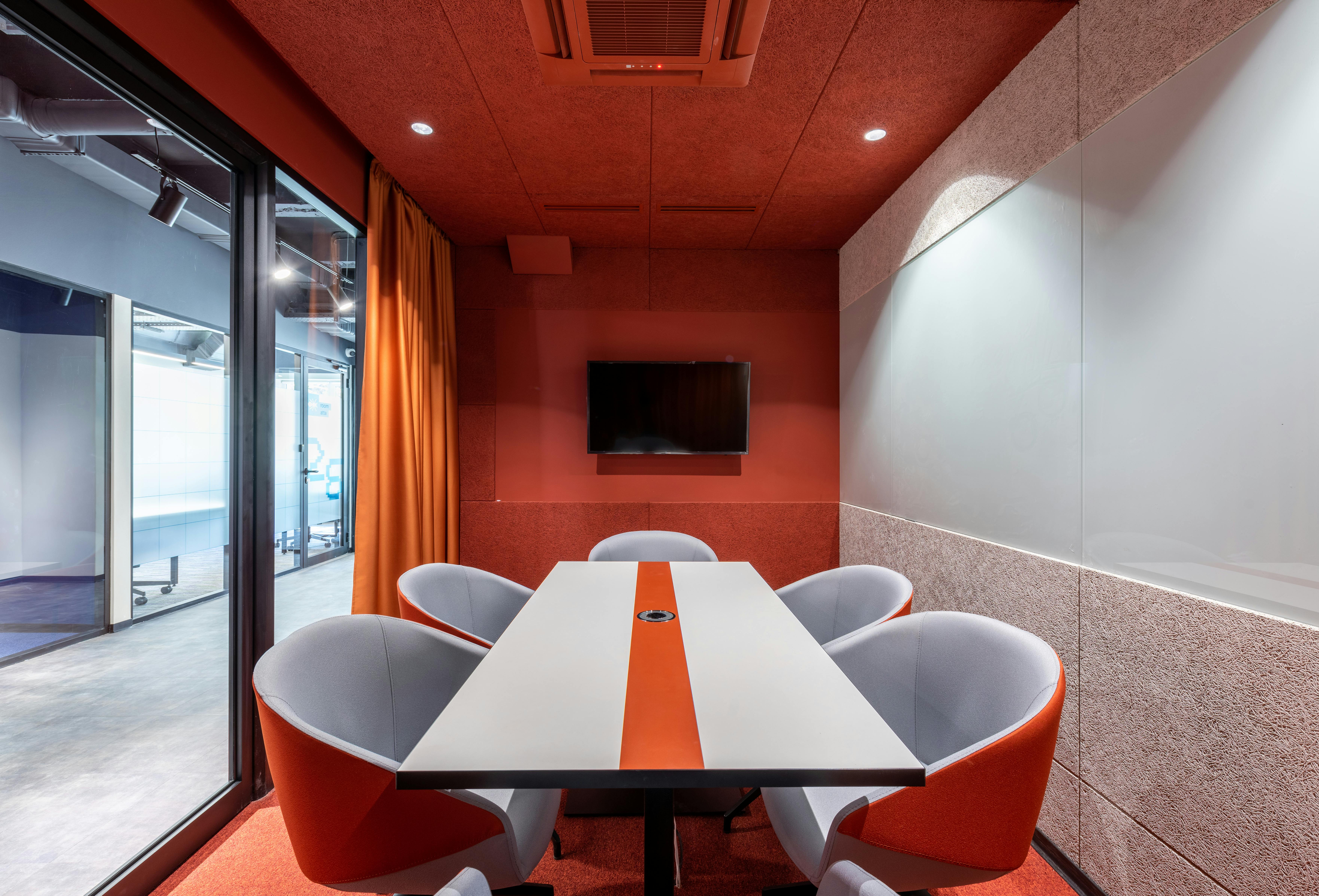
Image: A red room reads as urgency/activation fast. Great for energy, bad for calm work.
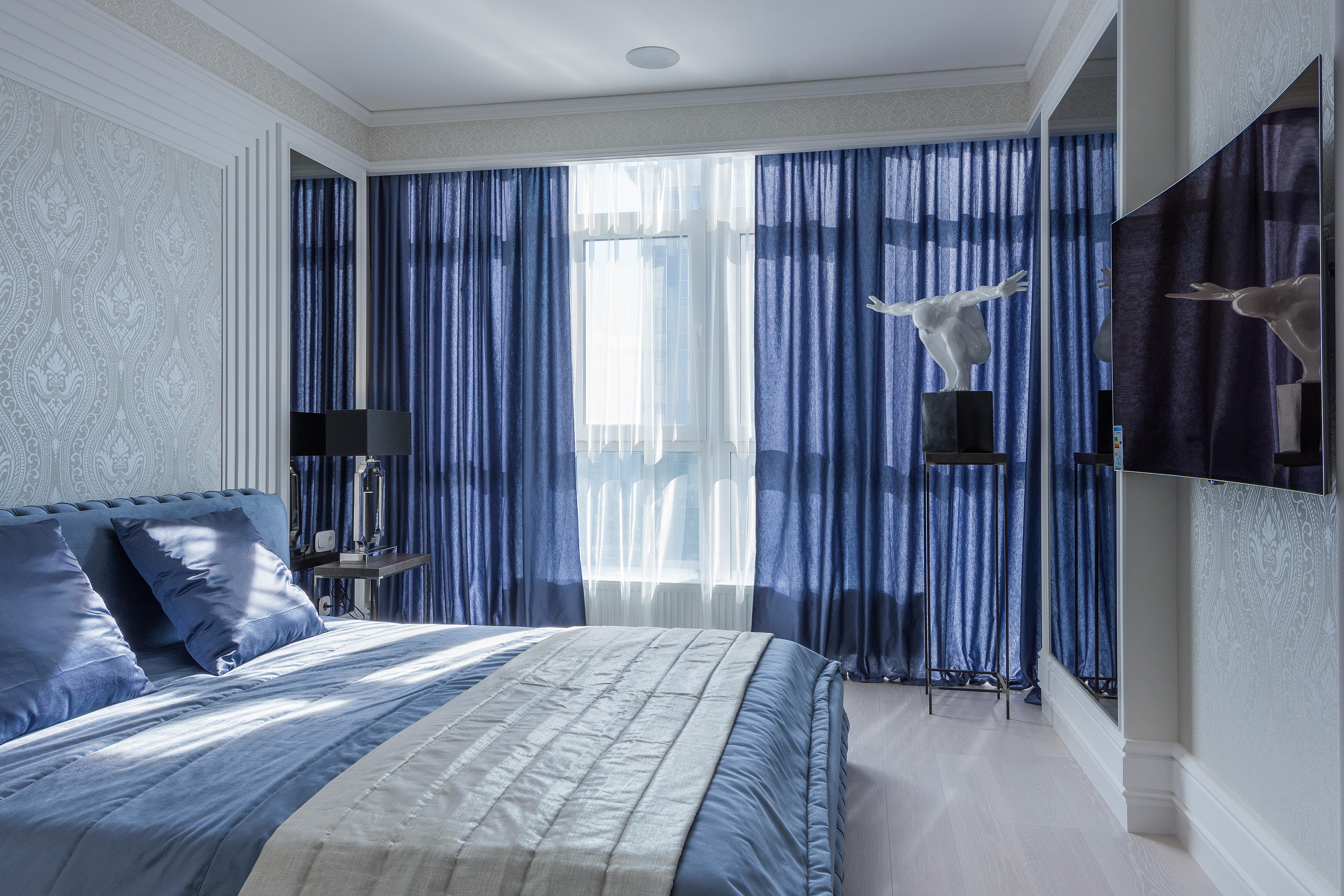
Image: Blue tones tend to read calmer and quieter, especially when they’re desaturated.
- High saturation = louder, faster, more “present.”
- Low saturation = calmer, slower, more background.
- Darker value = heavier, more enclosing. (Can feel rich or oppressive depending on light.)
3) Culture + use-case beats “what colors mean”
Color meaning is not universal. The same color can signal celebration in one context and mourning in another. So don’t design off a chart—design off the room’s job and the audience.
Fast, usable examples
- Bedrooms: calmer, lower-saturation tones usually win (sleep is fragile).
- Home offices: avoid high-saturation walls unless you like feeling “on” all day.
- Retail / calls-to-action: small high-contrast accents work better than painting the whole place loud.
What color psychology is (in one sentence)

Color psychology is the study of how perceived color shifts attention, emotion, and behavior—usually through context, contrast, and learned association (not magic).
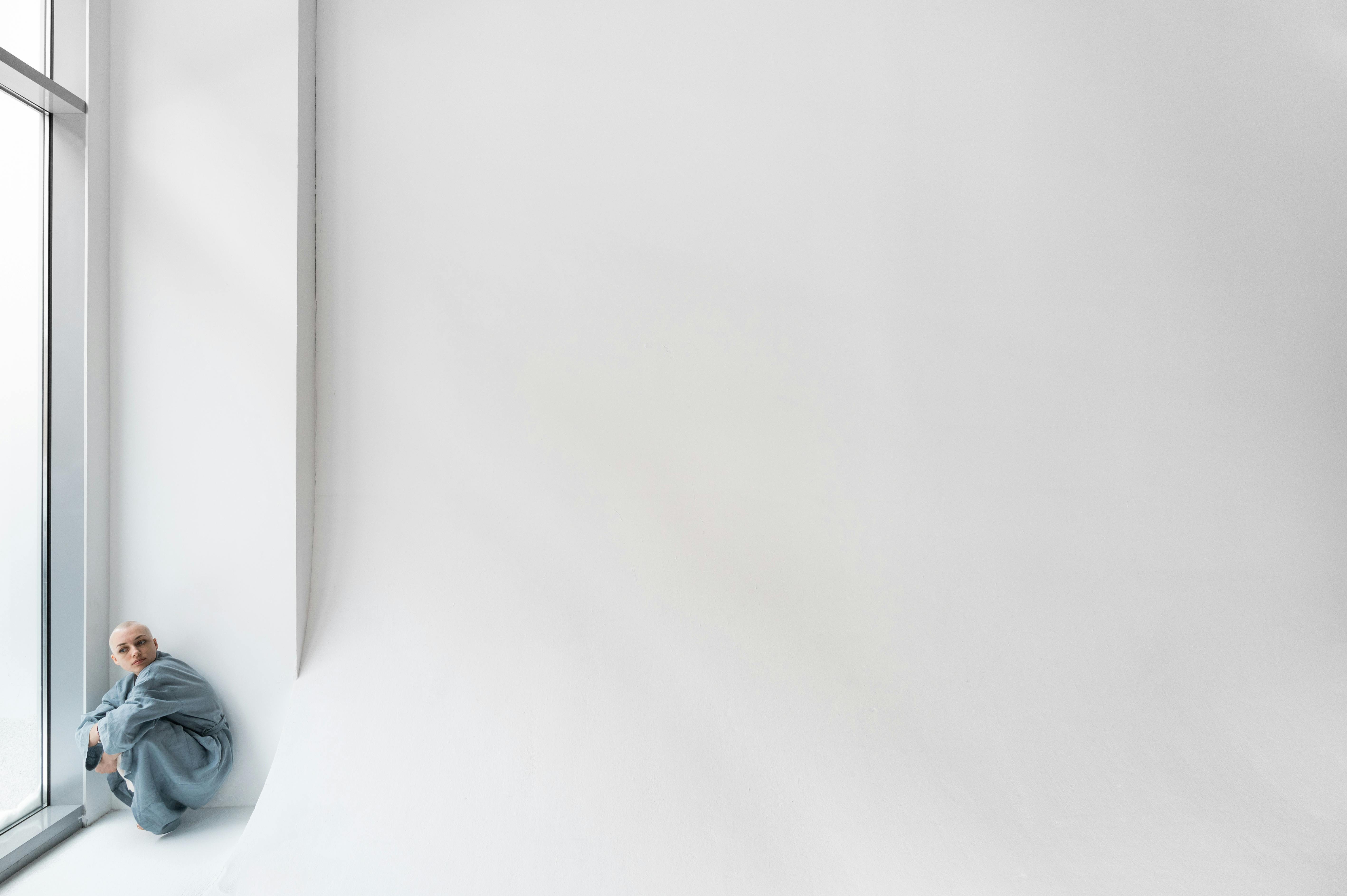
Image: White can read “clean” or “cold” depending on light, material, and how empty the space is.
Quick myths to stop repeating

- Myth: “This color always means X.” Reality: meaning shifts with culture + setting.
- Myth: “Neutrals are safe.” Reality: the wrong neutral undertone looks sickly fast.
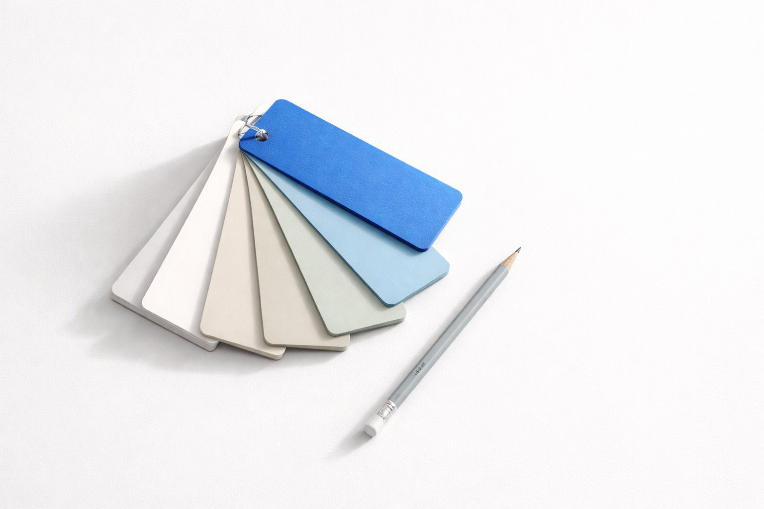
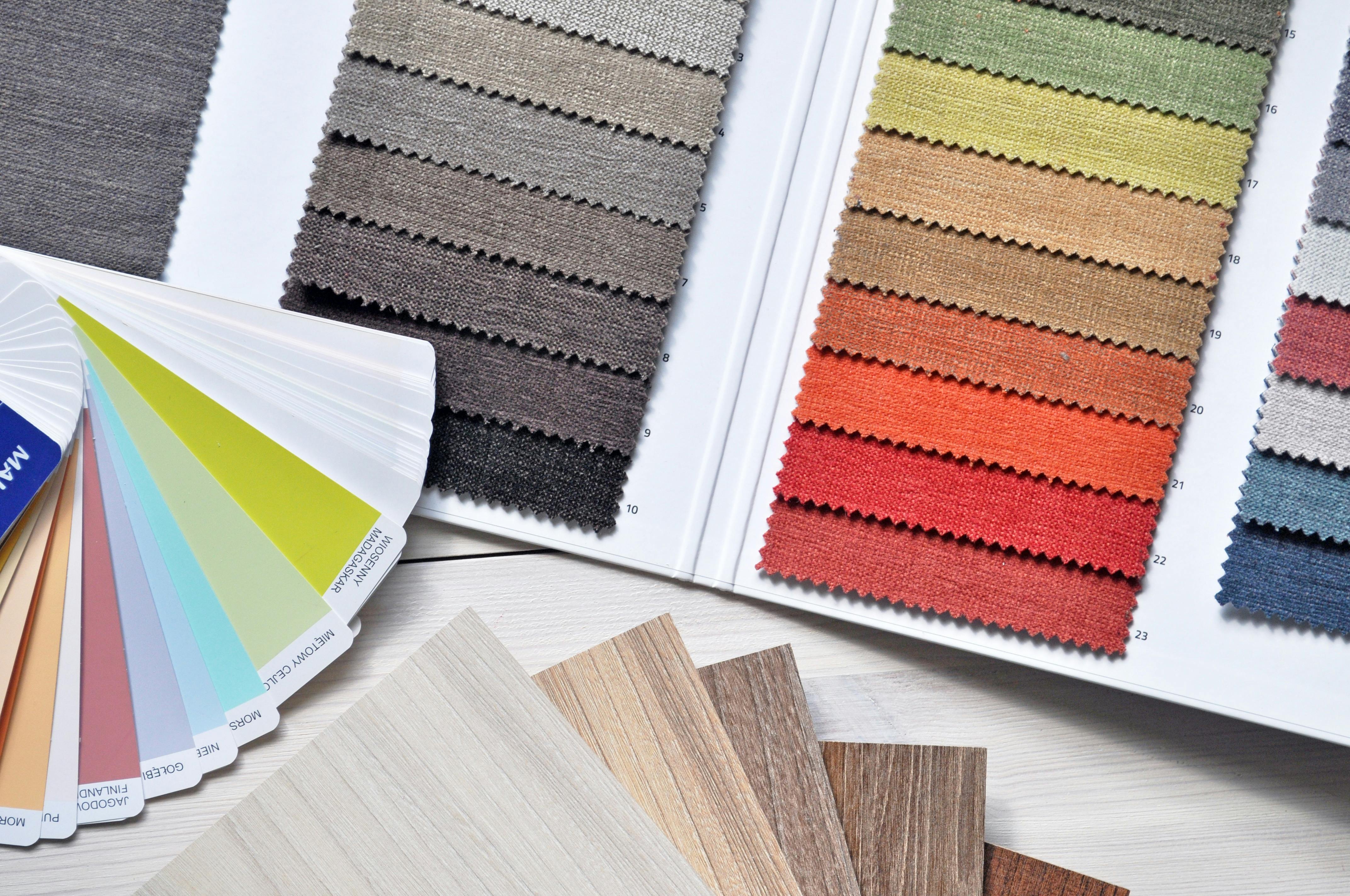
- Myth: “A swatch is enough.” Reality: area and adjacency change the read.
Where color shows up in real design work

You see the same patterns across interiors, branding, and screens: calm backgrounds, controlled accents, and enough contrast to keep people oriented.
- Interiors: mood + perceived cleanliness + perceived size.
- Branding: trust vs urgency cues (especially in small UI elements).
- Screens at night: blue-heavy light can keep people alert when they should be winding down.
Books worth owning
- Color Psychology and Color Therapy (Birren) — older, but still one of the few that talks like a practitioner.
- The Secret Lives of Color — cultural history, useful for context mistakes.
- Living with Color (Atwood) — practical home application without the cringe.
Keep learning
- American Psychological Association (APA) — research background for behavior + perception.
- CIE (International Commission on Illumination) — the lighting/vision side that actually drives “why this paint looks different.”
- CIDQ / NCIDQ — the credential body designers reference in practice.
FAQ
(the stuff people ask right after the paint sample “looks fine”)
Does color psychology actually work, or is it just marketing talk?
It “works” in a boring way: color changes perception and attention. But it’s not a mind-control button. Lighting, saturation, contrast, and context do most of the heavy lifting. If you ignore those, any “meaning” chart is useless.
Why does the same paint look different in the store vs my house?
Different light source + different surrounding colors. Store lighting is often high, cool, and even. Homes are mixed (daylight + warm LEDs + shadows). The wall also reflects off floors, cabinets, and furniture, which shifts undertones.
What’s the #1 beginner mistake with “neutral” paint?
Thinking neutral means safe. Most neutrals have an undertone (green, pink, violet, yellow). Under warm bulbs at night, the undertone often gets louder. That’s how you end up with “why is this white… green?”
How do I test undertones fast without buying ten gallons?
Do a large sample (at least poster size) and move it around the room. Check it in three conditions: morning daylight, late afternoon, and night with your actual bulbs on. If it turns weird in one of those, it will annoy you every week.
Is there a “best color” for calm or sleep?
Usually: low-saturation, mid-to-light value colors (soft blues, blue-grays, muted greens). The bigger factor is contrast and glare—high contrast and high saturation keep the room feeling “on.”
Is red really a bad idea for a whole room?
Not automatically, but it’s high-risk. Full-wall saturated red tends to feel active and loud. If you want the “red energy” without living inside it, use it as a smaller accent (one wall, a niche, a door, textiles).
Why do dark colors feel “cozy” in one room and “heavy” in another?
Light and window size. Dark paint needs enough daylight (and/or good layered lighting) to keep the room from collapsing visually. In low-light rooms, dark colors can feel like the ceiling dropped and the walls moved in.
What’s the safest way to use bold color without ruining a room?
Keep the background calm, then use bold color as a controlled signal: one focal surface, built-ins, art, or textiles. Big bold fields are where mistakes get expensive.
Is color psychology universal across cultures?
No. Some reactions are fairly consistent (high saturation reads as high energy), but “meaning” changes a lot by culture and context. If you’re designing for a specific audience, don’t assume your personal associations are shared.