
Color Harmony: How to Actually Make Colors Work Together
Most people think color harmony is just about matching pretty shades. It’s not. It’s about balance, contrast, tension—the stuff that makes a design feel right without knowing why.
If you've ever stood in a room and felt something was just off, chances are the colors weren’t working together. This isn’t just theory—it’s a practical tool. Used right, it changes everything.

IMAGE: A modern student studio using harmonious blue tones, soft greys, and bright yellow accents for a balanced and inviting space.
Below, I’ll break down the core harmony types, how the color wheel works in real life, and give you tips that actually help—from someone who's used this on real projects, not just a color chart.
TONAL UNITY
Mastering Color Harmony: The Basics That Actually Matter
What Is Color Harmony?
Color harmony is about making colors work together—so they feel balanced, intentional, and not like a mess. It’s not just what “looks good,” it’s what feels right. At its core, it’s about combining hues in a way that creates unity, flow, and mood.
In Art and Design
In art, harmony guides emotion and focus. In design, it shapes the whole vibe of a space. Get it right, and people won’t notice the colors—they’ll just feel something click.
Why the Color Wheel Still Matters
The color wheel isn’t just classroom stuff. It’s a real tool that helps you pick combinations that actually work—whether you’re going for calm, contrast, or energy. Once you learn how to use it properly, it’s hard to mess things up.
Types of Color Harmonies
Key Definitions and Applications
How Color Harmony Shapes Interiors and Artwork: A Practical Guide
- Analogous Color Harmony
- Definition: Colors that sit next to each other on the color wheel, like blue, teal, and green.
- Application: Ideal for creating serene, natural spaces like bedrooms or lounges. These colors flow well and feel cohesive, especially in areas where a tranquil atmosphere is desired.
- Example: A bathroom in soft greens, teals, and hints of blue can create a spa-like, calming environment.
- Complementary Color Harmony
- Definition: Colors opposite each other on the color wheel, like red and green or blue and orange.
- Application: This creates vibrant contrast, adding energy to spaces. Perfect for rooms like dining areas where lively conversation is encouraged.
- Example: A living room with a deep green sofa against red accent pillows and artwork.
- Triadic Color Harmony
- Definition: Three colors evenly spaced on the color wheel, like red, yellow, and blue.
- Application: Produces a balanced yet colorful look. Best used in rooms where a lively, energetic atmosphere is desired.
- Example: A kitchen with yellow cabinets, blue accessories, and red accent tiles.
- Tetradic Color Harmony (Double Complementary)
- Definition: Two complementary color pairs, like blue/orange and red/green.
- Application: Adds complexity and a richer palette. This scheme works well in larger rooms, as it offers plenty of visual variety without feeling chaotic.
- Example: A large living area with base tones of green and red, offset by smaller accents in blue and orange.
Color Harmony in Architecture and Interior Design
In real spaces, color harmony is about feeling.
The right colors make a space feel calm, bold, warm, or sharp without saying a word.
In Architecture
Architects use harmonious palettes to reinforce form and function. For example, a minimalist concrete home might pair soft neutrals with natural wood tones to balance cold with warmth. In contrast, public buildings often use high-contrast color schemes to guide flow and highlight zones—like a deep blue wall signaling quiet areas in libraries or schools.
In Interior Design
Harmony shows up in every choice—from wall color to upholstery. Pairing sage green with warm terracotta can make a room feel grounded and lived-in. Using monochromatic blues in a bathroom? That creates calm. Even using clashing tones—done intentionally—can spark energy in a creative studio.
Tip:
If it feels off, it usually is. Strip the room back and check your base hues. Often, fixing harmony means removing one “loud” color that’s fighting the rest.
Color Harmony in Architecture and Interior Design
Color harmony isn’t just theory—it’s how spaces feel right. When used well, it controls mood, flow, and function across a space. Here’s how it plays out where it matters:
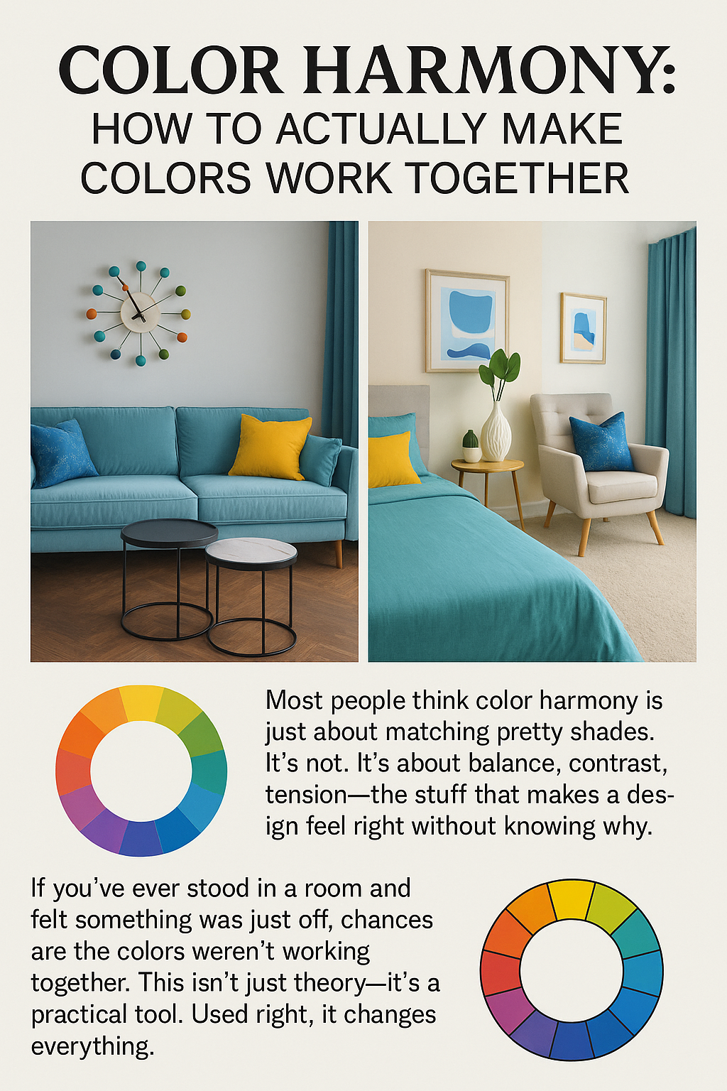
IMAGE: Design quote explaining that color harmony isn’t just about matching shades but about achieving balance, contrast, and subtle tension to make a space feel right.
How Color Harmony Shapes Spaces
Mood & Function:
Different harmonies set different tones. Complementary schemes (like blue and orange) bring energy. Analogous colors (like green, teal, and blue) create calm. Designers use this to match mood to function:
- Public Spaces: Schools and hospitals use soft, low-contrast palettes to ease stress.
- Homes: Warm tones in living areas promote connection; cooler hues in bedrooms support rest.
Perception & Flow:
Harmony changes how we feel scale:
- Open Plans: Triadic color schemes tie large spaces together without overwhelming them.
- Small Rooms: Monochromatic shades (light to medium blues) build visual depth, making rooms feel bigger.
Lighting Matters:
Natural and artificial lighting affect color harmony. A north-facing room needs warmth (e.g., terracotta). A sun-filled space balances better with cool tones. Lighting also helps define color zones:
- Accent Lighting: Highlight focal areas using light to enhance your palette.
- Natural Light: Choose hues that evolve well throughout the day—greens, creams, soft grays.
Material Interaction:
Hardwood warms a cold gray room. Glossy surfaces intensify color. Soft textures absorb light and calm things down. Color harmony isn’t just about paint—it’s how finishes and surfaces work with color.
Real-World Color Harmony Examples
- Living Room: Use analogous greens and blues with warm lighting to make the space calm yet energized.
- Home Office: Pair complementary blues and oranges—a blue wall, orange chair accents—for a sharp, focused vibe.
- Restaurant: Triadic harmony with burgundy, mustard, and teal feels bold and luxe. Add low warm lighting to tie it together.
Art & Design Uses of Color Harmony
- Photography: Nature shots often use green harmony with subtle yellow-blue tints for tranquility.
- Drawing/Illustration: Use complementary colors in shading (e.g., purple and yellow) to add depth.
- Green Harmony: Popular in eco-branding and biophilic design. Combine greens with yellow or blue for organic balance.
Color, Light & Temperature: Fine-Tuning the Mood
- Warm Colors (reds, ochres): Energizing and intimate. Use in kitchens or social spaces.
- Cool Colors (blues, sage): Relaxing and clean. Ideal for bedrooms, work zones, and bathrooms.
Mixing both balances calm and energy. Example: Blue walls with terracotta textiles.
Mastering color harmony means understanding how color, light, space, and material work together.
When it clicks, a space doesn’t just look right. It feels right.
Practical Tips for Using Color Harmony
A Step-by-Step Example
Let’s take a real-world example: designing a cozy yet vibrant living room space. The goal is to achieve a balanced feel that is inviting, warm, and visually interesting.
Step 1: Define the Mood and Purpose
In this case, the purpose is to create a welcoming atmosphere, suitable for relaxation and gatherings. For this effect, using a Complementary Color Harmony with warm tones (orange) balanced by cool hues (blue) can provide vibrancy without overwhelming the space.
Step 2: Choose a Color Scheme on the Color Wheel
Using the Color Wheel Harmony, select an Analogous Color Harmony (like warm shades of red, orange, and yellow) if you’re after a cozy and warm vibe, or opt for Triadic Color Harmony (three evenly spaced colors, like red, yellow, and blue) for an energetic but balanced look. Complementary Color Harmony (like orange and blue) brings in contrast that energizes without clashing.
Step 3: Apply Colors Strategically
- Main Wall Color: Use a soft, muted blue for a calming effect. Blues are great because they feel spacious and airy, and they naturally balance out warm accents. Blue tones also shift nicely with different types of lighting throughout the day, creating dynamic appeal.
- Accent Colors: Choose vibrant orange for cushions, rugs, or small decorative items. The orange accents add warmth and interest, contrasting with the calming blue.
- Secondary Colors: Add splashes of complementary colors like teal and mustard for added depth. These tones create a balanced visual field without disrupting the primary color theme.
Step 4: Experiment with Lighting
Lighting can enhance the mood created by the color scheme. Use warm-toned artificial lighting in the evenings to boost the cozy feel. Natural light helps highlight the blue tones during the day, making the room feel open and welcoming.
Step 5: Add Textures and Finishing Touches
Incorporate textures like plush fabrics, woven rugs, and smooth metallics to add depth to the color harmony. These textures soften the vibrant color contrasts and ensure that the room feels layered and inviting.
Color Harmony Theory in Home Improvement
Color harmony is an essential part of transforming spaces in home improvement, enhancing both aesthetics and comfort. It helps create balance, focus, and emotional impact in your home, turning ordinary spaces into environments that feel intentional and inviting. By applying Color Harmony Theory, homeowners can design spaces that truly reflect their personal style while also benefiting from a balanced, cohesive look.
Why Color Harmony Matters in Home Improvement
Applying color harmony in home improvement projects ensures a unified feel across different spaces, making each room feel connected yet distinct. When done right, it improves the functionality of each space by creating an environment suited to its purpose:
- Open Floor Plans
For open floor plans, Analogous Color Harmony works well, using colors next to each other on the Color Wheel Harmony (like blues and greens) to create a cohesive look while giving each area its distinct feel. A combination of soft greens in the kitchen, with calming blues in the adjacent living room, maintains flow without feeling overly uniform. - Enhancing Smaller Spaces
In compact rooms, applying Monochromatic Color Harmony can make the space feel larger. Using different shades of a single color, like soft to dark grays in a small bedroom, creates depth and maximizes light reflection, offering an airy, cohesive feel without crowding the space. - Highlighting Accents
Complementary Color Harmony (using colors opposite each other on the color wheel, like orange and blue) can bring life to accent pieces, such as furniture or decor. In a home office, a cool blue wall with a warm-toned orange chair creates visual interest, energy, and focus—ideal for a productive workspace.
Practical Tips for Using Color Harmony in Home Improvement
- Plan with Purpose
Determine the function of each room to select a color scheme that matches the mood. For example, calming colors are ideal for bedrooms, while vibrant tones work better in active spaces like kitchens. - Consider Color Temperature
The Science of Color Temperature is critical in home improvement. Warm colors (reds, oranges) create a cozy feel, suitable for social spaces like living rooms, while cool colors (blues, greens) are calming and perfect for areas like bathrooms and bedrooms. - Natural and Artificial Light
Light affects how color is perceived. North-facing rooms, which receive cooler light, benefit from warm tones to add comfort, while sunlit spaces can balance out deeper or cooler tones. Experimenting with lighting before finalizing colors helps achieve the desired effect. - Use Accent Lighting
Strategic lighting placement enhances color harmony by accentuating particular shades and creating focal points. For example, using warm lighting on a wall painted with a cool tone can soften the overall look and balance the temperature of the room. - Experiment with Tones and Textures
Incorporating different textures in a Monochromatic Color In Interior Design scheme adds depth without changing the overall color harmony. A beige-toned living room, for instance, can feel more dynamic with the addition of varied textures, like wooden accents, linen pillows, and metal fixtures.
Real-Life Example: Kitchen Renovation with Complementary Colors
A recent home improvement project involved renovating a kitchen by using Complementary Color Harmony. The client wanted an engaging, lively feel, so we chose a navy blue for the cabinets and paired it with warm copper fixtures. The navy provides a grounded, modern look, while the copper adds warmth and vibrancy, creating a balanced, inviting space perfect for both entertaining and daily family use.
This example highlights how complementary colors can elevate a space, using contrast for vibrancy without overwhelming. Copper lighting fixtures above the countertop further emphasize this harmony, creating an eye-catching focal point that ties the design together.
Key Takeaways
Color harmony is essential in home improvement, guiding every aspect of design to create spaces that feel cohesive and purposeful. By using different Types of Color Harmonies, including Analogous Color Harmony and Complementary Color Harmony, homeowners can achieve specific effects tailored to each room’s function. Whether enhancing natural light or creating mood with Accent Lighting, color harmony ensures each element of a home feels well-considered and connected.
Color Harmony and the Mind: What Designers Often Miss
Color harmony isn’t just about looking good. It’s about how color combinations shape the way we think, feel, and behave—especially in real-world spaces like homes, hospitals, and workplaces. Here's what most people overlook.
How Harmonious Colors Influence Decisions
In stores, offices, and classrooms, balanced color schemes can subtly guide how people think and act. Studies show that harmonious palettes build trust, comfort, and focus.
▪ In retail, using a split-complementary scheme—say, soft blues paired with warm oranges—can keep customers relaxed, making them more likely to linger and spend.
▪ In restaurants, the same combo creates just enough contrast to feel dynamic, but not chaotic—boosting appetite without overstimulation.
Color Harmony = Better Focus and Productivity
The right color pairings don’t just look nice—they change how your brain works.
▪ In workspaces, tetradic harmony (two complementary pairs) using calming greens and blues has been shown to reduce stress and boost cognitive performance.
▪ Some offices layer green harmony schemes (green + nearby tones on the wheel) in break areas to help employees decompress faster. They come back sharper and more focused—no extra coffee needed.
Designing Calm into Healthcare and Therapy
Hospitals and therapy rooms are ditching sterile white for softer, harmonious tones—and the science backs it up.
▪ Analogous palettes using blues, purples, and soft greens lower blood pressure and anxiety, according to healthcare design studies.
▪ Recovery rooms that blend harmonious cool tones feel less clinical, improving patient comfort and even healing outcomes.
FAQ
What is the main purpose of using color harmony in interior design?
- Color harmony brings balance, visual appeal, and psychological benefits to a space, making it not only beautiful but also comfortable and functional.
How does complementary color harmony work?
- Complementary Color Harmony pairs colors opposite each other on the color wheel, such as blue and orange. This combination creates a vibrant contrast that can energize spaces like living rooms or dining areas.
What types of color harmony are most popular in modern interior design?
- Some popular choices include Analogous Color Harmony for a serene look, Complementary Color Harmony for contrast, and Triadic Color Harmony for balanced vibrancy.
Can color harmony impact mental health?
- Yes, color harmony can positively influence mood and behavior. Harmonious colors reduce stress, create a welcoming atmosphere, and can even enhance productivity in certain environments.
Why are cool colors often used in healthcare design?
- Cool colors like blue and green, arranged in harmonious schemes, have calming effects, which can help reduce anxiety and create a soothing environment for patients.
Key Takeaways
Mastering Color Harmony Theory empowers designers and artists to craft visually appealing and meaningful compositions. Understanding how to select and combine Types of Color Harmonies—whether through Analogous Color Harmony or Tetradic Color Harmony—allows for creative expression that resonates with audiences, whether in digital design, painting, or interior décor.
Related
- Color Theory in Interior Design: Basics and Beyond
- Introduction to Architecture: A Beginner’s Guide to Building Design
- Form in Architecture: Free Courses and Practical Lessons for Aspiring Architects
- What is Form in Architecture? Principles, Examples, and Applications
- Form Meets Function: Principles for Great Architectural Design
- Understanding Additive Form in Architecture: Key Concepts and Examples
- Architectural Form Examples: How Shape Defines Function
- Building Forms in Architecture: From Traditional to Modern Design
- Clustered Form Architecture: Function, Space, and Design
- Architectural Shapes and Forms: How They Define Our Spaces
- Parti in Architecture: The Foundation of Great Design
- Scale and Proportion in Architectural Design: Balancing Form and Function
- Architectural Sketching for Beginners: From Tools to Techniques
- AI Design Software: Tools for Architects & Designers in 2025
Foundational Concepts of Color Harmony
- Color Harmony
- Color Harmony Theory
- Color Wheel Harmony
- Types of Color Harmonies
- Color Harmony Meaning in Art
- Harmonious Colors Definition in Art
- Color Harmony on the Color Wheel
Specific Types of Color Harmony
- Analogous Color Harmony
- Analogous Color Harmony Examples
- Complementary Color Harmony
- Double Complementary Harmony
- Tetradic Color Harmony
- Triadic Color Harmony
Color Harmony in Art and Design Applications
- Color Harmony Examples
- Color Harmony Examples in Drawing
- Green Color Harmony
- Color Harmony in the Color Wheel
- Color Harmony in Photography
- Complementary Color Harmony Examples
Resources
- Qatar National Library: qnl.qa
- ArchDaily on Color Theory in Architecture: archdaily.com