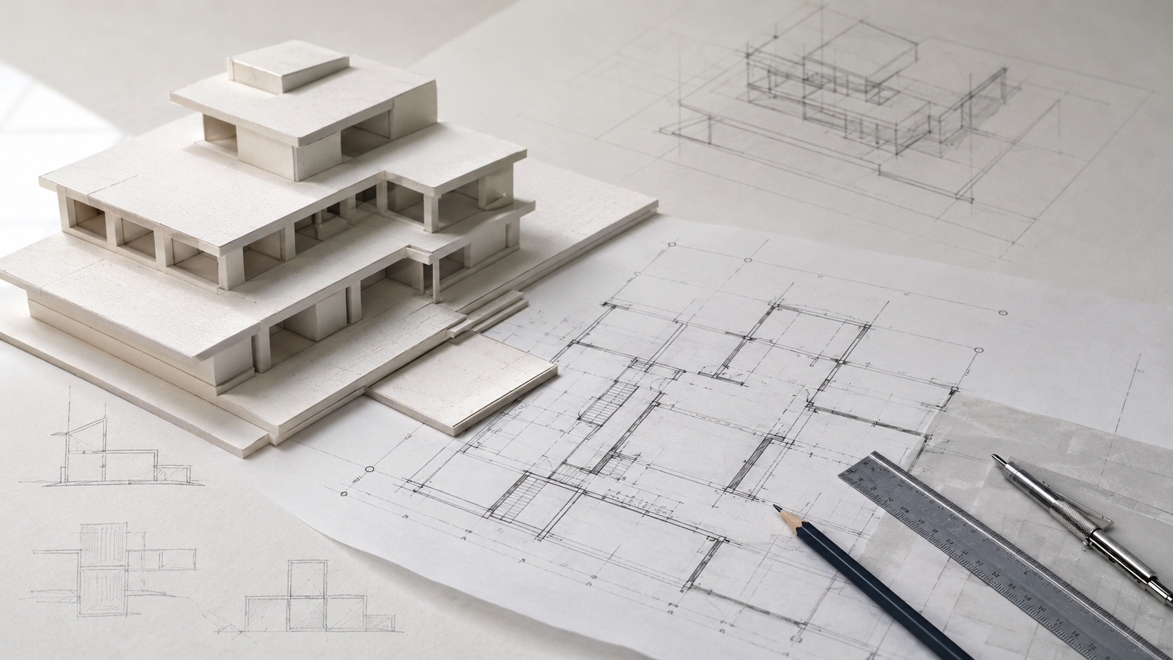
Image by ArchitectureCourses.org. Good diagrams do not fail because they look bad. They fail when they never meet span, thickness, circulation, daylight, drainage, or document reality.
Where Diagrams Fail at Review
A good-looking diagram can still fail the first real question.
Where is the load going? How do people leave? How thick is the wall? Where does water drain? What happens when the stair, ducts, ceiling, and structure all need the same space?
That is where weak student work usually breaks. The idea may be fine. The drawing just never dealt with gravity, code, daylight, site, structure, or documents.
A stronger diagram survives pressure. It shows the idea, then shows what the idea has to handle.
The Trap
Illustration by ArchitectureCourses.org. A strong diagram is only the start. It still has to survive structure, assemblies, movement, light, ground conditions, and the drawings that make the building real.
Reviewers usually ask different versions of the same thing:
- Where does it stand?
- Where does the wall go?
- How do I get out?
- Would anyone want to be here?
- What happens when it rains?
- Show me the set.
The problem is not that the jury is being unfair. The problem is that the drawing is making claims it does not prove.
One good stress-test move fixes a lot of fake confidence fast: take one hero diagram and force it to show one hard reality. A span. A wall buildup. A stair with a real landing. A daylight depth line. A site section with finished floor and drainage.
If the diagram gets weaker the second you do that, the concept was never carrying enough weight.
Grid First

Illustration by ArchitectureCourses.org. A building only becomes credible once the load path is clear. Roof, floor, wall, beam, column, footing. Something has to land somewhere.
Plans that never met a structural grid are easy to spot.
The warning signs are predictable:
- one big public room with no beam depth allowance
- random columns that destroy the plan after the fact
- long thin cantilevers that exist only in model view
- stairs and shafts drifting away from any real support logic
The fix is not glamorous.
- Drop a grid. Even rough.
- Pick a system. Bearing walls, frame, or hybrid.
- Mark the weak spans. The places you keep explaining are usually the crack.
- Give the building a spine. Core, wall line, bracing line, or something equivalent.
Structure should strengthen the concept, not arrive later to rescue it.
If you need the plain-language bridge between concept and buildable logic, start with How Buildings Work and then go straight to Building Materials.
Useful reference: Architecture: Form, Space, and Order is still one of the clearest books for seeing how structure, plan, and form stop being separate conversations.
Thickness Is Design
In drawings, walls are hairlines. In buildings, walls are consequences.
Thickness steals area, changes window logic, changes stair geometry, changes roof edge conditions, and exposes whether the plan was ever real.
- your nice corridor narrows
- the bathroom starts colliding with the wall build-up
- window returns, heads, and structure show up
- the roof edge becomes drainage, insulation, and termination detail
One brutal overlay tells the truth faster than ten polished plans:
- exterior wall buildup
- interior partitions that actually carry or contain something
- floor thickness with structure and services included
Most late project pain is thickness pain.
The Path Must Be Legal

Illustration by ArchitectureCourses.org. Circulation is not just a nice arrow diagram. The path has to be clear, usable, and legal once doors, stairs, corners, and exits become physical.
A lot of good-looking projects quietly fail here.
The circulation concept reads well. The building does not.
- Where is the primary exit from each space?
- Where is the second way out when it is required?
- Do the stairs land cleanly?
- Are the door swings fighting the path?
- Do the corridors pinch where movement matters most?
The fast stress test is simple: stop drawing egress as a soft diagram and force it into plan reality.
- real door swings
- real stair widths and landings
- real corridor widths at corners
- real exit discharge to the outside
Do not code-wash the plan with vague arrows.
Make the path physical.
Program Changes the Test
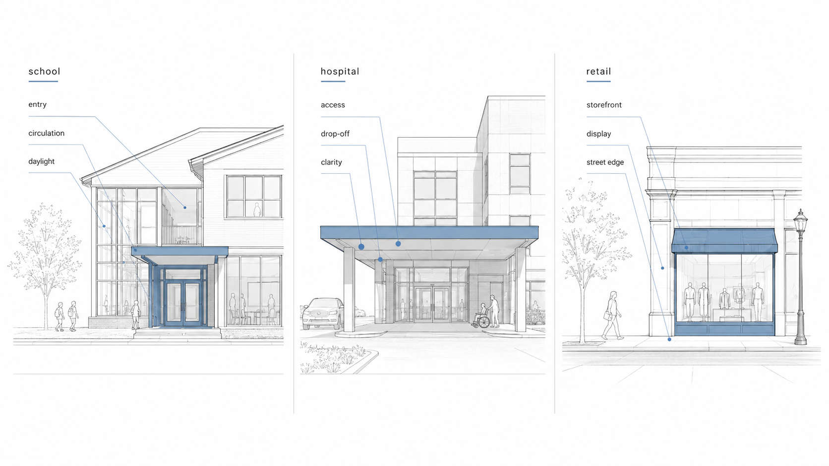
Illustration by ArchitectureCourses.org. Different building types break for different reasons. A school, a hospital, and a retail space do not need the same proof.
One reason reviews go sideways is that students talk about “architecture” in the abstract when the program is already telling them what matters.
| Building Type | What Reviewers Check Fast | What Usually Fails First |
|---|---|---|
| School | entry clarity, movement, supervision, daylight, repeated room logic | circulation and room depth |
| Hospital | access, drop-off, service movement, separation, life safety | circulation conflict and support spaces |
| Retail | storefront presence, entry, display edge, service back-of-house | street edge and layout friction |
Good diagrams are not generic. They prove the thing this building type will get judged on first.
Light Has Limits
Daylight is not a mood board term. It is geometry, glare, heat, furniture, and depth.
What usually goes wrong:
- rooms are too deep for the window logic
- glass area is large but unusable because of glare or overheating
- furniture reveals dead zones the render hid
- the “daylight strategy” exists only in the perspective view
The quick check is not hard:
- pick two key rooms
- draw the daylight depth from the opening inward
- drop real furniture footprints
- mark where glare destroys the use
Treat daylight as spatial logic, not decoration.
If your room layout is still fuzzy, tighten the plan first with Space Planning Essentials. If the problem is the light itself, go next to Natural Lighting in Architectural Design.
Ground Reality
Site is where the cool plan starts losing arguments.
- drainage sends water toward the building
- fire, service, or garbage access does not work
- frost and soil reality arrive too late
- grades turn the clean entry idea into ramp chaos
One honest site section beats a lot of talk.
- finished floor versus grade
- drainage direction
- foundation depth logic
- how people actually arrive and leave
When someone asks where the water goes, they are not killing the concept. They are checking whether the building survives weather.
Every Unresolved Diagram Becomes a Cost Problem
Weak early diagrams do not stay abstract. They come back later as expensive fixes.
| Unresolved Early | Looks Small in Studio | Gets Expensive Later |
|---|---|---|
| span logic | a clean open plan | deeper beams, extra columns, transfer structure, redesign |
| wall and floor thickness | a minor drafting issue | clearance problems, reworked rooms, ugly soffits, tighter net area |
| egress path | a circulation diagram problem | replanned stairs, doors, corridors, and discharge routes |
| daylight and glazing logic | a facade question | glare control, overheating fixes, privacy problems, layout compromise |
| drainage and site section | a civil issue for later | water damage, awkward grading, foundation revisions, access failure |
Good diagrams are often money diagrams in disguise.
Not because design should become cheap. Because weak early thinking usually gets paid for twice.
Documents Make It Real
At some point the project has to graduate from poster mode.
You do not need a full permit set in school. You do need enough document logic to prove the building is not fake.
The fastest way to do that is to add one piece of drawing reality that forces decisions:
- a door and window schedule
- a wall type callout
- a reflected ceiling fragment
- a basic legend that proves you control your symbols
If you do only one of those, do the schedule.
Schedules do not let you hide.
This is where Components of a Construction Document Set becomes more useful than another pretty board.
Performance Is Not a Bonus
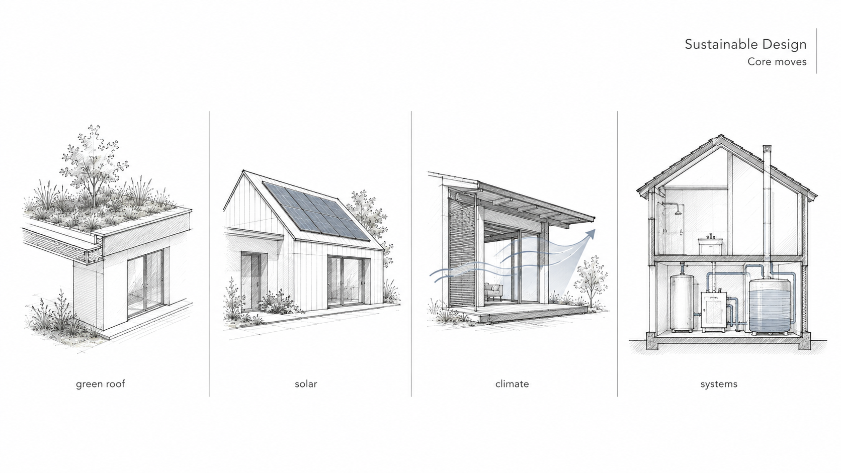
Illustration by ArchitectureCourses.org. Performance starts with basic decisions: orientation, envelope, water control, roof logic, and how the building deals with climate before equipment tries to rescue it.
Materials are not a palette. They are performance, sequencing, maintenance, and failure mode.
The questions that matter are boring in the best way:
- How does it shed water?
- How does it move with heat and cold?
- How does it get built?
- How does it get repaired later?
The sustainability version of this is not complicated either. Use the site well. Reduce loads first. Choose durable assemblies. Stop pretending hardware can fix a lazy envelope.
If you want the cleaner support page for that side of the topic, use Sustainability in Architecture Design.
Keep One Honest Reference Nearby

Image by ArchitectureCourses.org. Good reference books are not there to make the project academic. They are there to stop the drawing from becoming imaginary.
Code books, detailing books, and construction references are not there to make your project boring.
They are there to keep it from lying.
Use them early while the main moves are still flexible. Verify the stair. Verify the exit. Verify the wall. Verify the section. Then go back to the concept and make it sharper.
Also useful: Architectural Theory if the project is concept-heavy, and How Buildings Work if the project keeps collapsing when it meets physical reality.
Mini Checklist
- Span check: can the main spaces stand up without fantasy structure?
- Thickness check: do the wall, floor, and roof depths still fit the plan?
- Egress check: can people legally get out on the drawing, not just in the concept?
- Daylight check: do the important rooms get usable light without glare disaster?
- Site check: where does water go, and how do people arrive?
- Document check: is there at least one drawing or schedule proving the building is real?
FAQ
What is the fastest way to make a project feel buildable?
Add thickness, one honest section, and one schedule. That combination forces real decisions fast.
Do I need to know the whole code book in studio?
No. You need to understand where code constrains the big moves: exits, stairs, occupancy logic, widths, and discharge.
Why do reviewers attack structure so early?
Because structure exposes whether the plan is real. If the span logic collapses, everything else turns into styling.
What drawing exposes weak projects fastest?
A real section. It shows thickness, stair logic, ceiling conflict, structure, and daylight all at once.
How much documentation is enough in school?
Enough to prove the design can survive contact with reality. Not a permit set. Not just a poster either.