Design Elements and Principles | A Fresh Look at the Basics
Straight Basics
Design works through simple moves: balance, proportion, rhythm, texture, and color. They shape how a space feels. The problem is too many people keep these ideas locked in textbooks instead of putting them into real projects. A simple look at texture in architecture shows how much depth and emotion one element can add.
Where Teaching Misses
Architecture and design schools often reduce the basics to lists of terms. Students memorize them, but never see how they change a room or a plan. That’s why so much student work looks stiff and flat.
The Real Effect

Symmetry, proportion, and contrast are not theory. They change how the brain reacts. A symmetrical space feels stable. Contrast tells the eye where to look. Texture shifts mood. These aren’t decorations. They’re structure. If you doubt that, check how even the simplest design can feel powerful when the fundamentals are applied well.
What This Guide Covers

-
Using symmetry and asymmetry together
-
Making texture create depth and mood
-
Directing attention with contrast and rhythm
-
Applying proportion and balance from plans to details
Proof in Practice
Frank Lloyd Wright played with proportion instead of following it by the book. His buildings still feel balanced because he knew how far the rules could bend. That’s the level to aim for.
📘 MUST READ
The Language of Interior Design by Alexa Hampton
Direct lessons on proportion, color, and balance without textbook jargon.
Buy on Amazon
Bottom Line?
Design principles are the toolkit. Learn them. Apply them. Break them when it makes sense. That’s how your work moves from correct to compelling.
Why Design Principles Sneak Into Daily Life
Design rules are not locked in a textbook.
They show up in how a street corner feels safe or tense.
They decide if a kitchen layout makes cooking smooth or frustrating.
They explain why a chair invites you to sit or makes you keep walking.
Balance, rhythm, proportion, hierarchy.
These are not abstract terms.
They are the hidden logic behind why some places calm you and others drain you.
Once you start noticing them, you cannot unsee them.
See: Architectural Form Examples: How Shape Defines Function
The Basics of Design That Every Architect and Designer Uses
Design Elements and Principles That Actually Shape Good Work
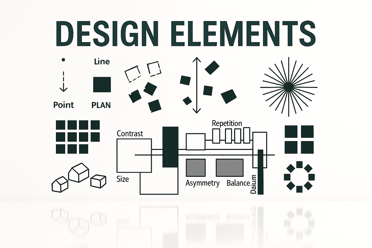
Beyond Definitions: What Are Design Elements and Principles?
Why These Basics Shape Everything
Design elements and principles decide how buildings, rooms, and visuals feel. They influence mood, function, and story. A building can calm or inspire. A logo can tell a story in a second.
The point is not memorizing words but using tools like texture, line, and color with principles like balance and rhythm to make design that works. Even something as simple as color psychology shows how choices directly shape emotion.
Stop Treating Design Like a Glossary

Most people are taught design like it’s a vocabulary test. Memorize symmetry. Define proportion. Move on. That’s useless without knowing how to use them. The real craft is taking these basics and applying them to real spaces, drawings, or objects. That’s why even the simplest design choices can make or break a project.
Who Needs This Guide
● Students who want to connect class theory to actual projects.
● Professionals who want sharper results and better execution.
● DIY designers making choices in their homes or projects.
● Design fans who want to know why something feels strong.
This isn’t locked to one group. If you’re learning, working, or just curious, this helps you see design with fresh eyes.
What You’ll Actually Get Out of This
● Clear tips on using line, color, and texture with purpose.
● Tried techniques for rhythm, contrast, and proportion.
● Fixes for common problems like lifeless layouts or clutter.
● Confidence in sketching, planning, and presenting.
By the end, you’ll stop thinking of design as theory. You’ll see it as a working set of tools you can use, adapt, and test.
Beyond Definitions: What Are Design Elements and Principles?

Design is not about memorizing terms. It’s about knowing the tools (elements) and the rules (principles) that make work stand up visually and functionally.
Elements of Design: The Building Blocks
These are your raw materials:
-
Line – Guides the eye and defines space.
Example: Vertical lines in Gothic cathedrals create height and awe. Horizontal lines in Wright’s Prairie houses feel grounded.
Pro tip: Use verticals for power, horizontals for calm. -
Shape and Form – Shapes are 2D, forms are 3D. They set structure.
Example: Gehry’s Guggenheim balances playful geometry in both dimensions. -
Color – Adds mood and emotion.
Pro tip: One bold accent in a muted palette is enough to draw focus. -
Texture – Creates depth and tactility.
Example: Tadao Ando’s smooth concrete paired with rough stone. -
Space – The balance between filled and empty areas.
Pro tip: Leave negative space. It gives breathing room. -
Value – Light and dark shifts that add depth.
Example: A monochrome palette works if values contrast strongly.
See: Understanding Additive Form in Architecture: Key Concepts and Examples
Principles of Design: The Rules of Arrangement
These tell you how to organize the elements:
-
Balance – Symmetry or asymmetry for stability.
-
Contrast – Differences that draw attention.
-
Rhythm – Repetition that guides the eye.
-
Proportion – Relationships that feel natural.
-
Unity – Makes parts feel like a whole.
-
Emphasis – Directs focus to what matters most.
see: Architecture Design Process Examples: 7 Phases with Case Examples
How They Work Together
Elements and principles only come alive when combined:
-
Texture (element) + contrast (principle) = depth in minimal spaces.
-
Line (element) + rhythm (principle) = flow and movement.
Fresh Insight: Breaking the Rules
Strong design isn’t always about playing safe. Unexpected pairings can elevate work:
-
Neon color against asymmetrical balance feels edgy and deliberate.
-
Rough raw concrete with elegant proportions feels bold and timeless.
Pro tip: Experiment. Some of the best designs come from pushing rules instead of obeying them.
From Theory to Results
Using elements and principles well turns projects from flat to memorable. They give you a toolkit to design homes, logos, or spaces that don’t just look good but stick with people.
Psychology in Design: What Actually Works
Design choices hit deeper than looks. Symmetry, color, and balance affect how people feel, move, and connect with spaces. Here’s how psychology shapes design you actually remember.
Symmetry vs Asymmetry
● Symmetry feels safe. The Taj Mahal façade or a Greek temple works because our brains read symmetry as health, stability, and order. Perfect for authority, tradition, or calm spaces.
● Asymmetry feels alive. Zaha Hadid’s fluid, off-balance forms suggest motion and energy. Great when you want dynamism or disruption.
Pro tip: Use symmetry where formality is expected. Use asymmetry to energize, but balance weight carefully so it doesn’t collapse visually.
Color and Emotion
Colors change mood and behavior in seconds.
● Blue/green calm. Hospitals, spas, and healing spaces lean on them.
● Red excites. Restaurants, brands like Coca-Cola, and marketing campaigns push energy and appetite.
● Cultural shifts. White is purity in the West but mourning in parts of Asia. Context matters.
Pro tip: Pick palettes for the people you’re designing for, not just your own taste. Check cultural meaning before going global.
See: Psychology of Architecture: How Design Shapes Our Emotions
Why This Psychology Works
Humans are wired to find safety in balance and stimulation in surprise. A great design doesn’t just look polished. It hits the brain on instinct: calm or exciting, stable or risky. That’s why psychology isn’t a bonus: it’s really the foundation.
See also: Color Psychology Basics: What Every Designer Should Know
Mastering Design Principles: Tips, Examples, and Fresh Perspectives
Fresh Takes on Core Design Elements
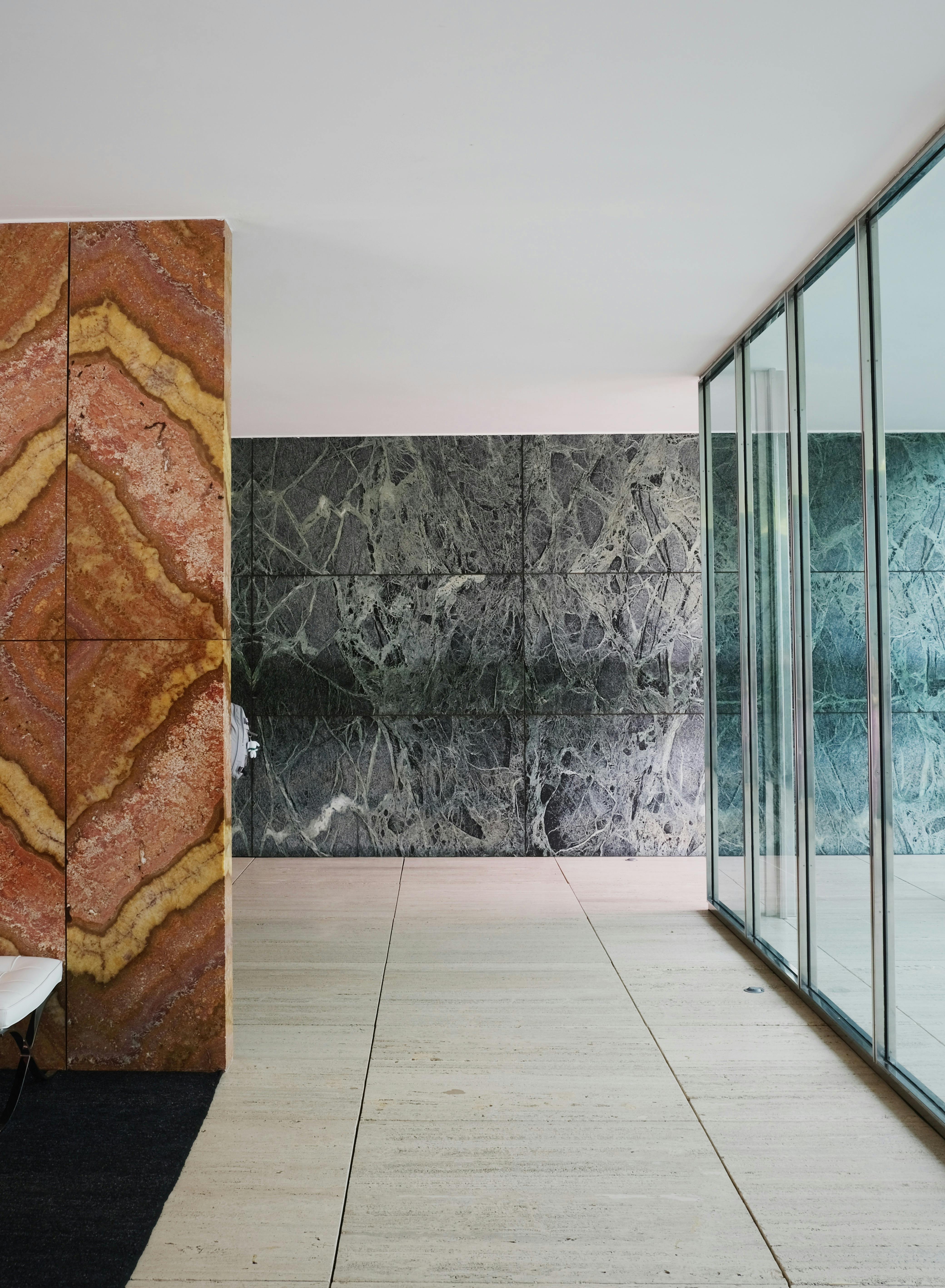
IMAGE: Barcelona Pavilion in Spain, designed by Ludwig Mies van der Rohe, illustrating key elements of design—clean linear forms, expansive horizontal lines, and open space—combined with principles like balance, rhythm, and contrast to create a harmonious, minimalist structure.
Design elements are not academic definitions. They’re the tools that decide whether a project feels flat or alive. Here’s how line, texture, and white space work when used with intent.
Line: The Emotional Language of Direction
Lines guide movement and set tone.
● Vertical lines = strength. The Eiffel Tower’s upward thrust is pure ambition. In a corporate lobby I designed, tall wooden slats framed the entrance, giving the space momentum and focus.
● Horizontal lines = calm. Frank Lloyd Wright’s Prairie houses stretch outward to ground themselves in the landscape. In a home project, I used long horizontal windows to blur indoors and outdoors.
Pro tip: Mix vertical and horizontal for balance. Use drama where you want energy. Use horizontals where calm is needed.
Texture: More Than Meets the Eye
Texture adds dimension you can feel.
● Tactile: Ando’s Casa Wabi pairs smooth concrete with raw wood. In a café project, I mixed rough brick walls with polished steel counters to strike cozy and industrial at once.
● Visual: Even fake texture works. A wallpaper that mimics aged plaster adds character without structural changes.
Pro tip: Let natural light do the work. I lit a rough-textured gallery wall from below so shadows shifted during the day, making the surface feel alive.
More on this here: Texture: More Than Meets the Eye.
White Space: A Canvas for Focus
White space isn’t empty. It’s clarity.
● Why it works: Apple’s branding shows how space around an object makes it iconic.
● Applied: I used white space in skincare packaging design. Clean labels, no clutter. The result was simplicity that sold.
Pro tip: Don’t overdo it. Too little white space looks messy. Too much looks barren. Find the balance that directs the eye.
The Real Difference
Lines set direction. Texture gives feel. White space gives clarity. Use them carelessly, and designs look busy or empty. Use them with purpose, and projects resonate in ways people can’t explain but instantly feel.
📘 MUST READ:
Designing with Society: A Capabilities Approach to Architecture, Technology and Ethics — clear thinking for architects who want to build ethically in a tech-saturated world.
Creating Holistic, Cohesive Designs
Applying Design Principles as a System
Design principles don’t work in silos. They overlap, amplify each other, and create depth when layered together. Balance ties into proportion. Contrast builds emphasis. Rhythm needs unity to work. The strongest projects treat these not as checklists but as interconnected moves.
Balance and Proportion: Building the Base
How they connect: Balance sets stability. Proportion fine-tunes relationships between elements.
Example: The Parthenon combines perfect column symmetry with Golden Ratio proportions. The result is harmony that feels inevitable. It shows how texture and proportion build more than surfaces—they create systems.
Takeaway: Start here. Stabilize with balance, refine with proportion.
Contrast and Emphasis: Where Eyes Go
How they connect: Contrast makes things pop. Emphasis decides what should hold the gaze.
Example: Brutalist towers often pair raw concrete with sheets of glass. The texture clash creates contrast. Cantilever slabs then pull the eye with emphasis. This is contrast as structure, not decoration, proving why the simplest design choices can carry the most weight.
Takeaway: Don’t use contrast everywhere. Anchor it with a focal point.
Rhythm and Unity: Keeping Flow Intact
How they connect: Rhythm repeats forms to create movement. Unity makes sure those repetitions feel like one language.
Example: Barcelona’s tree-lined streets march in rhythm, yet the consistent spacing and material palette create unity across districts.
Takeaway: Use rhythm to carry the viewer forward. Use unity to keep it cohesive.
see: Conceptual Architecture Examples That Still Hold Up
Proportion and Movement: Making Spaces Work
How they connect: Proportion keeps elements comfortable to the body. Movement guides interaction.
Example: Apple Stores space products proportionally, then arrange pathways to flow naturally from one display to the next.
Takeaway: Proportion makes spaces feel right. Movement makes them intuitive.
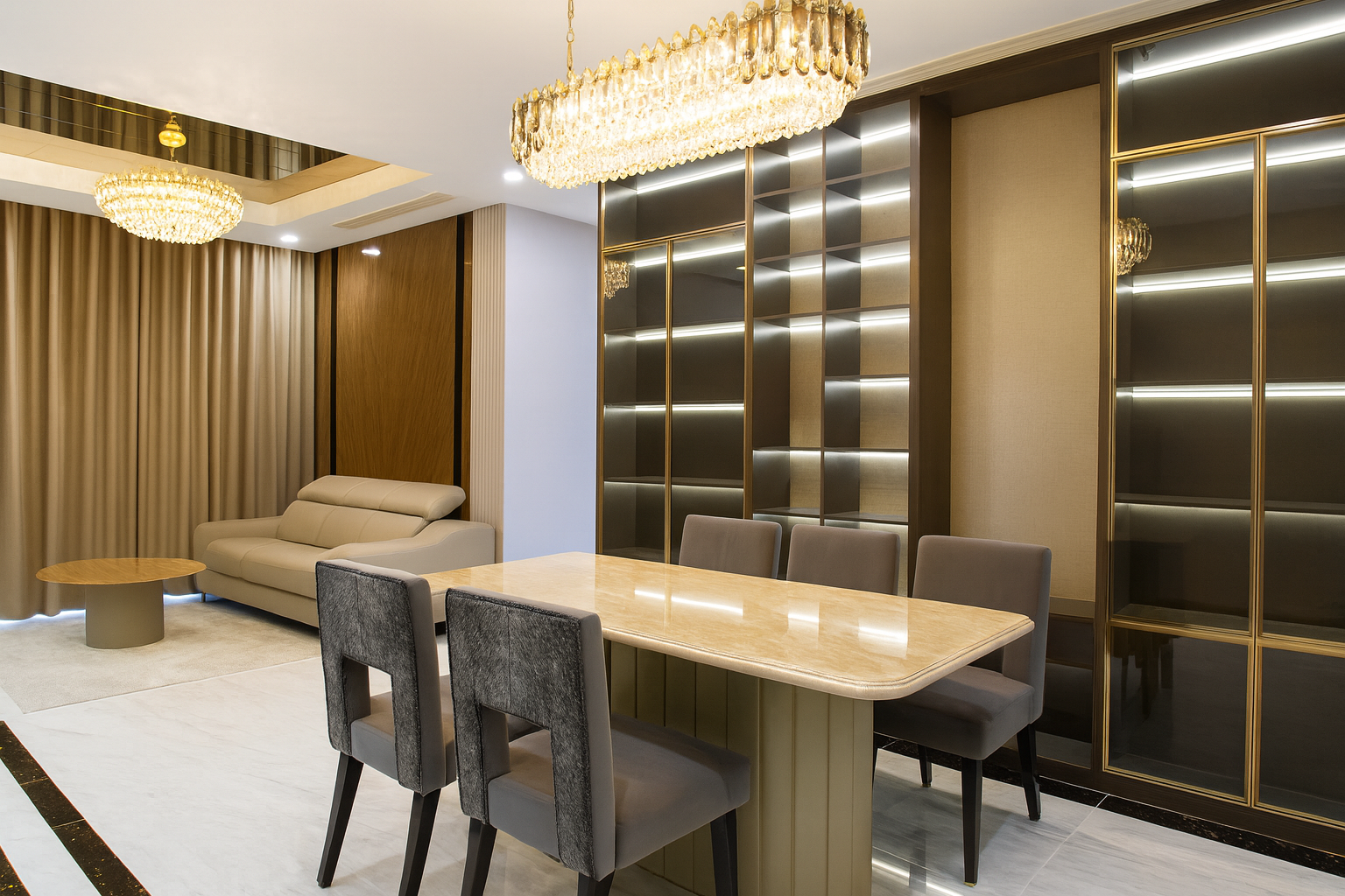
Case Study: Interior Design:
Open Space: Breathing Room
Open layouts create flow and flexibility. They let natural light spread and keep sightlines unbroken.
Example: A living room without dividing walls feels larger, calmer, and more social. The eye can travel across the space without interruption.
Image Caption Before: Furniture blocks light and bunches the space.
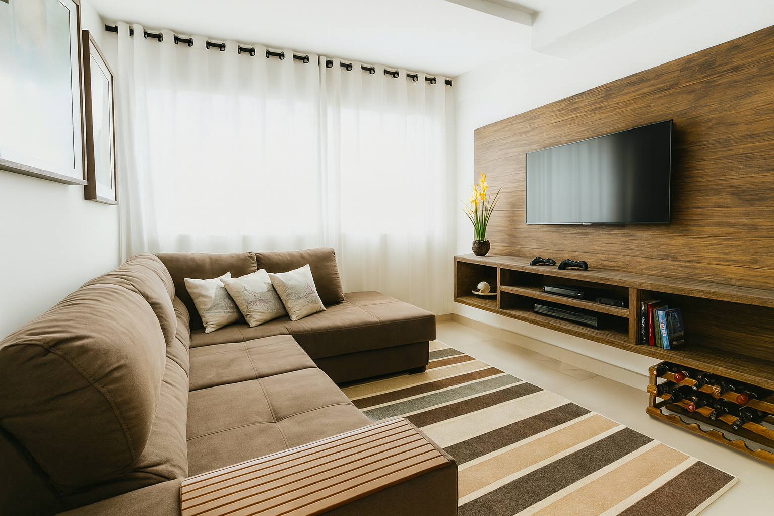
IMAGE: A small living room showing a poor design with cluttered furniture, minimal open space, and a cramped layout. (Before redesign)
Image Caption After: Open space layout with minimal barriers. Natural light connects the room into one whole.
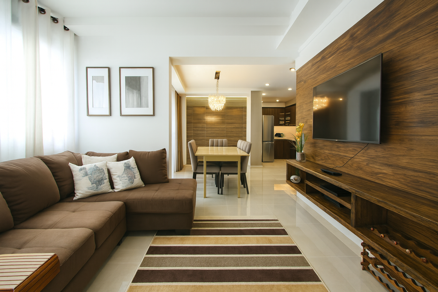
IMAGE: The same living room redesigned with an open layout, improving flow and space, creating a psychologically comfortable and cozy environment. (After redesign)
See: Applying Design Principles in Architecture and Interiors
Case Study Exterior: Sydney Opera House
● Balance: Its sails balance asymmetrically.
● Proportion: Each sail scales precisely to complement the others.
● Rhythm/Unity: Repetition of the shells builds rhythm, while a consistent white-tiled skin ties them together.
Result: A structure both iconic and cohesive. Proof that layering principles creates depth no single principle can reach alone.
Practical Layering Tips
● Start with stability. Fix balance or proportion first.
● Add energy. Use contrast and emphasis next.
● Guide flow. Introduce rhythm and movement.
● Seal with unity. Align palettes, materials, or grids to tie it all together.
Holistic Design: Intent Over Checklist
When principles are stacked with intent, they stop being rules and start being tools. A design doesn’t just function. It resonates. The difference between decent and unforgettable often lies in how these principles intersect.
MUST READ
📘 The Elements of Graphic Design by Alex W. White
Clear breakdowns of how balance, rhythm, and proportion overlap in real projects. Great case studies across print, architecture, and product design.
→ Buy on Amazon
Making Design Principles Work: Real-Life Insights and Applications

Design principles are where theory meets real impact. They turn abstract ideas into spaces and visuals that guide, inspire, and hold attention. Here’s how balance, proportion, contrast, and rhythm actually work in practice with real projects and field-tested insight.
Balance: The Art of Stability
Balance keeps a design grounded, either through symmetry or deliberate asymmetry.
● Static Balance: Symmetry creates harmony and order.
Example: The Parthenon’s symmetrical façade radiates timeless stability.
● Dynamic Balance: Asymmetry introduces energy.
Example: The Sydney Opera House uses asymmetry to suggest motion and intrigue.
My Take: For a boutique hotel, I designed a lobby with asymmetrical seating anchored by balanced lighting. The space felt alive but not chaotic, setting a modern, welcoming tone.
Tip: Use dynamic balance in hospitality or retail to keep spaces visually engaging. More on why texture matters to balance: Texture in Architecture.
Proportion and Scale: Designing for Humans
Proportion and scale are about relationships—between elements and to the human body.
● Beyond the Golden Ratio: Math helps, but comfort matters more.
Example: Apple Stores keep display heights human-centered, paired with airy layouts that encourage exploration.
My Take: In a museum project, I adjusted seating proportions so visitors weren’t dwarfed by sculptures. Comfortable scale encouraged longer stays and deeper engagement.
Tip: Always design from the user’s perspective. Learn more about applying scale in real contexts: Human-Centered Design and Architecture.
Contrast: Adding Drama with Intention
Contrast directs focus and adds drama.
● Material Contrast: Pairing opposites creates tension and depth.
Example: Brutalist structures contrast rough concrete with smooth glass for striking effect.
My Take: In an urban café, I contrasted dark reclaimed wood with polished copper fixtures. The tension between warmth and industrial feel resonated with the client’s audience.
Tip: Limit your contrasts. Too many create noise instead of clarity. Sometimes the simplest design choice delivers the strongest impact.
Rhythm and Repetition: Guiding the Eye
Rhythm and repetition establish flow and guide navigation.
● Urban Patterns: Repeated trees or light posts create rhythm and order.
Example: The Champs-Élysées in Paris uses rhythmic rows of trees and lights to frame its grand axis.
My Take: In a landscape design, I laid a sequence of stone pavers with alternating flower beds. The rhythm naturally guided people while keeping the aesthetic relaxed and coherent.
Tip: Vary elements slightly within rhythm to prevent monotony. Think of it as a beat that carries but doesn’t bore.
Bringing It Together
When applied together, these principles go beyond problem-solving.
They elevate experiences.
Balance stabilizes. Proportion connects to the human scale. Contrast excites. Rhythm guides.
Layer design principles with intent. That’s what separates average work from design people remember.
MUST READ
The Future of Architecture in 100 Buildings by Marc Kushner — shows what’s coming next, and what architecture still needs from humans.
Breaking the Rules: When Principles Don’t Apply
Design rules give structure—but the best work sometimes ignores them. The trick is knowing when.
Frank Gehry’s Guggenheim Museum in Bilbao is a perfect example: flowing titanium forms defy symmetry and proportion, yet create one of the most iconic museums in the world. The lesson? Break rules only when it adds meaning.
Tips for Controlled Chaos
-
Purpose first: Know which principle you’re bending and why.
-
Balance in chaos: Even radical forms should still feel usable.
-
Test before committing: Sketch, model, and experiment before scaling up.
👉 Rule-breaking isn’t rebellion. It’s mastery. Understand the rules deeply, then bend them to amplify creativity.
Learning from the Masters: Real-World Case Studies
Frank Lloyd Wright’s Robie House
Horizontal lines echo the Midwestern landscape, grounding the home in calm stability. Wright’s Prairie-style shows how proportion and line reinforce harmony with nature.
I.M. Pei’s Louvre Pyramid
Glass minimalism meets classical symmetry. Pei used precise proportion and rhythm so the modern pyramid complements centuries-old façades instead of clashing.
Zaha Hadid’s Heydar Aliyev Center
Flowing curves reject rigid order, creating a sense of movement and discovery. Proof that asymmetry and fluidity can still feel coherent when handled with intent.
The takeaway: Design isn’t about copying formulas. It’s about knowing when to stick with balance, when to merge eras, and when to rewrite the rules.
For deeper dives on materials and surface treatments, check out Texture in Architecture.
Beyond Aesthetics: Designing for People
Great design blends form, function, and user experience.
-
Human scale matters. Apple Stores prove proportion only works if it feels intuitive for people. Learn more in Human-Centered Design and Architecture.
-
Accessibility is design. From tactile paving in cities to clear visual hierarchy in websites, inclusive design makes environments usable for everyone.
-
Context counts. A sleek tower may look out of place in a historic square. The best projects respect culture and environment.
Design isn’t just visuals—it’s about creating spaces and tools that work for people, across abilities and contexts. Sometimes the simplest design choice is the smartest.
Fresh Directions: Touch, Tech, and Sustainability
-
Tactile Design: Surfaces matter. Rough wood warms, marble signals luxury. Tadao Ando’s use of raw concrete proves minimalism can still feel rich.
-
Tools: SketchUp, AutoCAD, and Photoshop let designers test lighting, proportions, and materials before they’re built.
-
Sustainability: Milan’s Bosco Verticale integrates greenery into towers, proving proportion and harmony can align with eco-conscious goals.
Tomorrow’s design will be adaptive, sensory, and sustainable. Start small—experiment with material mixes, daylight strategies, or interactive layouts.
MUST READ
📘 The Elements of Graphic Design by Alex W. White
Breaks down how balance, rhythm, and proportion overlap across projects—from print to architecture. Clear, practical lessons for every designer.
→ Buy on Amazon
Training Your Eye at Home
Exercises
How to Train Your Design Eye
Design is only learned by doing. These drills sharpen the basics so you can spot patterns and use them in your own work. No special setup—just time, a notebook, and curiosity.
1. Critique a Real Building
What to Do
Pick a building or product you admire: the Sydney Opera House, a Frank Lloyd Wright house, an Apple Store, or a mosque courtyard. Pull up photos, videos, or walk around it in person if you can.
How to Do It
● Write down what grabs your eye first—shape, material, or light.
● Look for balance: is it symmetrical, or does it rely on asymmetry?
● Find the focal point. How is emphasis created?
● Scan textures—are they rough, smooth, cold, or warm?
● Check how form follows use. Does it fit how people move and gather?
Why It Works
This trains you to look past “beautiful” and see how design choices actually function.
Pro Tip
Visit a local building. Watch how light changes the design throughout the day—it’s a different project at noon than at dusk.
2. Sketch and Balance
What to Do
Draw an asymmetrical design: a room layout, a garden plan, or even a poster.
How to Do It
● Place one big element first—a couch, a bold graphic, or a tree.
● Add smaller pieces to counterbalance it.
● Use size, color, or texture to keep the eye moving.
● Step back. Does it feel lopsided or balanced? Adjust until it clicks.
Why It Works
Asymmetry makes spaces more dynamic, but it’s harder to pull off. This drill forces you to test how balance works without mirror symmetry.
Pro Tip
Sketch over grid paper or use digital guides. Grids help you see proportion while experimenting.
3. Texture Hunt
What to Do
Build a small composition with three textures: stone, fabric, glass, metal, or wood. A shelf arrangement works perfectly.
How to Do It
● Gather contrasting pieces—smooth glass, rough stone, soft cloth.
● Layer them into a vignette or mood board.
● Play with light. Notice how surfaces shift under daylight vs lamp light.
● Adjust the order. Which texture feels best as a base? Which works as an accent?
Why It Works
Texture is what keeps spaces from looking flat. Practicing with real objects sharpens your ability to add depth to drawings, interiors, or products.
Pro Tip
Take photos from different angles. It shows you how textures read in 2D—vital for presentations and portfolios.
4. Build a Color Story
What to Do
Create a palette for a project—a logo, a room, or a website.
How to Do It
● Pick a mood: calm, bold, nostalgic.
● Choose three to five colors using swatches or a tool like Adobe Color.
● Apply them to a sketch, poster, or simple room plan.
● Test under different lights—natural vs fluorescent.
Why It Works
Color shapes mood faster than form or texture. Practicing palettes teaches you how subtle shifts change the message.
Pro Tip
Save your palettes. Over time, you’ll build a personal library you can pull from instead of starting from scratch every project.
MUST READ: Natural Lighting in Architectural Design: The Secret to Better Living → Read here
📘 FIELD PICK
Architecture: Form, Space, and Order by Francis D.K. Ching
Still the best primer. Clear diagrams, sharp examples, and a direct link between theory and practice.
The Moment Design Hits You
Every designer remembers one scene that changed how they looked at space. Maybe it was the way sunlight cut across a concrete wall at 4 pm. Maybe it was walking into a cathedral and realizing sound carried further than sight. Or standing in a plaza where nothing was symmetrical, yet everything felt right.
That’s the real power of elements and principles—they’re not abstract terms. They’re the silent rules shaping how people move, pause, and feel in a space. A single shift in proportion can make a hallway oppressive or uplifting. A color choice can calm thousands of commuters in a subway, or agitate them without anyone knowing why.
The exercises train your eye. But the wow happens when you see design working without words. Once that switch flips, you stop moving through places passively. You start noticing: balance in a street corner, rhythm in a façade, unity in a product you hold every day.
That’s the moment design stops being theory. It becomes a lens you can’t take off.
Final Word
Why Design Rules Aren’t Enough
Most people think design is a set of rules. Balance here. Contrast there.
But rules alone don’t make good work. What matters is how those rules collide with context.
A plaza isn’t a kitchen. A kitchen isn’t a phone app. The same principle bends differently depending on scale, light, and purpose. That’s the part most guides skip.
Design is a system you bend, stress, and test until it works for the exact problem in front of you. Once you see that, the principles stop looking like vocabulary words and start acting like tools.
FAQs
Design Elements and Principles
General Basics
1. What are design elements?
They’re the building blocks: line, shape, color, texture, form, value, and space.
2. What are design principles?
They’re the rules for arranging elements: balance, contrast, rhythm, emphasis, proportion, unity, and movement.
3. Why do designers need both?
Elements are the materials. Principles are how you arrange them. Together, they make design work.
4. Is it better to follow rules or break them?
Learn the rules first. Break them only when you understand why.
5. How do design elements apply beyond architecture?
They apply everywhere: posters, websites, furniture, products, even city planning.
Line and Shape
6. How does line affect mood?
Horizontal lines calm, vertical lines feel strong, diagonal lines create motion.
7. What’s the difference between geometric and organic shapes?
Geometric shapes are precise and predictable. Organic shapes are irregular and natural.
8. Why do circles feel different from squares?
Circles feel continuous and soft. Squares feel stable and structured.
9. Can lines guide movement in a building?
Yes. Floor patterns, railings, or ceiling beams can direct how people walk and look.
10. What’s the danger of overusing symmetry?
It can feel stiff and predictable. Asymmetry often creates more interest.
Color
11. How does color impact mood?
Blue calms. Red energizes. Green restores. Yellow lifts.
12. What’s color harmony?
It’s choosing colors that look balanced together, using schemes like complementary or analogous.
13. Do cultural meanings of color matter?
Yes. White means purity in the West but mourning in parts of Asia. Always check context.
14. How do I stop a palette from looking flat?
Use contrast: mix darks with lights, warm with cool, muted with bold.
15. Should I pick paint colors or materials first?
Materials first. Paint is easier to change than brick, stone, or tile.
Texture and Material
16. Why does texture matter?
It adds depth and makes a design feel tactile, not just visual.
17. How do smooth and rough textures affect space?
Smooth feels sleek and modern. Rough feels grounded and raw.
18. Can too many textures ruin a design?
Yes. Stick to two or three strong ones, then repeat them for consistency.
19. How does light affect texture?
Raking light exaggerates roughness. Diffused light softens it.
20. What’s the best way to test material combinations?
Create a physical or digital mood board. Place samples side by side.
Space and Form
21. What’s the difference between space and form?
Space is the area around and between things. Form is the 3D shape itself.
22. How does negative space help design?
It gives breathing room, improves focus, and avoids clutter.
23. Why do architects love open floor plans?
They create flow, flexibility, and visual connection.
24. What makes a space feel cramped?
Too much furniture, low ceilings, or poor light.
25. How do proportions affect a building?
Bad proportions make spaces awkward. Good ones feel natural and human-scaled.
Balance and Proportion
26. What’s visual balance?
It’s the weight of elements across a composition—symmetrical or asymmetrical.
27. Why is asymmetry harder?
It feels dynamic but needs careful tuning to avoid chaos.
28. What’s the golden ratio in design?
A ratio of 1:1.618, often used to make proportions feel natural.
29. How do I check if something feels balanced?
Step back. If your eye gets stuck on one side, it’s off.
30. What’s scale vs proportion?
Scale is size compared to the human body. Proportion is size relationships within the design.
Rhythm and Movement
31. How do you create rhythm in design?
By repeating elements like windows, beams, or patterns.
32. Why does rhythm matter?
It creates flow, like beats in music. Without it, design feels static.
33. What’s visual movement?
The path your eye follows across a design.
34. How do I make people look up in a space?
Use vertical lines, tall forms, or lighting that draws the eye.
35. Can rhythm exist in color?
Yes. Repeated accent colors guide attention across a space.
Unity and Contrast
36. What is unity in design?
It’s when all elements feel like they belong together.
37. What kills unity?
Too many styles, colors, or textures clashing.
38. Why is contrast important?
It prevents monotony. Light vs dark, rough vs smooth, large vs small.
39. Can you have too much contrast?
Yes. Too much makes design chaotic. You need areas of calm too.
40. How do unity and contrast work together?
Unity ties things together. Contrast gives them energy.
Practice and Application
41. How can I train my eye?
Critique real buildings, photos, or products. Break them down by elements and principles.
42. Do digital tools replace sketching?
No. Both matter. Sketching is fast for ideas. Digital tools refine them.
43. How do I avoid clutter in design?
Start simple. Add one element at a time. Stop when it feels balanced.
44. What’s the best way to learn proportion?
Draw from life. Furniture, rooms, or people. It sharpens scale awareness.
45. How do I know if my design works?
Ask: Does it function? Does it feel intentional? Does it fit the context?
Professional Insight
46. Why do clients often pick “safe” designs?
Because they fear risk. Your job is to show why bold choices still work.
47. What’s the biggest mistake new designers make?
Treating elements as decoration instead of problem-solving tools.
48. Can design principles change over time?
Yes. Minimalism, maximalism, postmodern play—all shift, but the basics stay.
49. Why do some famous buildings look “wrong” but succeed?
They bend principles on purpose while still achieving balance and impact.
50. How do I keep growing as a designer?
Keep observing, sketching, and testing ideas. Design isn’t learned once—it’s a constant practice.
Related
Core Architectural Design Principles
-
What is Form in Architecture? Principles, Examples, and Applications
-
Form Meets Function: Principles for Great Architectural Design
-
Balance in Architecture: Key Principles for Stunning Designs
-
The Principles of Design: Transforming Ideas into Visual Excellence
-
Design Basics in Architecture & Building: The Fundamentals!
-
Basic Design and Architecture: A Must-Read Guide for Students in 2025
-
Architecture Basic Design: Key Concepts Every Student Must Know
Architecture & Building Basics
-
Understanding the Basics of Architecture: A Beginner’s Guide
-
Seismic Design Basics: How to Make Buildings Earthquake-Ready
Drawing, Techniques & Representation
Interior Design & Applied Basics
-
Introduction to Interior Design: Understanding the Basics
Design Psychology & Color
Related Guides on Design Basics
Balance
● Symmetrical balance: stability and formality through mirrored layouts
● Asymmetrical balance: uneven distribution that still feels cohesive
Rhythm and Flow
● Using line, shape, and color to set a visual beat
● Building patterns that move the eye naturally
Typography
● Choosing type for clarity and impact
● Layout tricks for readability
Color
● Color psychology and mood setting
● Cultural meanings and symbolism
● Working with palettes and systems
Texture and Pattern
● Adding depth with tactile or visual textures
● Repeating elements for unity and rhythm
Proportion and Scale
● Why relative size matters in harmony
● The golden ratio and aesthetic balance
Emphasis and Hierarchy
● Guiding the eye with focal points
● Layering elements to signal importance
White Space
● Using empty space for clarity and elegance
Materials and Sensory Design
● Choosing textures and finishes that fit
● Designing for touch, light, and multisensory impact
Resources
- American Institute of Architects (AIA)
- www.aia.org: Resources for architects on design principles and professional standards.
- Royal Institute of British Architects (RIBA)
- www.architecture.com: Guides and examples of design excellence.
- The Design Council (UK)
- www.designcouncil.org.uk: Articles and case studies on design thinking and applications.
- International Interior Design Association (IIDA)
- www.iida.org: Insights into design principles for interior projects.
- World Design Organization (WDO)
- www.wdo.org: Global best practices and design trends.