Basic design is where a project proves it can work.
A nice shape means little if the entry is weak, the plan is confused, the rooms do not fit people, the structure has nowhere to land, or the light makes the best space useless.
Start with five checks: purpose, movement, hierarchy, scale, and structure. If those are clear, the project can grow. If they are weak, better graphics only hide the problem for a while.
What Basic Design Means in Architecture
Basic design is the order behind a building. It is how a plan, section, model, material, and idea work together.
It answers simple questions:
- What is the main idea?
- Where do people enter?
- How do they move?
- What space matters most?
- Where does the structure go?
- How does light enter?
- What should be simple, and what should stand out?
Students often think design basics are easy because the words sound simple. Space. Form. Scale. Balance. Light. The hard part is making those words control a real project.
For the broad starting point, read introduction to architecture. For a shorter list of terms, use basic design concepts in architecture.
The Five Checks That Catch Weak Design
| Check | Question to ask | What failure looks like |
|---|---|---|
| Purpose | What is this building trying to do? | A shape with no clear use or reason. |
| Movement | Can people enter, move, pause, and leave clearly? | Random corridors, dead ends, and hidden entrances. |
| Hierarchy | What is the main space or main move? | Every room feels equally important, so nothing reads clearly. |
| Scale | Does the building fit the body, the room, and the site? | Doors, rooms, stairs, furniture, or elevations feel off. |
| Structure | Can the idea stand up in a believable way? | Columns, spans, walls, and roof logic are ignored until too late. |
Most weak student projects fail one of these checks before they fail on style.
Start With Purpose, Not Shape
Many beginners draw a shape first, then try to force the building into it. That usually creates trouble.
Start with the job of the building:
- Who uses it?
- What happens there?
- What needs to be public?
- What needs privacy?
- Where does the sun hit?
- Where is the noise?
- Where should people arrive?
- What can the structure realistically do?
Form can still be bold. It should come from the problem, not float above it. For that idea, read form follows function in architecture.
Circulation: How People Read the Building

Circulation is not only hallways. It is how the building tells people where to go.
A good plan has a clear main path. It may have side paths too, but the main route should not be a mystery. The entry should feel like an entry. Important rooms should be easy to find. Service spaces should not block the experience.
Weak circulation shows up fast:
- the entrance is hard to find
- rooms are reached through other rooms by accident
- corridors feel leftover
- public and private areas mix badly
- stairs or elevators land in awkward places
For a practical planning layer, read space planning essentials.
Thresholds: Where One Space Becomes Another
Thresholds are the moments between spaces: porch to lobby, street to courtyard, hallway to room, low ceiling to high ceiling, dark space to bright space.
They make movement feel intentional. A small change can do a lot:
- a lower ceiling before a tall room
- a darker entry before a bright courtyard
- a change from rough floor to smooth floor
- a narrow opening before a wide space
- a step, bench, screen, or column line that slows people down
Bad thresholds make a building feel flat. Good thresholds make even a simple plan feel designed.
Hierarchy: What Matters Most
Hierarchy means the building has a clear order. Some spaces lead. Some support. Some stay quiet.
Without hierarchy, a project feels flat. Every room asks for attention, so the visitor does not know what matters.
- Primary spaces: the main hall, studio, courtyard, worship space, gallery, or gathering room.
- Secondary spaces: classrooms, offices, bedrooms, smaller rooms, and support spaces.
- Service spaces: toilets, storage, shafts, mechanical rooms, kitchens, and back-of-house areas.
Hierarchy can be made with size, height, light, axis, material, color, structure, or position in the plan. For a deeper explanation, read hierarchy in architecture.
Scale and Proportion
Scale is how big something feels to the body. Proportion is how parts relate to each other.
A room can be large and still feel wrong. A facade can be symmetrical and still feel weak. A stair can fit code and still feel mean if the landing, rail, light, and approach are handled badly.
Check scale early with real things:
- people
- doors
- stairs
- furniture
- columns
- floor-to-floor height
- wall thickness
- street width
Grids, repeated bays, datums, and furniture layouts help you control proportion before the design gets too complex. Read scale and proportion in architecture for more.
Form and Massing
Form is not only the outside shape. It is mass, void, height, edge, roof, ground, and the space carved out between parts.
Start with a simple massing family:
- bar
- courtyard
- cluster
- tower and base
- spine
- pavilion
Then test it against movement, light, structure, and program. If the plan fails, the massing is not ready. If the structure has nowhere to land, the form is not ready. If the best rooms get bad light, the form is not ready.
For the wider idea, read what form means in architecture.
The Parti: A Fast Test of the Idea
A parti is the simple diagram behind the project. It is the move that holds the design together.
It might be a spine, courtyard, ring, bar, cluster, cross-axis, or split between public and private zones. It should be simple enough to draw quickly.
A useful parti helps you decide:
- where the main space goes
- where people enter
- how circulation works
- what to cut when the project gets messy
- what belongs and what does not
If the parti cannot guide decisions, it is only a sketch. For more, read parti in architecture.
Structure and Materials
Structure is not a late technical problem. It is part of the design from the start.
Ask simple structural questions early:
- Where do columns land?
- Which way do beams span?
- Where are the walls doing work?
- How does the roof carry load?
- Where can openings happen?
- Does the section match the plan?
Materials also change the design. Concrete, wood, brick, steel, glass, and stone do not behave the same way. They have different spans, thicknesses, joints, costs, textures, and weathering problems.
For a basic material overview, read building materials basics.
Light
Light is one of the cheapest ways to make a building feel better. It is also one of the easiest things to ruin.
- North light: soft and steady.
- South light: strong and useful when shaded well.
- East light: bright in the morning.
- West light: beautiful at times, but often hot and harsh.
Do not add big windows without asking what the room will feel like at different times of day. A good light strategy uses opening size, wall depth, shade, glass, ceiling height, and surface color together.
For more, read natural lighting in architectural design.
Sustainability Starts Before Equipment
Sustainability does not start with solar panels. It starts with the basic design decisions that reduce waste.
- orient the building well
- control sun and glare
- reduce heating and cooling loads
- use durable materials
- avoid wasteful form
- make the building easier to repair
- keep water, shade, and ventilation in the plan
Mechanical systems matter, but they should not be used to rescue a weak design. For the bigger picture, read sustainable architecture.
Common Studio Mistakes
| Mistake | What it means | Fast fix |
|---|---|---|
| Starting with a cool shape | The building has form before it has a reason. | Write the program, site forces, and main path before modeling. |
| No clear entry | The building does not tell people where to arrive. | Make the entry visible in plan, section, and massing. |
| Flat hierarchy | No space feels more important than another. | Choose the main space and support it with size, light, or position. |
| Over-modeled form | The model has many moves but no clear order. | Return to a simple parti and cut what does not support it. |
| Structure added too late | The design depends on spans, walls, or openings that do not make sense. | Add a basic grid, beam direction, wall thickness, and section logic early. |
| Pretty board, weak plan | The graphics hide a building that does not work. | Check furniture, paths, doors, daylight, service, and section before polishing. |
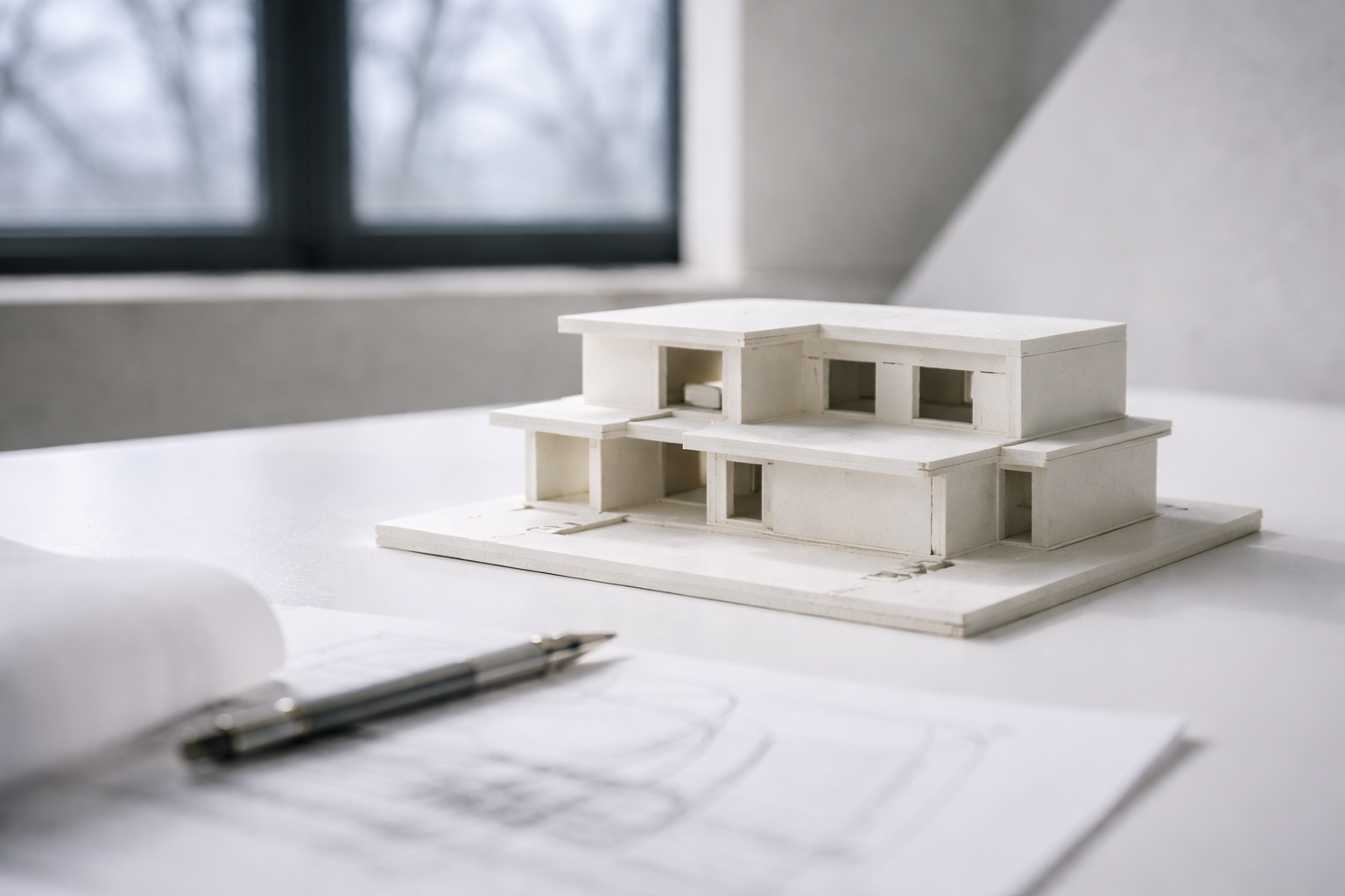
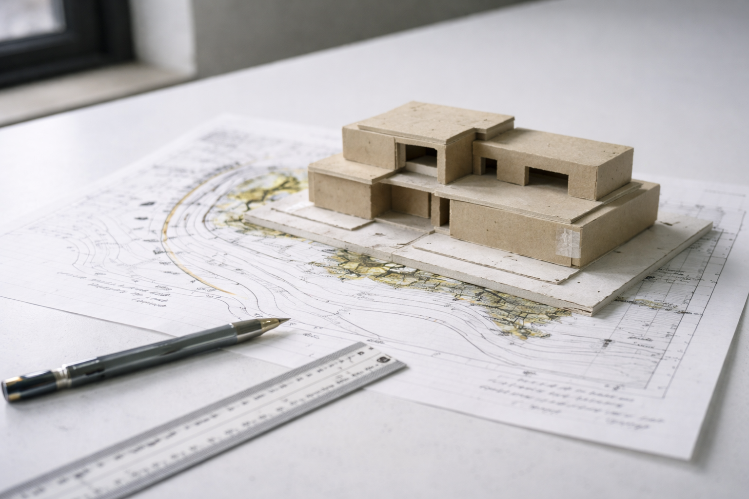
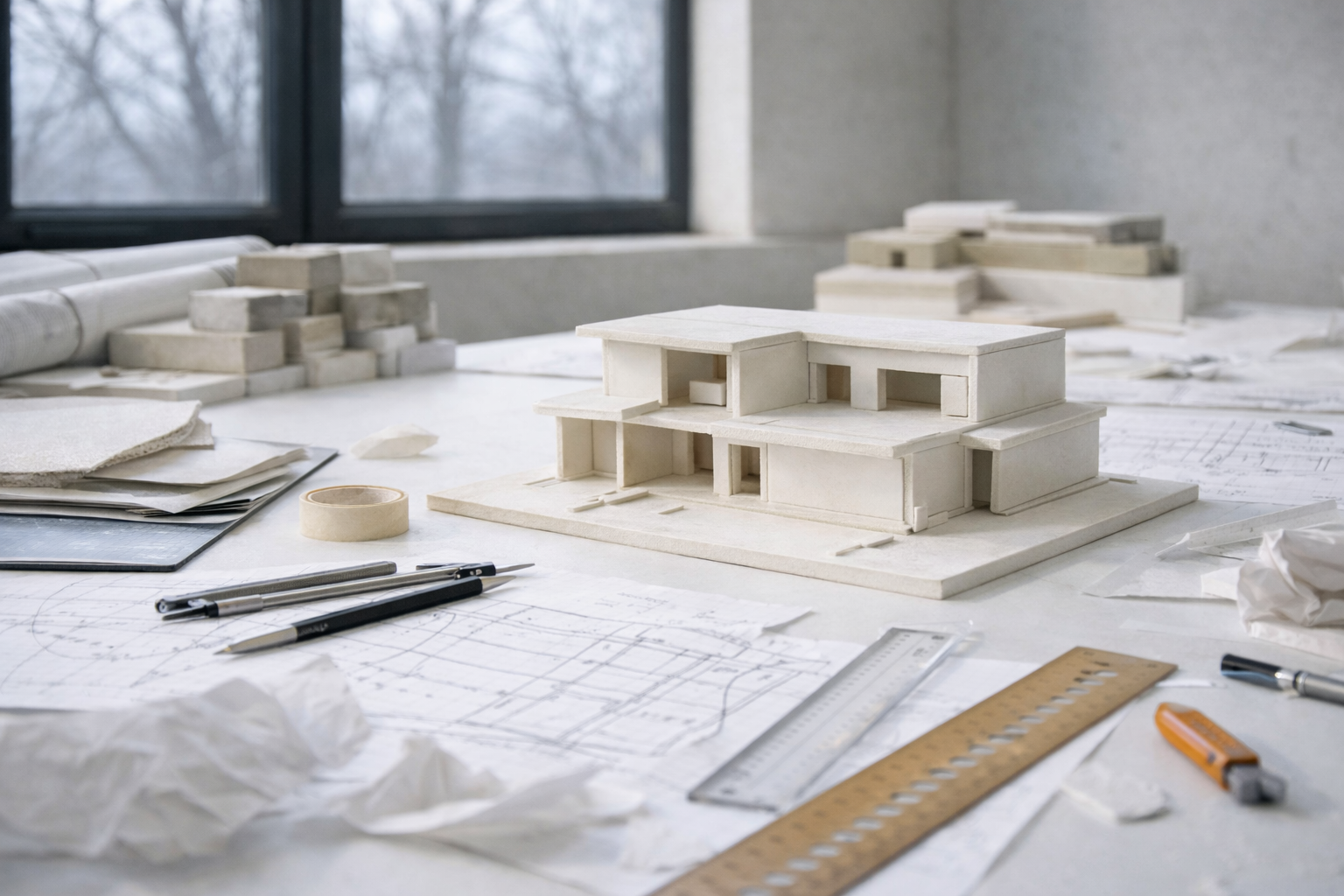
Model Making
Models show problems that drawings hide.
A plan can look clean while the massing is weak, the roof is confused, the main space is not clear, or the walls feel too thin. A quick model catches those problems early.
Build small and fast first. Use chipboard, foam, paper, cardboard, wood scraps, or a simple digital massing model. The goal is not a perfect object. The goal is to see the project.
How to Get Better
Design improves through reps. Not one perfect idea. Reps.
- Sketch for ten minutes a day.
- Make six options before choosing one.
- Build ugly study models early.
- Redraw a plan after critique instead of defending it.
- Collect precedents for one clear reason each.
- Check every idea in plan, section, and model.
The best students are not the ones who avoid bad ideas. They are the ones who test bad ideas quickly and move on.
Books Worth Keeping Nearby
Architecture: Form, Space and Order is the basic studio reference for space, order, circulation, proportion, and form.
The Timeless Way of Building is slower, but useful for thinking about why some places feel right beyond style.
Elements of Architecture is useful when you want to study parts of buildings — stairs, windows, corridors, walls, doors, and roofs — as design problems.
FAQ
What is basic design in architecture?
It is the logic behind a project: purpose, movement, hierarchy, scale, form, structure, light, and how the building works as a whole.
What should beginners learn first?
Start with plan, movement, scale, and hierarchy. If those are weak, the rest of the project will keep fighting you.
What is the fastest way to improve?
Make more options. Sketch, model, test, revise. Do not fall in love with the first version.
Why does my project feel flat?
It may lack hierarchy. Choose the main space, main path, and main idea. Then make the rest support them.
Is hand drawing still important?
Yes. You do not need perfect drawings, but you need to think visually. Sketching helps you test ideas before the computer slows you down.
Is sustainability part of basic design?
Yes. Orientation, shade, daylight, material durability, ventilation, and envelope performance are design basics now.