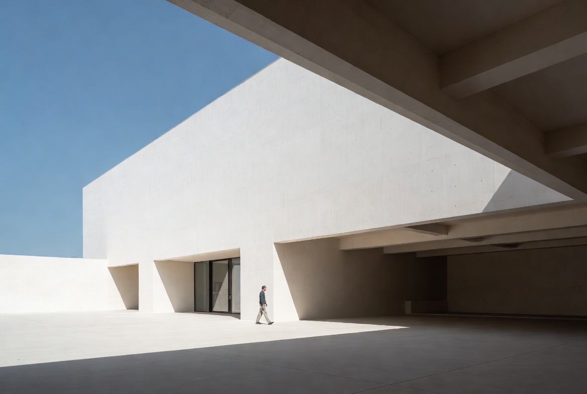
Image by ArchitectureCourses.org. Scale becomes visible when the body meets wall height, span, depth, and opening size in one clear space.
Scale and proportion get mixed up because a room can be big enough and still feel wrong. A facade can look fine on paper and still feel off when you stand in front of it.
Scale is size against a reference, usually the body, a piece of furniture, the street, or the site. Proportion is the relationship between parts: window to wall, column to beam, room width to ceiling height, opening to solid. One asks how big something is. The other asks whether the parts feel right together.
Both sit near the center of basic design and architecture because both shape how a project feels before style even enters the picture.
Scale and Proportion Are Not the Same Thing
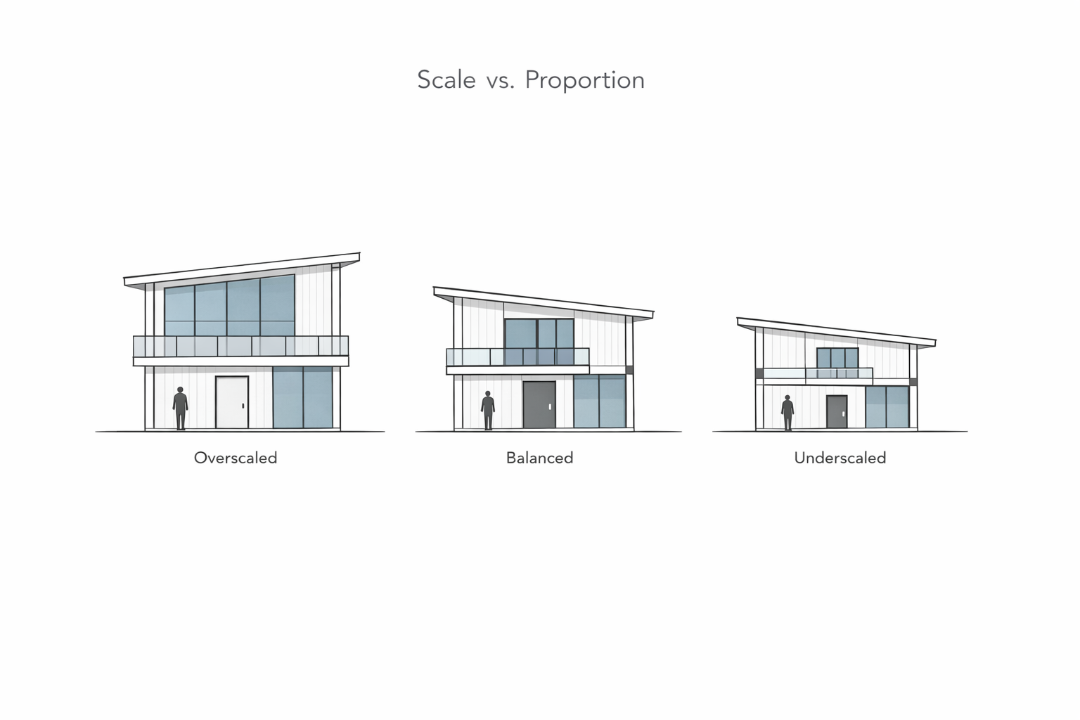
Illustration by ArchitectureCourses.org. Controlled comparison showing how facade elements can feel overscaled, balanced, or underscaled within the same residential elevation.
They work together, but they do different jobs.
| Principle | Main Question | What It Controls | Common Beginner Mistake |
|---|---|---|---|
| Scale | How big does this feel? | Comfort, use, presence, fit with body and site | Making everything oversized to look “important” |
| Proportion | Do these parts relate well? | Balance, rhythm, harmony, visual order | Mixing parts that do not belong to the same system |
| Scale + Proportion together | Does it feel right and read clearly? | How the whole design holds together | Fixing one while ignoring the other |
A narrow stair in a tall atrium is a scale problem. A facade with tiny windows floating in huge blank walls is a proportion problem. A room with both bad ceiling height and weak opening placement has both problems at once.
What Scale Controls
Human Scale
This is the first check. Can a body move through the space without strain or awkwardness? Doorways, risers, handrails, counters, desks, seating depth, and ceiling height all live here. If the body feels wrong in the room, the drawing is not done.
Human scale is why some spaces feel calm and others feel hostile before you can explain why. A low reading corner can feel protective. A huge lobby can feel ceremonial. Neither is “better.” The point is control.
Room Scale
A room is not judged only by its dimensions. It is judged by how those dimensions behave once furniture, circulation, storage, light, and people enter. A bedroom that fits a bed on paper may still fail when you try to move around it. A classroom can hit the required area and still feel flat or cramped.
This is where space planning starts to overlap with scale. You are not just measuring a box. You are testing whether that box can carry daily life.
Building Scale
Buildings also need to relate to other buildings, the street, and the horizon. A small pavilion dropped onto a large civic plaza can feel weak. A heavy apartment block on a narrow residential street can feel overbearing even when it meets code.
Good scale helps a project belong where it lands. It does not have to disappear into context, but it does need to know what it is standing next to.
What Proportion Controls
Proportion is what makes parts hold together. This is where architecture shifts from “large enough” to “convincing.”
Openings and Wall Fields
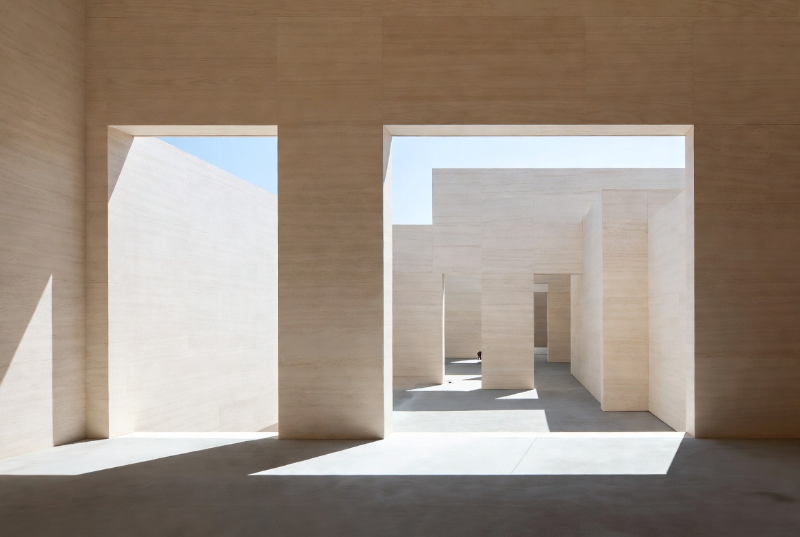
Image by ArchitectureCourses.org. Openings are not only holes in a wall. Their depth, width, and placement shape how proportion is read.
Windows do not just need the right size. They need the right relationship to the wall around them. Too small and they look timid. Too large and the wall loses discipline. The same is true of doors, arcades, skylights, and cutouts.
Height to Width
Rooms, courts, halls, and facades all depend on this relationship. A room can be generous in area and still feel squat. A narrow court can feel severe. A facade can be wide enough but still look top-heavy because the upper band is carrying too much weight.
Rhythm and Repetition
Columns, bays, panels, rafters, openings, steps, and structural grids rely on repeatable relationships. This is where proportion starts to overlap with hierarchy. Good proportion helps the eye understand what leads, what repeats, and what matters most.
Thickness and Thinness
Students often judge only height and width. They forget thickness. A slab edge, frame, column, wall return, or roof line can feel clumsy or weak if it has the wrong visual weight for the job.
If you want a tighter look at ratios, systems, and visual relationships, move next to architectural proportions. This page is the wider basics view. That page is the closer read.
Ratios Help. Magic Numbers Do Not.
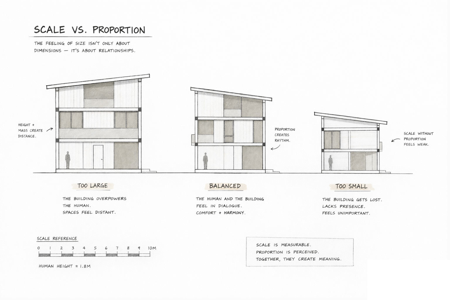
Illustration by ArchitectureCourses.org. Diagram comparing oversized, balanced, and underscaled building composition to show how scale and proportion change visual balance.
The golden ratio gets dragged into this topic every time. It has its place. So do modular systems, classical orders, thirds, halves, and simple grids. But beginners often turn ratios into superstition.
A proportion system is useful when it helps you make cleaner decisions across the whole project. It becomes useless when it is dropped onto one facade or one room as a trick. Good architecture is not saved by one famous number.
Start with these questions instead:
- Does the opening belong to the wall?
- Does the room height support the width?
- Does the structure feel strong enough for the span it suggests?
- Do repeated elements belong to the same family?
That is a better foundation than chasing formulas too early.
Where Student Work Starts to Slip
Everything is enlarged to look important
Big windows, tall doors, deep canopies, wide stairs. The drawing starts shouting. Scale loses discipline fast when every move is trying to become the focal point.
The facade and the plan are speaking different languages
The room layout may be regular, but the elevation is pushing a completely different rhythm. That disconnect is often a proportion problem, not a creativity problem.
Furniture gets ignored
A plan can look elegant right up until you place a bed, desk, table, or chair into it. Then the room shrinks, the circulation collapses, and the scale problem becomes obvious.
The section is an afterthought
Proportion is often tested in elevation, but scale often fails in section. Head height, sill height, guard height, beam depth, compression, release, and daylight all show up there.
One part is refined and the rest is random
Students may get the entry beautifully controlled, then lose the same discipline in windows, stair geometry, furniture spacing, and wall thickness. Scale and proportion need to spread across the whole project, not just the hero view.
A Fast Four-Reference Check Before Review
This is one of the easiest ways to catch problems before critique.
| Reference | Question to Ask | What It Catches |
|---|---|---|
| Body | Can a person use this comfortably? | Bad stair geometry, awkward door height, cramped movement |
| Furniture | Can the room hold what the program demands? | Fake room sizes, weak circulation, overpacked plans |
| Building | Do the parts belong to the same visual system? | Bad opening rhythm, weak wall-to-window relationships, clumsy massing |
| Site | Does the project fit its surroundings? | Overbearing height, weak street presence, wrong overall scale |
That check is simple, but it catches more than students expect.
Check It in Plan, Section, and Elevation
In Plan
Scale shows up in clearances, furniture fit, corridor width, turning space, and room depth. Proportion shows up in room shape, bay spacing, and how solid and void are distributed.
In Section
Scale shows up in head height, seat height, sill height, guard height, and vertical compression or release. Proportion shows up in how floor thickness, window height, ceiling height, and structure relate to one another.
In Elevation
Scale shows up in how the building meets the street and how large the openings feel from a distance. Proportion shows up in rhythm, symmetry or asymmetry, alignment, and the relationship between large and small elements.
Students who want to improve this fast should sketch more. Not polished renderings. Small line studies. Fast tests. That is why architectural sketching for beginners still matters even in digital workflows.
One Small Example
Take a simple studio apartment. The first pass on plan may fit a bed, a table, a kitchenette, and a bathroom. Fine. But the room still may not work.
If the bed eats the circulation zone, the scale is off. If the window is too small for the wall and floats too high, the proportion is off. If the ceiling height is mean but the glazing is stretched tall, the room may feel unbalanced even though each piece looked acceptable alone.
Now adjust it. Widen the clearance at the bed edge. Lower the sill enough to connect the occupant to the outside. Keep the opening tall, but relate it to the wall margins. Let the table size support daily use instead of acting like a token placeholder. Suddenly the room reads better.
No fancy style move happened there. Just better control of scale and proportion.
How Scale and Proportion Support Form
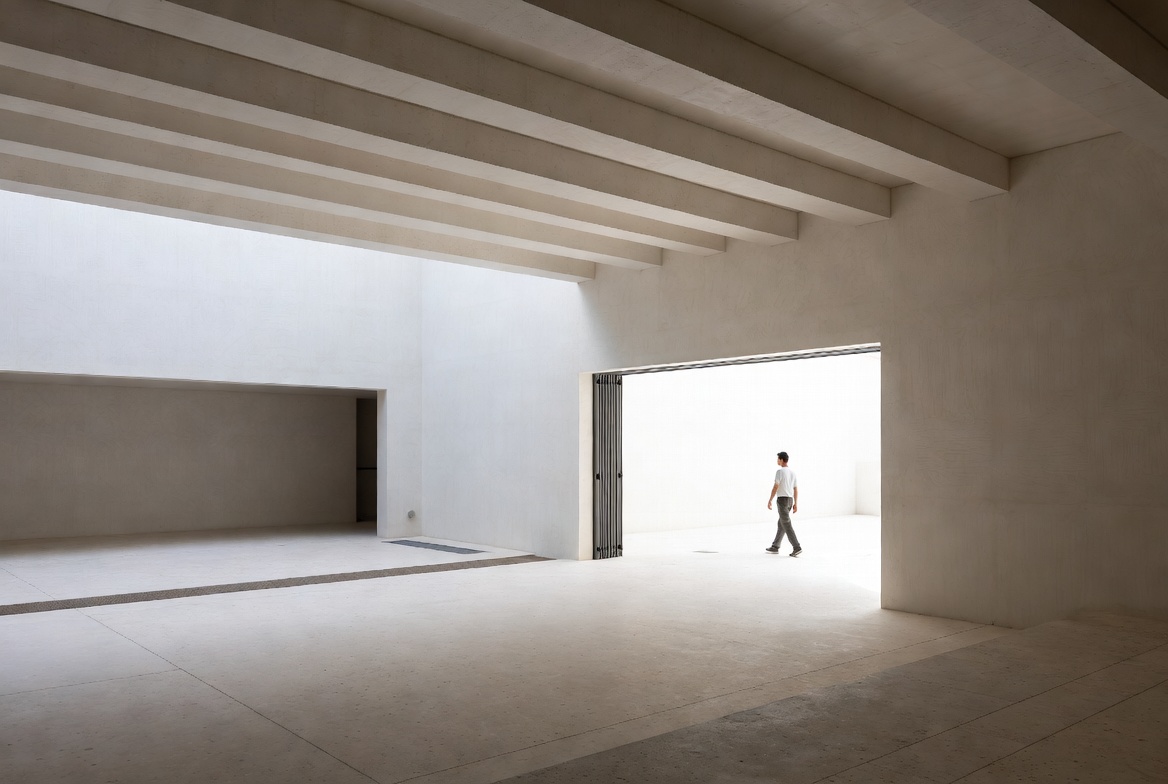
Image by ArchitectureCourses.org. A space starts to feel right or wrong when its height, width, depth, and openings are read against the body.
Students often think form comes first and these ideas get added later. It does not work that way for long. Form only holds up when mass, opening, structure, and edge relationships are resolved.
That is why this topic sits close to form in architecture. A strong form is not just a silhouette. It is a mass whose parts relate clearly, whose size feels intentional, and whose geometry can survive plan, section, and use.
Read This Next
- Hierarchy in Architecture if you want to understand what should dominate and what should stay secondary.
- Architectural Proportions if you want to go deeper into ratios, relationships, and visual order.
- Space Planning Essentials if your scale problems are showing up in rooms that do not work once furniture and circulation enter.
FAQ
What is the difference between scale and proportion in architecture?
Scale is about size against a reference such as the human body, furniture, the site, or another building. Proportion is about how parts relate to one another inside the composition.
Why are scale and proportion important?
Because they shape comfort, clarity, balance, and how a project is read. A design can meet the program and still feel wrong if its scale or proportion is weak.
Is human scale the most important kind of scale?
It is the first one to check, but not the only one. A project also has to deal with room scale, building scale, and site scale.
Do I need the golden ratio to design good architecture?
No. Ratios can help, but they are not a shortcut. Clear relationships, disciplined repetition, and good judgment matter more than forcing one famous number into every project.
How can I test scale quickly in studio?
Drop in a body, real furniture, circulation clearances, and one section cut. That catches most false scale fast.
How can I test proportion quickly?
Look at openings against the wall, compare room width to height, study repeated elements as a family, and ask whether all the parts seem to belong to the same system.
What is the most common student mistake?
Trying to make everything dramatic at once. When every door is tall, every window is huge, and every room is oversized, the project loses control.