Romanesque interiors are easy to misread if you start with decoration. The faster move is to start with structure.
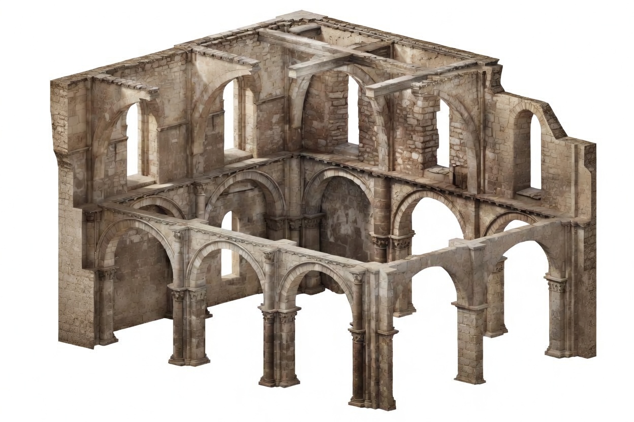
This style does not come from light surfaces, delicate trim, or visual softness. It comes from masonry mass. Thick walls. Rounded arches. Deep openings. Heavy supports. Ceilings that look like they are carrying real weight because they usually are.
So if you are trying to understand Romanesque interior design, the question is not “what ornaments did it use?” The better question is “what kind of room does this construction method create?” That gets you closer, faster.
Start With the Weight of the Room
A Romanesque interior usually feels built first and decorated second.
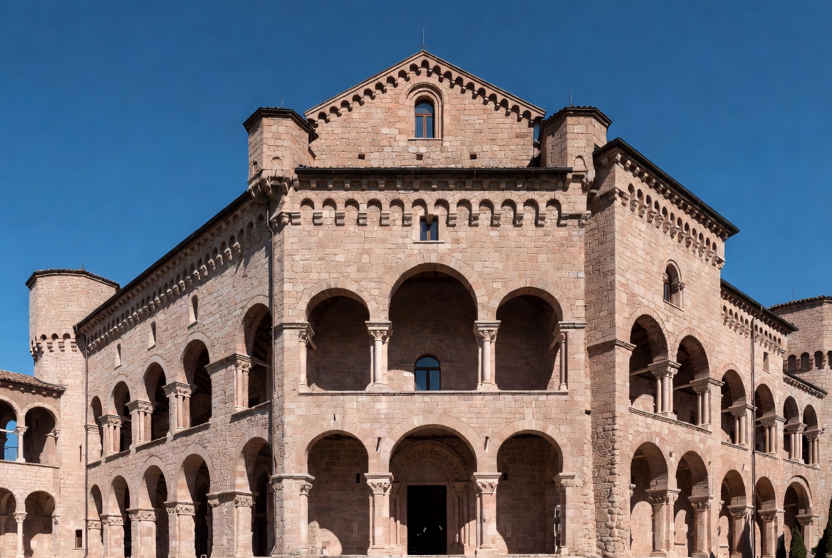
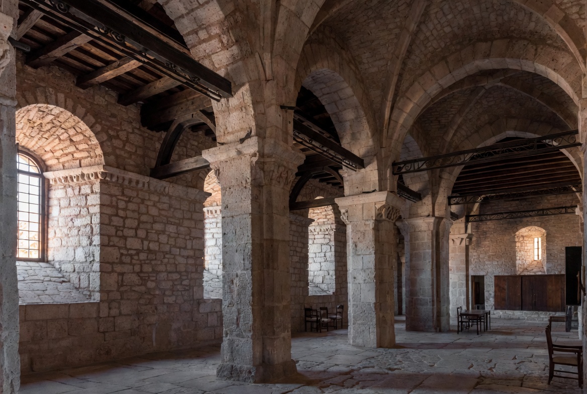
The walls read as thick. Openings look cut into mass, not stretched across thin partitions. Arches are rounded instead of pointed. Supports tend to feel chunky rather than slender. Even before you notice any carved detail, the room already feels solid, enclosed, and a little restrained.
That is one of the clearest tells. Romanesque space is not trying to disappear behind ornament. It wants you to feel the structure.
The Main Interior Cues
These are the features that usually matter most.
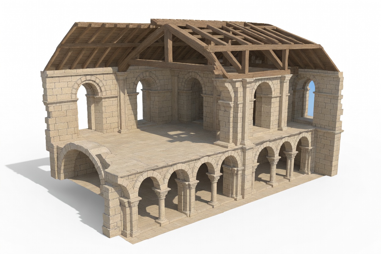
- Rounded arches. Doorways, arcades, and passage openings often use full semicircular arches.
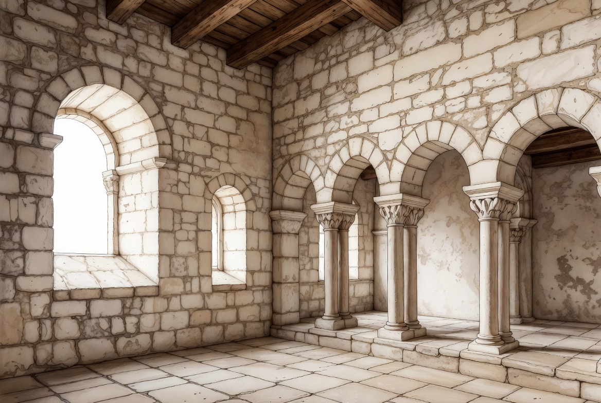
- Thick masonry walls. The wall is not just enclosure. It is doing structural work.
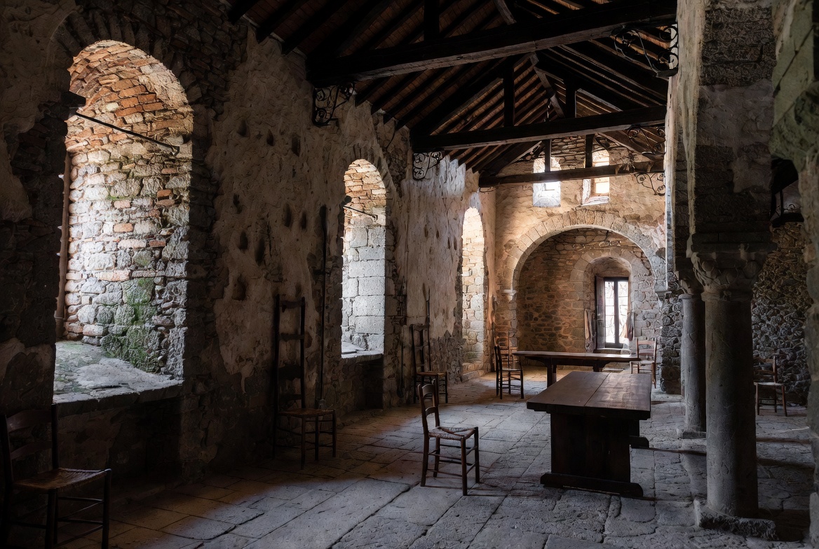
- Small, deeply set windows. Openings tend to be modest, which means more shadow and less wash of daylight.
- Barrel or groin vaults. The ceiling often reads as heavy masonry overhead, not a light skin.
- Heavy piers or columns. Supports usually feel substantial, sometimes almost blunt.
- Carved capitals and relief details. Decoration is often tied closely to the architecture instead of floating on top of it.
Not every room has every feature, obviously. But the more of these you see working together, the more clearly the interior reads Romanesque.
Why the Light Feels Different
Romanesque interiors are often darker than people expect. Not gloomy, exactly. Just controlled.
That comes from the construction logic. Thick masonry and small openings limit how much light gets in, and the deep wall reveals make the light feel more directional. You do not get the broad bright wash you see in later Gothic interiors. You get pockets of light, stronger contrast, and more emphasis on surface depth.
That is why the style often feels calm, heavy, and inward-looking even when the room itself is not especially small.
Where People Get It Wrong
A single rounded arch does not make a room Romanesque.
This gets overcalled all the time. Someone sees one semicircular opening, maybe some stone, maybe a dark wood ceiling, and that is enough for them. Usually too quick.
Romanesque character comes from the whole package: wall mass, arch shape, opening size, vault form, support thickness, and the general feeling that the room is carried by masonry. If those pieces are missing, the room may be borrowing from the style, but it is not really working in a Romanesque way.
Romanesque vs. Gothic Inside
This is the comparison that clears things up for most people.
Romanesque interiors usually feel heavier, rounder, lower, and more wall-dominant. Gothic interiors push toward height, pointed arches, larger openings, and a more skeletal structure.
If the room feels like mass with openings carved into it, you are closer to Romanesque. If it feels like the structure is trying to lift, sharpen, and dissolve the wall, you are moving toward Gothic. That transition matters, and this page on the birth of Gothic architecture is useful if you want to see where that shift really happens.
How the Style Shows Up in Interior Design
When people reference Romanesque interiors today, they are usually borrowing the spatial cues, not rebuilding a medieval room stone for stone.
The most convincing versions use thick arched openings, textured plaster or stone surfaces, deep window recesses, dark timber, heavy-looking ceiling forms, and a palette that stays grounded. Warm stone, earth tones, muted plaster, shadow. That kind of thing.
The weak version usually goes theatrical. Too many fake “castle” gestures. Random arches with no wall depth. Decorative pieces trying to do the work that structure should be doing.
If the room does not feel substantial, the Romanesque reference usually falls apart pretty fast.
What the Best Examples Usually Share
Forget the fake list of made-up mansions and civic halls. The useful pattern is simpler.
The best Romanesque interiors usually share a few things: repeated rounded arches, visible wall depth, heavy supports, restrained daylight, and a ceiling form that feels structural rather than decorative. Carved details help, but they are not the first move. The room has to feel right before the ornament can do anything useful.
That is why some spaces with very little decoration still read strongly Romanesque, while other rooms with plenty of carved detail do not quite get there.
The Detail People Usually Miss
It is the opening depth.
Not just the arch profile. The depth.
Romanesque interiors often show deep-set doors and windows because the wall itself has real thickness. That changes how light enters, how shadows sit on the surface, and how solid the room feels. A thin modern wall with a rounded opening can hint at the style, but it does not create the same effect.
That is one reason the style is harder to fake than people think.
Why It Still Feels Solid
Romanesque interior design still matters because it reminds you that atmosphere can come from structure, not just styling. Weight, shadow, thickness, rhythm, enclosure. Those are architectural tools, not decorating tricks.
If you want the broader background, this page on the history of Romanesque architecture is the right next step.