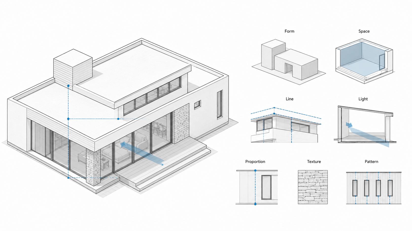
Illustration by ArchitectureCourses.org. Design elements make more sense when they are shown on one building: the mass gives form, the room gives space, the edges make lines, and the openings control light, proportion, texture, and pattern.
How to Read a Building Without Guessing
Design elements are not vocabulary to memorize.
Line, form, space, light, texture, color, scale, rhythm, balance, and hierarchy only matter when they change how a building works. A line can organize movement. A wall can hold structure and create privacy. A window can frame a view, control glare, and expose whether the room was planned well.
The weak way to study design is to label things. The stronger way is to ask what each element is doing.
Useful starting points: For the broader foundation, see Basic Design and Architecture. For the drawing side, keep Architectural Drawing Basics nearby.
Use Elements as Tests, Not Labels
A student can point to a wall and call it a plane. That is not enough.
The better question is harsher: what does the plane control? Does it hold the edge of a room? Block noise? Guide movement? Carry structure? Create shade? Hide a service zone? If the answer is only “it looks clean,” the design is still thin.
| Design Element | What It Should Control | Where It Usually Fails |
|---|---|---|
| Line | Direction, axis, rhythm, movement, alignment. | The drawing has lines, but the plan does not obey them. |
| Form | Mass, silhouette, enclosure, and the building’s main read. | The shape looks strong in a render but collapses in section. |
| Space | Volume, compression, release, privacy, circulation, gathering. | Rooms are filled with objects instead of shaped by voids. |
| Light | Focus, comfort, time, glare, shadow, orientation. | Openings are placed for the facade, not for the room. |
| Material | Touch, weight, weathering, joints, structure, sound. | Materials are picked like finishes instead of assemblies. |
| Scale | Body fit, street fit, furniture, openings, height, distance. | The drawing looks balanced, but the body feels wrong inside it. |
Line Is a Rule
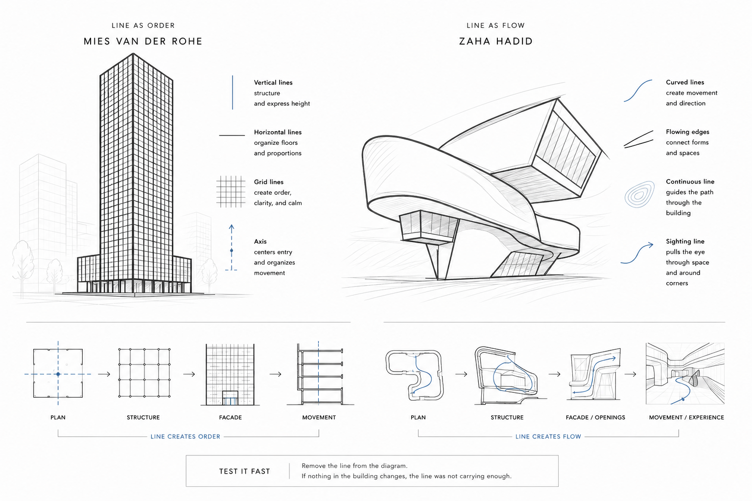
Illustration by ArchitectureCourses.org. Line is useful when it becomes a rule: the plan, structure, facade, and movement all have to answer to it.
Line is the first design element most students understand, and the first one they misuse.
A line can be a wall, beam, path, edge, joint, axis, sightline, or structural bay. It can make a plan feel calm or nervous. It can pull the eye toward an entry. It can make a room feel longer than it is.
But line has to become a rule. If you draw a strong axis on the diagram and then ignore it in the plan, the line is decoration. If the entry, stair, openings, and structure all respond to it, the line starts doing architectural work.
Test it fast: remove the line from the diagram. If nothing in the building changes, the line was not carrying enough.
Related: Lines in Architectural Sketches.
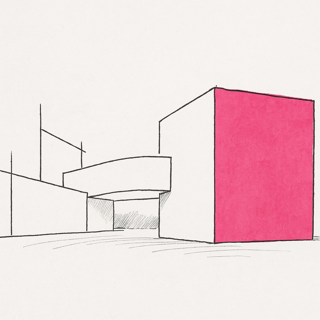
Form Has to Survive the Section

Illustration by ArchitectureCourses.org. Basic architectural design elements shown through simple sketches of form, space, geometry, structure, and circulation.
Form is more than the outside shape.
A cube, slab, tower, courtyard block, folded roof, or long bar building all look simple from a distance. The real test comes when floors, stairs, roof thickness, structure, daylight, drainage, and service zones enter the drawing.
This is where many good-looking concepts fall apart. The roof is too thin to build. The stair does not land. The dramatic void cuts through structure. The render hides the thickness that the section cannot avoid.
Form is strongest when the plan, section, and structure agree. Villa Savoye, the Farnsworth House, the Barcelona Pavilion, and the Salk Institute are useful to study because the form is tied to movement, proportion, light, and construction logic.
Also useful: Form in Architecture and Parti in Architecture.
Space Is the Part You Did Not Fill
Beginners design objects. Architects learn to design the space between them.
A courtyard, stair hall, porch, light well, arcade, lobby, or quiet corner can carry the whole project. Sometimes the most important design move is what you leave open.
Empty space is not automatically good. A dead atrium is still dead. A courtyard that gets no light, no use, no drainage logic, and no clear edge is just leftover space with a better name.
Ask what the void does:
- Does it bring light deeper into the plan?
- Does it organize movement?
- Does it create a place to pause?
- Does it solve privacy, air, or orientation?
If the answer is no, the space may be emptiness, not architecture.
Related: Space Planning Essentials.
Light Is Not a Finish

Illustration by ArchitectureCourses.org. Light is not a finish. The section, opening, reveal, and time of day decide whether a room feels calm, harsh, useful, or impossible to sit in.
Light proves whether the design was drawn for a real day or only for a still image.
A room can look balanced in elevation and fail once glare hits the work surface. A deep reveal can make a wall feel thick and calm. A high window can wash a ceiling. A poorly placed skylight can overheat a room and make the furniture layout miserable.
Light has direction, time, color, heat, and glare. Treating it as “nice atmosphere” is too weak.
For early design, test three moments: morning, noon, and late afternoon. One clean shadow study will teach more than another polished render. If the room only works at one perfect sun angle, it does not work yet.
Related: Natural Lighting in Architecture.
Material Is Where Theory Gets Caught
Material choices carry rules, not only mood.
Concrete, timber, steel, glass, stone, brick, plaster, tile, and sheet metal all bring rules with them. They have weight, joints, tolerances, movement, weathering, cost, sound, maintenance, and failure points.
A stone wall that pretends to be weightless feels fake. A timber detail with no room for movement will crack, cup, or open. A metal panel system with confused seams can trap water. A glass wall with no glare strategy turns the room into a punishment at certain hours.
Material logic starts at the joint.
Where does water go? Where does air leak? What touches the hand? What gets scratched first? What can be replaced without tearing apart the whole assembly?
Worth Knowing: Building Materials and Wood Materials in Construction and Design.
Texture Changes Light and Touch
Texture is not surface noise.
Smooth concrete, rough stone, brushed metal, matte plaster, soft timber, polished glass, and ribbed tile all change how light lands and how close people want to stand. A room with no texture can feel sterile. A room with too many textures feels busy before the furniture arrives.
The mistake is treating texture like an image filter.
Test it under real light. A material that looks calm on a sample board may look harsh beside a window. A glossy wall may double the glare. A rough surface may hold dust in a way nobody wants to maintain.
Color Has to Earn Its Place
Color can carry mood, focus, identity, and memory. It can also cheapen a room fast.
The safer move is not always white. The stronger move is using color with a job. A color can mark circulation, calm a patient room, sharpen an entry, make a thick wall feel heavier, or pull attention toward a view.
Color fails when it floats loose from material and light. Paint behaves differently on plaster, wood, metal, and concrete. The same color changes under north light, warm lamps, or hard afternoon sun.
Use fewer colors and test them harder.
Related: Color Psychology Basics.
Scale Starts With the Body
Scale is where drawings lie most easily.
A stair looks fine until the risers are too steep. A doorway looks elegant until a person stands beside it. A lobby looks generous until the furniture, queue, stroller, bag, wheelchair, or delivery cart enters the plan.
Do not test scale only with walls and roofs. Test it with reach, walking pace, furniture, sightlines, handrails, window sills, door swings, and where a person naturally stops.
Human scale is not sentimental. It prevents bad use.
Related: Scale and Proportion in Architectural Design.
Balance Is Not Mirror Symmetry

Symmetry is one way to balance a building. It is not the only way.
A heavy wall can balance a thin roof plane. A dark volume can balance a bright opening. A quiet courtyard can balance a busy street edge. The question is not whether both sides match. The question is whether the whole composition holds.
Overusing symmetry makes many student projects stiff. It also hides weak judgment. Mirroring something is easier than deciding what should carry weight and what should stay quiet.
I would test balance by squinting at the drawing. If one side feels nervous or overloaded, do not add decoration. Move weight.
Related: Balance in Architecture.
Hierarchy Decides What Leads
Every design needs a lead.
One main room. One main path. One main view. One dominant wall. One important courtyard. One public edge. The answer changes by project, but the project still needs a hierarchy.
When everything shouts, the design goes flat. Every material is special. Every opening is dramatic. Every room gets the same emphasis. The visitor has no idea where to look first.
The fix is often subtraction. Calm the secondary parts down. Reduce the number of special moments. Give the main move better light, size, position, structure, or edge control.
Good hierarchy does not make the rest of the building unimportant. It gives the rest of the building a job.
Rhythm and Repetition Need a Reason
Rhythm can guide movement, calm a facade, organize structure, and make a long space readable.
It can also become dead repetition.
Columns repeated without hierarchy. Windows copied across a facade with no room logic. Lights spaced evenly because the ceiling grid made it easy. Tile repeated until the drain ruins the layout.
Repetition works when the repeated part has a reason. Change works when the break has a reason too.
That is the part worth teaching: rhythm is not sameness. It is a controlled beat with meaningful changes.
Composition Pulls the Elements Together

Illustration by ArchitectureCourses.org. Composition holds when the building still reads after color and materials are stripped away: mass, void, opening, and path have to carry the design.
Composition is where the separate elements stop acting like separate tricks.
Line, form, light, texture, color, scale, and rhythm have to become one readable order. That order may be calm, tense, heavy, light, compressed, open, formal, loose, or deliberately strange. But it should be legible.
The fast test is black and white.
Strip the drawing down to mass, void, opening, and path. If the design still reads, the composition has bones. If it only works with material labels and a render mood, it is not ready.
One More Thing: Geometric Patterns in Architecture is useful when composition depends on grids, modules, and repeated elements.
The Five-Lens Test
This is the part that makes the article useful instead of another list of design terms.
Take any building, room, facade, or student project and read it through five lenses. Do not start by naming the style. Start by testing what the design is doing.
| Lens | Question to Ask | What a Weak Answer Looks Like |
|---|---|---|
| Body | How does a person move, stop, reach, sit, enter, or turn? | The plan looks clean but door swings, stairs, clearances, or furniture do not work. |
| Light | Where does light enter, land, glare, fade, or mark time? | The render looks warm, but the real room would be dark, harsh, or overheated. |
| Load | Where does the structure go, and does the form admit it? | The section hides beams, roof depth, supports, or impossible spans. |
| Edge | How do parts meet: wall to roof, glass to frame, floor to threshold? | The idea dies at the joint, or the water path is missing. |
| Time | How does the space change by hour, season, use, maintenance, and age? | The design works as a still image but not as a lived building. |
If a design survives all five lenses, it is probably stronger than the vocabulary used to describe it.
Where Design Elements Fail in Real Buildings
This is the part architecture school critiques often miss.
A design element can look correct in isolation and still fail once the building is occupied, maintained, cleaned, heated, cooled, repaired, and used every day.
That is why good architectural judgment usually comes from watching what happens after the drawing phase.
Light That Punishes the Room
Large glazing can look calm and minimal in renderings. Then summer arrives.
Now the glare lands directly on desks and screens. The floor overheats by afternoon. People close blinds permanently, which kills the whole daylight concept the facade depended on.
A window is not automatically successful because it is large. The opening has to control light, not just admit it.
Minimalism That Cannot Survive Use
Minimal interiors fail when the detailing is weak.
One uneven reveal. One sloppy cabinet alignment. One bad transition between wall and ceiling. One visible patch at a service panel. Suddenly the room feels cheap because there are fewer visual layers to hide mistakes.
Quiet spaces demand more discipline, not less.
Beautiful Stairs Nobody Wants to Climb
A stair can photograph well and still feel terrible in the body.
Risers too steep. Treads too shallow. Handrails placed awkwardly. Landings too tight. Open risers that feel unsafe for children or older users. Hard surfaces amplifying every footstep through the room.
Circulation is experienced physically before it is understood visually.
Facade Rhythm Destroyed by Systems
Many clean elevations fall apart late in the project.
Mechanical louvers appear where nobody planned for them. Exterior lighting shifts off-grid. Drainage locations interrupt the facade rhythm. Access panels land in visible areas because maintenance was ignored during design.
This is why facade design without coordination usually ages badly.
Texture That Becomes Maintenance
Some materials look better in samples than in buildings.
Deep texture can trap dust. Soft stone can stain near entries. Matte black surfaces show fingerprints constantly. Ribbed materials collect dirt in ways the render never showed.
Material decisions should survive cleaning crews, weather, and touch, not just photography.
Dramatic Voids With No Environmental Control
Large atriums and double-height spaces often become environmental problems before they become architectural successes.
Hot air collects at the top. Sound echoes through the volume. Glare becomes difficult to control. Heating and cooling loads increase. Maintenance access becomes harder and more expensive.
The void has to earn the energy and coordination burden it creates.
Thin Roof Profiles That Ignore Water
Extremely thin roof edges look elegant in elevation.
Then the section begins fighting back.
Drainage slope disappears. Insulation depth becomes difficult. Flashing gets compressed into impossible dimensions. Water staining appears earlier than expected. Ice buildup starts damaging edges in cold climates.
Some roof profiles survive because the detailing is exceptional. Others survive only in renders.
Plans That Look Balanced but Move Poorly
A symmetrical plan can still feel awkward.
Furniture interrupts circulation. Kitchen paths cross constantly. Doors collide. Hallways become wasted square footage. The shortest path through the building feels unnatural.
Good movement usually matters more than perfect geometric balance.
The important shift is this: design elements are not separate aesthetic categories. They become real architecture only when they survive structure, light, climate, systems, maintenance, movement, and time.
How Students Should Practice This
Do not make a giant chart of principles. It will feel useful and teach very little.
Pick one building. Redraw one plan, one section, and one elevation. Then mark only three things: movement, light, and structure. After that, add material joints and human scale.
That order matters.
If you start with style, you copy the surface. If you start with forces, the design begins to explain itself.
- Redraw the plan small enough that hierarchy has to be obvious.
- Cut one section through the strongest spatial idea.
- Mark where the body touches the building: handle, stair, sill, bench, rail, threshold.
- Find one detail where the whole idea either holds or fails.
That last detail is usually more honest than the hero image.
Where Beginners Usually Go Wrong
They Memorize Terms
Knowing the word contrast does not make a design stronger. The question is contrast between what: light and dark, heavy and light, open and compressed, rough and smooth, public and private?
They Design the Image First
A nice render can hide a weak plan for a while. It cannot hide a bad stair, poor daylight, fake structure, or a material joint that traps water.
They Use Principles as Decoration
Rhythm becomes stripes. Color becomes accent walls. Texture becomes mood. Balance becomes symmetry. None of that is enough.
They Forget the Body
Architecture is seen, walked, touched, heard, leaned on, cleaned, repaired, heated, cooled, and aged. A design element that ignores use is only graphic.
One Useful Reference
Architecture: Form, Space, and Order by Francis D. K. Ching is still one of the clearest references for understanding form, space, proportion, organization, and architectural composition. Use it as a drawing reference, not a substitute for looking at real buildings.
FAQ
What are design elements in architecture?
They are the working parts architects use to shape buildings: line, form, space, light, texture, color, scale, proportion, material, rhythm, and hierarchy.
What is the difference between elements and principles?
Elements are the parts. Principles are how those parts are organized. A wall is an element. Balance, rhythm, contrast, and hierarchy describe how that wall works with other parts.
Which design element should beginners study first?
Start with line, form, space, and light. Those four reveal most early design problems quickly.
Why does scale matter so much?
Because buildings meet the body. A stair, door, room, window, bench, or hallway can look fine in a drawing and still feel wrong when used.
Is color important in architecture?
Yes, but it should have a job. Color can guide attention, change mood, mark circulation, or strengthen material identity. Random color weakens a project fast.
How do I know if my design composition is weak?
Strip it down to black and white. If mass, void, path, and hierarchy do not read without finishes, the composition is probably weak.
Should architecture students copy famous buildings?
Yes, as an exercise. Redraw them, analyze them, then break the lesson apart. Copying the look is shallow. Copying the logic teaches something.
What is the biggest beginner mistake?
Treating design elements as labels. The better move is to ask what each element controls: body, light, load, edge, time, cost, or use.