Renaissance architecture is easy to recognize badly.
People see arches, columns, symmetry, and a heavy cornice, then stop looking. That misses the real work. The style was not just a set of classical details. It was a way of making buildings look measured, rational, and controlled from the street, the courtyard, and the main room.
The important features are not decorative checkboxes. They control how a building meets the ground, how the windows line up, how the wall casts shadow, how the courtyard brings in light, and how people move through the plan.
This page focuses on the features themselves. For the broader history and larger movement, use Renaissance Architecture. For the older classical source material, Ancient Roman Architecture and Greek Architecture are the better background reads.
The Short Version
Renaissance architecture brought back classical order, but the strongest buildings did more than copy the past.
They used proportion, symmetry, wall depth, classical orders, courtyards, round arches, aligned windows, and controlled perspective to make buildings feel readable. A good Renaissance façade has a base, middle, and top. A good Renaissance plan controls entry, light, stair movement, and social rank. A good Renaissance interior feels ordered before decoration arrives.
| Feature | What It Looks Like | Why It Matters |
|---|---|---|
| Symmetry | Balanced fronts, paired openings, centered axes | It makes the building read as planned instead of accidental. |
| Proportion | Repeated ratios, measured bays, calm spacing | It ties windows, floors, doors, and wall height together. |
| Classical orders | Columns, pilasters, capitals, entablatures | They give the wall visual structure and hierarchy. |
| Strong cornice | A clear horizontal top edge | It finishes the façade and casts a real shadow line. |
| Rusticated base | Rougher or heavier lower level | It makes the building feel grounded and stable. |
| Courtyard plan | Open court inside a dense building block | It organizes light, movement, privacy, and status. |
| Perspective control | Aligned openings, floor grids, long views | It turns movement through space into a measured visual sequence. |
What Made the Style Different
The difference was not just “old style versus new style.” It was a change in how buildings were judged.
Renaissance architects wanted a building to make sense at a glance. The façade should show order. The main floor should be readable. The windows should follow a rhythm. The top should end with confidence. The plan should move people from public space to private space without confusion.
Earlier buildings often grew through repair, addition, local habit, and vertical drama. Renaissance design wanted more control. It valued horizontal order, measured scale, and parts that looked related.
That does not mean Renaissance buildings were plain. Many were rich and powerful. But the richness worked best when it sat on a clear structure.
How to Read a Renaissance Façade

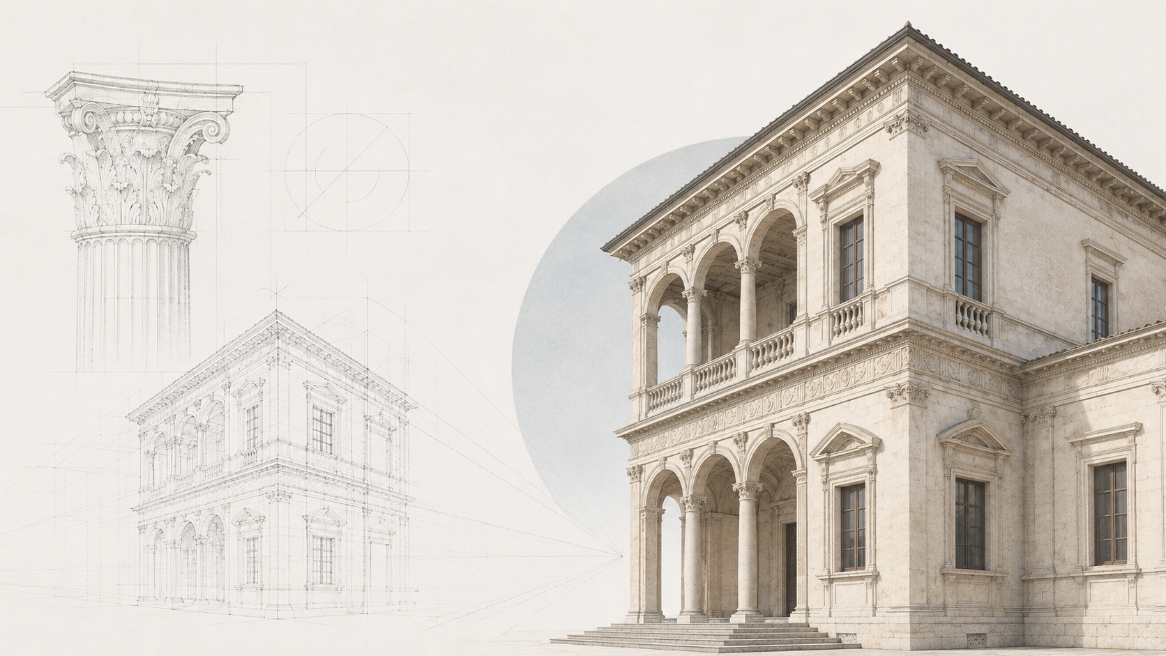
Start at the ground.
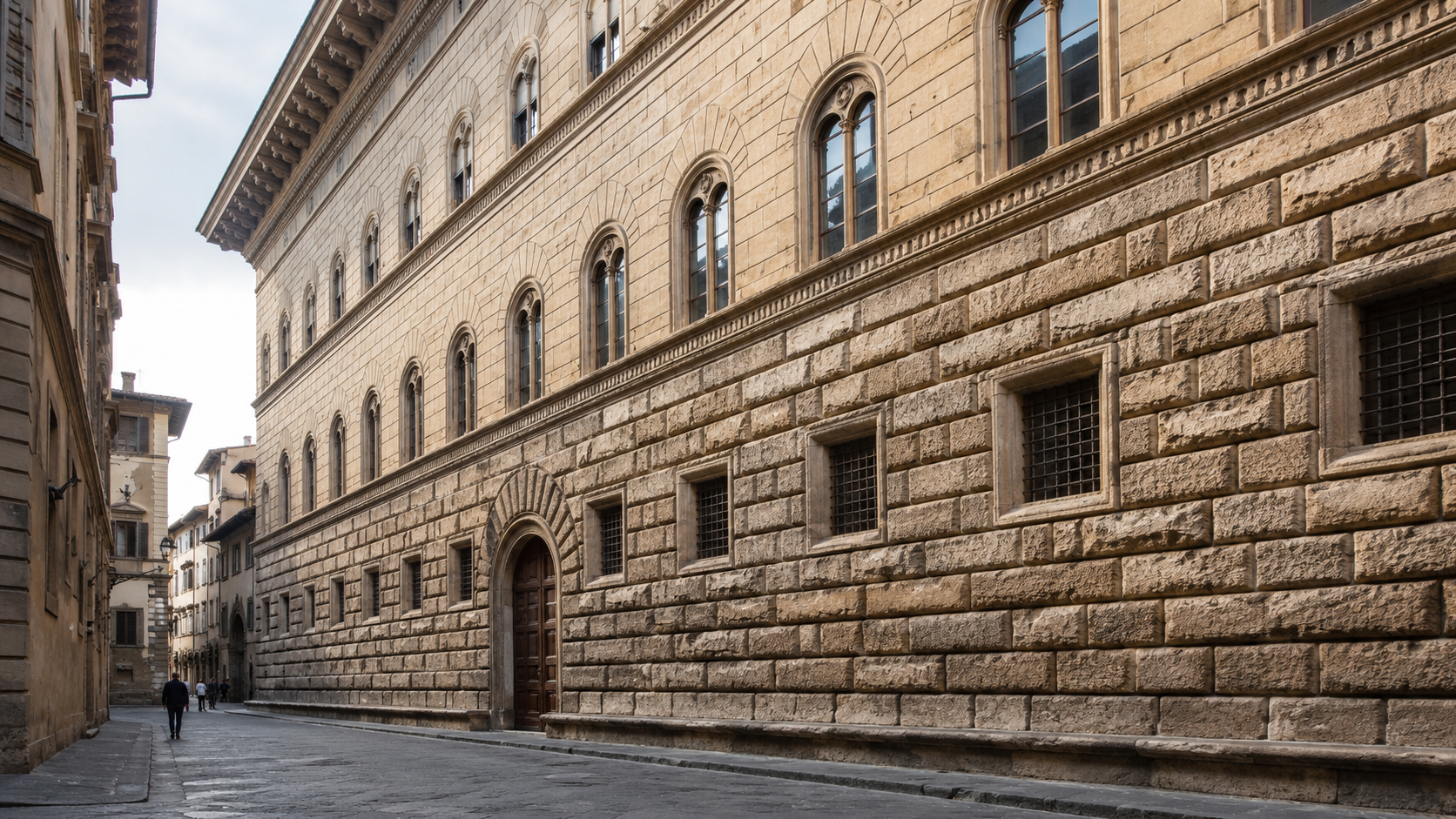
A Renaissance façade often has a heavier base. That base may use rusticated stone, deeper joints, darker shadow, or stronger texture. It tells the eye that the building has weight. It also separates street-level activity from the more formal floors above.
Then look at the piano nobile, the main formal floor. This level often gets taller windows, better trim, or a stronger rhythm. It is where the building tells you which rooms matter most.
Above that, the upper floors usually become lighter. The windows may be smaller or simpler. The cornice finishes the whole wall. Without that top edge, the façade can look unfinished, even if the rest is symmetrical.
This base-middle-top reading is one of the easiest ways to identify Renaissance architecture. It also explains why weak copies fail. They may use the same parts, but the hierarchy is missing.
Symmetry Is Not Enough
Symmetry is one of the most obvious Renaissance features, but it is also the most misunderstood.
A symmetrical façade can still be bad. If the windows are too close together, the base is weak, the cornice is thin, or the entry has no depth, the building may look balanced but still feel cheap.
Renaissance symmetry works because it is tied to proportion. The parts have to relate. Window spacing has to match wall thickness. Floor heights have to make sense. Door size has to belong to the building, not just the centerline.
That is the difference between balance and a mirrored mistake.
Proportion Holds the Building Together
Proportion is the feature people talk about most and explain the least.
In simple terms, proportion means the parts feel measured against each other. A window is not just a window. It belongs to a bay. The bay belongs to the floor. The floor belongs to the height of the wall. The cornice belongs to the size of the whole building.
Renaissance architects often used simple ratios and classical rules to keep those relationships under control. The exact math changed from building to building, but the goal was consistent: make the whole building feel related.
This is why good Renaissance architecture can feel calm even when it has a lot of detail. The detail is not floating. It is attached to an order.
For a broader design explanation, Scale and Proportion in Architectural Design is the better follow-up.
Classical Orders Give the Wall a Skeleton
Columns and pilasters are not the same thing, but both can help organize a Renaissance façade.
A column stands free and can carry load. A pilaster is attached to the wall and often works more as visual structure. Renaissance façades use pilasters to divide the wall into bays, show rhythm, and give the surface a classical order.
The familiar orders are Doric, Ionic, Corinthian, Tuscan, and Composite. You do not need to memorize every capital to understand the building. The important point is that the order gives the façade a visual grammar.
Doric and Tuscan feel heavier and simpler. Ionic and Corinthian feel more refined. Composite is more ornate. In good Renaissance work, the order is chosen to support hierarchy, not to decorate at random.
For the older column background, use Ancient Greek Columns.
Round Arches and Strong Openings
Round arches are one of the easiest Renaissance features to spot.
They appear in arcades, courtyards, windows, loggias, and public-facing ground floors. Their appeal was not only visual. A round arch gave the building a link to ancient Roman construction and made openings feel measured and stable.
But arches need depth. A flat arch shape stuck onto a thin wall is not the same thing. Good Renaissance openings have shadow, reveal, and thickness. The wall feels like it has mass.
That is why many modern “Renaissance style” details fail at close range. The outline may be right, but the opening has no depth.
Courtyards Control Light, Movement, and Status

The courtyard is one of the most important Renaissance features because it proves the style was not only about façades.
In a dense city palace, the courtyard brought light into the middle of the building. It gave visitors a place to arrive. It separated public entry from private rooms. It helped organize stair access, service movement, deliveries, and formal reception.
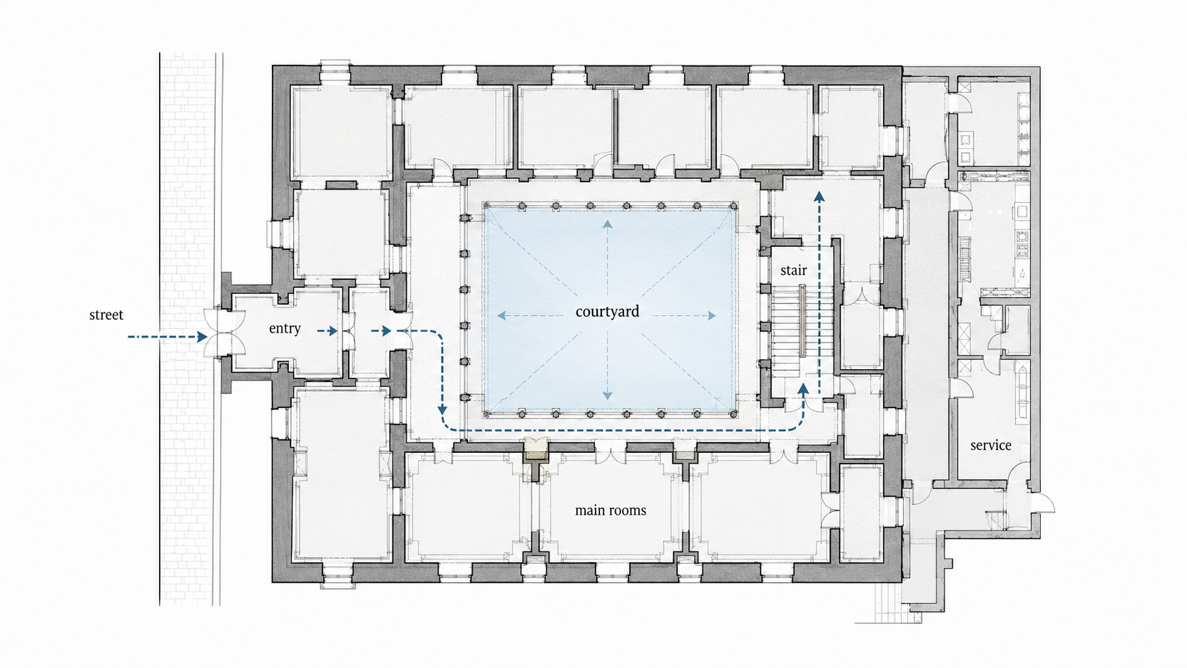
The sequence mattered: street, entry, courtyard, stair, main rooms. A visitor could feel the building’s hierarchy before anyone explained it.
That is why courtyards should not be treated as decorative holes in the plan. They are planning devices. They control light, air, movement, privacy, and rank.
Perspective Turns Space Into a View
Renaissance architecture is tied to perspective because architects became more aware of how space is seen from a fixed point.
This changed interiors, courtyards, corridors, galleries, stairs, and urban spaces. Floors could guide the eye. Ceilings could repeat a rhythm. Openings could align. A corridor could become a measured view instead of just a passage.
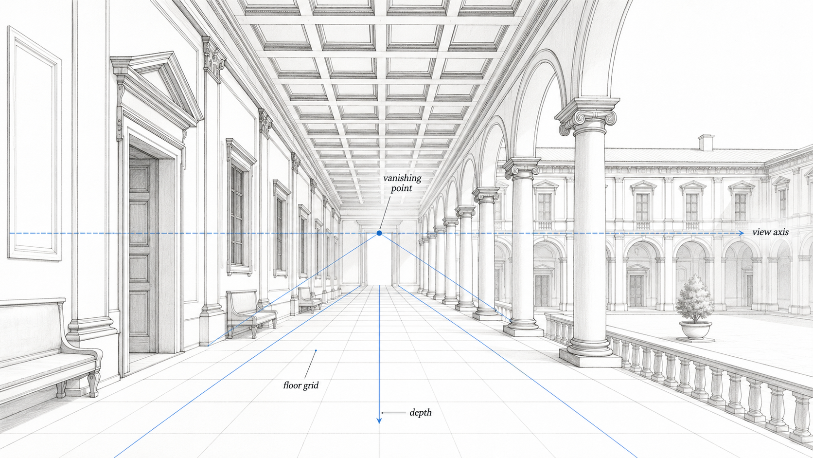
This is where Renaissance architecture becomes more than a collection of parts. It becomes a visual system. The building controls what you see, when you see it, and how far the space appears to extend.
That does not always mean calm. Late Renaissance and Mannerist buildings sometimes used perspective to create pressure, tension, or surprise. Once architects mastered the rules, some started bending them.
Domes, Porticoes, and Villas

Domes belong in Renaissance architecture, but they should not dominate every explanation.
For this page, the better example is the villa. A Renaissance villa could use symmetry, central planning, porticoes, and landscape views to make geometry part of daily life. Andrea Palladio’s Villa Rotonda is the clearest example. Its plan, four fronts, and relationship to the surrounding landscape make the building read as a complete system.
The lesson is not “add a dome.” The lesson is that center, approach, view, room sequence, and exterior form can work together.
Palladian design traveled far because it was easy to draw, publish, and adapt. That also made it easy to copy badly. A portico without site logic becomes a stage prop. Symmetry without plan discipline becomes a diagram, not a building.
Interiors Were Architectural Before Decorative
Renaissance interiors are often reduced to furniture, painted ceilings, wall panels, and rich finishes.
Those matter, but the stronger interiors were architectural first. Ceiling rhythm, floor pattern, window alignment, stair shape, wall thickness, and room sequence controlled the experience before movable decoration arrived.
A coffered ceiling could make a room feel measured. A floor pattern could pull the eye toward an opening. A stair could slow the visitor before the main room. A window could establish rank by deciding where light lands.
This is where modern “Renaissance style” interiors often go wrong. They borrow heavy furniture, gold trim, arches, and classical motifs, then forget the room itself. The ceiling is too flat. The windows do not line up. The wall has no depth. The furniture fights the architecture.
A better Renaissance interior starts with order. Where does the eye go first? Where does movement slow down? Which wall has weight? Which room is the main event?
Regional Styles Changed the Features
Renaissance architecture did not look the same everywhere.
Italy stayed closest to the classical source. France mixed Renaissance detail with château forms, steep roofs, and royal scale. Spain moved between surface richness and severe geometry. England adopted Renaissance ideas later, often through large houses, halls, brickwork, formal plans, and tall windows. The Low Countries mixed classical details with local civic façades.
| Region | Common Direction | Feature To Watch |
|---|---|---|
| Italy | Palaces, villas, courtyards, measured façades | Clear base-middle-top hierarchy and classical proportion |
| France | Renaissance detail on château massing | Steep roofs, tall silhouettes, formal fronts |
| Spain | Decorative Plateresque or severe Herrerian restraint | Surface treatment and strong geometric discipline |
| England | Late adoption through houses and civic rooms | Large windows, brickwork, formal plans, long galleries |
| Low Countries | Classical details mixed with local town façades | Gables, civic buildings, stone trim, street rhythm |
The shared language was order and proportion. Local materials, roofs, climate, and building habits changed the result.
How Renaissance Features Changed Over Time
Renaissance architecture was not frozen.
| Phase | What Changes | Feature To Notice |
|---|---|---|
| Early Renaissance | Clear geometry, measured arcades, calm human scale | Simple bays, round arches, readable proportions |
| High Renaissance | Stronger symmetry, central planning, idealized proportion | More complete control of plan, façade, and volume |
| Late Renaissance / Mannerism | Rules stretched, distorted, or made more tense | Stairs, walls, openings, and details begin to behave with pressure |
| Palladian influence | Villa logic becomes portable through drawings and books | Porticoes, symmetry, published ratios, repeatable fronts |
The early work corrected disorder. Later work tested how far the rules could bend.
Features That Look Renaissance but Do Not Work
This is the part most feature lists skip.
Renaissance architecture is easy to imitate badly because the visible parts are familiar. A designer can add pilasters, round arches, a cornice, a centered entry, and symmetrical windows. The building may look “classical” for a second, but still feel thin.
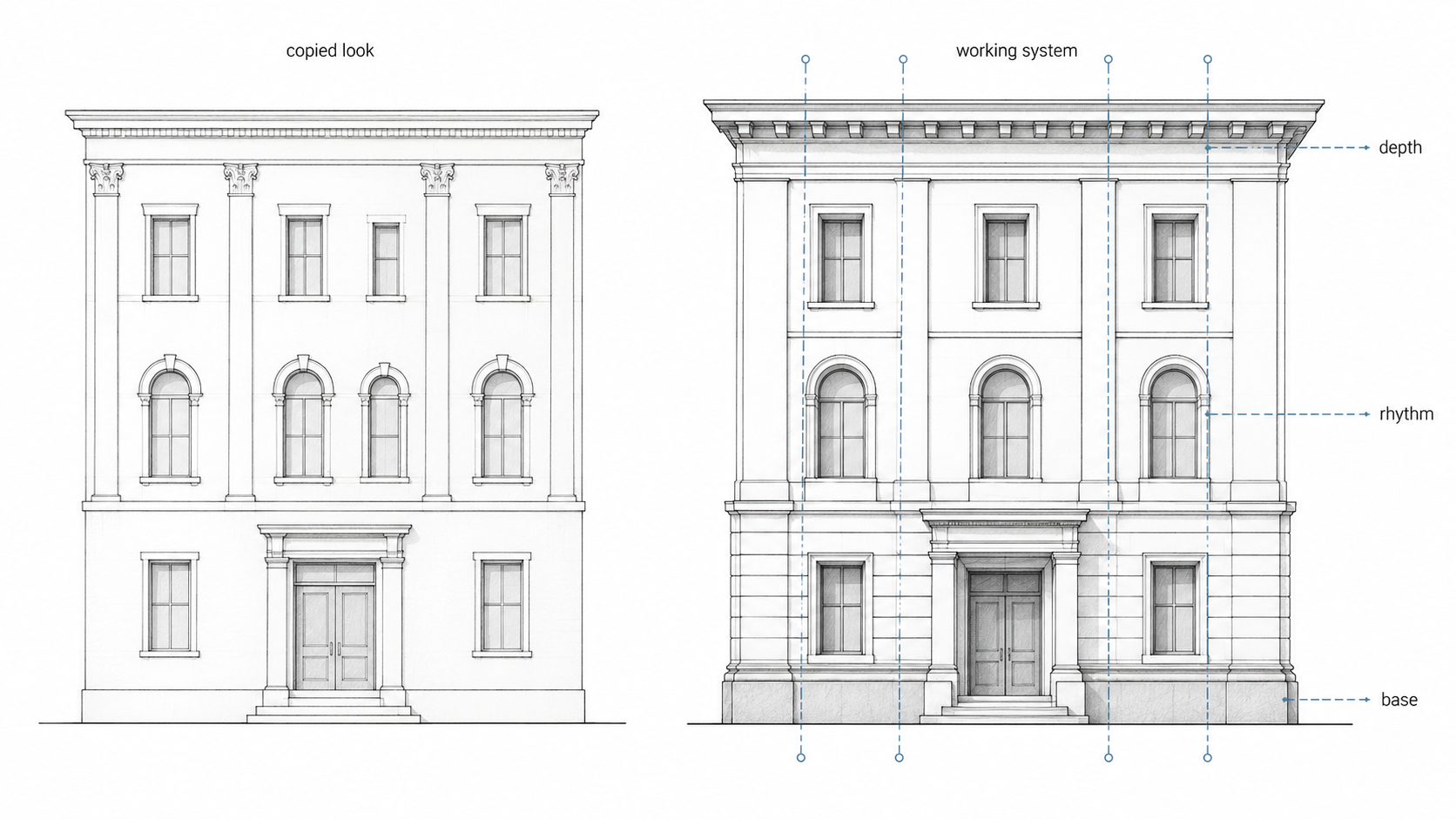
The problem is usually depth and hierarchy.
The base is too weak. The windows have no reveal. The pilasters are flat strips. The cornice casts no shadow. The door is centered but not important. The upper floors do not get lighter. The wall has decoration but no weight.
That is not Renaissance discipline. It is a costume.
The protective question is simple: what is this feature doing? If the feature does not control weight, rhythm, entry, shadow, proportion, movement, or hierarchy, it may be decoration pretending to be architecture.
Quick Identification Checklist
Use this when you are trying to identify a Renaissance-style building.
| Question | What To Look For |
|---|---|
| Does the façade have a clear base, middle, and top? | Rusticated base, main formal level, lighter upper floor, strong cornice |
| Are the openings aligned? | Windows follow a calm rhythm across floors and bays |
| Does the wall have depth? | Deep reveals, real shadow, strong masonry or plaster mass |
| Are classical elements used with order? | Pilasters, arches, columns, and cornices support the hierarchy |
| Does the plan organize movement? | Entry, courtyard, stair, main rooms, and service areas make sense together |
| Does the interior follow the architecture? | Ceiling rhythm, floors, windows, walls, and furniture support the room order |
Why These Features Still Matter
Renaissance features still matter because they teach discipline.
They remind designers that a façade is not only a surface. A window is not only an opening. A stair is not only a way up. A courtyard is not leftover space. A cornice is not trim. Each part can help the building read better, move better, and age with more dignity.
The best lesson is not to copy Renaissance buildings. It is to copy the level of judgment.
Use proportion before ornament. Use depth before trim. Use rhythm before decoration. Make the entry clear. Let the plan explain movement. Give the wall enough weight to hold the style.
Useful Reference Books
The Four Books of Architecture by Andrea Palladio is useful if you want to see how Renaissance villa logic, proportion, porticoes, and plans became a system that later architects could study and reuse.
Ten Books on Architecture by Vitruvius is the older classical source Renaissance theorists kept returning to for proportion, building judgment, materials, and architectural order.
FAQ
What are the main features of Renaissance architecture?
The main features are symmetry, proportion, classical orders, round arches, strong cornices, rusticated bases, courtyards, central planning, aligned windows, and controlled perspective.
How can you identify Renaissance architecture quickly?
Look for a clear base-middle-top façade, ordered windows, a strong cornice, classical details, balanced proportions, and a plan that organizes entry, courtyard, stair, and main rooms.
What makes Renaissance architecture different from medieval architecture?
Renaissance architecture usually reads as more horizontal, measured, and rational. It favors proportion, symmetry, classical orders, and clear façades instead of vertical drama and dense medieval complexity.
Are Renaissance features only decorative?
No. In strong buildings, the features control hierarchy, shadow, rhythm, entry, movement, and proportion. They fail when they become flat trim with no architectural job.
Why was proportion so important?
Proportion helped connect the parts of a building. Windows, floors, bays, doors, and cornices felt more convincing when they were measured against each other.
Why were courtyards important in Renaissance buildings?
Courtyards brought light into dense city buildings and organized movement, privacy, service access, and social rank.
What is the difference between Renaissance and Baroque architecture?
Renaissance architecture usually emphasizes clarity, balance, proportion, and restraint. Baroque Architecture came later and pushed movement, drama, contrast, and spatial pressure much harder.
Do architects still study Renaissance architecture?
Yes. They study it for proportion, façade hierarchy, classical orders, planning, perspective, and the way buildings control movement and visual order.
Read This Next
Renaissance Architecture gives the broader history of the style, including palaces, villas, courtyards, architects, and urban design.
Scale and Proportion in Architectural Design explains why spacing, rhythm, and human scale still matter in modern design.
Greek Architecture and Roman Architecture Style explain the older classical language Renaissance architects adapted.
Baroque Architecture is the natural follow-up if you want to see what happened when Renaissance balance turned into drama, movement, and pressure.