
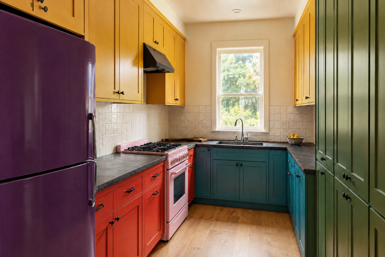
When the cabinet sample looked right in the showroom and looks wrong on the counter at home, nothing went wrong with the paint. The sample was judged against the wrong things. A kitchen color is never seen on its own. It is seen next to a countertop, a floor, a backsplash, and whatever bulbs are in the ceiling, and those four decide more about the result than the color name does.
Before choosing anything, work out which large surfaces are staying, what undertone each one carries, and what light the room gets. The color decision follows from those three.
One Step Above Faint
Bold has two separate controls, and most kitchens go wrong by turning the wrong one.
The first is commitment: how far the color sits from neutral, or whether it stayed in the white, beige, and gray range at all. The second is saturation, meaning how much pigment intensity that color carries. They move independently. A committed hue at low saturation and a timid hue at high saturation are very different rooms, and only one of them is easy to live with.
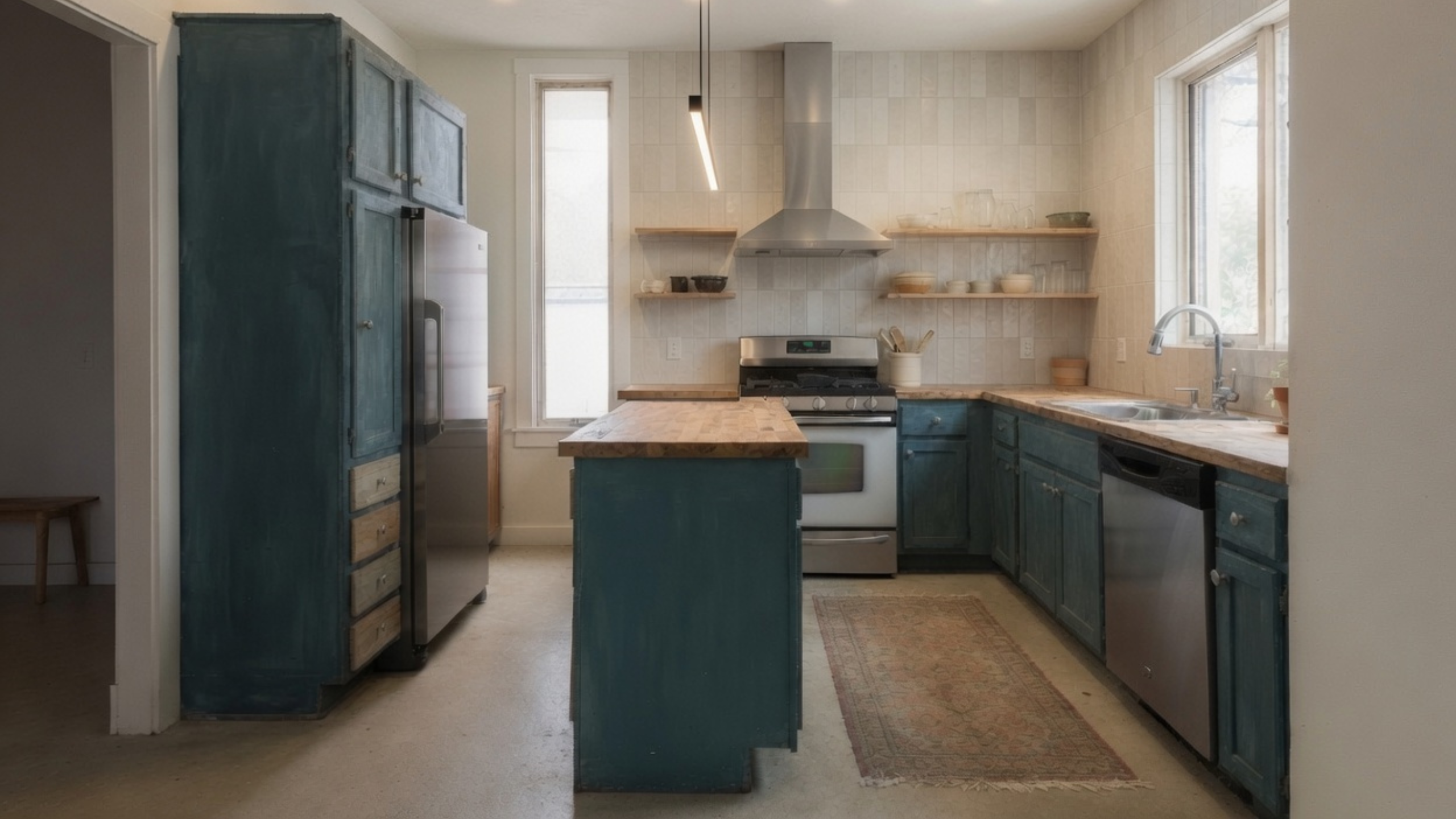
The kitchen above has committed. Nobody would call those cabinets neutral, and nobody would mistake the room for a white kitchen. But the saturation is held down: it is a grayed, chalky blue-green rather than a bright teal. That pairing is what reads as considered rather than loud, and it is roughly one step above faint rather than five.
Three practical things follow from keeping saturation low.
A muted color moves less under changing light. A highly saturated finish shifts further between morning and evening, and it bounces its own color onto whatever sits beside it. A saturated teal base cabinet throws green onto a white counter and a pale ceiling all day. A grayed version of the same hue does far less of it, which means fewer surprises after installation.
It also reads as settled. Paint loses saturation over decades as pigments break down under light and the binder chalks, so low-saturation color carries the visual signature of something that has been in the room a while. That is where the cozy, lived-in quality comes from, and it is difficult to buy any other way.
And it survives the trend cycle better. Fashion moves along the saturation axis more than the hue axis: green kitchens have been in favour for years, but which green keeps changing, and the change is mostly intensity. A muted color reads as a neutral with a direction, which is a much harder thing to date.
The cheapness people worry about does not come from color. It comes from matching. A saturated color usually arrives with the exact tile, hardware, and lighting it was photographed beside, so the whole room reads as one purchased package. The kitchen above pairs its teal with wood counters, plain cream tile, and stainless, none of which are trying to agree with it, and the result reads as accumulated instead of ordered.
Start With What Is Staying
An existing kitchen and a full remodel need different sequences.
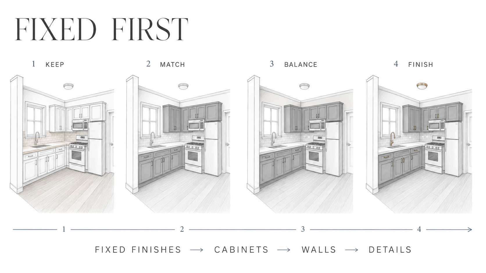
If the floor, countertop, and backsplash are staying, they are the starting point rather than the paint deck. A warm cream counter with yellow-beige movement will make an icy white cabinet look sharper and colder. Golden oak flooring can push a blue-gray toward steel. Repainting the walls cannot settle a disagreement between two large fixed surfaces, because the walls are usually the smallest visual share of the four.
In a full remodel there may be no fixed finish yet. Put the cabinet-door sample beside the actual countertop slab, or a large representative sample, then add backsplash and flooring. Approve the group before releasing the cabinet or stone order.
Read Each Finish Before You Look at Paint
Stand in the kitchen without trying to name a style. The useful question is not whether the room is modern or traditional. It is what each large surface does to the color beside it.
| Existing finish | What to inspect | What commonly goes wrong |
|---|---|---|
| Countertop | Background color, veining, and whether the stone leans pink, yellow, green, blue, or gray | A cabinet white matches one bright vein but fights the dominant background |
| Backsplash | Tile body, grout color, sheen, and pattern strength | A new paint color makes older beige grout look dirty |
| Flooring | Species, stain, tile undertone, and how much is visible from the kitchen | Cool cabinets make orange or red tones in the floor look stronger |
| Wood cabinets | Yellow, orange, red, or neutral-brown cast; grain strength; gloss level | Wall paint gets chosen to hide the wood instead of working with it |
| Appliances and metals | Bright white, black, stainless, warm brass, nickel, or bronze | Several unrelated metal temperatures unsettle a quiet palette |
Check the adjacent room as well. An open doorway can put the kitchen wall directly beside another paint color. They do not need to match, but a sudden jump from warm beige to blue-white looks accidental when both are visible at once.
Undertones, and Why Samples Match in the Store and Fight at Home
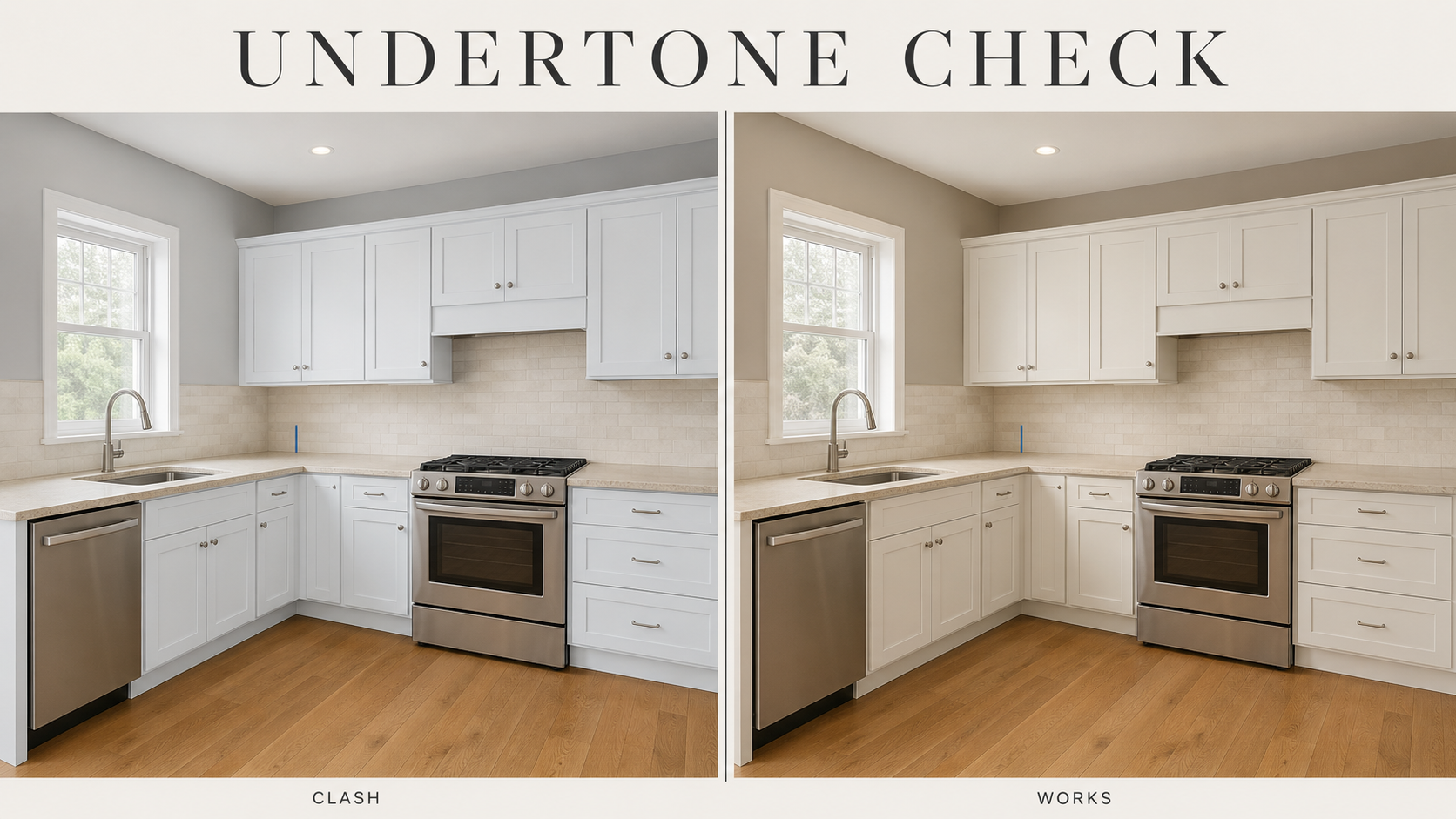
White, gray, beige, and cream are families, not colors. A white can lean blue, green, pink, or yellow. Gray carries blue, violet, green, or brown. Beige can turn pink beside yellow oak even when it looked neutral on the rack.
There is a name for the specific failure where two samples agree under one light and disagree under another: metamerism. It happens when two surfaces reflect light differently across the spectrum but land on the same apparent color under one particular source. Move them to a different light and the match falls apart. Store fluorescents and kitchen LEDs are exactly the pair that does this.
The practical defence is to judge at the joint. Place the cabinet sample against the countertop edge, not six feet away on the opposite wall. Move it beside the backsplash and down near the floor. A weak mismatch is easiest to see where two materials touch.
A perfect match is not always the goal. Warm wood can sit with muted blue or green if something bridges them: a countertop, wall color, or backsplash that relates to both. Without that middle note, the warm surface reads warmer and the cool surface reads colder.
For hue, value, saturation, and how color relationships work, see Color Theory for Interior Design.
The Number on the Back of the Chip
Every paint color has a Light Reflectance Value, and most people never look at it. LRV runs from 0, an absolute black, to 100, a pure white, and no real paint reaches either end. Sherwin-Williams, Benjamin Moore, and Behr publish it on the back of fan-deck chips.
It is the one objective number on the card, and it is more useful than the name. Benjamin Moore Simply White has a published LRV of 89.5. Sherwin-Williams Shoji White sits at 74. Both are sold as white, they are more than 15 points apart, and one will brighten a dim kitchen while the other quietly warms it. Shoji White has effectively crossed into greige territory, which the name does not tell you and the number does.
Rough working bands, useful for narrowing rather than deciding:
- Above 70 reads as light and keeps a room feeling open
- 50 to 70 has real presence but still feels airy
- 30 to 50 changes the mood of the room and needs decent natural light
- Below about 20 is genuinely dark and works best where the room supplies the light
The band that matters most is 50. Above it a color returns more light than it absorbs, below it the reverse, so a kitchen going below 50 needs its lighting plan revisited rather than assumed.
LRV also does something the color name cannot: it lets you compare two candidates numerically. Two colors that look near-identical on a screen or a mood board can sit well apart on the scale, and that gap is what shows up on the wall.
Kelvin Is Only Half of the Lighting Question
A cabinet color does not get the same light across a whole kitchen. The door beside a window can look clean and pale while the same finish under an upper cabinet looks deeper, grayer, or greener.
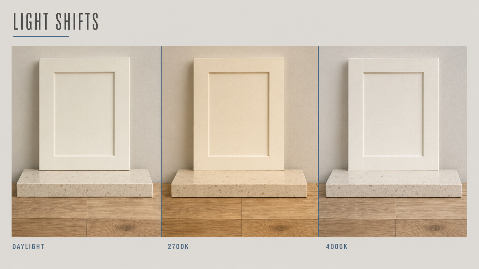
North-facing daylight strengthens cool undertones. West light adds warmth late in the day. Trees, brick walls, flooring, and nearby painted surfaces all reflect color into the room, so compass direction is only a starting point. Benjamin Moore advises checking paint under every lighting condition, and Sherwin-Williams documents the same color changing through morning, midday, and evening. As a rough marker, bulbs below about 3000K read warm and those above roughly 4000K read cool, with the neutral ground in between.
Colour temperature is the part most guides cover: 2700K warmer, 4000K cooler. The half they leave out is Color Rendering Index, which measures how accurately a light source shows color against natural daylight at 100. These two are independent. Two bulbs can share a Kelvin rating and render color completely differently.
Standard LEDs are typically CRI 80. At that level reds and deep saturated colors are muted and subtle undertones flatten out, which is precisely the information you are trying to read when judging paint. CRI 90 and above is the usual recommendation for rooms where color matters, and the difference shows most in kitchens.
The practical consequence: a sample judged under CRI 80 bulbs is being judged with the undertone partly hidden. Set the kitchen's bulbs, both temperature and CRI, before approving anything. If one ceiling fixture is warm and the under-cabinet strip is much cooler, a single cabinet door can appear to change color from top to bottom, and swapping bulbs is a cheaper fix than repainting.
Test at Kitchen Scale
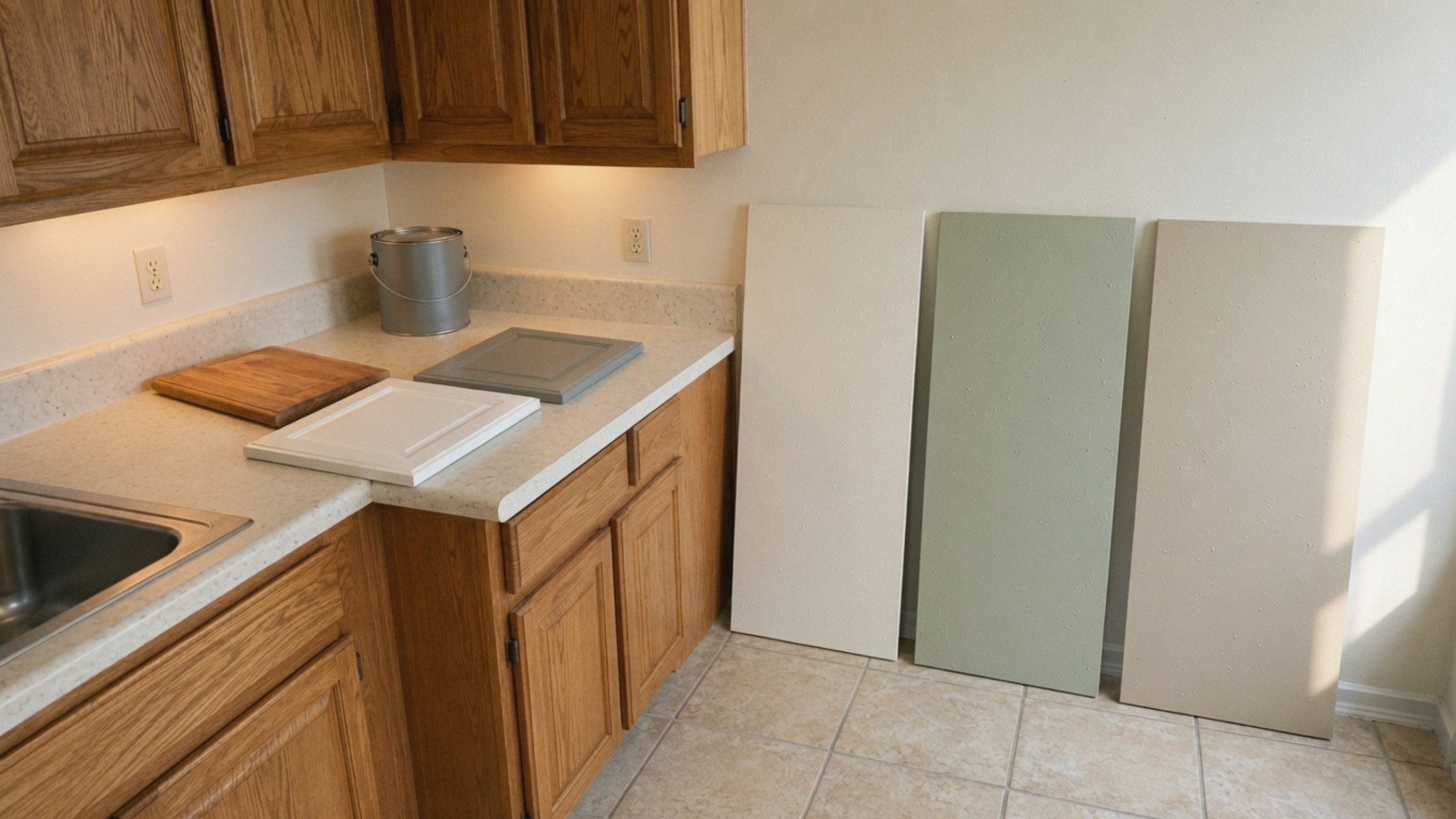
A two-inch chip is useful for eliminating colors and too small for approving one.
Use a large movable board for wall paint, around 18 by 24 inches, which gives enough area to read the color without painting competing patches on the wall. For cabinets, use a properly prepared sample door or finished panel, because substrate, primer, application method, and sheen all change the result.
Move the sample around the room. Check it beside the counter, under an upper cabinet, near the window, and at the darker end of the run. Look again in the morning, late afternoon, and after the lights come on.
Do not approve three finishes under three different conditions. Put cabinet, countertop, backsplash, and flooring samples together under the same light, because that is the group that has to work once it is installed.
Where the Stronger Color Should Sit
Color across every cabinet door has the largest effect and the highest cost to reverse. It works when the room has enough light, the finish has been tested along the whole run, and the color relates to the floor and counter.
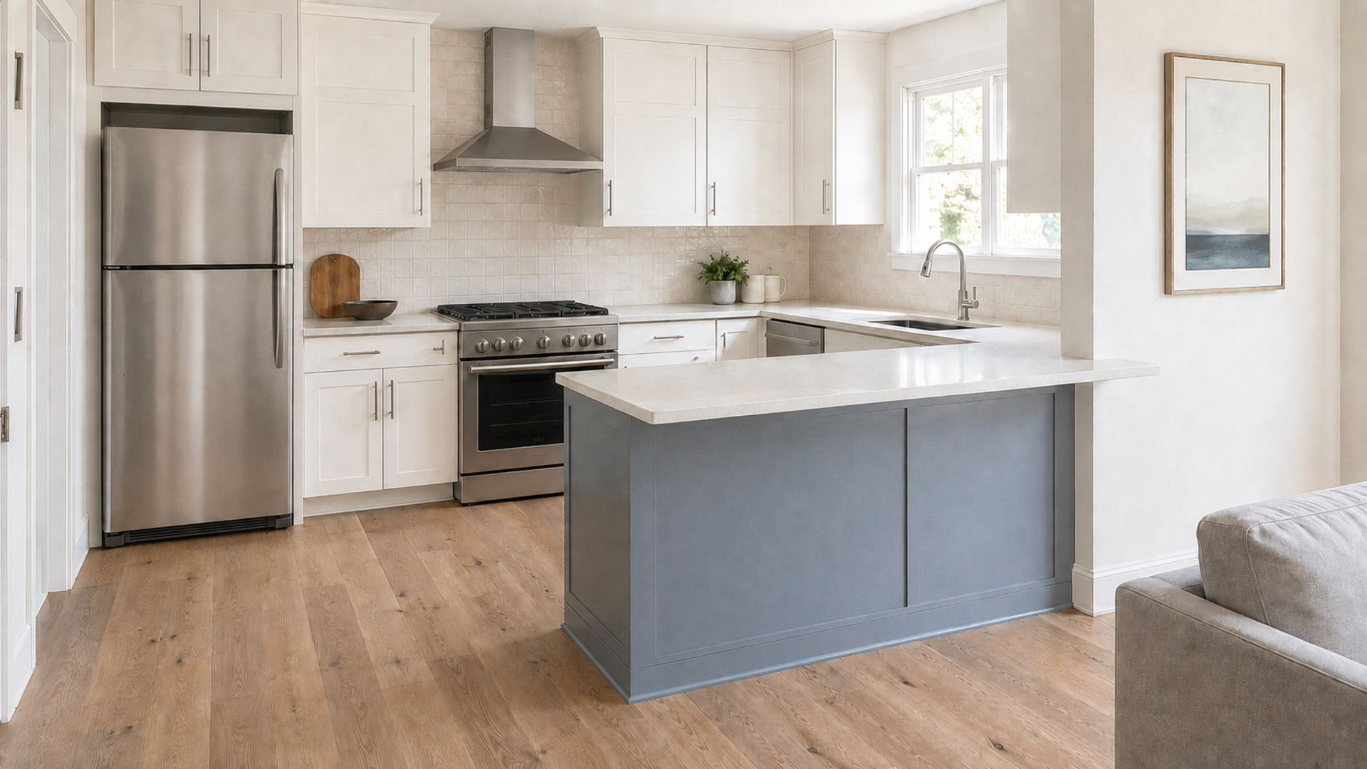
An island or peninsula is a smaller commitment. It can carry a deeper blue, green, or charcoal while the perimeter stays quiet. That contrasting section still needs a connection to the room: veining in the counter, repeated hardware, nearby upholstery, or a related wall color.
Walls are the least expensive place to make a substantial change, which makes them a sensible testing ground when cabinets and counters are staying. A backsplash is the opposite. Tile combines color, texture, grout, and pattern, and replacing it later is far more disruptive than repainting.
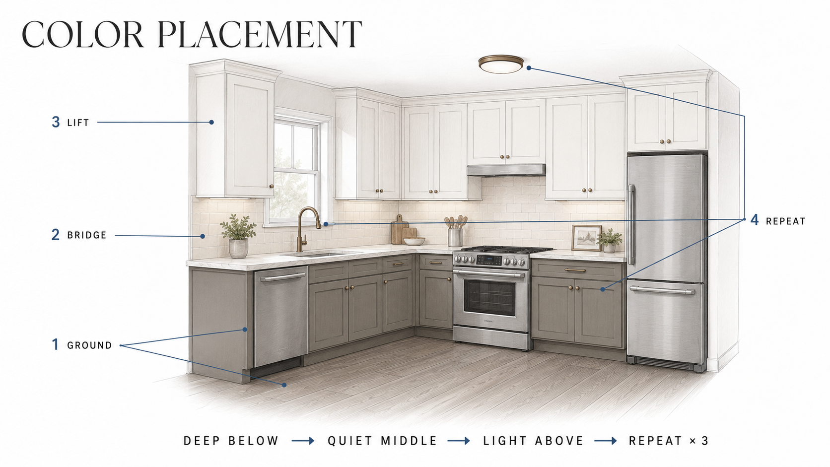
Height matters as much as position. The usual arrangement puts deeper colors low, quieter materials through the middle at counter and backsplash level, and lighter finishes on the upper cabinets and walls. That convention survives for three practical reasons rather than taste.
Base cabinets take the abuse. Feet, mops, cleaning products, and bags all land at toe-kick height, and a darker finish carries that wear where a pale one records it. Upper cabinets sit in your sightline, so dark ones close the room in at eye level in a way base cabinets never do. And light bouncing off the upper walls and cabinet fronts is what reaches the counter, which is where the work happens; dark uppers absorb it.
The convention breaks in specific cases. A kitchen with no upper cabinets has no upper mass to lighten. A room with a skylight or tall windows supplies its own light from above and can carry darker uppers. A single wall of full-height cabinets is one plane rather than a base and an upper, and reads better in one color than split.
One large color move is usually enough. Saturated cabinets want a quiet countertop and backsplash. Stone with strong movement wants quieter cabinets. The Kitchen Color Combinations page covers complete cabinet, counter, wall, and floor pairings.
How the Main Color Families Behave
White and off-white
White exposes nearby undertones quickly. A clean blue-white can suit cool stone and stainless, then make cream tile or warm quartz look yellow. Warm white is more forgiving with oak and aged finishes but can look dingy beside a bright white appliance. Compare the proposed white with trim, appliances, and countertop at the same time, since three almost-whites clash more visibly than one white paired with a deliberate color.
Cream, mushroom, and warm neutrals
Cream works with warm wood, beige stone, and traditional cabinetry. Mushroom and taupe quiet yellow oak without forcing the room into cold gray. The failure is uncontrolled warmth: cream cabinets, beige walls, golden flooring, and warm bulbs merging into one yellow cast. Separate them by value rather than hue, using a lighter wall or a deeper floor. The Cream Kitchen Cabinets page goes further into counters, walls, and hardware.
Gray
Gray should come from something already in the room: stone veining, stainless, slate flooring, or a cooler wood stain. Chosen only because it seems neutral, it can turn blue, violet, or green once installed. Warm gray and greige help where the kitchen holds both wood and cooler manufactured surfaces. Cool gray is difficult beside golden oak and cream stone. See Gray Kitchen Cabinets for specific pairings.
Blue
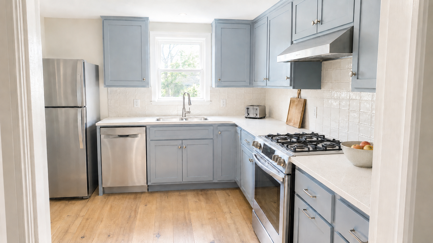
Muted blue-gray can read almost neutral in daylight and much deeper at night. Navy gives strong contrast against light counters, but a long dark run needs good task lighting so the work surface does not vanish beneath it. Blue is easiest to control when the rest of the room stays restrained, since patterned stone, blue cabinetry, and a decorative backsplash all compete for the same attention.
Green
Green changes character with its undertone. Yellow-green feels warmer and connects to oak, brass, and cream. Blue-green feels cooler beside white stone and nickel. A sage that looks gray on the card can turn mint under cool lamps or olive beside warm flooring. Check it against the view as well, because dense foliage reflects green into a bright kitchen through the summer.
Black, charcoal, and other darks
Dark cabinets can work in a small kitchen. The harder questions are whether the counters get enough light, whether there is contrast at the floor, and whether the run has visual breaks. Black also shows dust, fingerprints, and edge wear differently from a mid-value color, and it does not correct swollen doors or uneven old paint. It makes those easier to see.
Natural wood
Wood is already a major color. Honey oak carries yellow and orange, cherry brings red, walnut can lean purple-brown, and white oak is quieter until its finish warms it. Do not treat the cabinets as a neutral background when choosing wall paint. Compare against the grain and against the darkest and lightest areas of the doors. For honey oak with black granite specifically, where the surrounding colors have to manage both warmth and weight, see Honey Oak Cabinets With Black Granite.
Small or Dark Kitchens: Manage Contrast Before Brightness
Painting everything bright white does not reliably brighten a kitchen. With a dark floor, a black counter, and upper cabinets stopping short of the ceiling, the room still contains several strong visual breaks, and the eye stops at each one.
This is where LRV earns its keep. Rather than reaching for the palest paint available, compare the published LRV of the wall color and the upper cabinet finish and keep them close, so the two largest light surfaces read as one plane instead of two. A lighter backsplash returns light to the counter where the work happens. Under-cabinet lighting at a decent CRI often does more than moving from one pale wall color to another.
A dark kitchen can succeed when it is deliberate. Keep the working surfaces readable, provide task lighting, and avoid stacking several other high-contrast materials. Dark paint used to manufacture drama in a poorly lit room gets heavier after sunset.
Cabinet Condition Comes Before Cabinet Color
Paint updates a sound door. It does not repair a swollen particleboard edge, a loose box, a failing thermofoil skin, or a layout that blocks the dishwasher.
Check boxes, hinges, drawer slides, and door material before pricing paint. Solid boxes with serviceable doors justify cleaning, preparation, and a new coating. Good boxes with badly worn doors point toward refacing. Failing boxes or a poor layout move the decision to replacement.
Kitchen grease is an adhesion problem, and older high-sheen coatings need to be cleaned and dulled before repainting. Benjamin Moore's cabinet-preparation guidance calls for thorough cleaning, degreasing where needed, and sanding an existing high-sheen finish so the new coating can bond. Benjamin Moore lists satin, semi-gloss, and high-gloss as cabinet options; the product matters as much as the sheen, so use a coating meant to cure hard on cabinets and trim. Higher gloss reveals dents, brush marks, and uneven preparation more clearly.
Homes built before 1978 need one more check before sanding painted cabinets, walls, or trim. Disturbing lead-based paint creates hazardous dust, and the EPA recommends lead-safe practices and a lead-safe certified contractor where appropriate.
For how cabinet condition, layout, lighting, and oak finish interact in practice, see 1980s Kitchen Remodel: Before You Paint the Oak Cabinets.
Selection Order for a Full Remodel
- Confirm the layout and cabinet construction. Color cannot rescue a refrigerator squeezed against a wall or an aisle that is too tight.
- Approve a physical cabinet-door sample. Review the finish on the intended door material and sheen.
- Compare the countertop with that door. For natural stone, view the actual slab, since a small sample can miss the dominant movement.
- Add flooring and backsplash. Judge them together, at the same scale, under the same light.
- Set the bulbs. Temperature and CRI, both fixed before final paint approval.
- Choose the wall color last. It has the widest range of options and is the easiest major finish to change later.
Do not approve one sample in a cabinet showroom, another in a stone warehouse, and a third from a phone photograph. Bring the physical finishes together before ordering. A delay here costs less than repainting installed cabinets or replacing a backsplash approved on its own.
What Kitchen Photographs Hide
A photograph records the camera's exposure and white balance, then your screen changes it again. Bright interiors are usually edited so whites read cleaner, shadows lift, and wood looks less yellow. A color copied from a photograph may never reproduce in a room with different windows, bulbs, and fixed materials.
Photographs are useful for relationships: light cabinets over a darker floor, muted green beside warm wood, a dark island against a pale perimeter. The shade itself is not a specification, and the real work starts when physical samples reach the kitchen.
The Test You Cannot Run
One variable stays out of reach. A kitchen chosen in February has not been seen in July, and the difference is not small: summer foliage reflects green through the windows, winter light comes in at a lower angle and lasts fewer hours, and snow outside throws a cold bounce onto everything near the glass.
Nobody can sample their way around this. A north-facing kitchen approved under flat winter light will read differently once the trees fill in, and there is no way to check that in advance beyond keeping the sample boards and looking again in six months. Colors chosen close to neutral tend to shift most, because they have the least of their own character to hold onto.
Short Checklist
- List every large surface that is staying
- Identify the undertone and value of the countertop, floor, backsplash, and wood
- Look up the LRV of each paint candidate rather than judging by name
- Decide where the strongest color will sit
- Settle bulb temperature and CRI before approving paint
- Use large movable wall samples and a finished cabinet sample
- Check samples at the material joints, not separately
- Review in morning light, afternoon light, and after dark
- Inspect cabinet condition before assuming paint is the right repair
- For pre-1978 painted surfaces, address lead-safe work before sanding
FAQ
What is the safest kitchen color?
There is no universal answer. Warm white, soft mushroom, and natural wood are flexible, but each can still conflict with a particular countertop, floor, or bulb. The safest choice is the one tested against the finishes that are staying.
What is LRV and why does it matter?
Light Reflectance Value measures how much light a color returns, on a 0 to 100 scale printed on the back of most fan-deck chips. Above 50 a color returns more light than it absorbs. It lets you compare two candidates numerically instead of by name, which matters when two colors both sold as white sit more than 15 points apart.
Why did my paint sample look different at home?
Often metamerism: two surfaces can match under one light source and separate under another because they reflect light differently across the spectrum. Store lighting and kitchen LEDs are a common mismatch. Low-CRI bulbs make it worse by flattening the undertones you are trying to read.
What does bold mean in a kitchen color?
Two different things, and they move independently. Commitment is how far the color sits from neutral. Saturation is how intense the pigment is. A committed hue at low saturation reads as confident and settled; the same hue at high saturation reads loud and dates faster, because trend cycles move mostly along the saturation axis.
Should cabinets and walls share an undertone?
They should relate rather than match. A warm cabinet works with a muted cool wall when another material bridges them. Trouble starts when two near-neutrals sit side by side and expose unwanted pink, yellow, green, or blue.
What colors make a small kitchen look larger?
Lighter values and lower contrast. Keeping walls, upper cabinets, and backsplash close in LRV reduces the number of visual breaks. Good task lighting and a readable countertop matter more than finding the palest possible paint.
Can a small kitchen have dark cabinets?
Yes, when counters stay visible, task lighting is strong, and the palette is controlled. Dark cabinets get heavy alongside dark floors, weak lighting, and several busy finishes.
Is 2700K or 4000K better for kitchen colors?
Neither automatically. 2700K reads warmer, 4000K cooler and clearer. Choose one to suit the materials, then use it consistently while testing. Check the CRI as well, since two bulbs at the same Kelvin can render color very differently.
What sheen works for painted cabinets?
Satin and semi-gloss are both common. Use a cabinet or trim coating designed to level and cure hard. Semi-gloss reflects more light and shows preparation defects more readily; satin reads quieter.
Should old cabinets be painted or replaced?
Paint them when boxes, doors, and layout are serviceable. Consider refacing when boxes are sound but doors are past sensible repair. Replace when boxes are failing, water damaged, or cannot support the layout and appliances you need.
Sources and data
- Benjamin Moore, guide to warm and cool paint colors: checking paint under every lighting condition, and how warm and cool light sources affect color.
- Sherwin-Williams, how light and finish affect paint color: the same color through morning, midday, and evening light.
- Diamond Vogel, what is LRV: Light Reflectance Value scale and how it is used to predict how light or dark a color appears.
- Published LRV figures for named colors come from Benjamin Moore and Sherwin-Williams technical data. Confirm the current value for the specific color before ordering, since manufacturers restate them.
- Waveform Lighting, Color Rendering Index explained: CRI 80 as the general baseline and CRI 90 and above where color appearance matters.
- Benjamin Moore, painting kitchen cabinets: cleaning, degreasing, and sanding high-sheen coatings before recoating.
- Benjamin Moore, kitchen cabinet paint colors and finishes: satin, semi-gloss, and high-gloss cabinet options.
- United States Environmental Protection Agency, Renovation, Repair and Painting Program: lead-safe practices for pre-1978 housing.
- LRV and CRI figures are published values from manufacturers. Confirm the number for the specific color or bulb before ordering.