
Color of the Year is marketing. The useful part is the pattern behind the picks.
Every year, paint companies announce a Color of the Year. Every year, the same question follows: do I actually have to care about this?
The honest answer is no and yes. No, you do not have to paint anything. Yes, it is worth paying attention — not because the brands are always right, but because the colors they pick together usually say something true about where interiors are heading. And in 2026, they are all saying roughly the same thing: calm down.
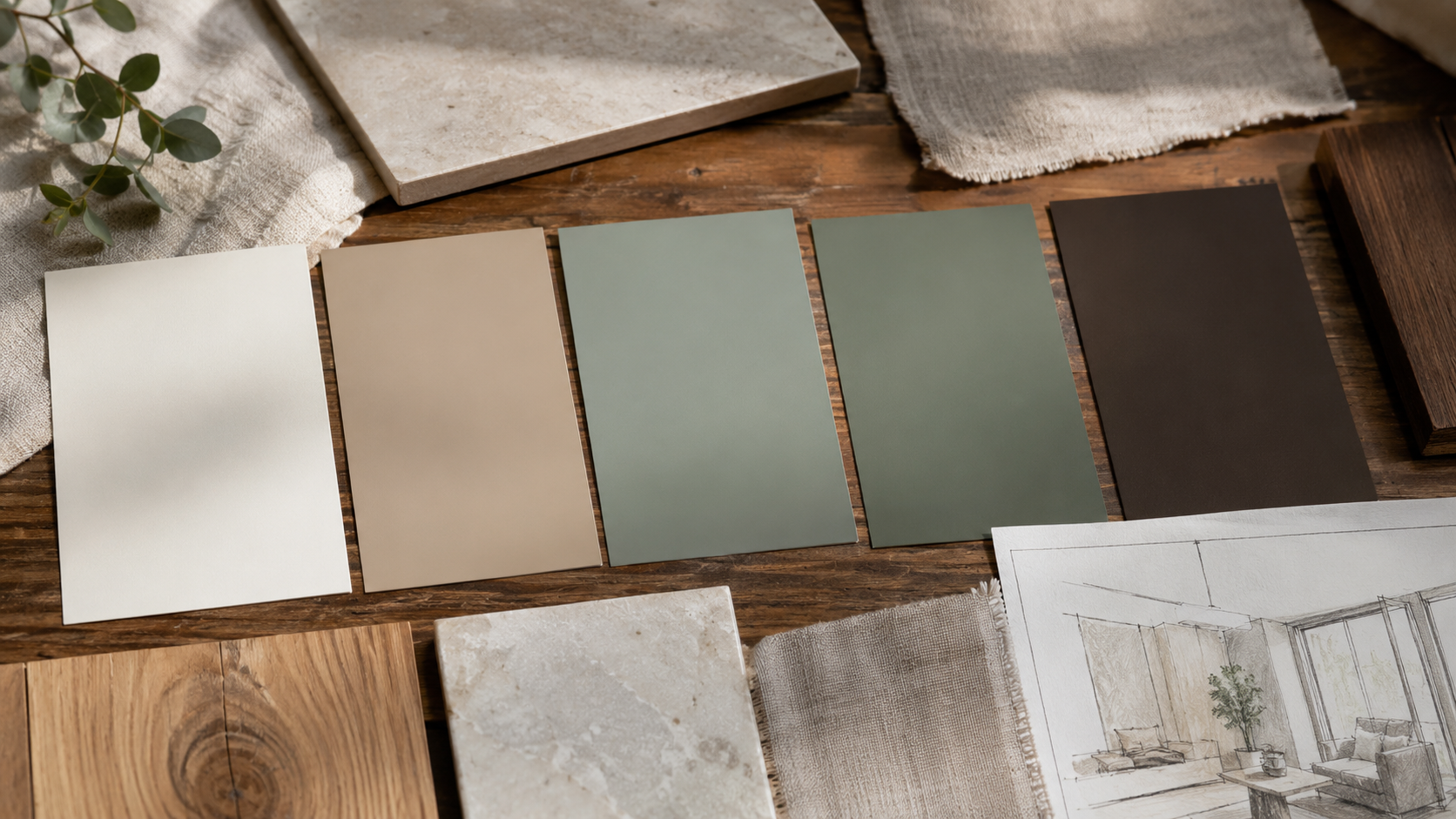
Soft white. Warm khaki. Smoky jade. Grounded eucalyptus green. Deep brown. Not one of these colors shouts. That is the point. After years of high-contrast interiors, bold accent walls, and colors that photograph well but are exhausting to live with, the industry is pulling back toward rooms that feel settled. Whether your house needs that or not is a different question.
What Colors Are Defining Interiors in 2026?
Pantone named Cloud Dancer — a soft white — as its 2026 Color of the Year. Sherwin-Williams chose Universal Khaki SW 6150. Benjamin Moore chose Silhouette AF-655, a dark brown with charcoal depth. Behr chose Hidden Gem, a smoky jade. Valspar chose Warm Eucalyptus, a grounded green.
These colors do not look the same on a fan deck and they do not belong to one tidy family. But put them in actual rooms and they are doing similar work: stepping back so the materials, furniture, and light can do the talking.
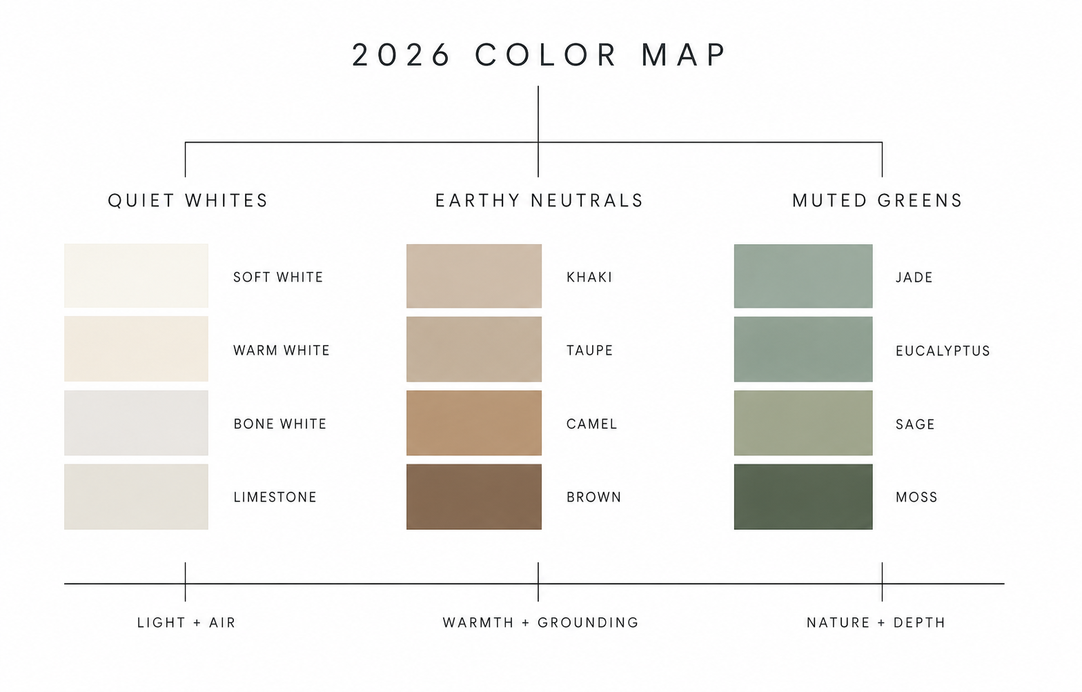
The white is not a hard builder white. The khaki is not old beige. The jade and eucalyptus are not bright greens. The brown is not just a dark accent. Together they point toward interiors that want less visual noise, more material depth, and fewer colors fighting for the same space.
Why 2026's Color Picks Feel Like a Warning
Here is the uncomfortable part: quiet colors expose rooms that have nothing else going on.
A soft white wall can look calm and considered in a room with warm wood floors, good daylight, textured linen, and trim that fits the architecture. In a room with bad lighting, no material contrast, and furniture that does not quite work together, the same white looks unfinished. Like someone ran out of ideas and called it minimalism.
Khaki can feel tailored and warm. It can also look exactly like old rental paint if the undertone clashes with the flooring. Smoky green can feel expensive and earthy. It can feel murky if the room already has yellow light, greenish tile, or too many finishes pulling in different directions.
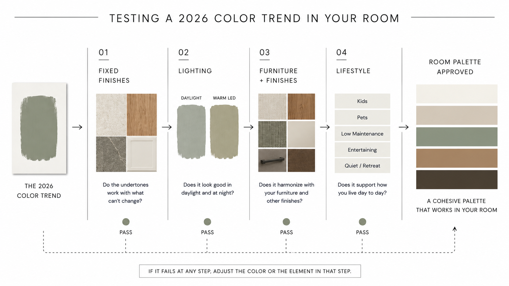
That is why Color of the Year is a signal, not an instruction. The trend points somewhere useful. It does not guarantee the color works in your specific room with your specific light and your specific furniture. You still have to do that part yourself.
Why White Became the Loudest Choice
Pantone picking a soft white is the clearest sign that 2026 is not about spectacle. A white shade only becomes interesting when everything around it is doing something.
For years, interiors bounced between two extremes: all-white minimalism that photographed beautifully but felt cold, and heavy color moments that made strong statements but were tiring to live inside. Cloud Dancer sits somewhere in the middle — it says the background can be the design, but only if the room has enough texture, warmth, and contrast to carry it.
In practice, soft white is not the easy choice it sounds like. It magnifies everything around it. Scuffed trim, cold light bulbs, weak furniture, cheap flooring, clutter — all of it becomes more visible against a quiet white wall. White is not forgiving. It is the hardest background to make look deliberate when the rest of the room has no plan.
Khaki Is the Return of the Useful Neutral
Sherwin-Williams picking Universal Khaki is a small rehabilitation of beige — and beige deserves it.
Not the flat builder beige used to cover mistakes and appeal to nobody. The better version: warm, slightly earthy, grounded, and genuinely easier to live with than stark white or the cool gray that dominated the last decade.
Khaki works because it bridges things. It can sit beside wood, leather, linen, black metal, off-white trim, stone, and muted greens without demanding to be noticed. That is useful in a way that a showier color is not.
The risk is undertone. Khaki can lean yellow, pink, or green depending on the light source and the finishes around it. Beside pink-beige tile it can look dirty. Beside cool gray flooring it can look flat and dull. Test it for 48 hours beside your actual fixed finishes before deciding it is safe.
Brown Is Becoming Structure, Not Just Mood
Benjamin Moore's Silhouette reflects another shift: deep brown is quietly replacing some of the black, charcoal, and navy that carried a lot of interior work over the past several years.
Brown gives depth without the sharpness of black. It works with wood instead of competing with it. It can make a dining room, study, powder room, built-in wall, kitchen island, or trim package feel genuinely grounded rather than just dramatic.
The catch is that deep brown needs real lighting. In a room with one overhead fixture and nothing else, it gets heavy fast. In a room with wall lights, table lamps, art, daylight, and lighter textiles giving it room to breathe, it becomes structure. That is the difference between moody and muddy, and the difference is usually just the lighting plan.
Green Is Becoming the New Background Color
Behr's Hidden Gem and Valspar's Warm Eucalyptus both show where green is going. The 2026 greens are not clean mint, bright sage, or jewel-tone emerald. They are smoky, gray-green, blue-green, or warm green — colors that read almost like a neutral while still giving the room something to say.
Muted green works especially well with wood, cream, stone, brass, linen, dark brown, and black. It can calm a kitchen, soften a bedroom, or make a living room feel less cold without turning the room into a nature theme. That versatility is why it keeps appearing across different brands at once — it is filling a real gap between neutral and interesting.
The common failure is ignoring the light. Warm bulbs can push some greens yellow. Cool daylight can pull others toward blue-gray. A color that looks calm and grounded on a screen can look sickly or muddy beside the wrong floor. Sample it first and check it at night with the lights you actually use.
How Quiet 2026 Colors Work in Real Rooms
Quiet colors need backup. They need texture, layered materials, and real contrast — otherwise they just read as absence of decision rather than presence of design.
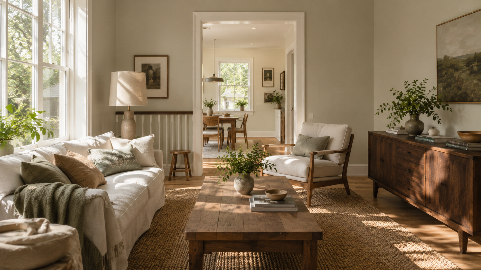
A warm neutral wall with a linen sofa, wood table, dark frame, and muted green accent can feel finished. The same wall with flat white trim, cold bulbs, and no texture can feel like primer that was never followed up.
A smoky green cabinet can look expensive with warm wood counters and stone. It can look tired beside a busy backsplash and a cool gray floor that pulls in the opposite direction.
A dark brown wall can make a small room feel intentional and rich. It can also swallow the room if there is no lighter ceiling, no lamp light, no reflective surface, and nothing to push back against the dark.
The 2026 colors are not hard to use. They are hard to use without a plan.
You Do Not Have to Choose the Color of the Year
This part matters more than the color choices themselves.
You do not have to repaint because a brand made an announcement. You do not have to like Cloud Dancer, Universal Khaki, Silhouette, Hidden Gem, Warm Eucalyptus, or any other 2026 pick. Trend awareness is useful. Blind trend following is expensive and rarely produces a room you actually want to live in.
A color has to suit the house first. Then the room. Then the person living there.
If you cook every night, a pale kitchen wall that shows every mark may annoy you within six months. If your living room gets weak north light, a smoky green may feel colder than you expected. If your house already has orange-toned wood floors, the wrong khaki will make those floors look louder, not quieter. If you need a room to feel energetic and bright, a quiet white may feel dead by Tuesday.
Use the trend as a filter, not an order. Ask whether the color works with your light, your fixed finishes, your furniture, your cleaning habits, and the way the room actually feels at 8pm on a normal weeknight. If the answer is no, skip it. A color that fits your life will age better than one that only fits the year.
The 2026 Palette That Actually Works
The safest way to use this trend is not to copy one color but to build a small palette around the idea behind all of them.
| Color family | Best use | Where it can fail |
|---|---|---|
| Soft white | Walls, ceilings, trim, gallery-like rooms, calm backgrounds | Can look unfinished without texture, warm light, or contrast |
| Warm khaki | Living rooms, bedrooms, halls, whole-house base color | Can look dull beside cool gray floors or dirty beside pink-beige tile |
| Smoky green | Cabinets, bedrooms, built-ins, accent rooms, furniture | Can turn muddy with yellow light or busy finishes |
| Warm eucalyptus | Bedrooms, bathrooms, kitchens, quiet living rooms | Can feel too soft if the room has no dark anchor |
| Deep brown | Trim, doors, libraries, dining rooms, powder rooms, furniture | Can get heavy without layered lighting and lighter materials |
A strong 2026 room might use soft white on the ceiling, warm khaki or neutral on the walls, wood as the main material, muted green on one controlled surface, and dark brown for grounding. That is not trendy in a fragile way. It is practical in a way that will still look right in five years.
What These Colors Fix
They fix the overuse of cold gray, which dominated interiors for most of the 2010s and wore out its welcome. They soften hard modern interiors that started feeling clinical. They work with older furniture, imperfect floors, and real lived-in homes better than stark white does. They make natural materials — wood, stone, brick, linen — feel chosen rather than accidental.
They also help open-plan homes. A quiet wall color can connect living, dining, and kitchen zones without making every area identical. Then green, brown, black, brass, wood, or fabric can do the accent work without the background fighting back.
For older houses especially, the 2026 palette can be genuinely useful. Warm neutrals and deep browns often sit better with wood trim, older floors, brick fireplaces, stone, and creamy tile than clean gray or bright white ever did.
Where These Colors Fail
They fail when people expect them to do all the work.
A calm wall color cannot fix bad lighting. A green cabinet cannot fix a chaotic backsplash. A dark brown accent wall cannot fix a room with no furniture plan. A soft white cannot fix a room where the trim, ceiling, and flooring all have different undertones pulling in different directions.
Another failure is using every 2026 color at once. White, khaki, jade, eucalyptus, brown, terracotta, black, brass, and wood can coexist, but only if the room has discipline. Most rooms do not need that many moves. One base, one support color, one anchor, one accent. That is usually enough.
How to Use the Trend Without Repainting the Whole House
Start small if the room already works.
- Bring in muted green through a side table, lamp, cabinet interior, pillow, or picture frame before painting a full room.
- Test dark brown through wood, leather, frames, trim, or one piece of furniture before committing to dark walls.
- Hold khaki or soft white samples beside your actual floor and trim for two full days before buying paint in quantity.
- Change the bulb temperature first and see what happens. A color can look wrong in a room because the light is wrong, not the color.
Paint is cheaper than most finishes, but a bad repaint still costs time, labor, and the frustration of living with something you do not like while you decide whether to fix it. Sample before you commit.
What to Skip in 2026
Skip the idea that one trendy color can make a room feel current. It cannot, and rooms that rely on it look dated faster than rooms built around materials and light.
Skip bright accent walls with no support color elsewhere in the room. Skip cold white walls beside warm floors without checking the undertones first. Skip smoky green in a dim room that already has yellow light. Skip dark brown without enough lamps, daylight, or lighter surfaces to keep it from going heavy.
And skip repainting just because a company attached a year to a color chip.
Before You Pick a 2026 Color
- Hold the sample beside your flooring, trim, counters, tile, and the largest piece of furniture in the room.
- Check it in morning light, afternoon light, and evening light.
- Turn on the bulbs you actually use at night and look at it again.
- Compare it against white paper to see the undertone clearly.
- Decide what the room actually needs: calm, warmth, contrast, or energy.
- Choose the color only if it helps the room do that job.
FAQ
What is the Color of the Year 2026?
It depends on the brand. Pantone chose Cloud Dancer, a soft white. Sherwin-Williams chose Universal Khaki. Benjamin Moore chose Silhouette. Behr chose Hidden Gem. Valspar chose Warm Eucalyptus.
Should I paint my house the Color of the Year?
Only if it works with your light, your finishes, your furniture, and the way you actually use the room. A trend color that clashes with your flooring or looks wrong at night is still the wrong color.
Why are 2026 colors so quiet?
The larger pattern is a move toward calmer interiors, warmer neutrals, muted greens, and deeper grounding colors. These shades are designed to work as backgrounds — so materials, texture, and light can do the interesting work.
Is white really a color trend for 2026?
Yes, but not hard sterile white. The version that works is softer and warmer, and it only looks good in rooms that have texture, wood, fabric, shadow, and contrast giving it something to work against.
Are green paint colors still popular in 2026?
Yes, but the useful greens are muted, smoky, gray-green, blue-green, or eucalyptus-like. Bright greens are harder to use across a full room without tipping into theme territory.
Is brown replacing black in interiors?
In some rooms, yes. Deep brown gives contrast with more warmth than black. It works well for trim, furniture, built-ins, dining rooms, studies, and small rooms with good layered lighting.
What is the safest 2026 color to use?
Warm khaki or a soft warm neutral is usually the safest full-room option. Soft white and muted green need more testing because lighting and undertones can shift them quickly in ways that are hard to predict from a sample chip.
What is the biggest mistake with 2026 color trends?
Copying the color without understanding what it is trying to do. The useful trend is calm backgrounds, natural materials, muted greens, earthy neutrals, and controlled contrast — not any specific paint chip.
Read This Next
- Color Theory for Interior Design
- Color Psychology Basics
- Neutral Color Palettes
- Kitchen Color Combinations
- Paint Undertone Test
References
- Pantone, Color of the Year 2026: Cloud Dancer.
- Sherwin-Williams, 2026 Color of the Year: Universal Khaki SW 6150.
- Benjamin Moore, Color of the Year 2026: Silhouette AF-655.
- Behr, 2026 Color of the Year: Hidden Gem.
- Valspar, 2026 Color of the Year: Warm Eucalyptus.