
Illustration by ArchitectureCourses.org. The 14 patterns work best when they change light, air, view, material, refuge, movement, and maintenance—not when they are treated as decoration.
The 14 patterns of biophilic design are useful only when they change how a space works. A plant wall may look natural, but it does not fix glare, stale air, dead corridors, hard acoustics, or rooms where nobody has a place to recover from noise.
Good biophilic design starts with the room, not the decoration. It gives people daylight without glare. It gives them views without overheating the room. It uses natural materials where touch matters. It creates open views, protected corners, moving light, fresh air, seasonal change, and small moments of surprise.
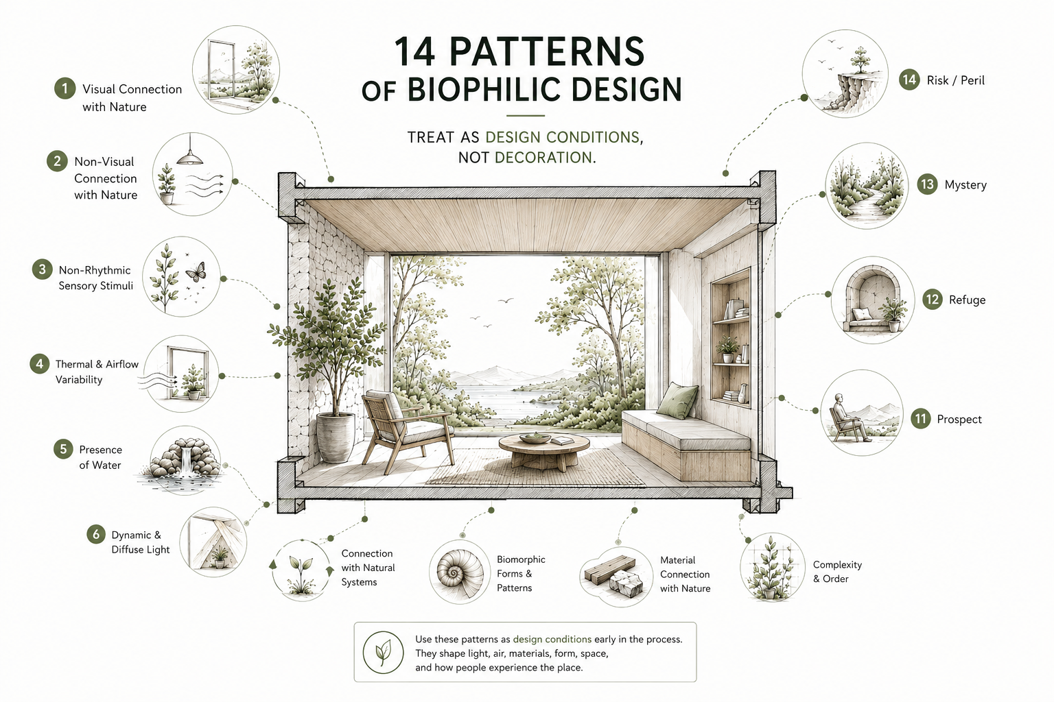
Illustration by ArchitectureCourses.org. The 14 patterns of biophilic design work best as design conditions, not decoration. Views, daylight, airflow, water, plants, natural materials, prospect, refuge, mystery, and risk all shape how a space feels and functions.
Use the 14 classic patterns as design checks. They can help test a room, office, school, clinic, lobby, courtyard, or building detail before calling it biophilic.
Note: The classic framework uses 14 patterns. Terrapin Bright Green’s newer 14+ Patterns edition also discusses a 15th pattern, Awe. This article uses the classic 14-pattern framework, then briefly explains where Awe fits.
The 14 Patterns Are Design Checks, Not Decoration Ideas
The easiest mistake is treating biophilic design as a finish package: plants, wood, green paint, a nature mural, maybe a water feature near reception. Some of that can help. None of it proves the room works.
A better test is simple. Ask what the pattern changes.
- Does it improve daylight, view, air, sound, comfort, or orientation?
- Does it give people a place to look out, step back, focus, recover, or move through?
- Can someone maintain it without closing the room, damaging finishes, or letting water sit where it should not?
If the answer is no, the design may still be attractive. It just may not be doing much biophilic work.
The Three Groups

Illustration by ArchitectureCourses.org. The patterns fall into three practical groups: direct nature, natural analogues, and spatial conditions such as prospect, refuge, mystery, and controlled risk.
The 14 patterns are easier to use when you group them by what they affect. Some bring nature directly into the space. Some use natural shapes, materials, and patterns. Others shape the room itself so people feel open, protected, curious, or safely exposed.
| Group | Patterns | What It Changes |
|---|---|---|
| Nature in the Space | 1–7 | Direct contact with light, air, water, plants, view, weather, and seasonal change. |
| Natural Analogues | 8–10 | Shapes, materials, textures, and ordered complexity borrowed from nature. |
| Nature of the Space | 11–14 | Spatial feelings: prospect, refuge, mystery, and controlled risk. |
Nature in the Space
These patterns work with real natural conditions: view, air, water, daylight, plants, weather, and seasonal change. They are usually the most visible patterns, but they also fail the fastest when nobody thinks about glare, humidity, drainage, access, or cleaning.
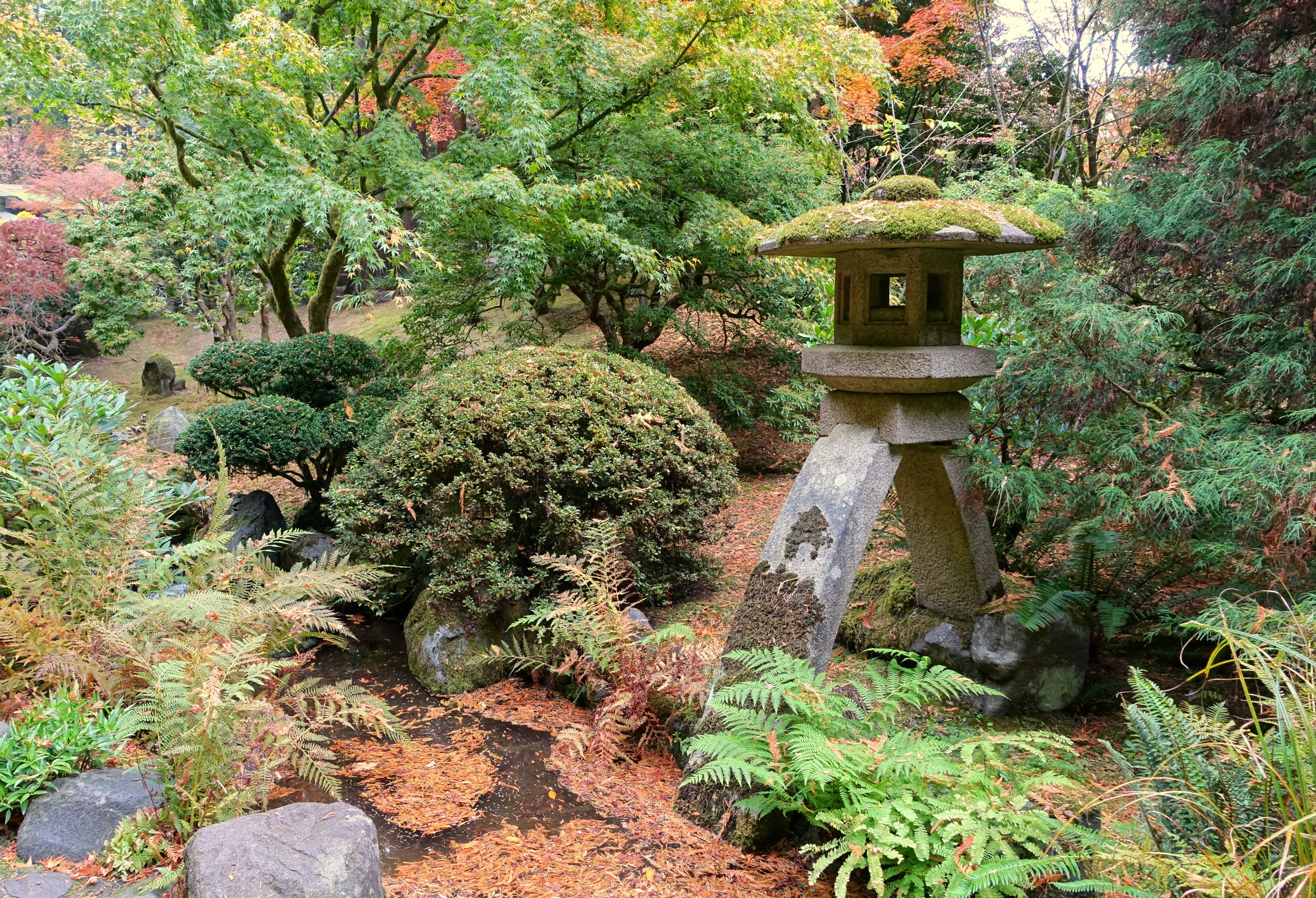
1. Visual Connection with Nature
This is the pattern most people understand first: seeing trees, sky, water, planting, a courtyard, a green roof, or even a small planted edge outside the window.
The important word is connection. A tiny plant in the corner is not the same as a real view. A window that faces a blank wall is not doing much. A glass wall with brutal glare may create stress instead of relief.
Use this pattern where people pause, work, wait, recover, or eat. Desks, hospital beds, classroom seats, reception areas, and break spaces benefit more than storage rooms and corridors.
Watch for: glare, overheating, privacy loss, dead winter views, and blinds that stay closed all day.
2. Non-Visual Connection with Nature
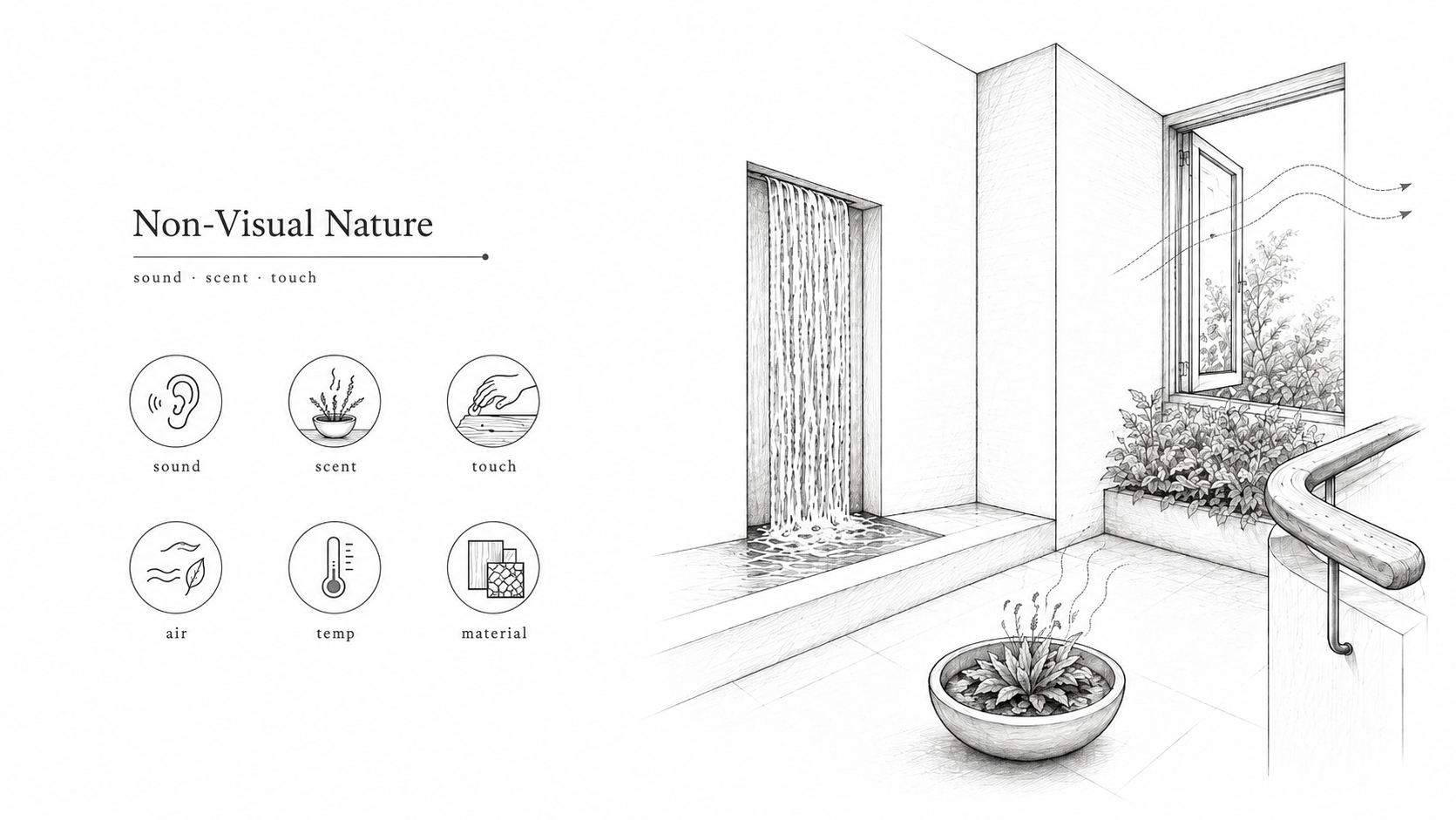
Illustration by ArchitectureCourses.org. Non-visual connection with nature comes through sound, scent, touch, airflow, temperature, and material feel, not only through views.
Not every natural connection is visual. Sound, scent, touch, air movement, temperature, and material feel also matter.
A room with a quiet water sound, breathable material, operable window, textured handrail, or fresh planted threshold can feel more natural than a room full of fake greenery. The body notices more than the eye does.
This pattern is useful in interiors where the view is weak. It can also help in deep-plan offices, clinics, schools, and apartment corridors where direct outdoor connection is limited.
Watch for: artificial scents, noisy water features, overused fragrance, scratchy textures, and anything that bothers people with allergies or sensory sensitivity.
3. Non-Rhythmic Sensory Stimuli
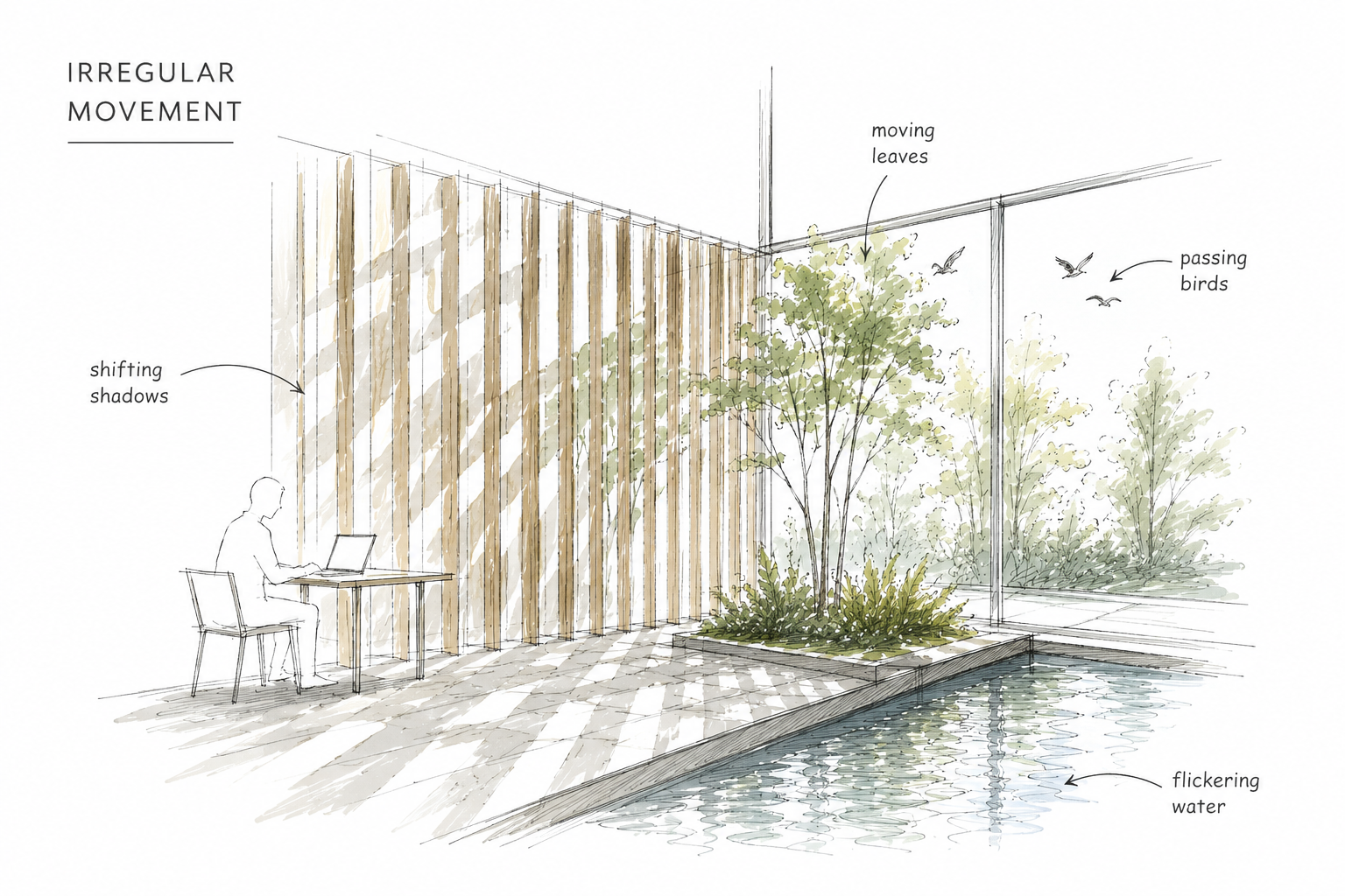
Nature rarely moves like a clock. Leaves shift. Reflections flicker. Shadows slide. Water ripples. Birds pass through and disappear.
This pattern uses small, irregular sensory changes to keep a space from feeling dead. It can be as simple as moving shadows from a screen, reflected daylight from water, a light curtain moving in air, or planting outside a window.
Use it lightly. A little irregular movement helps a room feel alive. Too much becomes distraction.
Watch for: animated lighting effects, gimmicky moving walls, noisy kinetic features, and anything that pulls attention away from work or rest.
4. Thermal and Airflow Variability
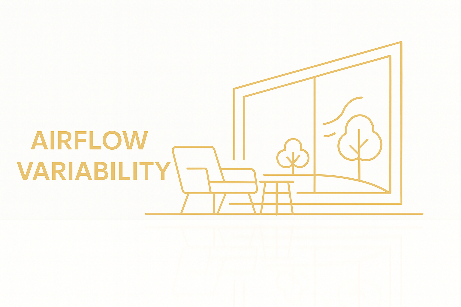
Sealed rooms with one flat temperature can feel lifeless. Natural environments have small changes: a cooler edge near a window, a warmer patch of sun, a light breeze, a sheltered corner.
This pattern does not mean making people uncomfortable. It means giving gentle variation and, when possible, some control. Operable windows, ceiling fans, shaded openings, mixed-mode ventilation, radiant surfaces, and protected outdoor rooms can all help.
In offices, this pattern needs discipline. One person’s breeze is another person’s complaint. Put adjustable air and operable windows where they can be controlled without ruining the rest of the room.
Watch for: drafts, condensation, uneven heating, blocked vents, and windows that fight the HVAC system.
5. Presence of Water
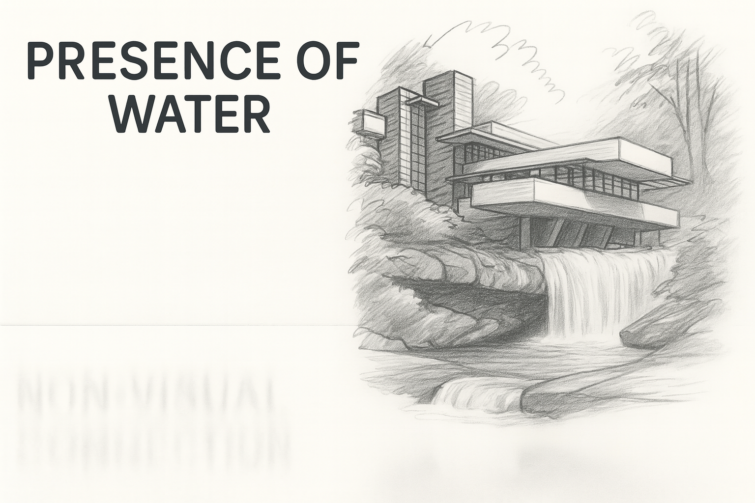
Water can calm a space, cool an edge, mask harsh noise, and create movement. It can also leak, stain, grow algae, attract maintenance calls, and become a liability if the detail is lazy.
Use water where it has a real job: a courtyard rill, a rain chain, a visible stormwater route, a shallow reflecting basin, or a small sound-masking feature in a waiting area. Keep it simple and serviceable.
Watch for: splash, slip risk, hidden pumps, poor drainage, hard-water staining, mosquito risk, and decorative fountains nobody wants to maintain.
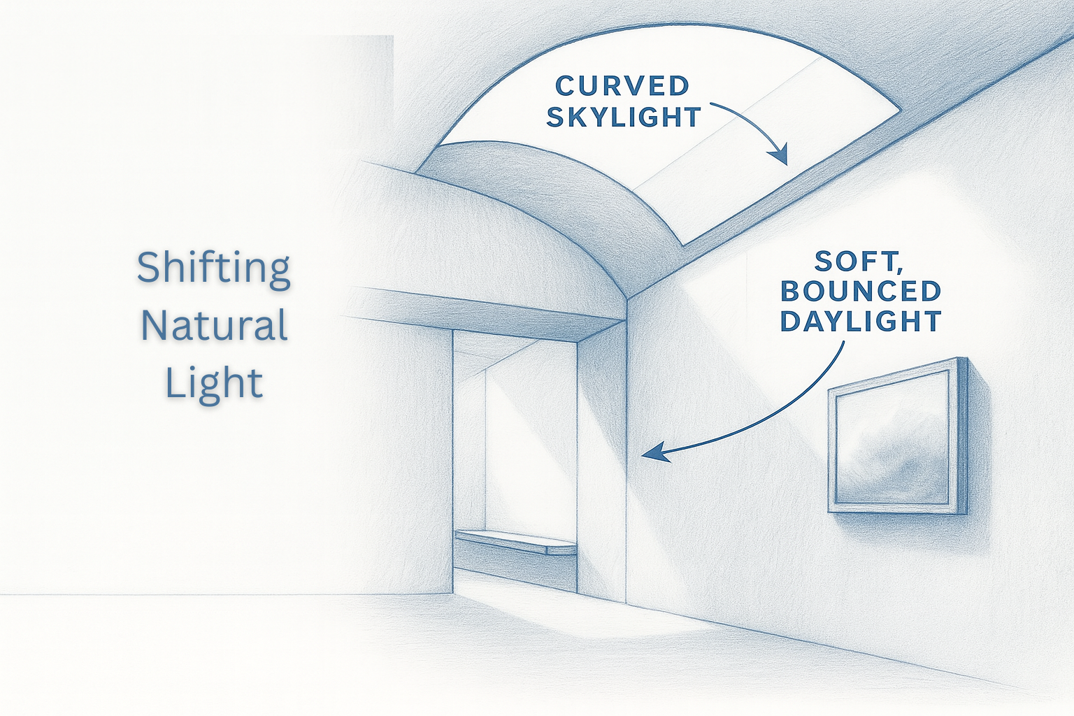
6. Dynamic and Diffuse Light

Daylight should not mean glare. The best biophilic light changes through the day but stays usable. It gives the room a sense of time without making screens unreadable or overheating one side of the plan.
Useful tools include light shelves, clerestories, shaded windows, translucent surfaces, deep reveals, skylight baffles, borrowed light, and soft reflected light from pale surfaces.
This pattern is especially important in schools, offices, studios, clinics, and homes where people spend long hours indoors.
Watch for: direct sun on screens, overheated south or west glass, dark middle rooms, and skylights without glare control.
7. Connection with Natural Systems
This pattern connects people with seasons, weather, growth, decay, rain, planting cycles, and ecological change. It is more than adding plants. It is the feeling that the building belongs to a living system.
A courtyard that changes through the year does this. So does a green roof visible from above, a rain garden, a planted schoolyard, deciduous shade, pollinator planting, or a lobby garden that changes with the season.
The best version makes time visible. The weakest version freezes nature into a permanent decorative scene.
Watch for: planting that dies indoors, fake seasonal displays, irrigation nobody checks, and exterior planting that blocks daylight or damages the envelope.
Natural Analogues
Natural analogues do not require direct contact with living nature. They use forms, materials, textures, and patterns that remind the body of natural systems. This is where biophilic design often becomes fake. A leaf-shaped ceiling panel is not useful by itself. It needs scale, order, material sense, and a reason to exist.
8. Biomorphic Forms and Patterns

Biomorphic forms borrow from living shapes: leaves, shells, branches, bones, waves, nests, and river stones. They can soften a room and make movement feel more natural.
Use this pattern where shape helps function. Curved benches can guide circulation. Branching ceiling baffles can organize lighting and acoustics. A soft-edged stair can make a lobby less rigid.
It goes wrong when the form is decorative but harder to build, clean, repair, or understand.
Also useful: Parametric Design Case Study: The Heydar Aliyev Center.
Watch for: expensive curves with no spatial benefit, awkward junctions, fake organic shapes, and panels that look natural but fight the structure.
9. Material Connection with Nature
This pattern uses materials that feel connected to the natural world: wood, stone, clay, cork, lime plaster, bamboo, rammed earth, wool, leather, exposed aggregate, and other tactile surfaces.
The point is not luxury. The point is contact, aging, warmth, texture, and honesty. A real wood handrail can matter more than a feature wall nobody touches.
Materials also bring consequences. Wood moves. Stone stains. Clay and plaster need the right moisture conditions. Plant-based materials can fail if the assembly traps water.
Watch for: fake wood film, sealed stone that still stains, rough surfaces in high-touch areas, and natural materials used where moisture or abuse will ruin them.
10. Complexity and Order
Nature is not blank. It has layered order: leaf veins, bark, waves, branching, shells, honeycombs, stone grain, shadows through trees. Complexity and order means giving the eye enough pattern to stay interested without making the room chaotic.
This can show up in screens, acoustic panels, brickwork, tile layouts, ceiling baffles, facade rhythm, planting clusters, or daylight shadows.
The trick is restraint. One strong ordered pattern is usually better than five competing natural motifs.
Watch for: visual noise, over-patterned rooms, fake fractals, and “nature-inspired” graphics pasted onto a bad layout.
Nature of the Space
These patterns are about spatial feeling. They shape where people sit, look, move, hide, pause, and take in the room. They are often more architectural than decorative.
11. Prospect
Prospect means a clear view across space. It gives people a sense of orientation and control. Think of a window seat with a wide view, a mezzanine overlooking a lobby, a classroom with a view to the door and outside, or a cafe seat that sees the room without being exposed on all sides.
Good prospect helps people understand where they are. In workplaces, schools, and public buildings, it can make a space feel less stressful because people are not visually trapped.
Watch for: exposed seating with no refuge, glass edges without comfort, views ruined by glare, and open plans that offer visibility but no privacy.
12. Refuge
Refuge is the protected place. It can be a deep window seat, booth, alcove, reading nook, sheltered bench, high-backed chair, small meeting pod, stair landing, or covered edge.
This pattern matters because open space alone is tiring. People need places where their back is protected and the room is still visible. In offices, libraries, schools, clinics, and homes, refuge often gets used more than the dramatic open area.
Watch for: refuge spaces that are too dark, too hot, too exposed to noise, too small to use, or built as pretty niches with no power, light, or acoustic comfort.
13. Mystery
Mystery gives people a reason to move forward. A curved path, partly hidden garden, framed opening, filtered screen, turning stair, or glimpse of light beyond a corner can make a space feel deeper than it is.
This is not about confusion. Good mystery still lets people understand where they are. It simply withholds the whole view for a moment.
Use it in gardens, museums, lobbies, corridors, restaurants, courtyards, and house plans where movement matters.
Watch for: unsafe blind corners, poor wayfinding, dark corridors, and mystery used as an excuse for a confusing plan.
14. Risk / Peril
Risk/peril means controlled danger. A glass floor strip, narrow bridge, balcony edge, high overlook, stepping stones, exposed stair, or close view of falling water can make a space memorable because the body senses risk while the design remains safe.
This pattern needs the most restraint. It must be code-compliant, accessible where required, structurally sound, and psychologically tolerable. The goal is alertness, not fear.
Watch for: slippery surfaces, unsafe edges, inaccessible routes, weak guardrails, bad lighting, and social-media features that make the building harder to use.
Where Designers Get the Patterns Wrong

Illustration by ArchitectureCourses.org. A green wall alone does not make a room biophilic. The stronger design fixes daylight, air, view, comfort, refuge, and maintenance together.
The common failure is starting with the visible layer. Plants first. Wood first. Green wall first. Nature mural first.
That order is backwards. Start with the room problem.
| Problem | Weak Biophilic Move | Better Design Move |
|---|---|---|
| Room feels dead | Add a plant wall | Add daylight control, view, airflow, and a maintained planting edge. |
| Office feels stressful | Add nature graphics | Add refuge seats, softer acoustics, better views, and controllable light. |
| Lobby feels cold | Use fake wood panels | Use real touch surfaces, warmer light, protected seating, and a visible outdoor link. |
| Corridor feels long | Paint it green | Break sightlines, add mystery, borrowed light, texture, and small pause points. |
A room can look natural and still fail. The test is whether the space becomes easier to use, easier to maintain, calmer to occupy, or clearer to move through.
How To Use the Patterns Without Creating Maintenance Problems

Illustration by ArchitectureCourses.org. The 14 patterns of biophilic design are usually grouped into three ideas: direct contact with nature, natural forms and materials, and spatial conditions such as prospect, refuge, mystery, and risk.
Biophilic design has a maintenance problem that usually shows up after opening day. Living systems need care. Natural materials move and stain. Water needs drainage. Green walls need access. Operable windows need controls. Daylight needs shading.
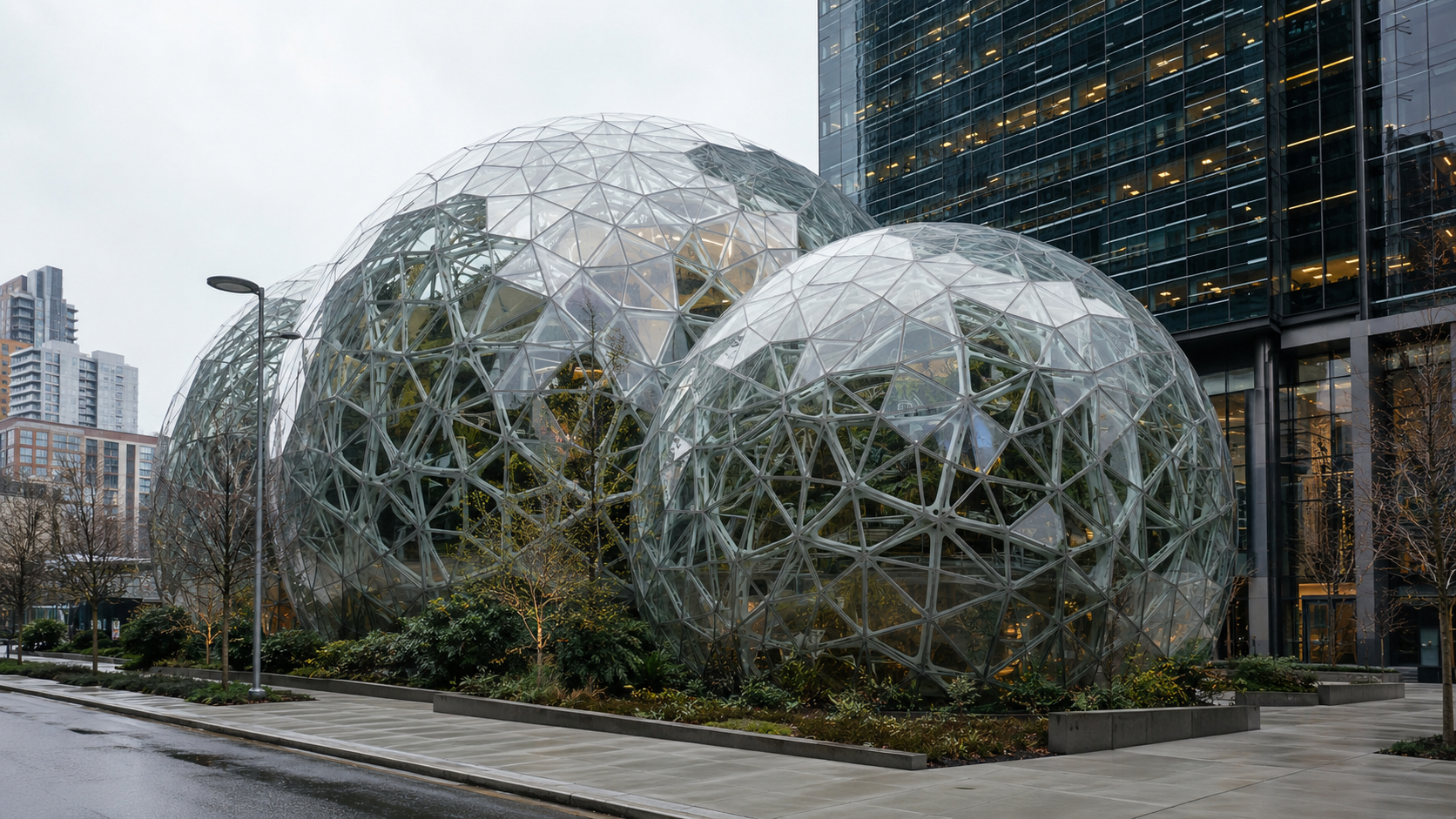
The detail that looks calm on opening day can become the first thing removed if the building team cannot maintain it. This is where a lot of “natural” design quietly fails. Nobody wants to keep a planter that leaks into the floor, a water feature that grows algae, or a green wall that needs a ladder every week.
Before approving a biophilic feature, ask four plain questions:
- Who cleans it, waters it, trims it, repairs it, or replaces it?
- Where does water go if the system leaks or overflows?
- Can the feature survive low light, winter air, heavy use, or tenant turnover?
- Does the design still work if the plants are smaller, dormant, or temporarily removed?
The strongest biophilic details are not always the most dramatic. A shaded window seat, a real view, a planted courtyard with access, a durable wood handrail, or a quiet refuge corner may outperform a huge living wall that nobody can reach.
What About the 15th Pattern, Awe?
Newer versions of the biophilic design framework discuss Awe as a fifteenth pattern. Awe is the feeling created when a space is larger, deeper, older, more powerful, or more beautiful than the body expects.
In architecture, awe can come from a tall light well, a quiet stone chamber, a vast timber roof, a framed view of mountains, a deep atrium, or a room where scale and light make people slow down.
Use it carefully. Awe is not the same as oversized. A huge lobby with bad acoustics is not awe. It is noise with a tall ceiling. The design still needs proportion, material, light, and a reason for the scale.
FAQ
What are the 14 patterns of biophilic design?
They are design patterns that connect people with nature through direct natural elements, nature-inspired materials and forms, and spatial conditions such as prospect, refuge, mystery, and controlled risk.
Who created the 14 patterns of biophilic design?
The best-known framework was published by Terrapin Bright Green in its 14 Patterns of Biophilic Design report. Designers, architects, planners, and researchers now use it as a practical way to discuss nature-connected design.
Are the 14 patterns only about plants?
No. Plants are only one layer. The patterns also include daylight, air movement, water, views, materials, texture, spatial refuge, prospect, mystery, and safe risk.
Which pattern is easiest to use at home?
Visual connection with nature is usually the easiest if the home has a decent window view. If not, start with daylight control, natural materials where people touch surfaces, and one small refuge spot such as a window seat or reading corner.
Which pattern matters most in offices?
Offices usually need prospect, refuge, daylight control, acoustic comfort, and real or borrowed views. A plant wall helps only if the room also solves glare, noise, stale air, and maintenance.
Is biophilic design the same as sustainable design?
No. They overlap, but they are not the same. Biophilic design focuses on human connection to nature. Sustainable design focuses more on environmental impact, energy, water, carbon, materials, and long-term building performance.
Can small spaces use biophilic design?
Yes. Small spaces can use light, view, natural textures, operable airflow, plants that suit the light level, and a protected seating edge. The smaller the space, the more important it is to avoid clutter.
What is the biggest mistake in biophilic design?
The biggest mistake is using natural decoration without fixing the room. A nature mural does not solve glare. A plant wall does not fix bad air. A timber panel does not create refuge. The pattern has to change the experience of the space.
What is the 15th biophilic design pattern?
Newer versions of the framework discuss Awe as a fifteenth pattern. In design terms, Awe is created by scale, light, depth, age, material power, or a view that changes how people perceive the space.
Read Next
For the full cluster hub, read biophilic design. For architecture rather than interiors, go to biophilic architecture. If you are working on rooms or workplaces, use biophilic interior design and biophilic office design. For living walls and planting systems, see vertical gardens.
References
- Terrapin Bright Green: 14+ Patterns of Biophilic Design.
- World Health Organization Regional Office for Europe: Urban Green Spaces and Health.
- U.S. Green Building Council: Designing with Nature, Biophilic Design for the Indoor Environment.