
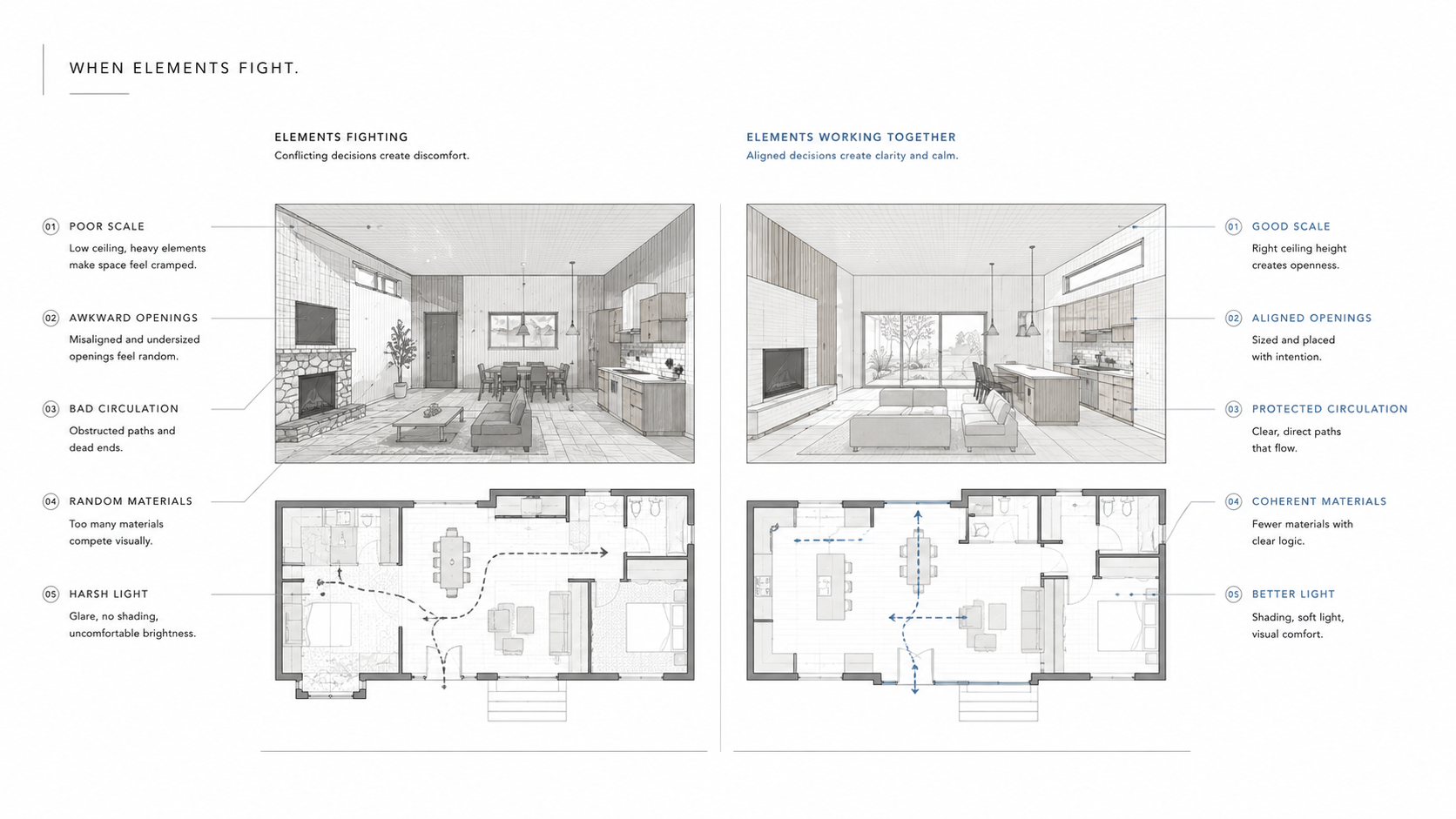
A building can have every “right” element and still feel wrong.
The walls are straight. The windows line up. The materials are expensive. The plan looks clean. Then you stand inside and something is off. The room feels flat. The entry is awkward. The light hits the wrong place. The stair interrupts the path. The facade has rhythm, but no reason.
That is the difference between naming architectural elements and using them.
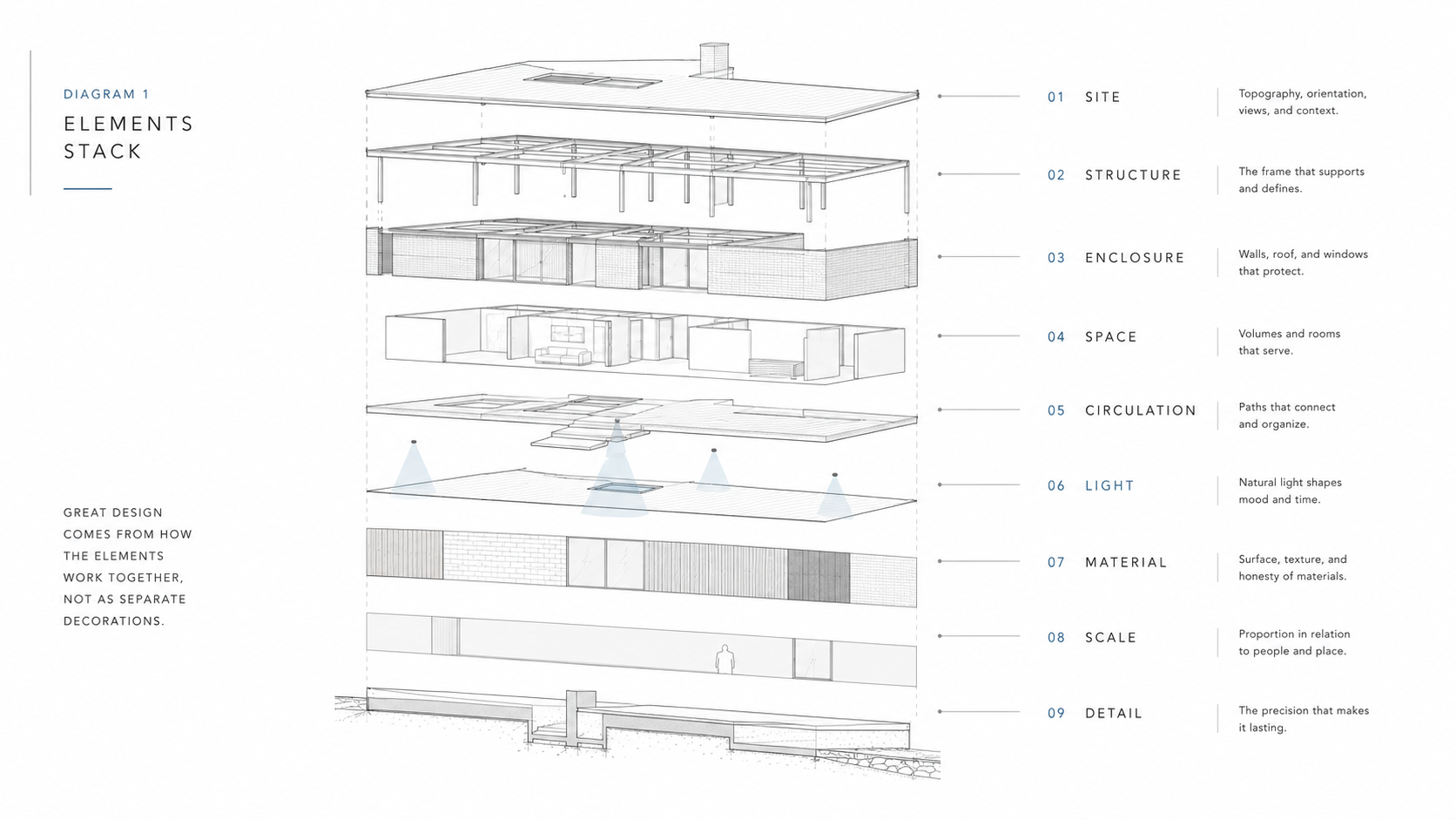
Elements of architectural design are not decoration pieces. They are the parts a designer uses to make space legible, useful, stable, comfortable, and memorable. Line, plane, form, space, light, material, texture, scale, proportion, openings, circulation, structure, and detail all matter. But none of them works alone.
The hard part is not memorizing the list. The hard part is making the elements agree.
Architectural elements are not a vocabulary test
A student can point to a wall, column, arch, roof, window, stair, or facade and still miss what the design is doing.
The better question is simple: what job is this element doing?
A wall may hold structure, separate public from private space, block noise, catch light, carry texture, guide movement, frame a view, or make a room feel protected. A window may bring daylight, but it can also create glare, expose privacy, weaken a wall, organize a facade, or pull the eye through a plan.
That is why architecture gets weak when elements are treated like labels. A column is not only a column. A line is not only a line. A material is not only a finish. Each one either helps the building’s logic or adds noise.
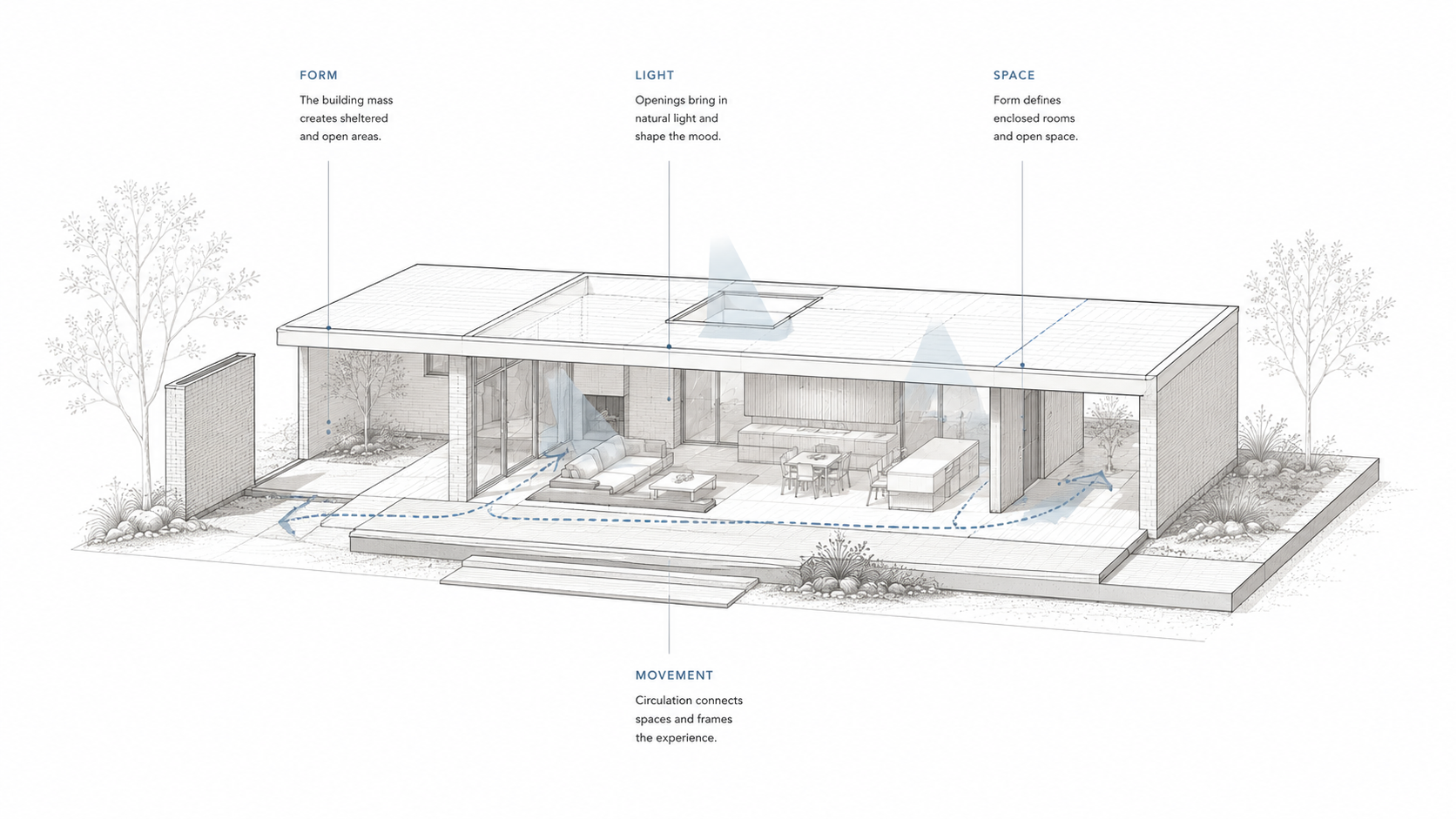
The basic elements start with space
Space is the main material of architecture.
Walls, floors, roofs, columns, doors, and windows matter because of what they do to space. They open it, compress it, divide it, frame it, protect it, or connect it to something else.
A good plan usually has a clear difference between where people arrive, where they pause, where they move, where they gather, and where they retreat. A weak plan may have the same square footage, but the spaces do not know their jobs.
This is why space planning essentials belongs close to this topic. Space is not empty background. It is where the design is tested by bodies, furniture, doors, light, sound, and daily use.
| Element | What it controls | Common failure |
|---|---|---|
| Wall | Enclosure, privacy, structure, edge, sound, view control. | The wall divides space but does not improve how it is used. |
| Floor | Movement, level change, material feel, acoustic response, durability. | The floor finish looks good but fails under real traffic. |
| Roof or ceiling | Shelter, height, volume, light, structure, atmosphere. | The room has enough area but feels wrong because the overhead plane is ignored. |
| Opening | Light, air, entry, view, privacy, facade rhythm, heat gain. | The window looks balanced outside but lands badly inside. |
| Stair | Vertical movement, sequence, orientation, safety, drama. | The stair becomes an object instead of a working part of circulation. |
Line gives the building its first direction
Lines are easy to draw and easy to misuse.
A horizontal line can make a building feel settled. A vertical line can give height and weight. A diagonal line can add speed or tension. A curve can soften movement or make a building feel continuous.
But line should not be chosen like a mood. It should answer the building.
A long low roofline makes sense when it strengthens the relationship to the site, horizon, or room sequence. A strong vertical bay makes sense when it marks an entry, stair, tower, or important interior volume. A curved line earns its place when it shapes movement, softens a corner, handles structure, or clarifies a public edge.
The goal is not to label every line. The goal is to know what the line is doing: calming the building, lifting it, speeding it up, organizing it, or making it unstable.
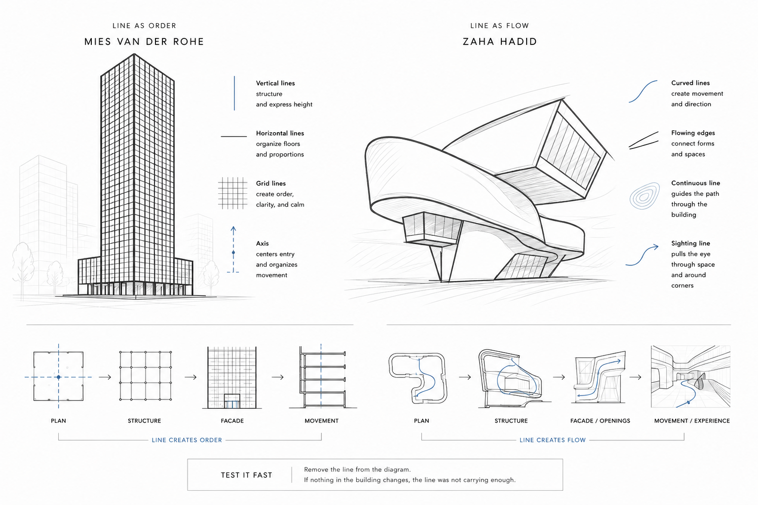
For a deeper look at drawing and line control, connect this with architectural drawings.
Form and shape are not the same decision
Shape is what you can often read quickly: square, circle, rectangle, triangle, curve, arch, block, tower, slab.
Form is stronger than shape. Form has mass, depth, edge, shadow, structure, volume, and relationship to the site. A building may start as a simple rectangle, but the form changes when the roof lifts, the wall thickens, the corner opens, the entry cuts in, or the room volume pushes through the facade.
This is where many beginner projects get thin. The shape is clear, but the form has no pressure behind it. It does not respond to structure, light, view, circulation, climate, or use.
Good form usually has a reason. It turns toward a view. It protects a courtyard. It lifts for shade. It steps with a slope. It thickens where storage or structure is needed. It compresses an entry before releasing into a larger room.
The related page on architectural shapes and forms can support this section, but the main point is plain: form should carry the design’s logic, not only its silhouette.
Light makes the form legible
Light is one of the strongest elements of architectural design because it changes everything it touches.
It can flatten a wall or reveal its texture. It can make a low room feel calm or mean. It can pull people toward an entry, mark a stair, make a corridor less dead, or turn a plain surface into the best part of the building.
Bad light is just as powerful. Glare can ruin a desk. A dark middle zone can make a plan feel heavy. A window in the wrong place can weaken privacy. Too much glass can overheat a room, create reflections, and make furniture placement harder.

Light should be planned before the building is “finished” on paper. Window size, sill height, roof overhang, wall depth, orientation, interior color, and material reflectance all change how the light behaves.
For more specific planning, use natural lighting in architectural design.
Form, space, light, and movement have to be tested together
A project can look convincing in one view and fall apart in the next.
The plan may show good movement, but the section may show a flat room. The elevation may show strong openings, but the interior may get glare. The model may show a clean form, but the entry may not be clear from the site.
Design gets stronger when the same idea survives plan, section, elevation, model, and use.
Material and texture have to do work
Material is not the skin you add after the design is done.
Brick carries scale through joints. Concrete carries weight, mass, and surface memory. Wood can warm a space, but it also moves, wears, dents, and changes color. Glass opens a building, but it can also create glare, heat gain, privacy issues, and cleaning problems. Stone gives permanence, but it asks for weight, support, and careful detailing.
Texture changes distance. A rough wall invites the hand and catches shadow. A smooth surface can feel clean, formal, or cold. A repeated joint can make a large wall feel measured. A bad material change can make the same wall feel patched together.
The mistake is choosing materials only from a sample tray. A material has to survive use, weather, maintenance, budget, touch, light, and the way it meets other materials.
That meeting point is where many designs get weak.
Scale is where the body catches the mistake
Scale is not only size. It is the relationship between the building and the person using it.
A door can be wide enough and still feel mean. A lobby can be large and still feel cold. A room can meet the plan requirement and still feel wrong because the ceiling, window, furniture, wall length, and path do not agree.
Proportion is the relationship between parts. Scale is how those parts meet the body, the site, and the building around them. The two are tied together, but they are not identical.
A facade with good proportions can still fail at human scale if the entry is lost, the base has no detail, the windows sit too high, or the material has no grain close to the body.
This is why scale and proportion in architectural design is one of the most important supporting pages for this topic.
Circulation is an element, not leftover space
Circulation is often treated as the empty part between rooms. That is how bad plans happen.
Movement has shape. It has width, direction, pace, pause, view, sound, and memory. A good circulation path tells people where to go without shouting. It gives them somewhere to arrive before asking them to choose. It avoids pushing public movement through private work. It lets people stop without blocking everyone else.
Stairs, corridors, thresholds, entries, ramps, doors, landings, and openings are all circulation elements. They do more than move people. They organize the building’s sequence.
If the circulation is weak, the rest of the elements work harder and still may not save the design.
This connects directly to spatial design and spatial planning and design, because movement usually exposes whether the plan is honest.
Principles organize the elements
Elements are the parts. Principles are how the parts are arranged.
Balance, hierarchy, rhythm, contrast, unity, proportion, repetition, symmetry, emphasis, and alignment are not extra vocabulary. They are the control system.
A building can have strong elements and still fail because the principles are weak. The windows repeat, but the rhythm has no relationship to the rooms behind them. The entry is meant to be important, but nothing gives it hierarchy. The materials are all good alone, but together they fight for attention.

| Principle | What it does | How it fails |
|---|---|---|
| Hierarchy | Tells the eye what matters first, second, and third. | Everything competes, so nothing feels important. |
| Rhythm | Uses repetition and variation to create order and movement. | Repetition becomes mechanical or random. |
| Balance | Controls visual weight across a plan, facade, room, or section. | The design feels lopsided, heavy, or artificially symmetrical. |
| Contrast | Makes differences clear: light and dark, heavy and light, rough and smooth, open and closed. | Contrast becomes noise instead of clarity. |
| Unity | Makes the project feel like one thought instead of many fragments. | The parts are individually fine but do not belong together. |
For the broader foundation, use principles of design.
The element that fails first is usually the one nobody coordinated
This is where students and homeowners find out the hard way that design elements are not just visual.
A window can be perfect on the elevation and wrong in the room. The sill height fights the desk. The glass creates glare. The exterior rhythm looks clean, but the interior furniture has nowhere to go.
A material can be beautiful and wrong at the edge. Stone meets drywall with no shadow line. Wood meets tile where water collects. Brick wants a joint pattern, but the openings ignore the module. A roof overhang looks elegant, but it dumps water where the entry path starts.
A stair can be dramatic and still damage the plan. It takes the best light. It lands in the wrong place. It cuts through a quiet zone. It looks good in a render but makes movement awkward every day.
Good architectural design is coordination. The elements have to meet in section, plan, elevation, detail, and use. If they only agree in a presentation image, the building will punish someone later: the builder, the client, the user, or the maintenance crew.
That is why the best review question is not “do I like this element?” It is “what is this element doing, and what does it force everything around it to do?”
Elevation elements should not be pasted on
A facade is not only the face of a building.
It shows structure, floor levels, openings, rhythm, proportion, material, shade, entry, weather protection, and the building’s relationship to the street or site.
Weak elevation design happens when windows, trims, columns, rooflines, panels, arches, and decorative pieces are arranged for appearance only. The elevation may look busy, but it does not explain the building.
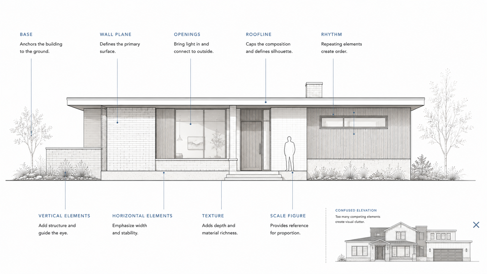
A stronger elevation usually has a readable base, middle, and top. Openings relate to rooms. Materials change where there is a reason. Vertical elements mark structure, entry, or height. Horizontal elements calm the facade or tie it to the landscape. Deep openings show thickness. Shadows show relief.
Architectural elevation elements work best when they reveal what is happening behind them.
Columns, arches, and motifs need a reason
Classical and historic elements can still work. They fail when they are used as costume.
A Doric column, Ionic capital, arch, cornice, vault, rib, buttress, or Gothic motif has a history, a structural memory, and a visual role. Even when the element is no longer carrying the same load, it still carries meaning.
The problem is not using old elements. The problem is using them without scale, material, proportion, or purpose.
A thin fake column stuck to a flat wall usually looks weak because it has no work to do. A pointed arch used only as decoration can feel hollow if the space, wall thickness, opening, and light do not support it. A cornice without proportion can make a building look like it is wearing the wrong hat.
If you are studying Gothic language specifically, use Gothic elements. The useful lesson is broader: borrowed elements need architectural logic, not just recognition.
Modern elements are not automatically honest
Modern architecture is often described through open plans, flat roofs, steel, concrete, glass, simple volumes, exposed structure, and limited ornament.
Those elements can create clarity. They can also become lazy.
A glass wall is not better because it is glass. An open plan is not better because it has fewer walls. A flat roof is not better because it looks clean. A concrete wall is not honest if it is used like wallpaper.
Modern elements work when they improve the design’s structure, light, flexibility, construction logic, and use. They fail when they are chosen only because they look like modern architecture.
The same rule applies to contemporary and biophilic elements. A green wall, skylight, solar panel, exposed beam, or planted courtyard should do more than signal a trend. It should improve comfort, orientation, durability, energy behavior, or the daily experience of the building.
How to test the elements in a design review
Do not present a list of elements in critique. Show how they work together.
Start with the main spatial idea. Then show the plan, section, and elevation that prove it. If light is important, show where it enters and where it lands. If material is important, show the joint and the scale of the surface. If circulation is important, draw the path. If structure is important, show the grid, span, or load path.
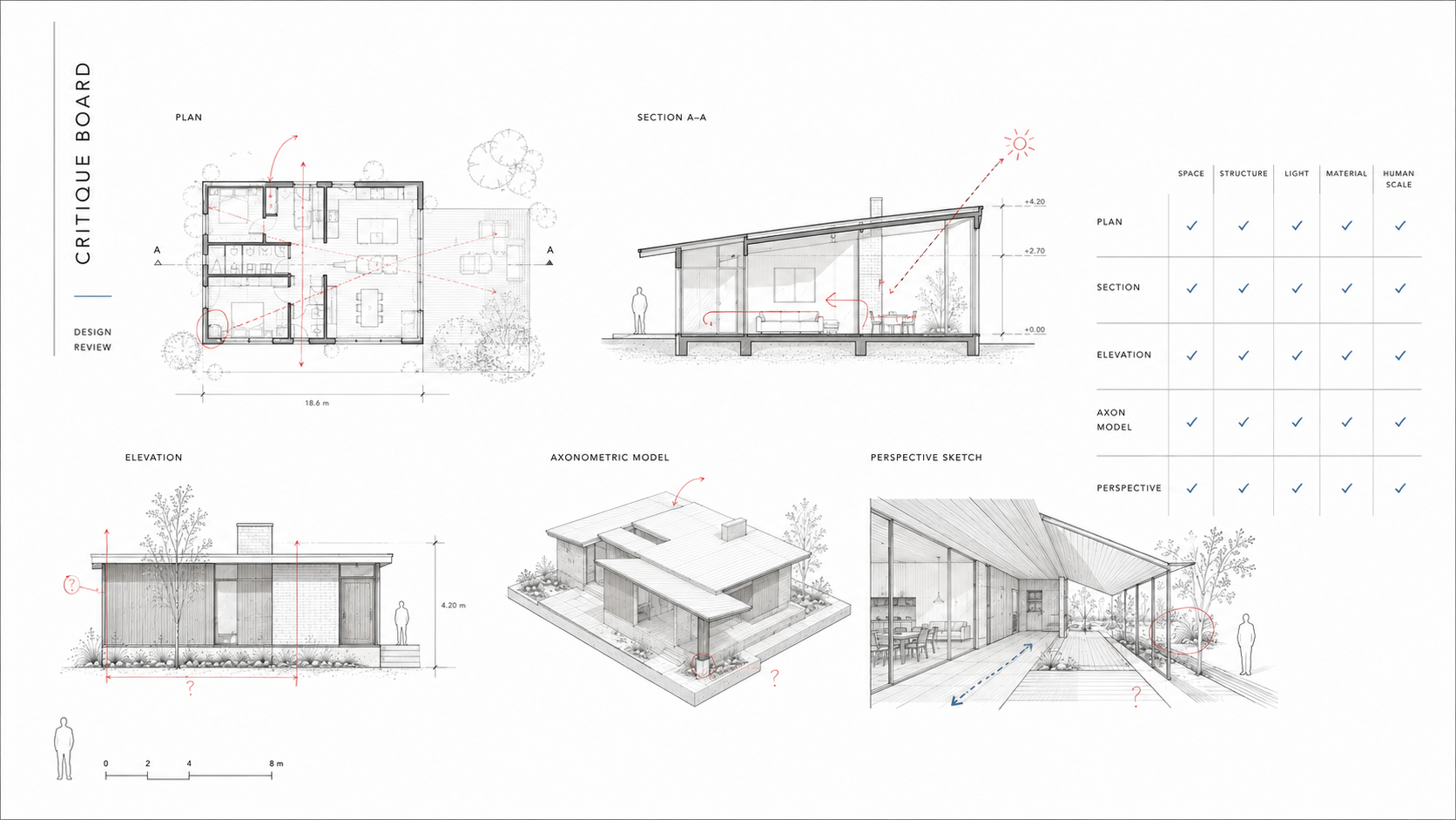
A strong review usually makes one chain clear: site to form, form to space, space to light, light to material, material to detail, detail back to human use.
If that chain breaks, the project may still look attractive, but the design logic is not strong enough yet.
For more on this kind of design logic, how architectural principles work together is a useful supporting page.
Where AI helps and where it makes the problem worse
AI can help a student or homeowner test architectural elements quickly.
It can compare massing options, show how light might affect a room, suggest material combinations, generate facade studies, or help explain the difference between line, form, scale, and rhythm.
But AI is also good at making weak elements look finished.
It may give a facade beautiful shadows without a real section behind them. It may make a room look large while ignoring furniture clearance. It may place windows where structure, privacy, heat gain, or wall use would make them difficult. It may mix materials that look good in an image but meet badly in construction.
Use AI for options and questions. Do not use it as proof that the building works. The real test is still plan, section, elevation, detail, site, climate, structure, and use.
A simple way to remember the elements
Start with the body.
Where does a person enter? Where do they stop? What do they see first? What touches the ground? What holds overhead? Where does light enter? What surface carries the hand, the eye, or the sound? What element makes the space feel protected, open, heavy, calm, fast, public, or private?
That is architectural design in practice.
The elements are not separate ingredients. They are relationships. A wall is also light. A window is also privacy. A stair is also sequence. A material is also scale. A detail is also maintenance.
Once you see that, the basics stop feeling basic.
FAQ
What are the main elements of architectural design?
The main elements include space, line, plane, form, light, material, texture, scale, proportion, openings, circulation, structure, enclosure, and detail. The exact list changes by teacher or textbook, but these are the parts that shape how a building works and feels.
What is the difference between elements and principles of architectural design?
Elements are the parts of the design. Principles are how those parts are organized. A window, wall, stair, material, and line are elements. Balance, rhythm, hierarchy, proportion, contrast, and unity are principles.
What are basic architectural elements?
Basic architectural elements include walls, floors, roofs, columns, beams, openings, stairs, doors, windows, and structural frames. In design work, those physical parts are shaped by space, light, form, scale, and circulation.
Why is space the most important element in architecture?
Space is where architecture is experienced. Walls, roofs, floors, columns, and openings matter because of how they shape movement, pause, privacy, light, and use.
How do form and shape affect architecture?
Shape gives a building its visible outline. Form gives it volume, mass, depth, shadow, and relationship to site and use. A strong form usually responds to structure, light, circulation, climate, or purpose.
Why is light an architectural design element?
Light reveals form, texture, scale, and atmosphere. It also affects comfort, glare, heat, privacy, and orientation. Poor light can weaken a good plan.
What are elevation elements in architecture?
Elevation elements include openings, base, roofline, wall planes, columns, vertical and horizontal divisions, material changes, trim, shade devices, and facade rhythm. They should relate to the rooms and structure behind the facade.
What are examples of Gothic architecture design elements?
Common Gothic elements include pointed arches, ribbed vaults, flying buttresses, tracery, vertical emphasis, stained glass, and clustered columns. These work best when understood as structural and spatial ideas, not just decoration.
What are modern architecture elements?
Modern architecture often uses simple volumes, open plans, flat roofs, steel, glass, concrete, exposed structure, and limited ornament. These elements work when they support function, structure, light, and construction logic.
How do I use architectural design elements in a project?
Start with the use of the space. Then test form, circulation, light, scale, material, and structure together. Do not choose elements only because they look good in isolation.
Read This Next
For the organizing rules behind these elements, read principles of design.
For scale problems that make buildings feel wrong even when the plan works, use scale and proportion in architectural design.
For movement, paths, and room relationships, go to spatial design and spatial planning and design.
For drawing the elements clearly, use architectural drawings.
For light as a design tool, read natural lighting in architectural design.