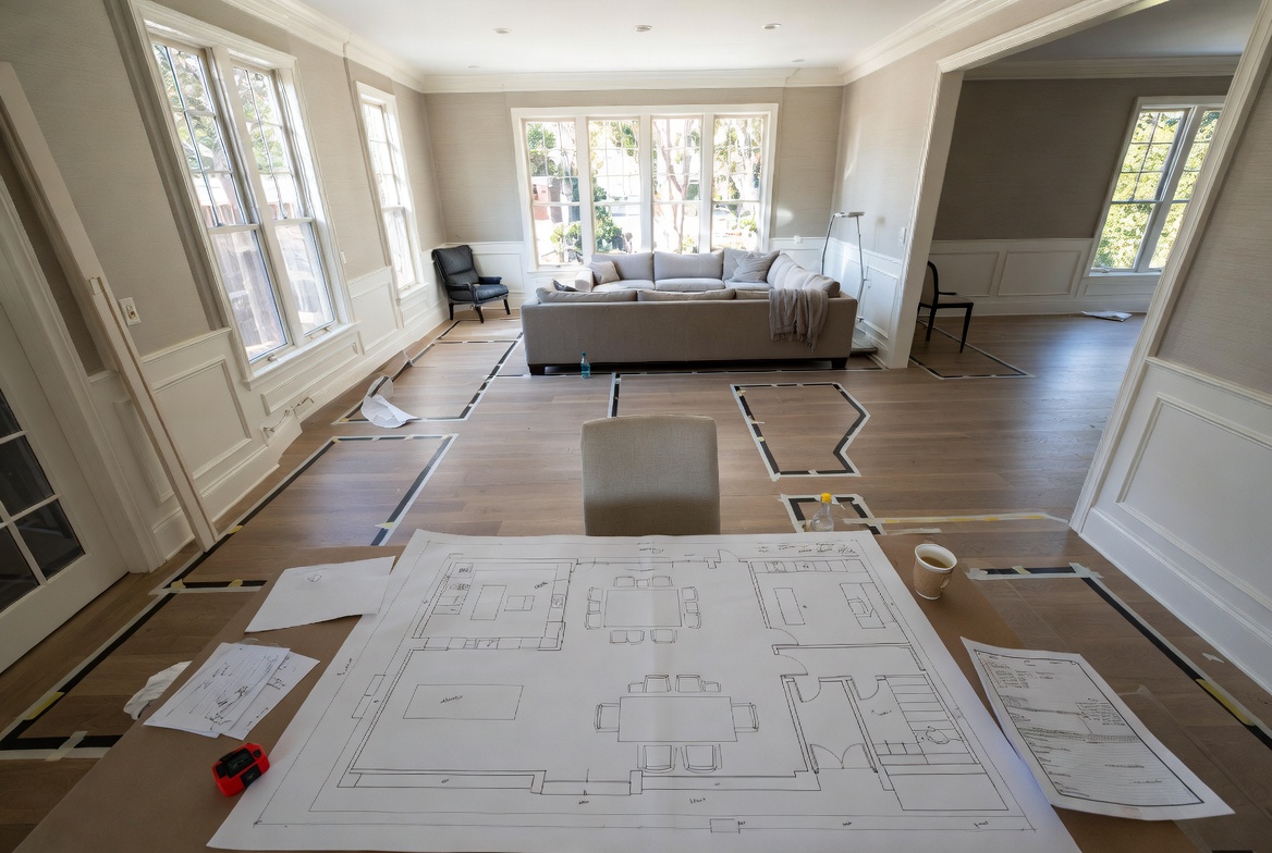
Image by ArchitectureCourses.org. Interior space planning starts before finishes. The room has to work in plan before style can help it.
A room can have good furniture, good light, and a decent budget and still feel wrong in under thirty seconds.
Usually the problem is not style. It is layout. The chair is in the way of the window. The dining table floats in the middle like it missed its stop. The rug is too small to hold the seating group together. The room technically fits everything, but nothing feels settled.
That is why space planning matters more than people think. It decides whether a room works before color, fabric, art, or styling get a chance to help.
For the broader idea, start with spatial design. For the process behind zones, paths, and adjacencies, use spatial planning and design. This page stays closer to the room itself: furniture clearance, circulation, zoning, proportion, storage, light, and the small decisions that make an interior feel calm instead of accidental.
What Space Planning Really Is
Space planning is the work of organizing a room so people can use it easily, move through it comfortably, and understand it almost without thinking.
That sounds simple. It is not. Good space planning is doing several jobs at once:
- deciding what the room has to do;
- giving each activity enough space to happen properly;
- keeping movement clear;
- making furniture feel scaled to the room;
- using openings, light, and edges to help the layout read clearly;
- checking what happens after real furniture, storage, and daily clutter arrive.
A good interior plan is not only a furniture arrangement. It is a working agreement between the room, the people, the objects, the light, and the paths between them.
The Fastest Way to Read a Bad Layout
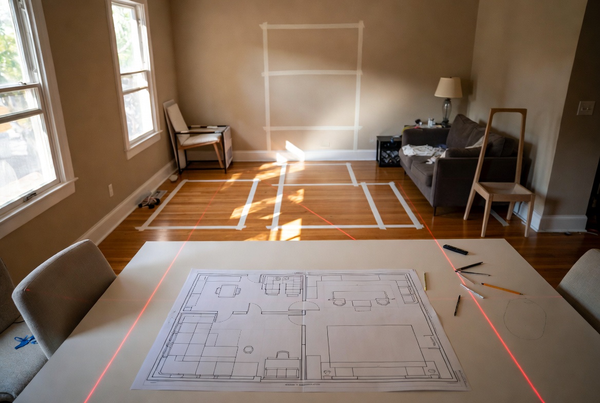
Illustration by ArchitectureCourses.org. A bad layout usually shows itself through blocked paths, awkward clearances, and furniture that fights the room.
A bad layout usually gives itself away through friction.
You have to turn sideways to pass the coffee table. A door opens into a chair. The bed blocks part of the window. Dining chairs cannot pull out cleanly. The room looks full before it looks useful.
That friction matters because people feel it immediately, even when they cannot name it. The room becomes tiring. Awkward. Slightly off.
A good layout does the opposite. It removes low-level irritation. You know where to walk. You know where to sit. You know what part of the room is for talking, working, eating, sleeping, or resting. The room explains itself.
Interior Layout Mistakes That Show Up Fast
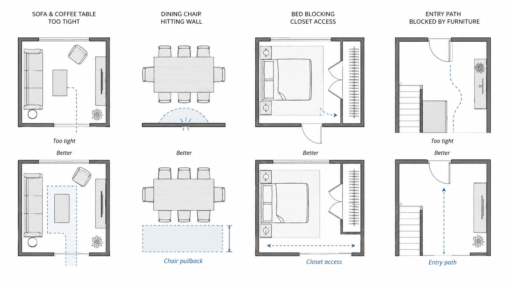
Illustration by ArchitectureCourses.org. Interior space planning fails when furniture is placed before movement, clearance, and daily use are tested.
Most layout mistakes are small enough to miss on a mood board and large enough to annoy you every day.
- A sofa is too deep for the walkway.
- A coffee table leaves no comfortable knee space.
- A dining chair hits the wall every time someone sits down.
- A bed technically fits but blocks the closet.
- A desk looks good until glare makes it hard to use.
- An entry has nowhere for shoes, bags, keys, coats, or deliveries.
These are not decoration problems. They are planning problems. Styling can distract from them for a photograph, but it cannot make a blocked path easier to walk through.
Start With Use, Not With Furniture
The first mistake is drawing objects too early.
Students often start with a sofa, a bed, or a table because those objects are easy to picture. Homeowners do the same thing when they shop before measuring. But furniture is not the first question. Use is.
Ask the blunt questions first:
- Who uses this room?
- What happens here every day?
- What needs quiet?
- What needs storage?
- What needs privacy?
- What path through the room gets used most?
- What lands here when people are tired, busy, or carrying things?
A living room for two adults reads differently from one used by a family with children. A studio apartment has to negotiate sleep, work, eating, storage, and guests in one space. A waiting room and a lounge may both use chairs, but they are not organized by the same social logic.
The room brief should lead. The objects come after.
Circulation Is Not the Leftover Space

Illustration by ArchitectureCourses.org. Circulation has to be planned before furniture starts stealing the path.
This is where a surprising number of interiors go bad.
Circulation is not the part of the room that remains after the furniture is placed. It has to be designed on purpose. Good circulation makes movement feel obvious and unforced. Bad circulation makes the room feel cramped even when the square footage is generous.
In practice, that means:
- main paths should stay open and readable;
- doors should open without fighting furniture;
- people should not have to cut through one activity zone just to reach another;
- seating groups should feel connected without blocking movement around them;
- storage should sit near the point of use, not across the main path.
One of the better tests is simple: trace the route someone takes from the entry to the main use points in the room. Sofa. Desk. Bed. Dining table. Window. Storage. If the path keeps pinching, stalling, or zigzagging for no reason, the layout is not solved yet.
Scale and Proportion Decide More Than Style Does
Rooms often fail because the pieces are the wrong size, not because the taste is wrong.
The sofa is too deep for the room. The rug is too small, so the furniture looks like it is standing around awkwardly instead of belonging together. The side table is too far away to use. The bed is correct on paper but leaves no comfortable clearance once drawers, doors, and bodies get involved.
This is where layout stops being abstract and starts becoming physical.
- Can someone sit down without clipping another chair?
- Can a dining chair pull out fully?
- Can a bedside table be reached without twisting?
- Can storage open properly?
- Does the rug anchor the furniture, or does it just sit under the coffee table?
For the deeper design logic, the related page on scale and proportion in architectural design helps explain why a room can be technically correct and still feel slightly wrong.
The Problem Usually Starts After the Furniture Arrives
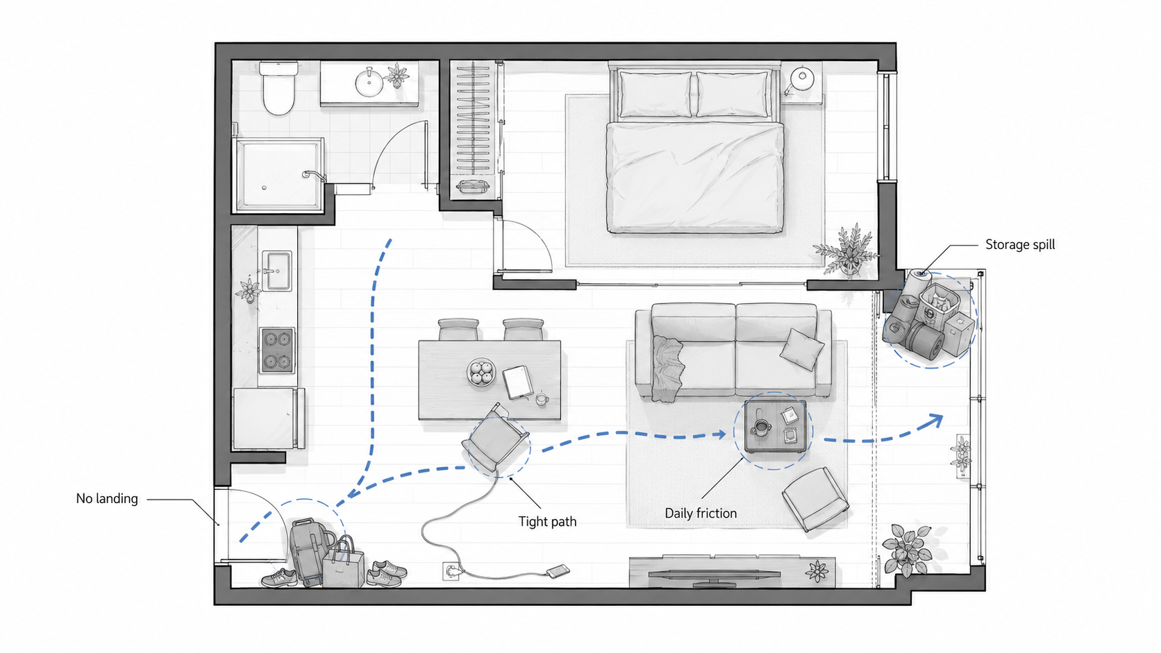
Illustration by ArchitectureCourses.org. A layout is not proven when empty. It is proven after daily use.
Empty rooms make bad decisions look harmless.
The trouble often starts after the order arrives. The sofa is six inches deeper than expected. The dining chairs need more pullback than the plan allowed. The rug looked generous online but barely reaches the front legs of the furniture. The dresser fits the wall, but the drawers cannot open without someone stepping aside.
This is also where money gets wasted. Custom furniture may not be returnable. Large furniture can carry freight, restocking, or delivery fees. A rug that is too small may still look “fine” to keep, so the room stays wrong. Built-ins can lock a bad circulation path into place. A new light fixture may expose that the table was never centered properly in the first place.
Before buying, tape the main furniture footprint on the floor. Open the doors. Pull out the chairs. Walk the path with the tape still down. Check outlets, lamps, drawers, closet doors, radiators, vents, and cleaning access. A room that only works in a screenshot is not ready for an order.
A Practical Sequence That Usually Works
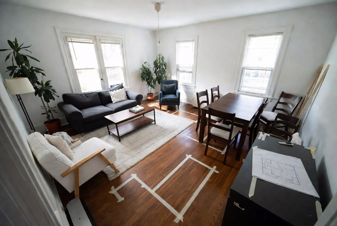
Illustration by ArchitectureCourses.org. A useful room layout starts with the brief, fixed conditions, circulation, and daily-use testing.
Space planning gets easier when the process stays clear.
- Write the room brief plainly. List what has to happen in the room, who uses it, and what problems already exist.
- Measure the room properly. Include windows, door swings, radiators, columns, outlets, vents, and awkward corners. Those details stop being minor later.
- Mark the fixed conditions. Entry points, daylight, views, built-ins, wet zones, structural walls, and anything expensive to move.
- Set the main use zone first. In a living room, that may be the conversation area. In a bedroom, the bed. In a dining room, the table.
- Protect circulation. Do not let furniture placement slowly destroy the movement paths.
- Add supporting pieces last. Side tables, lamps, benches, storage, and accent chairs should strengthen the room, not clog it.
- Test it against actual use. Imagine sitting, reaching, opening, crossing, storing, cleaning, and walking through while another person is already there.
For the broader planning process, use spatial planning and design. For beginner fundamentals, space planning essentials is the simpler checklist page.
Zoning Is What Makes Open Plans Feel Intelligent
Open-plan spaces are where layout quality becomes obvious very quickly.
If zoning is weak, the whole room reads like one large undecided area. If zoning is strong, the same square footage starts feeling organized and generous.
The key is not building hard boundaries everywhere. It is giving each part of the space enough definition to feel intentional.
That can happen through:
- rug placement;
- lighting type and position;
- sofa orientation;
- table alignment;
- storage placement;
- a change in ceiling condition or wall emphasis;
- a clear path that does not cut through the middle of every activity.
A dining table under a pendant already reads as a zone. A sofa backed by a console can quietly define a living area. A desk near daylight but out of the main passage path reads as work, not overflow.
Small Rooms Need Fewer Priorities
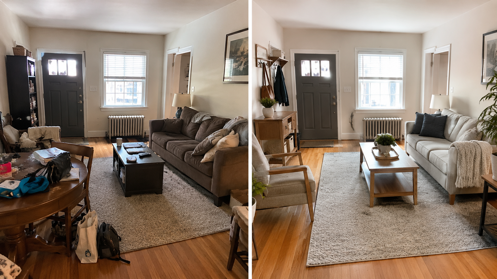
Image by ArchitectureCourses.org. Small rooms usually fail from blocked paths, missing storage, and furniture that is too large for the way the room is used.
Small rooms usually fail when every function is treated as equally important.
The room wants to be a lounge, office, dining room, guest room, storage area, and exercise corner. Everything gets squeezed in with the same visual weight. The result is not flexibility. It is noise.
A better small-room plan chooses the main job first, then lets the secondary jobs become lighter. A work surface might fold. Storage might go vertical. A dining function might share a table with another use. The seating area may need one strong arrangement instead of several small pieces pretending to create options.
The goal is not to make the room look larger through tricks. The goal is to make it stop fighting itself.
Rooms Need Different Kinds of Energy
Layout is not only about fit. It is about mood.
A room meant for focus wants a different arrangement from one meant for calm. A social room wants a different rhythm from one meant for retreat. This is where planning and atmosphere stop being separate topics.
Rooms that need energy
Workrooms, collaborative studios, creative spaces, and some kitchens usually benefit from clearer sightlines, brighter light, tighter task zones, and furniture that supports movement.
Rooms that need calm
Bedrooms, waiting areas, reading corners, and wellness spaces usually improve when movement is quieter, furniture is less confrontational, and the room does not ask for attention from every corner.
Rooms that need conversation
Living rooms, lounges, and family areas work best when people can sit in relation to each other without shouting across oversized gaps or colliding knees across undersized ones.
That is why planning is not a technical stage before design. It is already design.

Illustration by ArchitectureCourses.org. Different rooms need different planning logic because movement, storage, privacy, and social use change from room to room.
Two Quick Examples
Small studio apartment
The usual mistake is trying to make every function equal. Bed. Desk. Dining. Lounge. Storage. Everything gets squeezed in with the same visual weight, and the room starts feeling busy before it feels livable.
The better move is to decide what dominates. Usually the sleeping zone and work zone need the clearest logic. Then dining can stay lighter, sometimes foldable, sometimes shared with another surface. A rug can define the seating corner. Shelving can pull storage vertical instead of outward.
Family living room
Image by ArchitectureCourses.org. Family rooms need layout logic that survives toys, devices, walking paths, storage, and different kinds of seating.
Family rooms often fail because the layout chases a perfect composition and forgets daily use. Toys, throws, devices, walking paths, side tables, charging, reading light, and different kinds of seating all matter.
The stronger layout usually has one anchored seating group, reachable surfaces, durable storage, and enough open floor area that the room can shift between adult and family use without a full reset every night.
What Students and Young Designers Usually Miss
- They draw furniture symbols, not actual use. A desk on plan is not proof that someone can work there comfortably.
- They treat circulation as leftover space. It is not.
- They undersize rugs and oversize furniture. Common and damaging.
- They try to make every wall do something. Sometimes the room needs one quiet side.
- They separate layout from presentation. Good drawings matter because bad graphics can hide weak decisions for too long.
This is why architectural drawings still matter in interior space planning. A plan is not just a presentation image. It is the place where bad decisions should be caught early.
How AI Can Help With Interior Space Planning
AI can help if it is used as a layout checker, not a style machine.
A weak prompt asks for a beautiful living room. A stronger prompt gives the room size, door swings, windows, fixed furniture, storage needs, daylight problems, and the main daily frustration.
Ask AI to test circulation, furniture clearance, small-room alternatives, glare, entry storage, and what happens after the furniture arrives. Then check the result against real measurements. AI can make furniture look smaller than it is, ignore door swings, fake window light, and produce a room that looks better than it could ever function.
Use it for options. Do not use it as proof that the layout works.
FAQ
What is the difference between space planning and decorating?
Space planning decides how the room works. Decorating decides how it looks and feels once that structure is in place. Decoration can improve a good layout. It usually cannot rescue a bad one.
How do you know if a room layout is wrong?
The room usually creates friction. Movement feels pinched, furniture blocks openings, zones blur together, or the room feels crowded even before much is added.
What matters most in a small room?
Clear circulation, furniture scaled correctly, storage that does not waste floor area, and a refusal to force too many equal priorities into one plan.
How do you define zones in an open-plan interior?
Use layout, rugs, lighting, furniture orientation, and spacing. Good zoning usually comes from a few disciplined moves, not from adding visual clutter.
What is one of the most common layout mistakes?
Starting with furniture pieces before understanding how the room needs to function. The room brief should lead. The objects come after.
Can AI help with room layout?
Yes, but only if you give it real constraints: room size, doors, windows, furniture sizes, storage needs, and the current problem. A polished AI image is not proof that the layout works.
Read This Next
For the broader principle behind room layout, read spatial design.
For the process of zoning, adjacency, and circulation, go to spatial planning and design.
If you are studying the field or building a portfolio, read interior and spatial design.
For simpler beginner checks, use space planning essentials.