
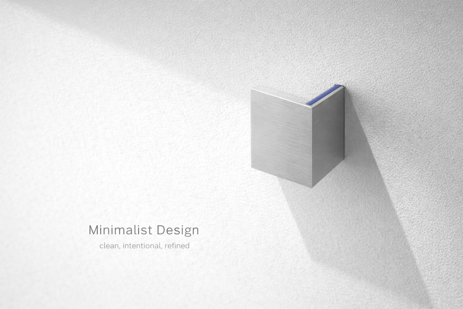
Minimalist design isn’t “empty rooms.” It’s a decision system: keep what earns its place, remove what doesn’t, and make the remaining elements work harder.
What this covers:
- What minimalist design actually is (and what it isn’t)
- The core characteristics that make a space feel calm, not sterile
- Current trends that still fit minimalism (without turning it into a Pinterest costume)
- Practical steps: declutter, plan, buy less, and make it live well

The essence of minimalism
What is minimalist design?
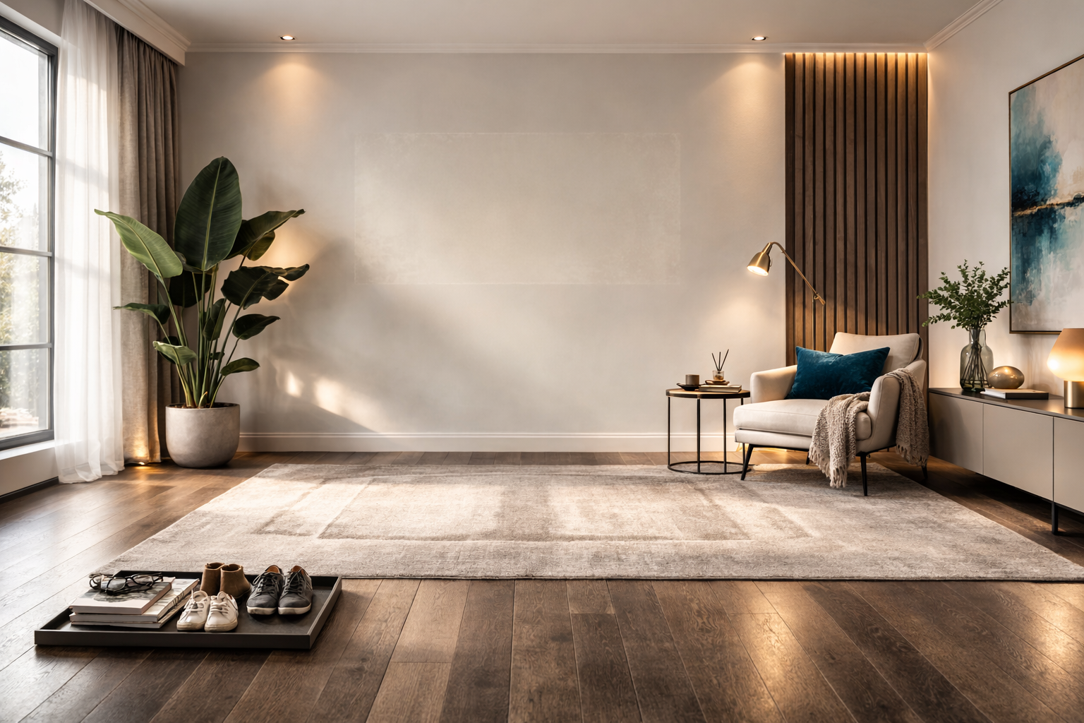
Minimalism is about reducing visual noise so the room reads clearly: circulation is obvious, storage is intentional, and the “stuff” doesn’t fight the architecture. You don’t need a white box. You need fewer competing signals.
In practice, that usually means three moves:
- Less inventory: fewer objects on display, fewer “tiny decor decisions.”
- Clear hierarchy: one or two elements lead (a table, a sofa, a material), everything else supports.
- Better control: storage, lighting, and finishes that don’t punish daily life.
Characteristics of minimalist design
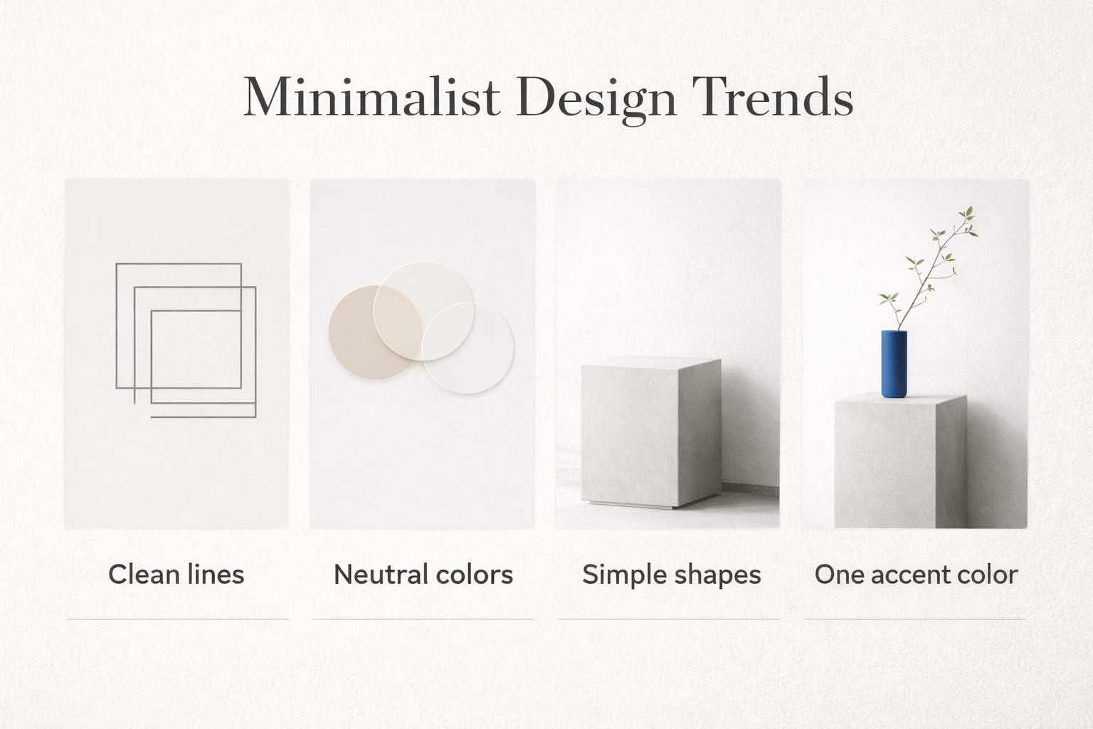
1) Clean lines (but not “sharp everywhere”)
Minimal spaces rely on readable edges: straight runs, consistent reveals, fewer fussy profiles. The trick is restraint, not harshness. If everything is razor-sharp, the room can feel tense.
- Works well: simple cabinetry, flush trim, consistent door hardware, furniture with clear geometry.
- Common fail: mixing five different “simple” styles (it stops being simple).
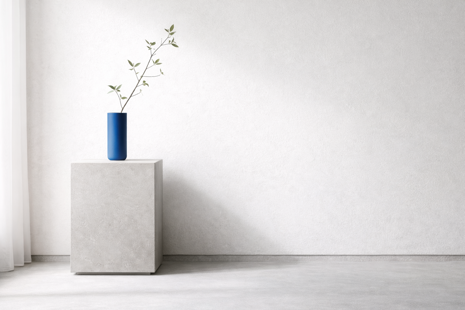
2) Negative space (the part people forget to design)
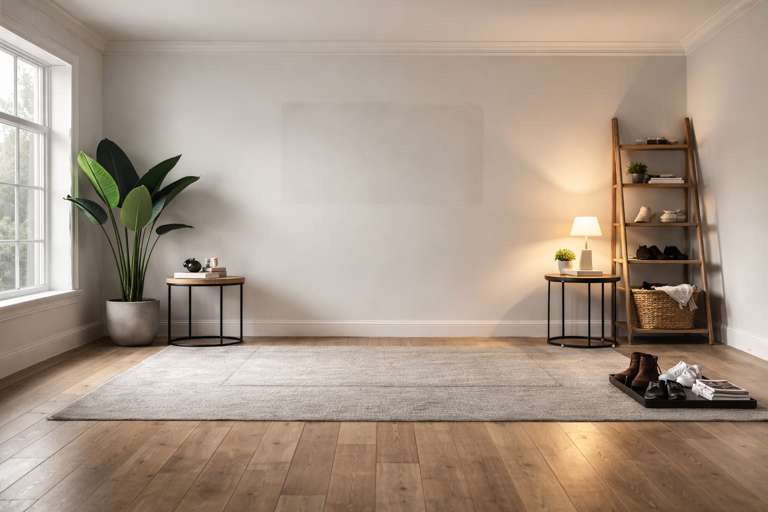
Empty space isn’t wasted. It’s what makes the room feel calm. Minimalism fails when every surface becomes a landing zone.
- Rule of thumb: leave at least one major surface intentionally clear (dining table, kitchen counter run, entry console).
- Daily-life test: if you need to “move stuff” to use the room, it’s not minimal yet.
3) A controlled palette (neutral is common, not mandatory)
Minimalism often uses whites, greys, and warm earth tones because they reduce contrast noise. But it’s not “neutrals only.” One controlled accent color works fine if it’s deliberate and repeated in small ways.
- Common fail: neutral everything + cool lighting = the “clinic” vibe.
- Fix: choose one warm element (timber, warmer white, warm metal, warmer lighting).
4) Material honesty (texture replaces decoration)
Minimal rooms feel rich when materials do the work: timber grain, matte plaster, linen, stone, brushed metal. When everything is glossy and perfectly flat, it reads cheap fast.
- Better: one or two “real” textures repeated (oak + linen, plaster + blackened steel, etc.).
- Watch-outs: too many competing textures becomes clutter, just in a different form.
5) Hidden storage (minimalism is a storage plan)
If you want minimal, you need somewhere for the real-life stuff to go: charging, mail, cleaning supplies, toys, pantry overflow, the random screwdriver that always lives on the counter.
- Works: closed storage in the “mess zones” (entry, kitchen, living room).
- Common fail: open shelving everywhere. It photographs well. It lives badly.
6) Lighting that doesn’t flatten everything
Minimal interiors need good light because shadows and highlights are part of the design. Flat overhead lighting makes minimalist rooms feel dead.
- Use layers: ambient + task + one soft accent.
- Avoid: one bright ceiling fixture doing all the work.
Common misconceptions
(why people bounce off minimalism)
“Minimalism means bare”
No. Minimalism means intentional. A minimalist room can still be warm: soft textiles, one great piece of art, one plant, one lamp with decent light. The space should feel lived-in, not staged.
“It has to be expensive”
Minimalism can get pricey if you replace everything at once. The smarter approach is slower: remove first, then upgrade only what you notice every day. Fewer purchases, higher usefulness.
“White = minimalist”
White is a tool, not the goal. Minimalism can be warm, dark, or color-forward. The “minimal” part is the reduction of competing elements, not the paint code.
Current trends that still fit minimalist design

Biophilic elements (kept disciplined)
A few plants, natural materials, daylight-first layouts. The minimalist version is controlled: fewer plants, bigger impact. One large plant reads calmer than twelve small ones.
Sustainable materials (not the performative kind)
Low-VOC finishes, durable flooring, reclaimed timber, repairable furniture. Sustainability in minimalist spaces is mostly about buying less and buying better.
Smart home integration (hidden, quiet)
Smart lighting, automated shades, simple climate control—fine, as long as the tech doesn’t add visual clutter. Hide chargers. Keep wall plates consistent. Don’t turn the room into a gadget showroom.
See: Biophilic Design: A Little Nature, Done Properly
Practical steps (how to actually get there)
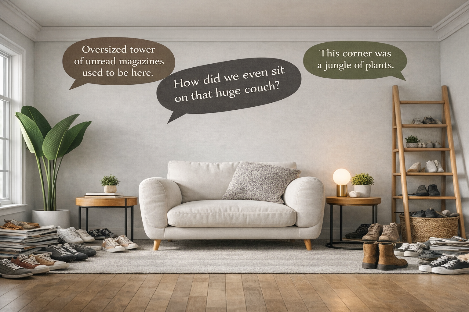
Step 1: declutter like a designer, not like a guilt trip
- Start with surfaces: clear countertops, tables, and the entry. Fast visual win.
- Make “homes” for repeat clutter: keys, mail, charging, bags, laundry.
- Don’t over-organize junk: remove first, then store what’s left.
Step 2: pick a simple rule set
- Palette rule: 1 main neutral + 1 secondary neutral + 1 accent (optional).
- Material rule: 2–3 materials repeated, not 8 “interesting” finishes.
- Display rule: one zone for “nice objects,” not every shelf.
Step 3: fix the layout before you buy anything new
Most “messy” rooms are actually circulation problems. If you’re constantly walking around furniture, you’ll pile things wherever you can. Measure your clearances and re-place the big pieces first.
If you want a quick measuring workflow, use a laser tape measure guide and plan the room like a drawing: key dimensions, clear paths, and where storage should land.
Step 4: buy less, upgrade slower
Minimalism collapses when you impulse-buy “minimalist stuff.” Live with the edited version of your room for two weeks. Then you’ll know what’s actually missing.
Minimalist design checklist
- Can you walk through the room without dodging furniture?
- Is at least one major surface intentionally clear?
- Do you have closed storage in the mess zones?
- Are you using 2–3 materials max (repeated), not a mix of everything?
- Is your lighting layered (not just one overhead light)?
- Do your “whites” and “greys” match the same undertone?
- Did you remove first before buying “organizers”?
- Do you have one display zone (art / shelf / console) and the rest calm?
- Do you have a defined spot for charging and small electronics?
- Does the room still feel human (texture, warmth, comfort)?
FAQ
How do I make minimalist design feel warm?
Use one warm anchor: timber, a warmer white, linen/wool texture, or warm-toned lighting. Don’t try to “warm it up” with more decor.
What’s the biggest beginner mistake?
Buying new minimalist furniture before fixing clutter and layout. You end up with the same mess, just more expensive.
Is open shelving minimalist?
It can be, but it’s usually maintenance-heavy. If you don’t want to curate constantly, go closed storage for most things and keep one shelf as the “display zone.”
Do minimalist rooms have to be white?
No. They have to be controlled. Dark minimalist rooms can look great, but they need better lighting and fewer competing textures.
What’s the easiest room to start with?
Entryway or kitchen surfaces. Clear them and add one storage solution that prevents the same clutter from returning.
How do I choose colors without overthinking?
Pick one main neutral, then decide if your space runs warm or cool. Keep everything in the same undertone family. If you want help building a calm palette, see neutral color palettes.