
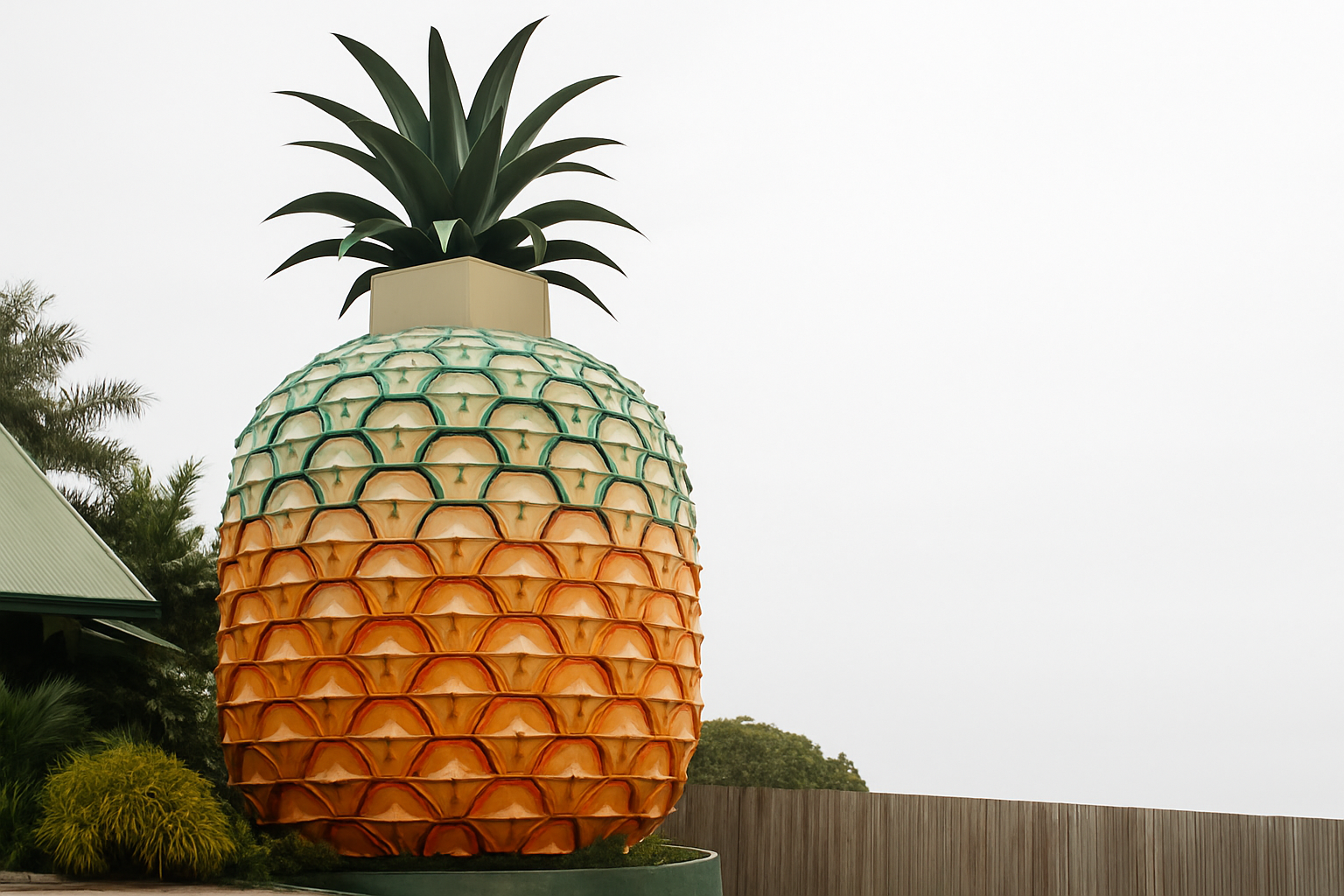
The Big Pineapple, Seen by an Architect
I went to see a 16-metre fruit and came home thinking about scale, memory, and whether kitsch can do civic work.
Arrival: the funny thing that suddenly gets serious
You don’t “discover” the Big Pineapple so much as you roll up on it and grin. The proportions are cartoon, the crown is a little too jaunty, and for a moment your inner eight-year-old is in charge. Then the architect part of your brain kicks in: this is an object building, a pure sign in the landscape, more billboard than house, closer to Venturi’s “duck” than anything else. It isn’t trying to be a building about pineapples; it is a pineapple. And that’s the first honest thing about it.
Pop architecture is usually dismissed as a novelty. Standing underneath those huge diamond scales I was reminded that novelty can hold a community’s memory for decades when more “serious” buildings can’t. Whatever your taste, the Pineapple has been doing free brand work for the Sunshine Coast for half a century. If you want a quick primer on why certain shapes in the built world read so fast, skim our plain-English notes on form and how it signals, then come back to the fruit.
Skin and skeleton: a costume with a spine
The outside is a performance—giant faceted “eyes,” a serrated crown, paint that does most of the heavy lifting. Up close, you start to see the real logic: a simple structural frame carrying a lightweight shell. That separation matters. Costume and skeleton are honest about their jobs: one tells the story, the other keeps you safe on the stairs. In a hot, coastal climate, a light envelope that can be repainted or patched is the sensible choice.
Architects often talk about “reading” a building. Here, the reading is blunt and refreshing: no coy systems, no invisible tech trying to pretend it isn’t there. If you’re used to industrial shells and big-sign architecture, you’ll recognise the playbook—steel, fixings, access, ladders—closer to roadside infrastructure than to a gallery. If you want context for that lineage, our short guide to industrial and utilitarian architecture helps frame why this approach ages differently from sleek, sealed minimalism.
About that scale
Sixteen metres is an awkward size for architecture. Too small to be sublime, too big to be cute. The Pineapple solves it by being legible from a car window at 80 km/h and from a child’s eye at two metres. The diamond pattern (those rhythmic “eyes”) does what good cladding does: it breaks the mass into a beat your brain can count. That rhythm turns absurdity into an object with a pulse. It’s the same trick we use on long elevations—repeat, vary, repeat.
Inside, the stair is the best moment. You feel the curve of the cone, your body spirals in the same geometry the fruit suggests, and the section finally matches the plan. It’s not high architecture, but it is honest spatial storytelling.
Weathering, maintenance, truth
Queensland sun, salt air, and cane toad humidity are cruel. This kind of object lives or dies by maintenance: repaint cycles, sealants, corroded fixings, safe treads on the stair after a week of rain. The Pineapple has had its ups and downs, and you can read them on the skin like growth rings—fresh gloss, chalked panels, a shiny crown panel replaced next to an older one. Architects love patina until it becomes a safety report; here, patina and compliance have to co-exist without turning the fruit into a patchwork quilt.
Kitsch or civic? Wrong question.
The Pineapple is kitsch, yes. But it’s also a landmark with jobs to do: wayfinding, memory, micro-economy. On my visit, I watched three generations pose for the same photo everyone takes. That ritual is the point. We talk a lot in studios about “placemaking,” and then we design polite plazas nobody uses. Meanwhile this fiberglass fruit throws a shadow and creates a gathering. The civic lesson is uncomfortable: sometimes the thing that works is the thing critics roll their eyes at.
Tourism machine, community anchor
Beyond the object, the precinct is a stitched-together economy—tours, trains, wildlife, festival days. The building is the poster; the ground plane is the business model. It works best when the route from car to photo to coffee is frictionless, with one or two quiet places to sit and watch the theatre of everyone else doing the same loop. That choreography is design, not accident.
Heritage with a wink
“Heritage” usually conjures sandstone and cornices; here it means protecting a beloved oddity because it holds local memory better than most town halls. If you list a pineapple, you aren’t saying it’s high art; you’re saying it matters to people. That is, frankly, a healthier definition of heritage than the usual style police.
What doesn’t quite land
The observation deck is more idea than view; the crown is a tight hat, and the horizon is mostly carpark and green. The internal exhibit logic has drifted over time, so the story sometimes feels like a scrapbook rather than a clear arc from farm to export to culture. Accessibility is better than it used to be, but this is still a vertical experience in a humid climate—shade, breezes, and rest points are doing heavy lifting. None of these are mortal sins, but they keep the architecture from being more than a charming object lesson.
What I actually learned by going
First: joy is a design tool. The laugh you hear in the carpark is part of the brief, not a side effect. Second: clarity beats subtlety when you’re building for passing cars and family photos. Third: durability here is less about indestructible materials and more about a maintenance-friendly kit of parts. Last: a community will fight for an object that reflects them back with humour, even when experts hesitate.
If I were asked to tune it, five moves
Keep it simple and keep it architectural, not theme-park. Here’s exactly what I’d do:
- Make the stair a story. Add three short “story landings” with shaded cut-outs that frame the plantation and the Bruce Highway. A sentence, a sketch, a relic. Less museum, more breadcrumb trail.
- Quiet the carpark. Plant a narrow bosque of hardy trees between cars and cone, so the approach compresses then reveals. Cheap urbanism, huge payoff in photos and heat.
- Re-skin a band. Replace one circumferential ring of panels with perforated, corrosion-resistant metal to give the façade a breathable shadow belt. Same silhouette, better longevity and depth.
- Night lighting as drawing, not flood. A warm outline on the crown edges and a gentle graze up the lower third. Keep the mid-belly dark so the fruit reads dimensional, not blown out.
- A single, honest exhibit. One room that shows “how the fruit gets from field to you” with weighing, grading, and shipping stories—light, tactile, kid-proof. The rest stays breezy.
If you like the anatomy-first way of thinking about buildings—breaking them into envelope, structure, sequence—that’s exactly the method we teach in our spot-and-name style guide, just applied to a fruit.
The bigger picture: lessons for serious work
It’s easy to laugh at large objects on highways. But the Big Pineapple survives because it does three serious things most civic buildings forget: it communicates at speed, it’s legible to children and adults simultaneously, and it asks very little of you to belong. When I left, I thought about school halls and libraries that could use exactly that generosity—clear entrances, one great stair, one good photo spot, one story told well.
Quick answers people actually ask me
Is it architecture or sculpture? Both. It’s architecture because you occupy it, climb it, and maintain it; sculpture because the form is the message.
Why keep it when tastes change? Because cities are memory machines. A few joyful weirdos among the “proper” buildings make places loveable.
Could you build it today? Yes, but I’d design the skin as replaceable cassettes, spec high-CRI warm lighting, and commit to a repaint schedule on day one.
Does it teach anything? If you let it. Use the climb to explain climate, agriculture, logistics, and why objects in landscapes matter.