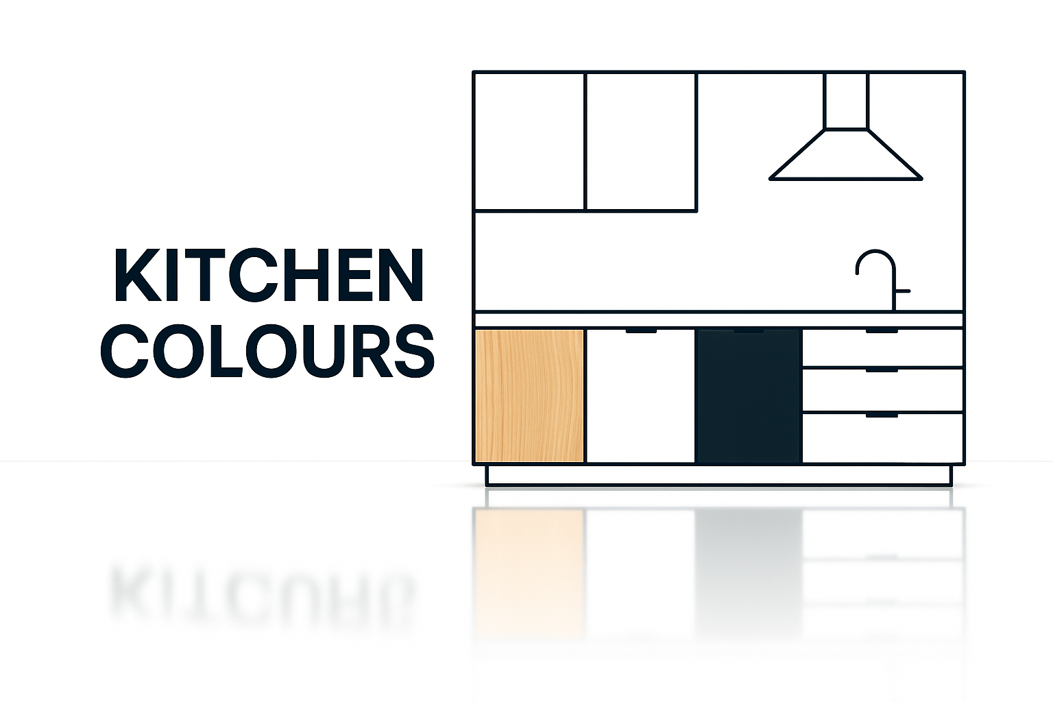
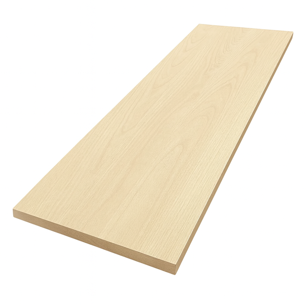
7 Kitchen Laminate Colour Combinations That Never Fail
How to Choose the Right Two Colour Kitchen Laminate Combination
A kitchen is the most used room in most homes. You cook, eat, and gather there. Friends always end up in the kitchen during parties, no matter how nice the living room is. Because cabinets take up most of the wall space, their colours define the entire room.
Pick the right laminate combination, and your kitchen feels timeless, stylish, and comfortable every single day. Pick the wrong one, and you’ll spend years staring at cabinets that feel too dark, too cold, or already dated.
Most mistakes happen because people choose safe colours from catalogues or showroom displays without testing them at home. They either go too neutral (beige on beige) or chase a trendy shade that feels tired after a year. The trick is balance: pairing colours that complement each other in tone, warmth, and finish.
Seven Modern Two-Colour Combinations for Kitchen Laminates
What follows are seven proven two-colour laminate combinations, two that fail in real life, and pro designer tricks to help you nail the details — from hardware to backsplashes. To make it real, I’ve included examples of how homeowners actually pulled these off in small condos, family kitchens, and full renovations.
Why Kitchen Colours Matter More Than You Think

Cabinets cover most of the walls in a kitchen, so the colours you choose decide how the room feels every single day. Go with one flat tone and the kitchen can look heavy or washed out. Break it into two balanced colours and the space suddenly feels layered, brighter, and more personal.
Dark colours on the base units hide the scuffs and spills that happen in every kitchen. Lighter colours on the uppers keep the room open and easier to live with. Together they add depth that a single colour never gives you.
I’ve watched plain beige kitchens lose their appeal in months, while the same layout done in navy bases and white uppers looked sharper and stayed fresh for years. The layout didn’t change. The lighting didn’t change. Just the colour pairing did all the work.
That’s the real power of two colours: they make the kitchen feel designed, not just installed.
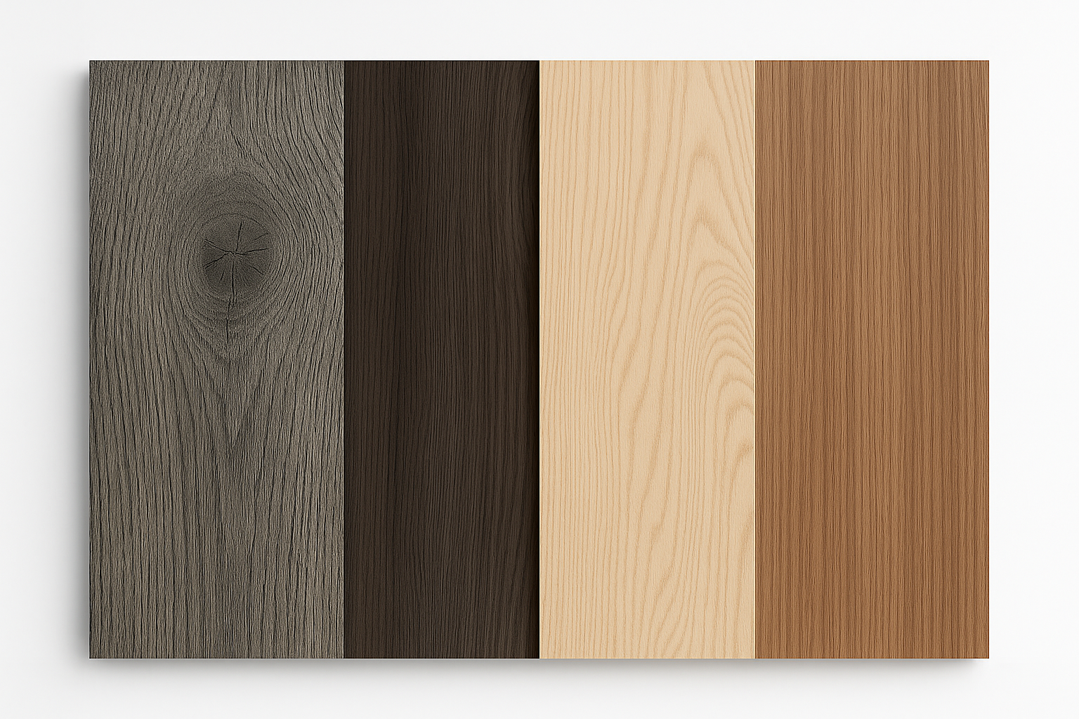
Kitchen Cabinet Laminate Colours: Winning Two Colour Combinations
7 Smart Two-Colour Laminate Pairings That Actually Work
1. Ocean Blue + Crisp White
Blue and white has survived centuries for a reason. It’s calm, clean, and never feels outdated. In kitchens, ocean blue on the base cabinets with crisp white uppers creates balance: weight on the bottom, brightness on top.
Why it works:
-
Blue adds depth without turning the room dark.
-
White reflects light, which is crucial in smaller kitchens.
-
It feels fresh year-round instead of seasonal.
Real-world example:
A couple in Toronto renovated a galley kitchen in a condo with poor natural light. They used ocean blue for the lower cabinets and white for the uppers. The blue gave the narrow space presence without making it feel cramped, while the white bounced every bit of available light. They paired it with matte chrome handles and light oak flooring. Three years later, the kitchen still feels new.
What to avoid:
Don’t overload with coastal décor (ropes, shells, beach signs). The colours carry the coastal calm. Props cheapen it.
2. Slate Grey + Walnut Brown
Grey is everywhere, but on its own it often feels cold. Walnut warms it up. Together, they deliver modern elegance without sliding into sterility.
Why it works:
-
Grey scratches the minimalist itch.
-
Walnut grain adds richness and texture.
-
Works in both matte and glossy finishes.
Real-world example:
In a suburban Chicago remodel, the homeowners used slate grey on tall pantry units and walnut on the island base. The walnut grain caught the light and softened the hard edges of the grey. With brushed black handles and a white quartz counter, the kitchen looked high-end without being unapproachable.
Pro tip:
Use darker walnut if you want luxury. For smaller kitchens, lighter walnut keeps things airy.
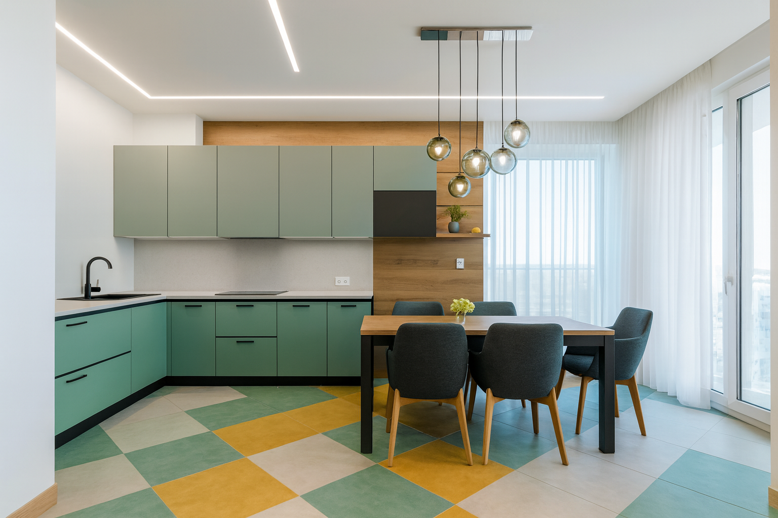
3. Grey + Mustard Yellow
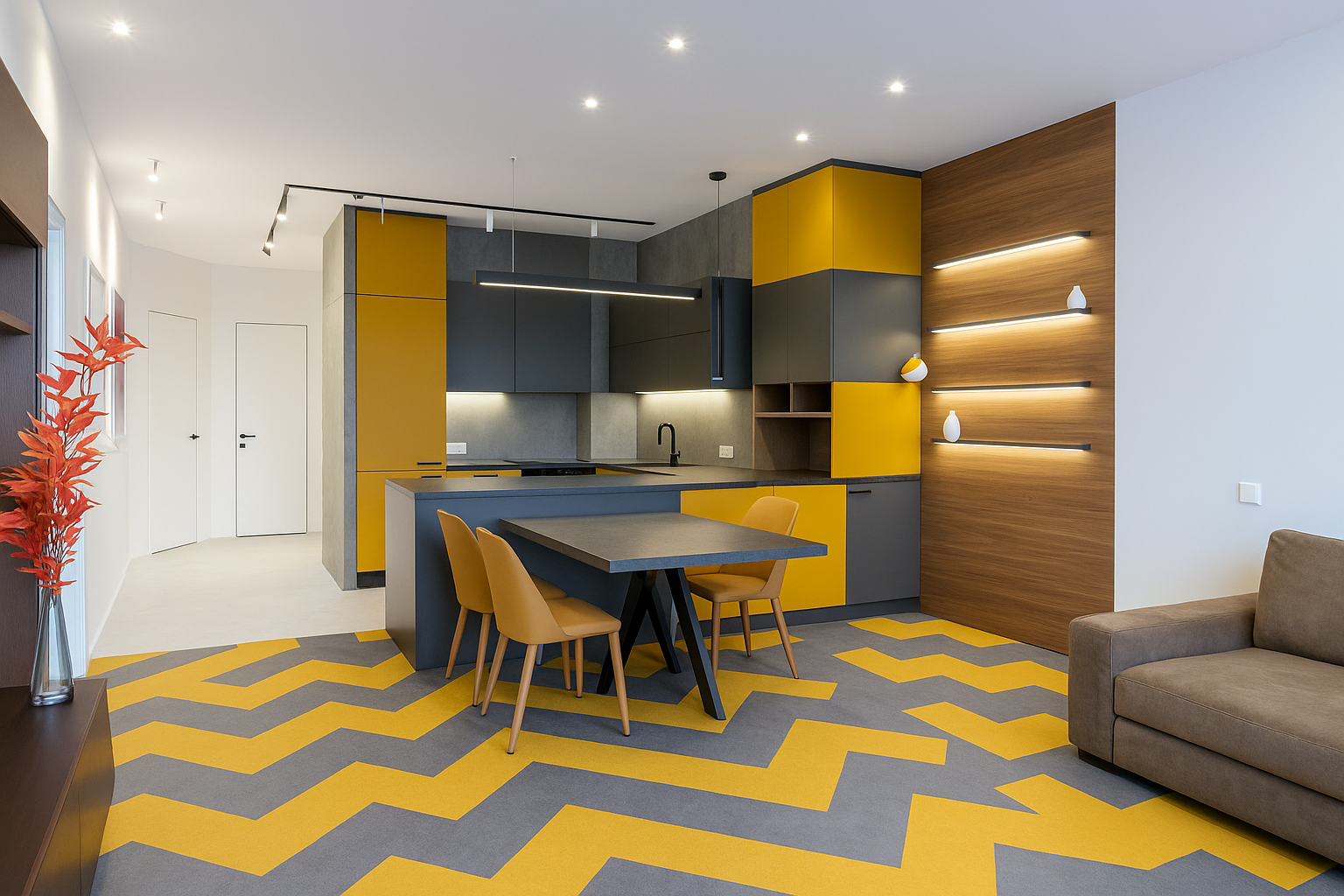
This one’s bold but smart. Grey holds the room steady while mustard injects energy. Unlike bright lemon yellow, mustard feels grown-up.
Why it works:
-
Mustard stimulates energy — great for kitchens where people gather.
-
Grey balances it so it doesn’t overwhelm.
-
Works best in matte finishes.
Real-world example:
A young couple in London wanted colour in their compact kitchen but feared making it too loud. They chose grey for the tall cabinets and added mustard laminate to just the base drawers under the window. With white walls and simple shelving, the mustard felt intentional, not chaotic. Visitors always comment on it.
What to avoid:
Don’t use glossy lemon yellow. It screams fast-food chain. Mustard or ochre will last.
4. Mint Green + Soft Grey
Mint green has a retro charm, but without grounding it can look like a 1950s diner. Pairing it with soft grey keeps it modern.
Why it works:
-
Mint adds freshness, especially in kitchens with little natural light.
-
Soft grey tones it down.
-
The result is playful but controlled.
Real-world example:
In a heritage bungalow in Melbourne, the owners wanted to modernize while keeping nods to the home’s age. They used mint on the base cabinets and soft grey for uppers. The mint kept things lively, while the grey linked the kitchen to the rest of the muted interior palette. Paired with warm brass handles, it felt fresh without clashing.
Pro tip:
Mint needs warm lighting. Under cool LEDs, it looks flat and washed out.
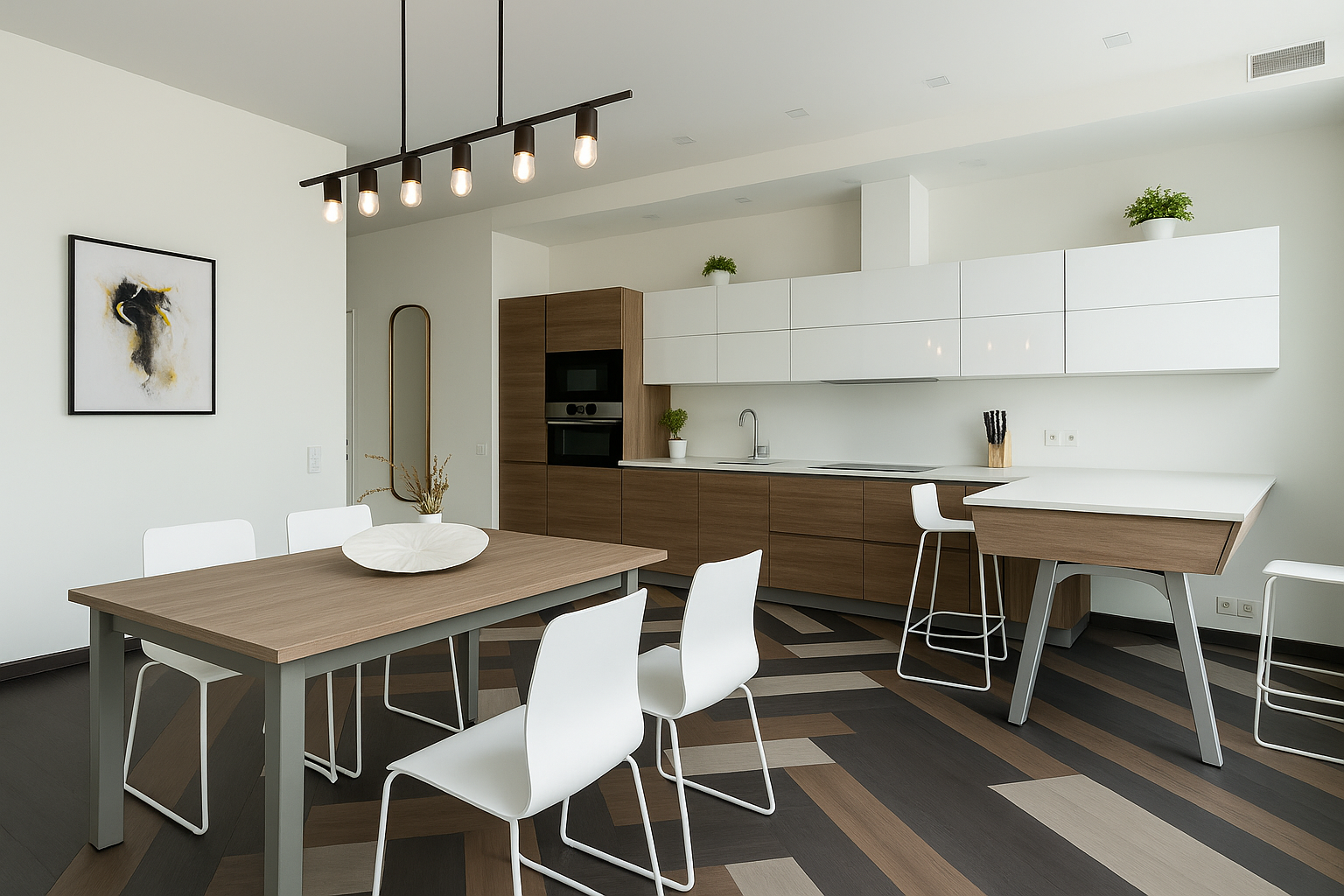
5. Cream + Chestnut Brown
Cream and chestnut is the reliable, never-wrong combination. It’s softer than white + wood, making it cozy without being dull.
Why it works:
-
Cream adds warmth but still brightens.
-
Chestnut grounds the space.
-
Easy to match with stone counters or beige flooring.
Real-world example:
A family in Austin used cream for all upper cabinets and chestnut for the island and pantry wall. With terracotta flooring and open shelves, the kitchen felt warm and inviting. The chestnut cabinets anchored the space, while the cream tied it to the dining room.
What to avoid:
Too many competing wood tones. Chestnut should dominate, with flooring and furniture either clearly darker or lighter.
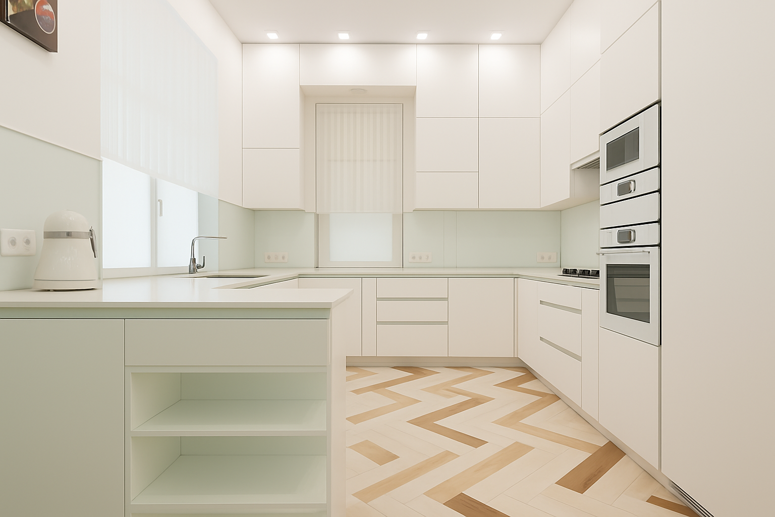
Cream + Chestnut Brown and the Risk of Overdoing It
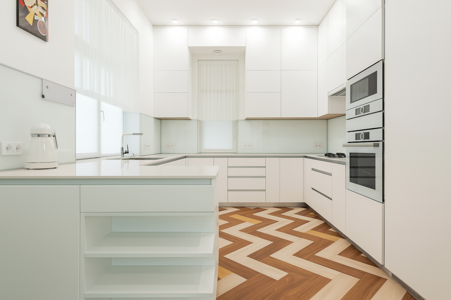
Chestnut flooring can bring warmth, but too much of it makes a kitchen feel heavy. In the first image the deep chestnut floor overwhelms the space. It clashes with the light cabinetry and pulls the whole room down, making it feel darker and smaller than it is.
Now look at the second image. The balance of cream with just a touch of chestnut completely changes the mood. The kitchen feels brighter, modern, and open. The cream keeps the space light while the small areas of chestnut add just enough richness without stealing the show.
Takeaway: Use chestnut carefully. On floors go lighter if your cabinets are already light. If you love chestnut reserve it for accents such as a feature panel, lower cabinetry, or floating shelves. Let cream or beige be the main backdrop so the space feels open, not cramped.
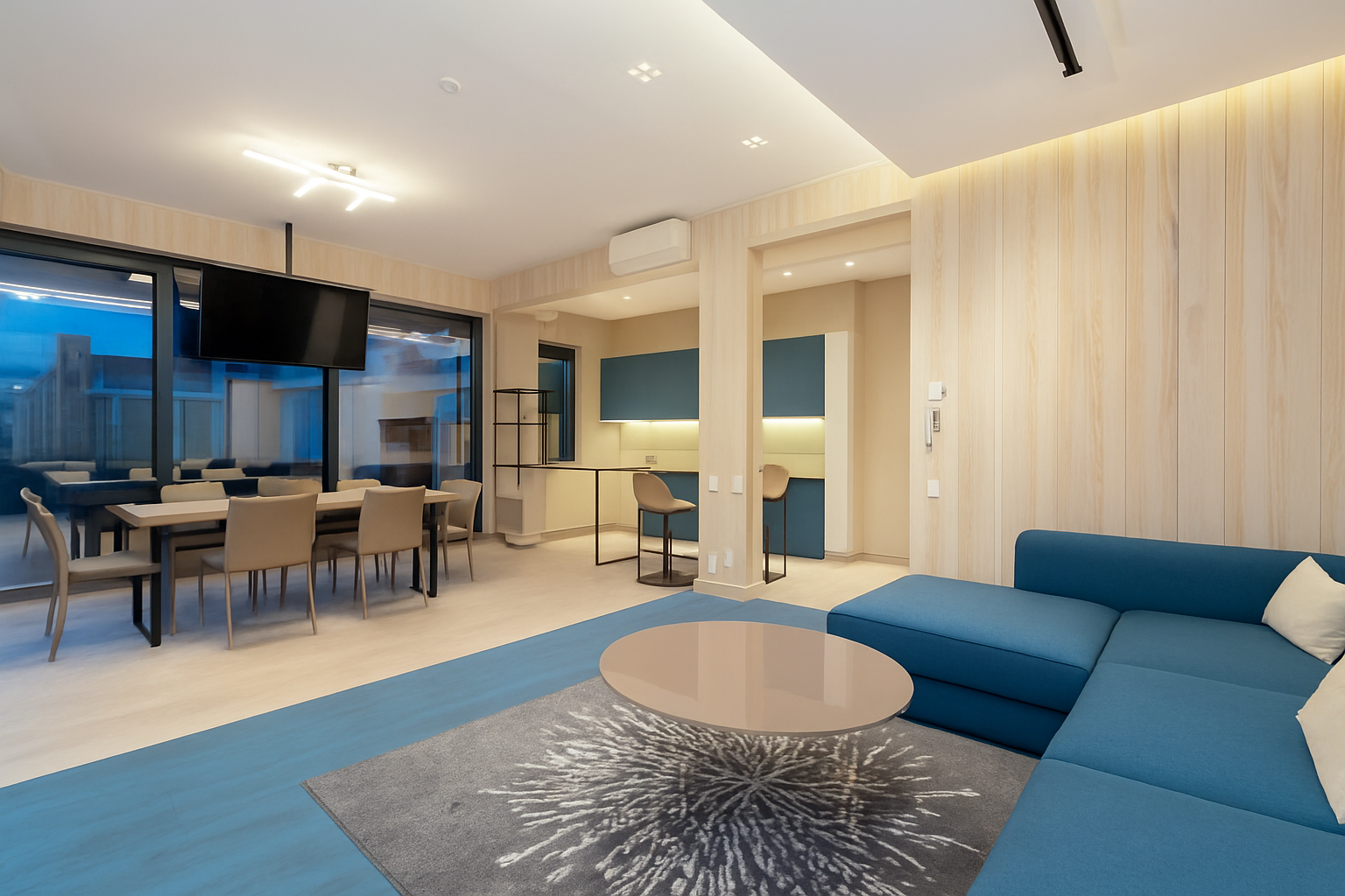
6. Dark Navy + White
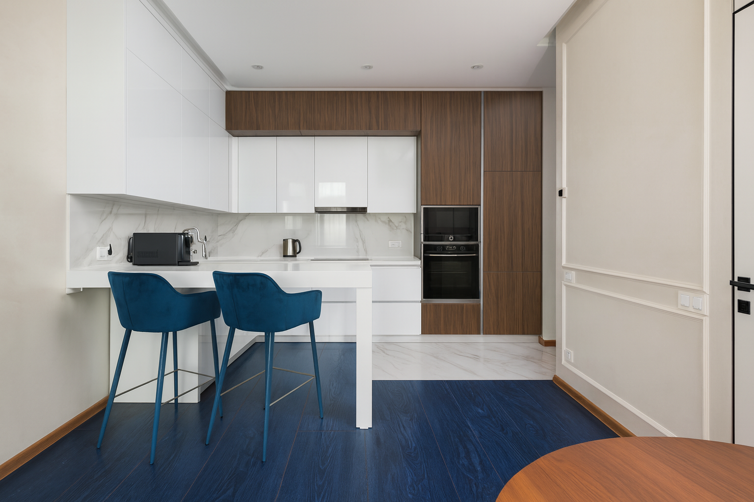
This is contrast at its sharpest. Navy has depth and authority; white keeps it breathable.
Why it works:
-
Navy hides fingerprints better than black.
-
White stops the room from feeling heavy.
-
Works across both traditional and modern cabinet styles.
Real-world example:
In a renovated farmhouse in upstate New York, the owners painted the lowers in navy and kept the uppers white. With butcher block counters and brass handles, the room looked both grounded and elegant. It’s a pairing that photographs well — real estate agents love it for resale.
Pro tip:
Stick to navy on lowers. Too much navy on uppers swallows light.
7. Natural Wood + Bronze or Warm Taupe
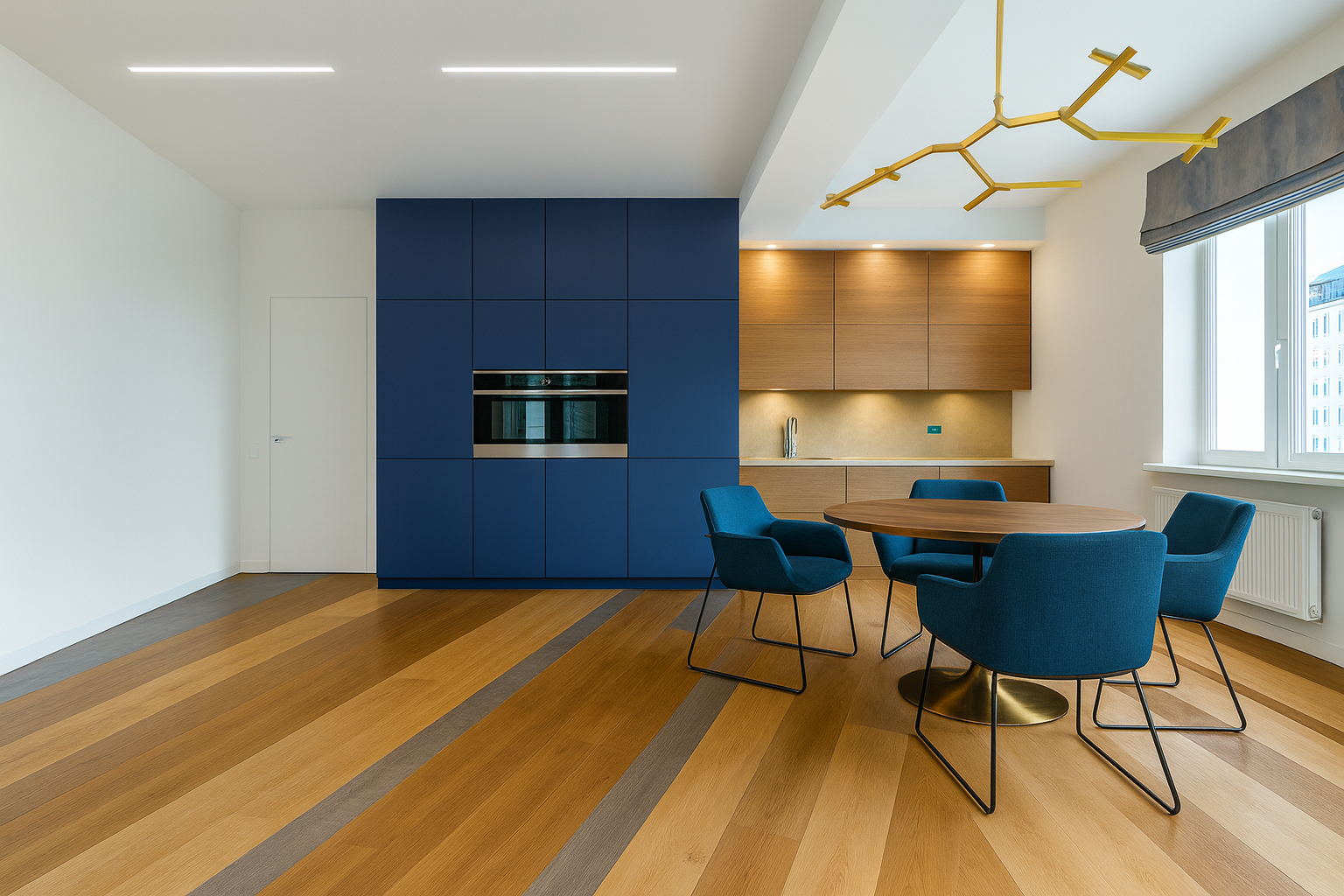
This pairing relies more on texture than contrast. Wood adds warmth; taupe or bronze brings elegance.
Why it works:
-
Wood keeps the space grounded and natural.
-
Taupe or bronze adds sophistication.
-
Matte finishes keep it upscale.
Real-world example:
In a downtown Vancouver condo, the owners used natural oak grain on the base cabinets and a bronze-tone laminate on the uppers. With stone counters and neutral flooring, the kitchen felt like a curated, high-end space. Guests often comment on how “calm” it feels.
What to avoid:
Skip glossy laminates here. They clash with wood’s natural grain.
2 Combinations You Should Skip
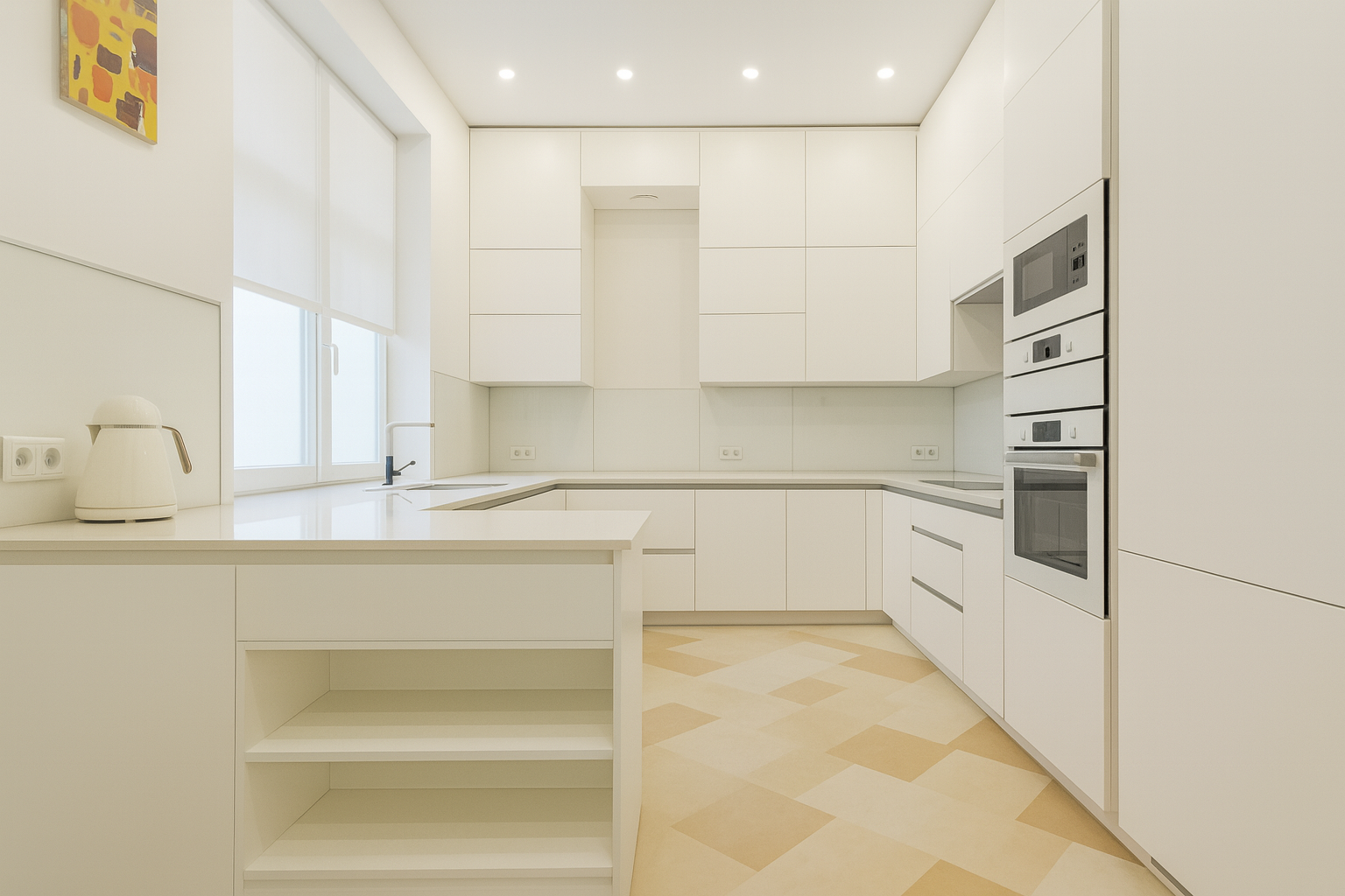
Beige on Beige
Stacking beige on beige looks safe but flat. It disappears instead of making a statement.
Why it fails:
-
Lacks contrast.
-
Ages badly.
Beige Cabinets + Cool Grey Floors
Warm beige and cool grey fight each other. The clash makes kitchens feel unfinished.
Why it fails:
-
Beige leans warm, grey leans cool.
-
Reads as accidental.
Better move:
Pair beige with warm wood or taupe. Pair cool grey with white or bold accents.
How to Test Colours Before Committing
-
Get large samples. Don’t trust tiny squares. Tape full-size pieces to your cabinets.
-
Check in different light. Morning sun, evening artificial light — colours shift.
-
Test with counters and floors. Always compare all materials together.
-
Live with it. Keep samples taped up for a few days. If it feels wrong, it won’t grow on you.
Two Colour Combinations for Kitchen Laminates That Actually Work
Designer Hacks That Make Two Colours Work
Hardware Choices
-
Blue + White? Brushed chrome or steel.
-
Grey + Walnut? Matte black.
-
Cream + Chestnut? Antique brass.
Backsplash Pairings
-
Navy + White: White subway tiles with dark grout.
-
Mint + Grey: White marble or simple stone.
-
Grey + Mustard: Stick with plain grey or white tiles.
Flooring Rules
-
Blue + White: Light oak or pale stone.
-
Walnut + Grey: Medium wood floors echo walnut.
-
Navy + White: Warm-toned wood or stone, not cold grey tile.
Lighting Tricks
-
Cool palettes (grey, mint): Use warm light.
-
Warm palettes (cream, chestnut): Use neutral white light.
Why These Combos Last
-
Balance contrast with calm. Enough difference to feel alive, not chaotic.
-
Work across styles. Navy + white fits farmhouse or modern.
-
Practical. Navy hides fingerprints; walnut hides wear.
-
Resale safe. Buyers don’t see them as trendy risks.
Real Advice From Homeowners
-
“Best decision we made was navy lowers, white uppers. Kids spill, navy hides it. Still feels airy.”
-
“Grey felt too cold until we added walnut. Now the kitchen feels like we want to hang out there.”
-
“Mustard scared me at first, but it makes the whole kitchen pop. Guests notice it immediately.”
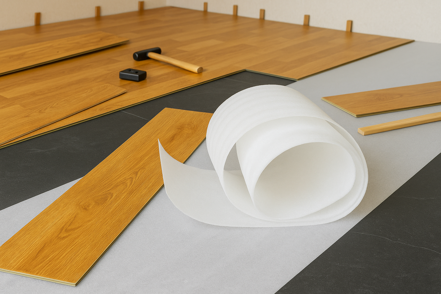
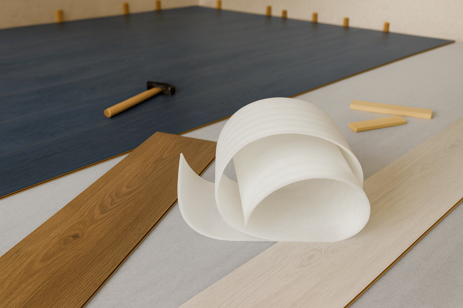
How to Judge Laminate Quality for Kitchens
Not every laminate is built to last. Some look fine on day one but start peeling, bubbling, or scratching within a year. If you do not want to replace doors in three years, here is what really matters when picking laminate for a kitchen.
Thickness Matters
Most cheap laminates are 0.7 to 0.8 mm. They chip at the edges fast. Good ones run 1.0 to 1.2 mm and feel heavier in the hand.
How to check in store: pick up a sample. If it bends like a playing card, skip it.
Brands that hold up: Formica and Wilsonart in the US and Canada, Laminex in Australia, Polytec in Australia and New Zealand. All of them sell thicker, commercial grade sheets.
Surface Finish
Matte and textured finishes hide scratches and fingerprints. Gloss looks sleek but it will scuff and show every touch unless you buy high pressure laminate with a protective coating.
Quick test: run your fingernail lightly across the sample. If it leaves a mark, imagine what a year of cutlery drawers will do.
Heat and Moisture Resistance
Steam, spills, and hot pans test every surface. Cheap laminates fail here first. If a surface warps from kettle steam, it is low grade.
Always ask if the laminate is resistant to boiling water and steam. Good brands list this clearly. If the supplier dodges the question, treat that as a warning.
Color and Print Consistency
A small swatch can look fine but once it covers cabinets, the flaws show. Bad laminates repeat patterns in a way that looks fake.
Always ask to see a large sample board or at least two full sheets. If the grain looks cartoonish or repeats every foot, avoid it.
Bonding and Backing
Even the best laminate will fail if it is not applied right. Cabinet doors need a balancing sheet on the back to stop warping. If a contractor says you do not need backing, get another installer. Strong adhesives and proper pressure during bonding are not optional.
Certifications and Warranty
In the US and Canada, look for GREENGUARD or CARB compliance to make sure emissions are safe.
In the UK and EU, check EN durability standards.
In Australia and New Zealand, Laminex and Polytec offer seven to ten year warranties on their better products.
The Bottom Line
A quality laminate feels solid in your hand. It does not scratch with a fingernail. It does not bubble from a little steam. If you spot lifted corners in a showroom display, that tells you everything. Spend more at the start and you will not be tearing out doors and replacing panels in three years.
Final Word
Two-colour kitchens work because they feel intentional. The right pairing makes your kitchen stylish, practical, and timeless.
Start by picking your mood:
-
Fresh and airy? Ocean blue + white.
-
Grounded and refined? Grey + walnut.
-
Bold and social? Grey + mustard.
-
Warm and cozy? Cream + chestnut.
Test your colours in your space with full samples, check them under different lighting, and match them with your flooring and counters. Pay as much attention to hardware, backsplash, and lighting as to the cabinet colours themselves.
Your kitchen should serve you for a decade or more. Don’t chase trends. Choose colours you’ll still love in five years. That’s how pros design kitchens that last.
FAQ
1. Is two-colour laminate better than a single colour kitchen?
Two-tone gives contrast and breaks monotony. Single colour kitchens can look flat unless you use texture. Most designers recommend two colours if you want depth.
2. Which colour should go on the base cabinets?
Always put the darker shade on the base. It grounds the kitchen and hides stains. Keep the lighter shade on the uppers to make the room feel open.
3. Do glossy laminates look better than matte?
Glossy reflects light but shows fingerprints. Matte looks modern and hides smudges. High-gloss works in small kitchens to bounce light. Matte suits larger or heavily used kitchens.
4. Can I use wood-tone laminates with colour laminates?
Yes. Pair warm woods with warm tones (cream, taupe, mustard). Pair cooler woods (grey walnut, ash) with cooler shades (blue, grey). Mixing wrong undertones makes it clash.
5. How do I pick colours that won’t go out of style?
Stick to neutral + accent combos. Examples: grey + walnut, navy + white, cream + chestnut. Avoid overly bright tones like orange or neon green unless you’re okay with redoing in 5 years.
6. Will dark colours make my kitchen look small?
Yes, if used everywhere. Dark works fine on lowers if uppers are light. If your kitchen lacks natural light, avoid full navy or black laminates.
7. Are laminate cabinets durable enough for daily cooking?
Good brands last 10–15 years if maintained. Heat and moisture can damage edges. Always use edge banding and avoid direct steam contact near cooktops.
8. How do I test laminate colour combinations before finalizing?
Order large swatches, tape them on existing cabinets, and check in natural and artificial light for a few days. Colours change with lighting.
9. Do hardware and handles matter with laminate colours?
Yes. Warm brass or bronze pairs with navy, cream, and wood. Chrome and steel pair with grey, white, and cooler shades. Wrong hardware ruins the look.
10. What’s the biggest mistake people make with two-colour laminates?
Picking two colours with the same tone or value. Example: beige + off-white just looks muddy. You need contrast — light + dark, warm + cool, or matte + gloss.
11. How do I keep laminate cabinets clean?
Use a damp microfiber cloth. Avoid harsh chemicals and scouring pads. For glossy finishes, use glass cleaner sparingly.
12. Can I combine laminates with other materials like acrylic or veneer?
Yes, but do it with restraint. Many homeowners pair matte laminates on base cabinets with glossy acrylic uppers for balance.
13. Are two-colour kitchens harder to resell?
No. If the palette is neutral (navy/white, grey/wood), buyers love it. Overly trendy combos like red/black may hurt resale.
14. What’s the safest combination if I don’t want to experiment?
White or cream uppers + a darker neutral lower (grey, walnut, or navy). Safe, timeless, and resale-friendly.
15. Can I repaint or change the colour later?
Laminate can’t be repainted easily. You’d need to re-laminate or replace. That’s why testing swatches and picking safe tones matters.