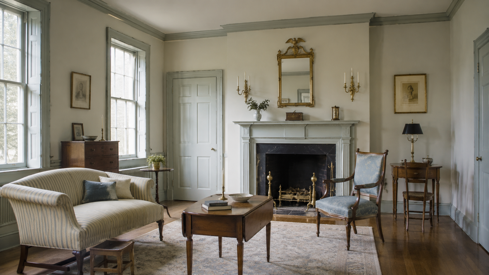
Image by ArchitectureCourses.org. Federal-style interiors work best when the room stays light, balanced, and restrained, with slim furniture, pale trim, quiet brass accents, and a clear fireplace or wall focal point.
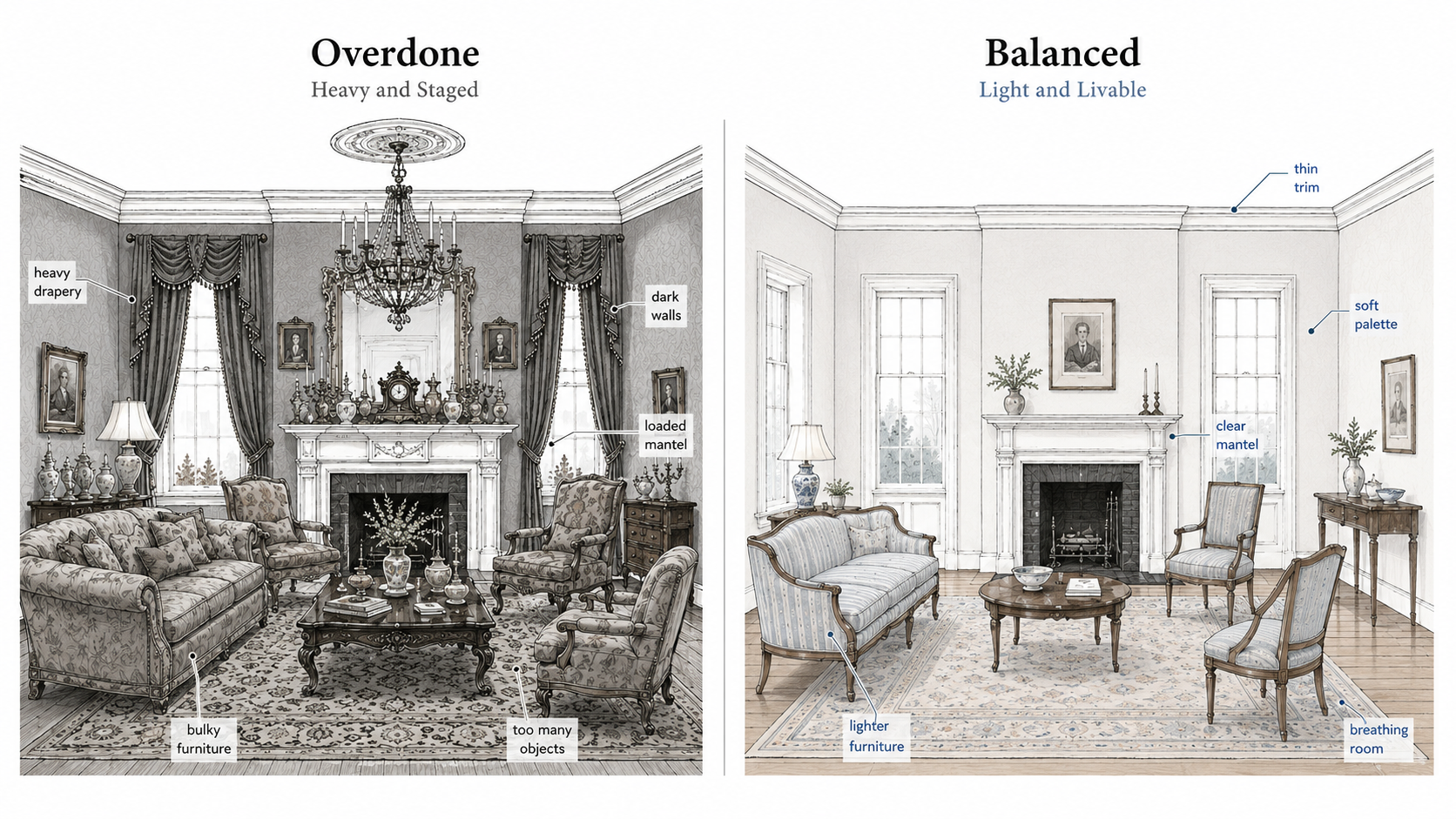
A Federal room can go wrong fast.
Too much mahogany. Too much drapery. Too much symmetry pushed so hard the room stops feeling alive. What should feel light and disciplined starts feeling staged.
The better version is quieter. Thin trim. Soft color. A clear center. Furniture with some grace in the legs and arms. Enough balance to calm the room, but not so much that it feels like nobody is allowed to sit down.
If you want the wider style family first, start with architecture styles. If you want the historical side of this cluster, read Federal Style architecture history. For the older roots behind the look, classical architecture and neoclassical architecture help place the room before you start choosing trim and furniture.
What makes a room feel Federal
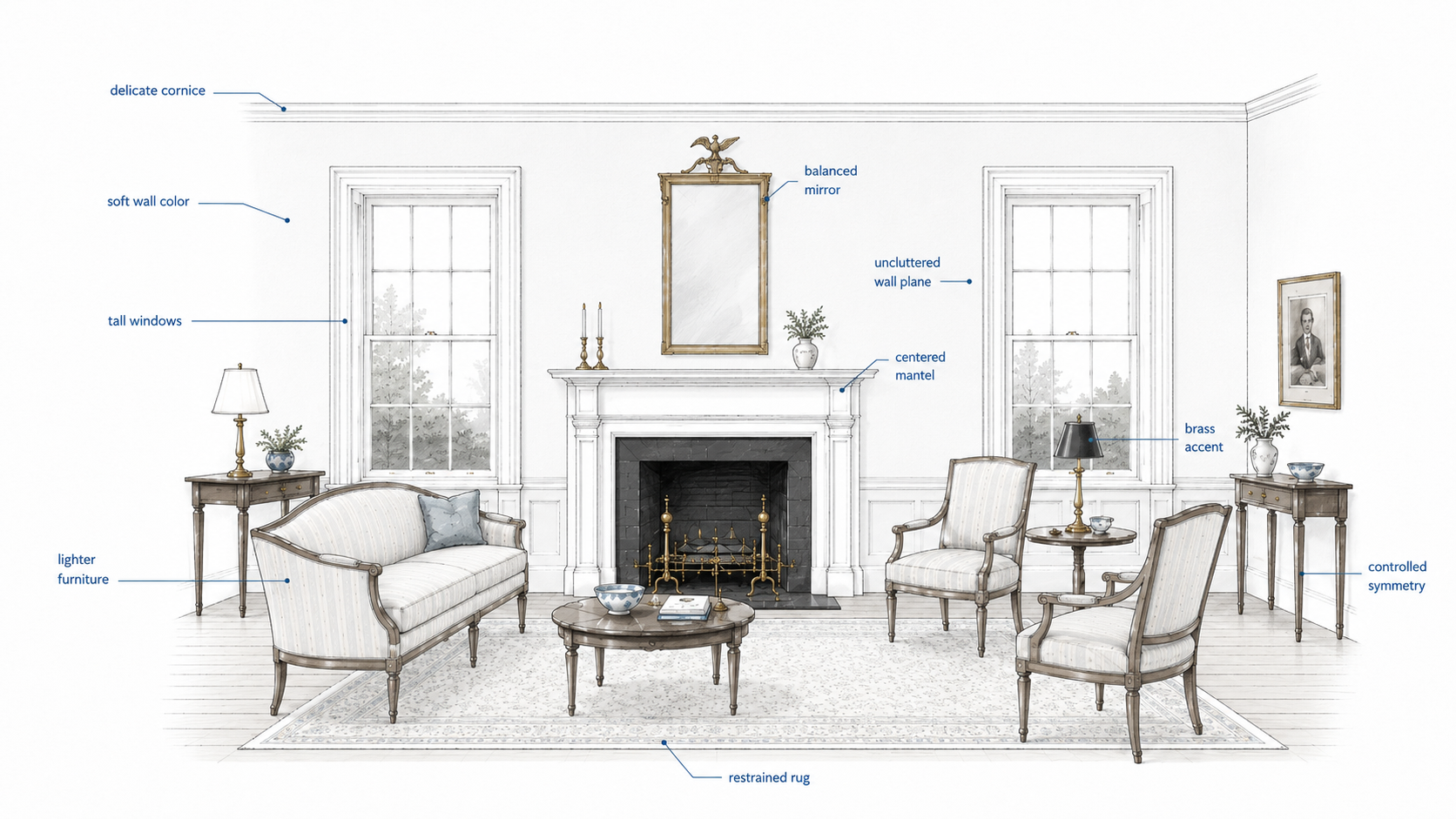
Federal interiors are not just old-fashioned rooms with antique furniture dropped into them. The style depends on proportion and restraint.
You usually feel it in a few places first: thin moldings, calmer wall color, a centered mantel or focal point, lighter furniture profiles, and a layout that believes in symmetry without turning rigid.
That is why the style is easy to miss. Nothing is supposed to shout. The room works because each part stays measured.
| Federal move | What it adds | What usually ruins it |
|---|---|---|
| Soft muted wall color | Calm and light | Dark walls make the room feel heavier than it should |
| Thin crown and trim | Refinement | Chunky molding makes the room feel later and louder |
| Centered mantel or focal point | Order | Off-center furniture fights the architecture |
| Lighter furniture profiles | Grace and openness | Bulky seating kills the room fast |
| Measured symmetry | Balance | Perfect matching everywhere makes the room feel staged |
Start with the shell, not the antiques
This is where a lot of bad Federal rooms begin. Someone buys a sideboard, a mirror, and a reproduction chair set before checking whether the room itself can carry the style.
If the trim is too thick, the mantel is too heavy, the walls are too dark, or the furniture scale is wrong, period-looking objects only make the mistake more obvious.
The better move is boring at first. Set the shell. Decide the trim language. Decide whether the room wants a mantel, a centered mirror, or a calmer art wall. Then bring in the furniture once the room already knows what it is.
Color first, but keep it calm
Federal interiors usually do better with soft color than with contrast for its own sake. Cream, dusty blue, muted green, pale gray, and warmer off-whites all fit because they let the trim and furniture do more of the work.
That does not mean every room has to be pale. It means the palette should feel controlled. One deeper note is usually enough.
If you need a plain-English reset on how color changes comfort, color psychology is the right support page. The mistake here is chasing “historic” color so hard that the room gets cold, dark, or too themed to live with.
Thin trim beats thick “historic” trim
Federal moldings are one of the easiest details to overdo. The style wants delicacy, not bulk.
A slim cornice, a modest medallion, and restrained wall framing can do a lot. Heavy foam crown, deep faux plaster swags, and oversized trim packs push the room out of the style fast.
This is also a money trap. People think bigger trim looks more formal. In Federal rooms it often just looks wrong.
A smaller medallion usually works better here. If you need a quick visual reference for scale and profile, browsing ceiling medallion options is more useful than starting with the biggest ornate version you can find.

The mantel should lead, not perform
Federal fireplaces and mantels usually work because they stay vertical, light, and composed. The surround is important, but it is not supposed to overpower the room.
That is why thick stone slabs, bulky overmantels, and crowded shelves usually miss. The mantel should act like a quiet center, not a stage set.
One mirror. One picture. A pair of objects if the room can take them. Then stop.

Symmetry matters, but not museum symmetry
Federal rooms like balance. They do not need perfect twinhood in every corner.
Matching chairs, paired sconces, and centered mirrors all make sense here. But the room still has to live. A little asymmetry in books, a plant, a side table, or one modern lamp keeps the room from feeling embalmed.
This is the line most articles skip. Federal interiors need order, but they still need air.
Light it at human height
Federal rooms should glow, not glare. Overhead light alone makes them feel flatter and more modern in the wrong way.
The better mix is simple: one calmer ceiling fixture if the room wants it, then lamps and sconces that light faces, trim, and the mantel at a more human level.
For wall lighting, candelabra-style wall sconces are a safer starting point than bulky lanterns or farmhouse fixtures.

Where people waste money
This is the section most other pages skip.
They buy the obvious things first. A reproduction chair. A brass chandelier. A sideboard. A fancy wallpaper sample. The room still feels wrong because the real problem was scale, trim thickness, or the missing center.
Federal interiors do not fail because the reader bought the wrong object once. They fail because the room never had a clear order underneath the purchases.
The better spending order is simple: shell first, focal point second, lighting third, furniture after that. Small decor comes last.
| Spend here first | Why it matters | What happens if you skip it |
|---|---|---|
| Trim and ceiling language | Sets the style honestly | Furniture has to work too hard |
| Mantel or room center | Gives the room hierarchy | The layout keeps drifting |
| Lighting plan | Makes the room feel human at night | The room stays flat or too bright overhead |
| Right-size furniture | Keeps the style light | The room feels later and heavier |
| Pattern and accessories | Adds finish and character | Easy to overspend without fixing the room |
Patterns belong in the room, not all over it
Federal interiors can handle stripes, small florals, toile, and finer repeats. The problem is not the pattern itself. The problem is volume.
One patterned drape. One chair. One wallpapered wall in the right room. That usually does more than trying to prove the style on every surface.
The room should feel composed, not busy.
Modern comfort is allowed
You do not need a museum room to get this right.
A cleaner sofa can work. So can modern lighting with a calmer profile. So can a newer rug if the color, scale, and pattern stay inside the room’s discipline.
The best Federal-inspired interiors are not pure replicas. They keep the trim and room order traditional, then let comfort and function come up to the present.
If you want the broader traditional family behind that idea, traditional home styles is the better next read.
What to do tomorrow, not someday
Pick one room.
Check the trim thickness. Check the wall color. Check whether the mantel, mirror, or main wall really gives the room a center. Then remove three things that are trying too hard.
Federal rooms improve fast when the weight comes out of them.
FAQ
What defines a Federal-style interior?
Light trim, balanced layout, restrained color, a clear focal point, and furniture that feels refined instead of bulky.
Do I need antiques?
No. One or two can help, but the room depends more on proportion and restraint than on collecting historic objects.
Can modern furniture work in a Federal room?
Yes, if the scale is right and the shell stays disciplined. The room should still read as Federal before the modern piece shows up.
What gets overdone first?
Trim, drapery, and furniture weight. That is usually where the room stops feeling graceful and starts feeling staged.
What rooms matter most?
Entry, parlor or living room, and dining room. Those are the rooms where the style reads fastest.
Read Next
For the historical side of the cluster, read Federal Style architecture history.
For the broader style family, go back to architecture styles.
For the older roots behind the room, read classical architecture and neoclassical architecture.
If you want to compare this room logic with a looser traditional approach, read traditional home styles.